Cycle 3 by Jenna Ko
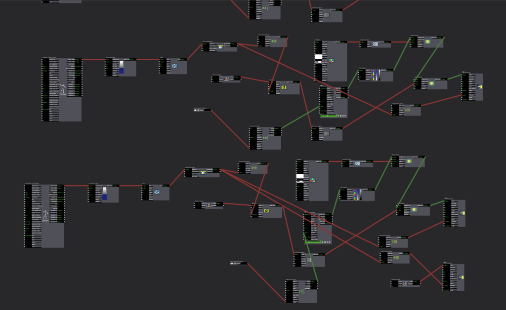
Posted: May 1, 2022 Filed under: Uncategorized Leave a comment »I used Isadora and Astra Orbbec for an experiential media design where a tunnel zooms in and out as the audience walks toward the projection surface.
The tunnel represents my state of mind where I mentally suffer from the news of the Russian invasion of Ukraine, the Prosecution reform bill in Korea, and marine pollution. The content begins with an empty tunnel. As the participant walk toward the projection surface, the news content fades in. I wanted to articulate my hopelessness and powerless feeling through the monochromatic content that fills the tunnel. As the participant walks towards the end of the tunnel, hopeful imagery of faith in humanity fades in. The content is in color, contrasting with the tunnel interior.
Finally, I was able to implement the motion-sensing function with my media design. If I were to do this again, I would set up the projector in a physical tunnel for a more immersive user experience.
Cycle 2 by Jenna Ko
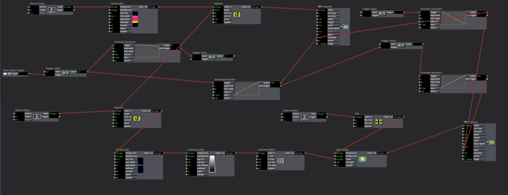
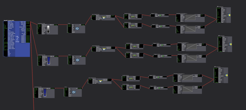
Posted: May 1, 2022 Filed under: Uncategorized Leave a comment »I used Isadora and Astra Orbbec for an experiential media design where projection content reverses in Korean political history as a participant walk towards the motion detector.
The content begins with superficial imagery of modern Korea with K-pop, kimchi, and elections. It reverses to 2017 impeachment and candlelight vigil, the democratization movement in the 1980s, President Park Jeong-hee and the Miracle on the Han River, 6.25 Korean War, ending with the Korean independence movement. As political polarization intensifies, I wanted to remind each party’s contributions to Korean democracy and prosperity for more respect and gratitude towards each other. This piece reflects my hope for politicians and supporters of each side to cooperate to make a better country than condemning and bogging each other down.
I used the Yinyang symbol of the Korean national flag to represent each political party. The Yinyang symbol represents the complementary nature of contrary forces and the importance of their harmonization. I translated the meaning to political colors, the red representing the conservative party and the blue symbolizing the liberal party. Synchronizing with the triumphing side, the yin and yang alternate as the participant walks towards the motion sensor until the participant reaches the Korean independence movement, where the symbol is complete.
I could not make the motion-sensing part work, so I triggered the scenes manually for the presentation and utilized the motion sensing function for Cycle 3.
Cycle 1
Posted: March 29, 2022 Filed under: Uncategorized Leave a comment »Concept: Following the 20th presidential election in Korea, I wanted to portray beauty of democracy and its hidden dark side. My goal was to articulate the irony of the rigid dichotomies between left and right, old and young, and Southeastern and Southwestern Korea balancing the power of the nation and protecting our democracy. With the emergence of social media, people began to access and believe in different information whether it’s true or not. The nation has become more polarized, and the politicians took advantage of the situation, disuniting the nation to gain more votes. With all the socioeconomic, generational, and regional conflicts and hatred, the polarization became uncontrollable to the point where the very purpose of the governance and elections degenerated into the survival of the party. No matter a plan was good or bad for the nation, each side would disagree with whatever the other side carried forward. One of the few times they agreed upon was when they wanted a pay raise. I got sick of the politicians having double standards towards each other(In Korea, we call this 내로남불, which means, “If I do it, it’s a romance, if you do it, it’s an infidelity.) and disuniting the nation, so I wanted to let my audience be aware of the danger of unconditional support towards certain political party which hinders the self-purification. In order to make rational decisions as voters, I thought it would be important to build mutual gratitude towards each other for bringing prosperity and democracy to the nation.
Methodology: Besides articulating my political thoughts, I wanted to explore the possibilities of texture and layering with the projections. Oded helped me install two projectors facing each other with a scrim in between them. I gathered videos of the poverty after the Korean war, Miracle of the Han River, the military dictatorship and the Democratization Movement, and Korea today with direct elections and added textures that would support the ideas. There was a live camera capture to individualize and highlight citizen power. It ended with intertwining red and blue waves which represents two political sides.
Next step: I think for the first cycle, I understood how to set up the layering of projections, how to add textures to them, and what effects they create. I think for the next step, I would like to add audio so the audience can follower and understand my intentions with the piece. I also want to explore interactivity with motion capture.
Jenna Ko_Audio Assignment
Posted: March 3, 2022 Filed under: Uncategorized Leave a comment »Pressure Project 3
For this project, I decided to narrate my cultural background, specifically in terms of Korean politics. Although there are no politicians in my family, I can say I grew up in a politically active family. We have veterans buried in National Cemetery, and I grew up witnessing my parents and grandparents holding candlelight vigils in Gwanghwamun Square whenever the nation was in crisis. In fact, Koreans in general love to congregate whenever the nation is in crisis. I remember my parents volunteering with millions of other Koreans to clean the coast when we had a huge oil spill. With great passion and strong beliefs, we also have various kinds of social conflicts. With the presidential election coming up, I thought this is the perfect time to share my cultural experience.
The challenge that I encountered was that most of my audience did not speak Korean. Originally, I wanted to gather news clips in English, but there were limited resources. Therefore, I decided to narrate the content by myself with a representative folksong, Arirang, in the background. I imported appropriate images in Premiere with the audio files.
Pressure Project: Umbrella
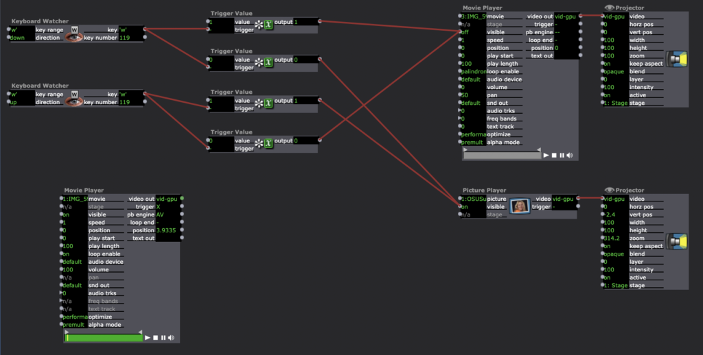
Posted: February 22, 2022 Filed under: Uncategorized Leave a comment »My original idea was to have three umbrellas that each represents me and my friends on a rainy day. I wanted Isadora to have unique sonic effects when the operator opens the umbrellas as follows:
Umbrella A: Jenna by herself on a rainy day (in her car)
Umbrella B: Ellen by herself (listening to music)
Umbrella C: Sejeong by herself (taking a walk)
Umbrella A and B: Jenna and Ellen having phone call
Umbrella A and C: Jenna and Sejeong having phone call
Umbrella B and C: Ellen and Sejeong having phone call
Umbrella A, B, and C: All Chatting
I wanted to reveal our video clips when the audience figure out the system. However, I could not figure out how to trigger videos with multiple keys in different combinations, so I decided to narrow them down to one variable: Jenna on a rainy day, indoor versus outdoor. When the umbrella opens, the audience see an outdoor video on a rainy day. When it closes, the audience see an interior image of the Sullivant Hall, where I took the video.
Pressure Project 1 by Jenna Ko
Posted: January 27, 2022 Filed under: Uncategorized Leave a comment »When I first heard the terms “congestion” and “intervention”, the first thing that came into my mind was BMV driving test that I took a couple months ago.
Although there were 48 agencies across the state, surprisingly the supply was insufficient to meet the demand, especially in the urban area. The written exam was first come, first served, so I visited a nearby, relatively highly-rated BMV half an hour after it opened. The line was already so long, so I had to wait an hour to sign up for the exam. When I finally got a chance to speak to the receptionist, she said I may or may not be able to take the exam that day. Surprisingly, there was only one computer in the BMV, so it all depended on how fast people could finish their exams. My cousin and I both had a schedule that does not usually align with BMV hours, so I decided to wait, and spent 2 hours glaring at 4 people taking the exam. Unfortunately, they were out of time, and we had to go back home. On our second visit, we arrived a little earlier and luckily I was able to take the exam and get the permit. Unlike the written exam, the driving test was only by reservation, so I went to the BMV website, and this is where the project begins. I chose to devise a benevolent intervention because the existing technology was already malevolent enough.
After I entered my personal information, my BMV records were identified, and I was able to access the scheduling webpage. This is how the system was designed:

It all went smoothly until I had to click each agencies to check the availability. Either the slots for the dates that I selected were unavailable, or their earliest date available did not work for my schedule. Accordingly, not only did I have to check each agencies individually, but also I had to check each dates for each of them. For instance, if I wanted to take an exam in October 24, I had to click each agencies to check their availability in October 24. The inefficient interface was causing serious congestion, because some agencies were fully booked a month in advance, while nearby agencies had many unbooked slots; The users got tired of checking each station individually, assumed all the stations were fully booked, and decided to wait for a month while neighboring agencies in the corner of the map were available the next day. I felt frustrated because the interface was overcomplicated for such a simple task, so this is how I simplified the process:
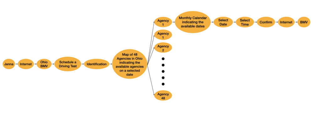
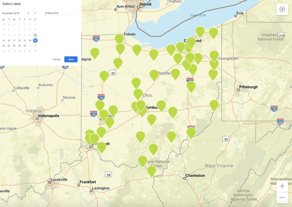
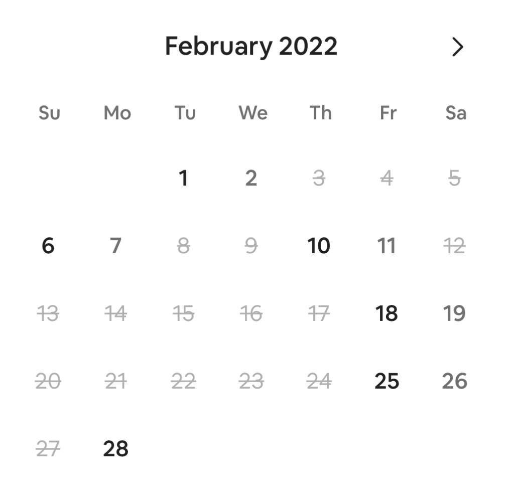
Since most people have their own schedule, I thought it would be convenient to see on the map which agencies are available on a selected date. For those who want to take the exam at a specific agency, instead of having them check the availability for each dates only to find out that it’s fully booked, I thought it would be nice to indicate the available dates on a monthly calendar, so we don’t have to check each dates one by one. This way, the user can also find out the earliest date available intuitively.
Project Bump
Posted: January 25, 2022 Filed under: Uncategorized Leave a comment »The storytelling project caught my eyes. It was personal, intimate, and visual. I could follow the creator’s emotional journey after Fukushima Nuclear disaster. It think it would be interesting to see it being more interactive. I began to think of how to make my content more specific and personal yet still be approachable to the audience.