Final Project – here4u
Posted: December 9, 2017 Filed under: Calder White, Final Project Leave a comment »There’s something about opening myself up and exposing vulnerability that is important to my creative work and to my life. In laying myself bare, I hope that it encourages others to do the same and maybe we connect in the process. I tell people about me in the hopes that they’ll tell me about them.
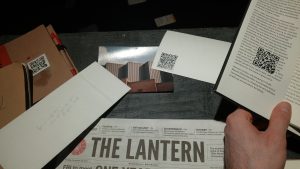
You can read in depth about where I started with this project in this post, but in as concise a way as I can manage with this project, I was working to tell a non-linear narrative about a platonic, long-distance relationship between a mother and son. Using journal entries, film photographs, newspapers, daily planners, notes to self, and random memorabilia from myself and my mother, I scattered QR codes throughout an installation of two desks with a trail of printed text messages between them. In order to enhance the interactivity of my project, the QR codes led to voicemails and text messages between a mother and a son, digital photos showing silhouetted figures and miscellaneous homes, and footage from anti-Trump protests. I worked to emphasize feelings of distance, loneliness, belonging, and relationship that I have experienced and continue to experience during my time in Columbus.
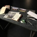
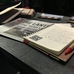
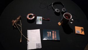
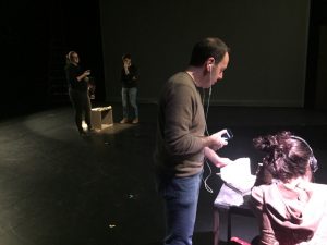
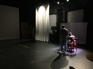
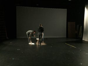
This final project — here4u — really took it out of me. Working from such a personal place was in some ways freeing, but constantly stressful. I spent a lot of time with this project worrying about whether people would connect with the work, whether they would believe the authenticity of it, and whether I was oversharing to the point of discomfort (for both the audience and for myself). The worry was balanced equally with excitement/anticipation of how it would all be received. To amplify some rawness that I was only beginning to develop after the first showing, I generated much more digital material and matched that with an increase in tangible items in the space. From laying out journals and planners that I carry with me every day, some even including notes and plans for the work, screenshotting and printing out text conversations between my mom and I to create a trail between the two desks, and even brewing the tea that reminds me of home was my way of leaning into opening myself up for the audience. Besides the lights that Oded designed for me, I wanted to strip this installation of all extraneous theatricality in order to get at the personal nature of the work.
The “son” space
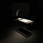
After some recommendations from Alex after the first cycle presentation, I began to think more choreographically about this project, shifting my mindset around it from the creation of a static installation into the curation of a museum of moments to be experienced. Between the first cycle and the final showing, I invested much more time and effort into crafting the viewer’s journey through the space. Oded’s lighting certainly helped this, and with it I thought critically about which QR codes should be placed where in order to enhance a tangible object, a written note, etc. This felt like mental prototyping and it helped me to conceptualize what I wanted for my final product.
I’m thankful for this final project (and this course) for giving me an outlet to investigate the concepts I’m researching in my dance-making through other disciplines. Taking themes I work with in the dance studio and translating them into photography, audio/visual art, and digital media design has given me a new perspective on the topics I am diving into for my senior project and beyond. DEMS was a real treat, and I’m glad to have been a part of it.
Pressure Project 3: Trailblazing
Posted: December 4, 2017 Filed under: Calder White, Paper & Pen, Pen and Pencil Games, Pressure Project 3, Uncategorized Leave a comment »For our third Pressure Project, our prompt was to take a pen & paper game and combine it with another game to make a delightfully replayable hybrid that had no more than 5 rules and did not require the creator’s verbal or gestural intervention. I love to play card games, and especially drinking games involved with cards, and so I decided to figure out a way in which I could revamp one of my favourite drinking card games — Ride the Bus — to suit this assignment.
For those who don’t know, Ride the Bus is a drinking game played with two people. The dealer lays out five cards and flips the first one. The second player then goes through a sequence of questions guessing the nature of the proceeding cards in this order:
- Is the second card higher or lower than the first card?
- Is the third card inside of (between) or outside of the first two cards?
- Is the fourth card red or black?
- What is the suit of the last card?
The catch is this: if at any point the second guesser makes an incorrect guess, they have to take a drink, a new set of five cards is dealt, and the game restarts. The player only wins once they “ride the bus” to the end.
Taking some inspiration from tic-tac-toe and Connect 4, I was curious about how Ride the Bus could function if placed in a grid. I decided that the cards would be set up in a 5×5 grid and this would become a game about which player — the dealer or the guesser — could collect the most cards by the end. Instead of having to drink for guessing a card incorrectly, an incorrect guess simply signaled the end of a player’s turn and therefore a stunted chance at collecting more cards.
The instruction sheet of my hybrid game can be found here: ACCADTrailblazing
In the end, this game reminded me a lot of afternoon’s spent at my Baba’s house playing War for hours. Although perhaps not the most stimulating for adults, Trailblazing could easily be an entertaining children’s or family game, and definitely gets more fun the more you play it!
Cycle 1 Presentation – here4u
Posted: November 28, 2017 Filed under: Calder White, Final Project, Uncategorized Leave a comment »For my final project in DEMS, titled here4u, I’m working to tell a non-linear narrative about a long distance platonic relationship between a mother and a son. The story is told mainly through text messages, voicemails, and journal entries and photographs (both physical and digital), unlocked via QR codes scattered throughout the installation. My inspiration comes from an extremely personal place as I have been in this very situation for the past four years of my undergraduate career, and my drive for this project stems from an artistic desire for transparency between creator/performer and the audience. Through this project, I am opening myself up to the audience — using actual voicemails and texts between my mother and I and actual entries from my journal — to tell a story about distance, loneliness, belonging, misinformation, struggle, and coming of age. I am doing all of this in the hopes that my “baring it all” can open a dialogue about connection and relation between myself and the people experiencing this installation, as well as between the visitors to the space.
In the first cycle presentation, I organized two desk spaces diagonal to each other in the Motion Lab, one being the “mother” space and the other being the “son” space. The mother space has various artifacts that would be found on my mom’s desk at home: note pads with hand-written reminders, prayer cards and rosaries from my Baba, and a film photograph from the cottage that my mom and I used to live in. Spread within the artifacts are QR codes that include worried voicemails from my mom about suspicious activity on campus, texts from her to me asking where I’ve been, and links to screen recordings of our longer text conversations.
Across the room stands the son space, a much less organized desk with worn and filled daily planners, books dealing with citizenship theory, journals open to personal entries, and crumpled to-do lists. The QR codes here lead to first-person videos of protests, an online gallery of silhouetted selfies, and voicemails apologizing for taking so long to respond to my mom.
In the creation of this project, I am dredging up a wealth of emotions from my time in Columbus and pinning it to a presentation that I hope won’t feel like a performance. That being said, I realize that in it’s presentational nature, there are certain theatrical elements that need to be considered and addressed. With the first cycle showing, I learned very quickly how individual an experience this is. In order to get the most out of the QR codes — particularly the voicemails — the audience members must wear headphones, which immediately isolates them into their own world and deters connection with other audience members during their experience. In my attempt for creating a feeling of loneliness, I would say this was a success.
I received a wealth of feedback on which aspects of both spaces worked and which didn’t, and agreement on the most powerful aspects of the story-telling being the voicemails and texts was unanimous due to the emotion heard in the voice. At the suggestion of Ashlee Daniels Taylor, I will be working to generally increase the amount of material in the space so that there is more to look through and find in the QR codes. This works towards another one of my goals with the narrative, which is to engender the sense of a story without the need for the audience member to find every single piece of the puzzle, amplifying individual experience within the installation.
For my second cycle, I have been working towards the generation of more material to be found and directing the experience moreso than in my first presentation. Without any sort of guidance using vocal, lighting, or other cues, the first presentation invited viewers to find their own way through the installation which, although was fun for me to watch and hear how different people pieced together the experience for themselves, led to awkward successive QR codes (being too similar or repetitive), a desire for more direction, and an undefined ending to the experience. I will be working with some theatrical lighting to guide the viewers in a more predetermined path through the space.
The emotional feedback that I received after the first presentation has inspired me to push forward with this project’s main intentions and to develop this experience has honestly and authentically as possible. The tears and personal relations shared in our post-presentation discussion proved to me the value in making oneself vulnerable to their audience and I intend to lean into this for the second cycle presentation.
Audio Urban Legend
Posted: October 9, 2017 Filed under: Calder White, Pressure Project 2 Leave a comment »Our second Pressure Project challenged us to tell a narrative using audio as the star of the show. This narrative could be in any form, and at the recommendation of telling an urban legend, I was inspired to make a sound score of a classic urban legend that I used to hear at ~literally~ every bonfire of my childhood.
The urban legend takes many forms, but it generally involves a couple driving out to a make-out point only to be interrupted by a serial killer with a hook hand. With this narrative in mind, I started to rummage through FreeSounds.org for the meat of my story, and once I had found them I layered the audio using GarageBand. By using a grab-bag of sounds from different user sources on the website, I felt as though I was embracing the piecemeal nature of urban legends to shift over time and space — how the same urban legend can have slightly different details depending on who tells it.
Working with the one-minute time constraint was the mos
t difficult part of this project, particularly because this specific urban legend sources it’s fear from the loneliness and uncanny duration of the girl’s wait in the car after her boo has excused himself for a pee break. The story thrives off of the building of tension, and this is hard to do in such a short amount of time. In an attempt to remedy this constraint, I experimented with volume and panning of the tracks as well as cross-fading to elude to the idea of time passing. With more than five hours, I think I could have done a better job of this.
Similarly, I think that I could have clarified the latter half of the score better as it left many people confused and left the story unresolved for some. I was referencing this version of the urban legend (told at the 47 second mark):
…but some versions of the story that others in the class had heard either didn’t end this way or ended slightly differently. The pros and cons of the fluidity of these urban legends…
Feel free to check out the audio narrative by clicking here and please comment with any suggestions you might have for me to improve upon this project!
~fortune cookie cootie catcher~
Posted: September 17, 2017 Filed under: Calder White Leave a comment »During the announcement of our first pressure project as a fortune telling game, I immediately started brainstorming fortune-telling games from the schoolyard. My first inspirations were cootie catchers, the game M.A.S.H, and the lucky 8 ball. In my mind, and especially with the score of keeping the game non-random, I decided that a virtual cootie catcher would be the most doable of my options.
After a conversation about ease of access to a digital game – particularly in relation to language – I really wanted to create a non-language-based experience, and I imagined an experience with numerous Isadora buttons with only question marks and different shapes and sizes. Unfortunately, with the time constraint, this idea fell to the wayside and my game became heavily reliant on text and the English language in general.
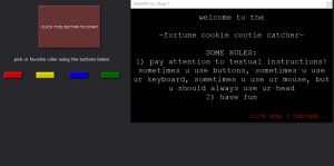
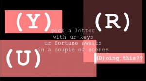
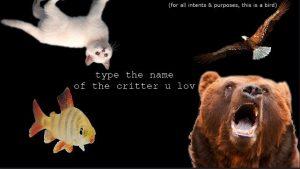
I started to develop my game linearly, creating my Welcome screen first with the idea of the unfolding of a cootie catcher. To achieve this effect, I attached a Wave Generator to the facets of a Shape actor, making it unfold and refold repeatedly. The first decision-making screen I made was a selection of the user’s favourite colour using buttons in Isadora, each specific colour leading to a new decision-making screen: one to choose a number, one to choose a letter, one to choose a shape, and one to choose an animal. It was at this point that I realized that only using buttons in Isadora to control exchange between scenes would a) take the user off of the main stage screen – not something I wanted to happen – and b) reveal all of the future options/questions/choices before the user gets to a designated scene.
In an effort to find a solution to this problem, I decided that the actions needed to progress through the cootie catcher would be different for each scene: sometimes the user would need to hit a key on the keyboard, sometimes the user would use buttons in Isadora, and sometimes the user would need to click an area of the stage. I knew how to accomplish a key-prompted jump between scenes using the Keyboard Watcher actor, and Alex O helped me set up a patch to create clickable text and therefore a mouse-click-prompted scene jump. This clickable text can be seen all throughout my project in the form of “CONTINUE” and “TRY AGAIN” buttons on-stage.
After numerous proto-typing experiments in the green room of the Dance Department, I very quickly learned that instructions, particularly relating to selection during the cootie catcher, were necessary. Because I chose to alternate the method of selection between clicking with the mouse, using Isadora buttons, using the keyboard, and typing full words (using multiple Keyboard Watcher actors linked to a Simultaneity actor), it became immediately obvious that more direction was needed for a first time user to progress through the patch. This inspired me to add an “Instructions” screen at the beginning that prompted the user to pay close attention to cues in the text of each scene.
I started making the poems in each scene more descriptive of what action was required to progress. The cootie catcher worked in a color>letter or number>animal or shape experience, always with four choices and always with a logic that confused and either looped back to a preliminary stage or gave a fortune with the option to try for another…
It wasn’t until I created my Letters scene that I really began to loosen up with the project and bring humour into the fortune-telling experience. The overall aesthetic became internet-speak meets computer flash game, and I employed Courier New font as well as flashing CONTINUE/TRY AGAIN buttons to make it seem really cheesy yet recognizably digital.
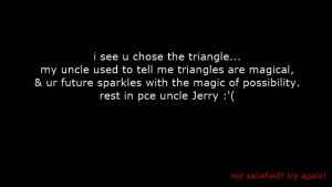
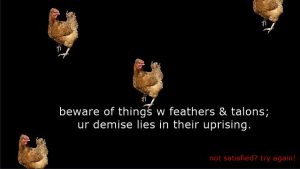
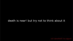
I initially wanted a huge range of fortunes, but due to time restrictions I settled on eight. The logic of arriving at each fortune was different. Generally, my goal throughout the patch was to create a logic that confused the user and looped them back to scenes in order to encourage them to try out different combinations of answers and arrive at new fortunes. Here’s a small sampling of some of the fortunes:
My final touch was adding some simple movement to the patch. I did this by attaching Wave Generator actors to the x and/or y axes of Text Draw and Picture Player actors and to the rotation of Shapes actors in the Shapes scene. I think this was especially effective in the Animals scene where it looks like the fish is swimming and the bird is soaring.
Overall, the class received the ~fortune cookie cootie catcher~ waaaay better than I had expected. They actually laughed at my fortunes! Ashlee complimented me on the choice in and continuity of a specific aesthetic throughout the patch and classmates seemed to enjoy getting caught in loops and figuring out how to progress through the fortune teller to an ending. People also seemed to appreciate the clarity in flashing text as a link. Bita reminded me of the amount that this patch depended upon a solid understanding of English language and rhetoric, and I would be very interested in trying to create an iteration of this patch that was more accessible to non-English speakers.
Enough of me explaining it, though. Try it out for yourself using the download link below!
https://osu.box.com/v/calderwhitePP1
![20171205_161939[1]](http://recluse.accad.ohio-state.edu/ems/wp-content/uploads/2017/12/20171205_1619391-e1512876401400-300x169.jpg)
![20171205_162905[1]](http://recluse.accad.ohio-state.edu/ems/wp-content/uploads/2017/12/20171205_1629051-300x169.jpg)
![20171205_170446[1]](http://recluse.accad.ohio-state.edu/ems/wp-content/uploads/2017/12/20171205_1704461-1-169x300.jpg)
![20171205_170102_HDR[2]](http://recluse.accad.ohio-state.edu/ems/wp-content/uploads/2017/12/20171205_170102_HDR2-169x300.jpg)
