Pressure Project 1-Fortune Teller
Posted: September 26, 2017 Filed under: Kelsey Gallagher, Pressure Project I Leave a comment »My original idea for this pressure project was a flash game type experience where you had to answer questions to get an outcome. In the quick nature of the project I couldn’t quite figure out how to make each of the questions matter so i made the first two questions red herrings.
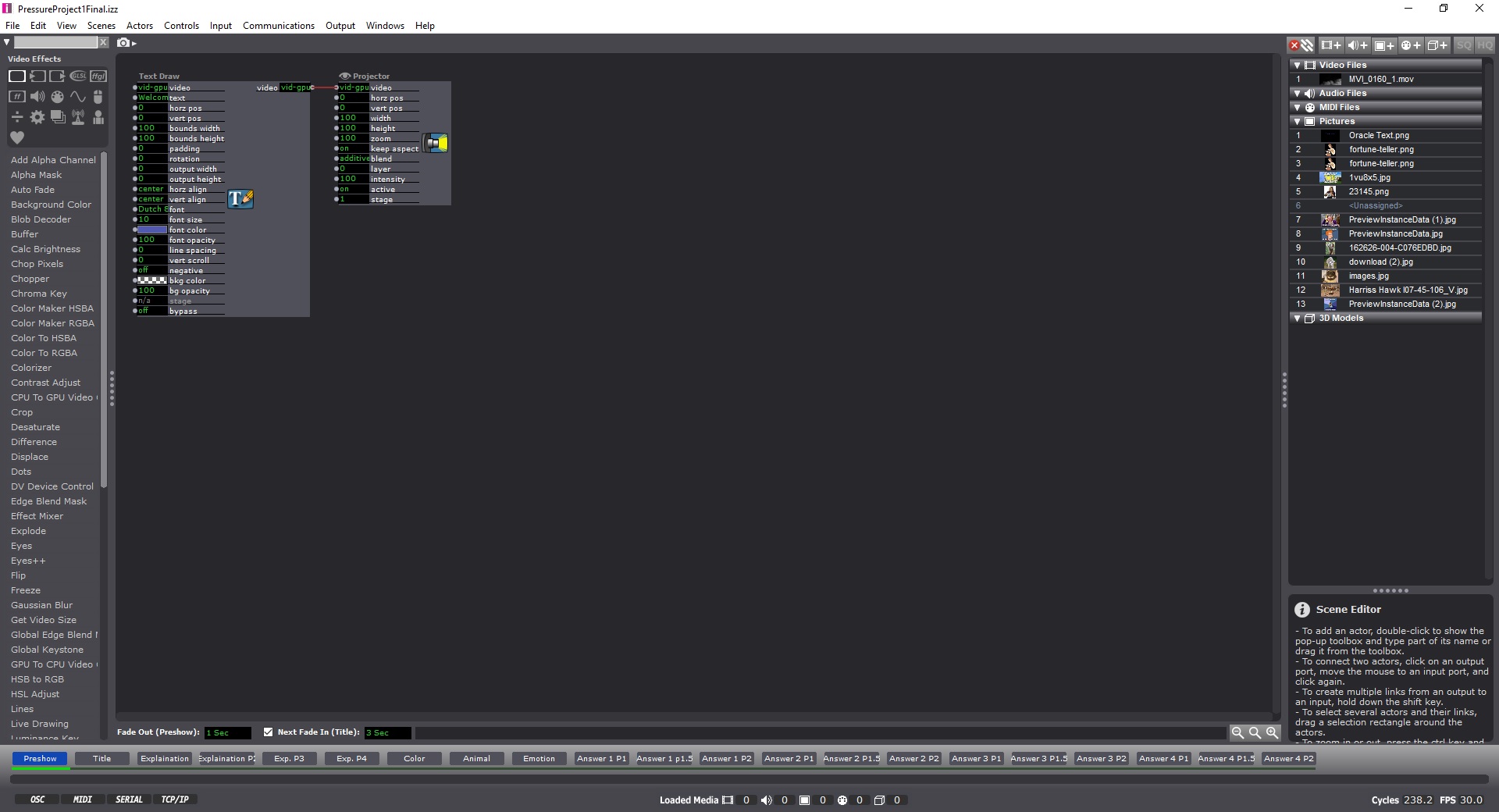
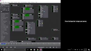
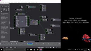
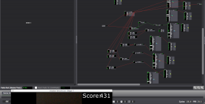
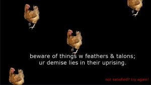
This first image is from my pre-show screen. Instructing the audience to use the space bar.
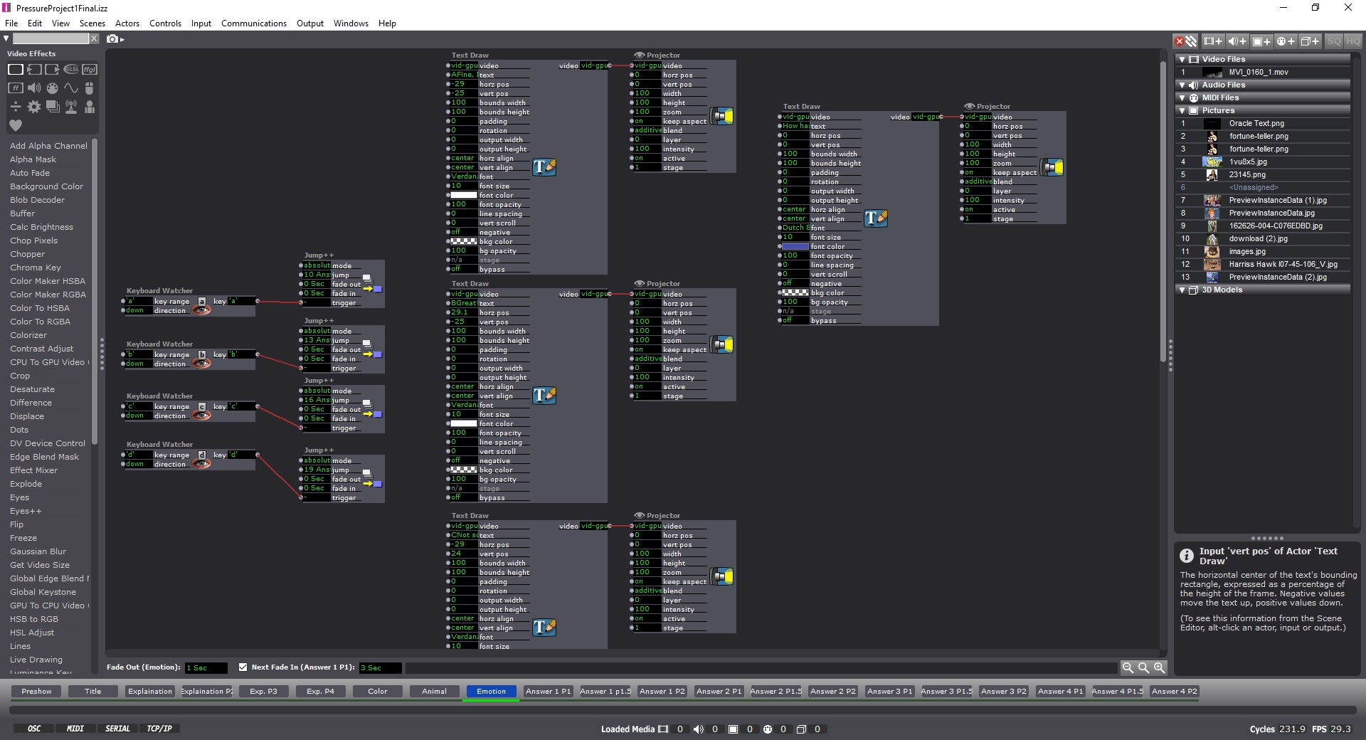
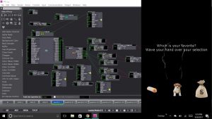
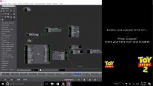
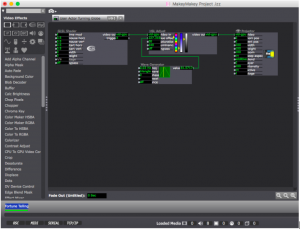
This image is of one of my question pages, that included keyboard watchers, so you could answer with typing corresponding letters and Text Draw actors, shapes actors or picture payers, depending on which question you were on.
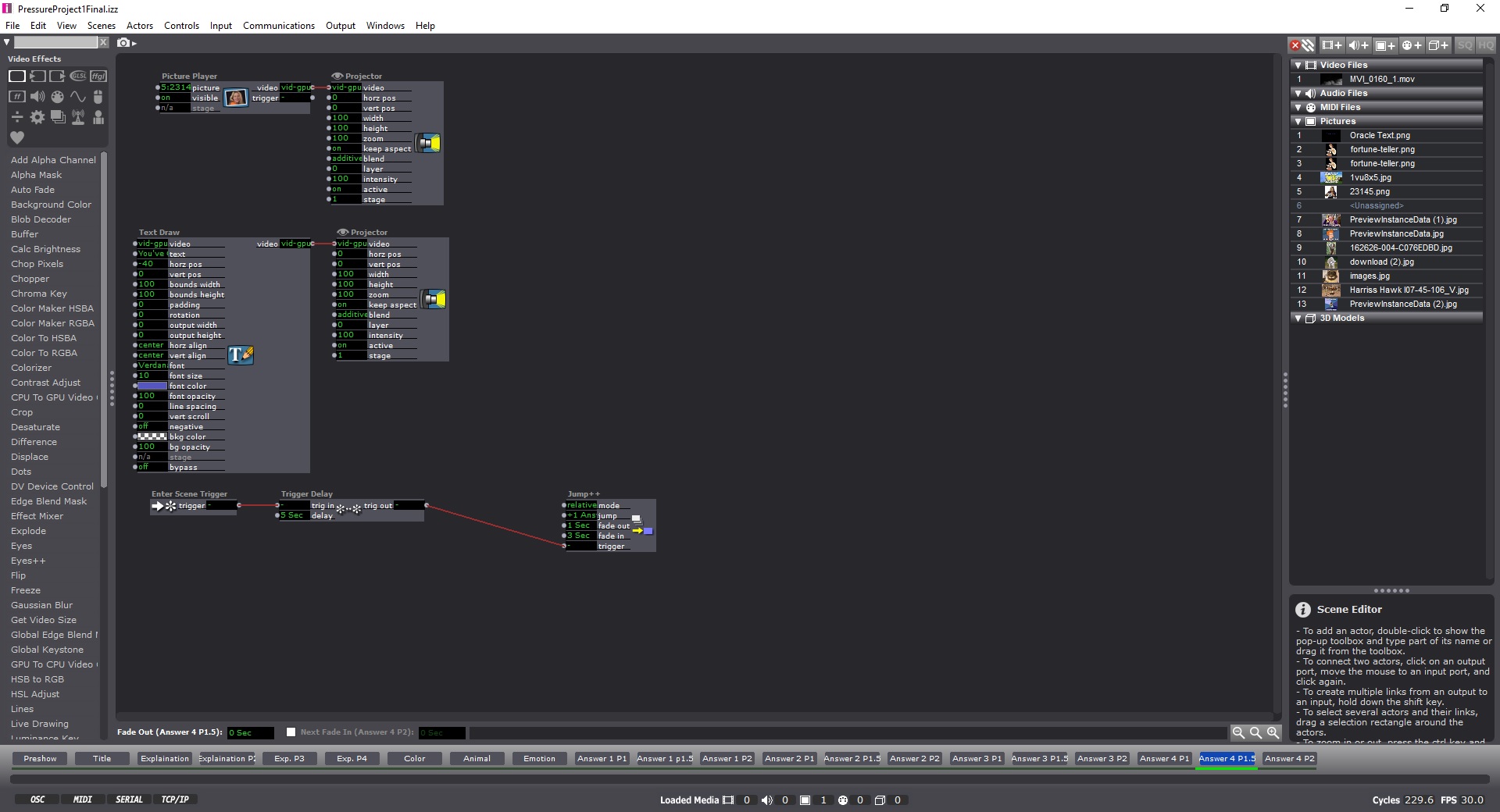
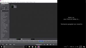
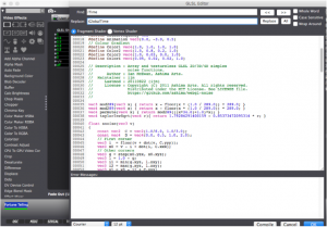
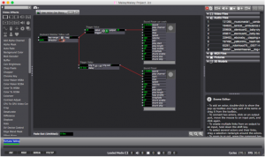
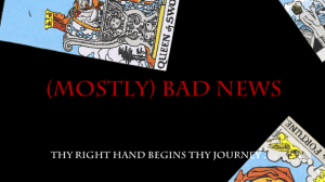
This Image is from the filler image just before the end, where you get your fortune.
Most of my process was pretty linear and fluid. I was unsure of how to structure the program, so I did it the way I was most comfortable, which was like cueing a lighting board. Each change is within a new scene. I learned from the VR class last year that clear instructions are paramount, so I worked hard to make sure it was easy to figure out what you needed to do.
Reflections-
I definitely needed to add sound to the experience, it was very stark without the sound. Otherwise, other improvements could have been made by stretching the amount of possible answers, making more questions and linking them together, or possibly finding ways to make infinite loops. I also should have accentuated the troll face in the crystal ball at the end a bit more.
I was happy to use my personality in this project.
Pressure Project 1: Fortune Teller
Posted: September 22, 2017 Filed under: Zach Stewart Leave a comment »My fortune telling system put visitors through a silly yet engaging interface to reveal to them some their deepest, darkest, most personal fortunes…. or, more than likely, just an odd, trolling remark. From the beginning of the project I wanted to keep the experience fun and not too serious. I wanted to keep some aspects of the stereotypical fortune telling experience but critique the traditional experience in that the questions I ask and the final response have essentially nothing to do with each other. It was also important for me to remove the user from the traditional inputs of the computer (i.e. the keyboard and the mouse) to create a more interactive experience.
My system started by prompting the user to begin their journey by pressing the space bar (the only time they used the keyboard during the experience) which took them through several scenes that set the up for what was about to happen. The purpose of these scenes wasn’t to take in user input but set the mood for the experience. The slides were simply just text that had a wave generator applied to its rotation input to give the text a more psychedelic, entrancing feeling that falls in with the theme of the fortune telling experience. The idea here being to create some predetermined conversation that would carry throughout the entire project.
Once through the initial scenes, the user was introduced to the first scene with a question which had 3 possible responses. On the scene, the top part of the screen was devoted to the text. On the lower portion were 3 icon representing responses to the question. In the background of the scene is the projection of the user. The projection is using the video input from my computer’s web cam and then running it through the difference actor to calculate the movement of the user. The output of the difference actor was also plugged into an eyes++ actor which tracked the movement of the user through the blob decoder actor. To respond to the question the user was prompted to wave their hand over the icon that matched with their answer. The scene would then jump to the next scene that corresponded with the answer. This happened due to the inside range actor that were placed over each icon that watched for the blob’s movement over the actors. The scene would change once the x and y coordinates of the blob were inside the range prescribed by the inside range actors.
This set up for the scene continued throughout the remainder of the project. Each set of questions that followed tried to keep up with the user’s inputs with text presented at the top of each scene. The text continued the conversation that was started at the beginning of the presentation. After the first question, depending on the user’s choice, they could have been brought to any one of three scenes with a question featuring two possible answers. From there, the user was then directed to a third question with another two potential answers. The third question for all possible question paths was the same, but it appeared on six separate scenes as to still be considerate of the user’s previous inputs and the user’s answer to the question. From the last question the user was then fed into a scene containing 1 of 6 possible fortunes. And that was it!
During the presentation of the system, I ran into some tricky bumps in the road. The big one being that the system would skip scenes when users would wave their hands too long over an icon. Additionally, and confusingly, it would in some cases not respond after several seconds of violent waving by a user. When the system’s tolerance was calibrated it was calibrated in a lot of natural light which could have given rise to discrepancies when the system was then turned on in the computer lab which is only lit by artificial light. The system could be fixed using several alternative methods. The first being a trigger delay for when moving from scene to scene. This would prevent that eyes++ actor from prematurely recognizing inputs from the user. The second being a stricter calibration of the eyes++ actor. In the actors inputs you can control size of the recognized blob being tracked and the smoothness of its movement. Both of these inputs would have given greater tolerance to user’s movement. The last solution may have been to consider a different form of input that used a more sensitive camera or Leap Motion.
Additional improvements could be made around how the system interacts with user and the type of outputs the system produces. After watching some of the other presentations it was very clear that my system could have benefited from the introduction of sound. The element of sound created another level of thematic experience that could have played up the concept of my goofy fortune telling experience. The second being the idea of the system looping back to the beginning. After every user finished their interaction the system had to manually prompted back to the being scene. A jump actor could have easily fixed this.
I feel like I could say more, but I should probably stop rambling, so here is my project, check it out and enjoy!
https://osu.box.com/s/dd6sopphqnxa5uu8cgjboa0xzsam2u0r
Pressure Project 2 – 2017
Posted: September 22, 2017 Filed under: Uncategorized Leave a comment »PP2 – Media and Narrative:
This Pressure Project was originally offered to me by my Professor, Aisling Kelliher:
Topic – narrative sound and music
Select a story of strong cultural significance. For example this can mean an epic story (e.g. The Odyssey), a fairytale (e.g. Red Riding Hood), an urban legend (e.g. The Kidney Heist) or a story that has particular cultural meaning to you (e.g. WWII for me, Cuchulainn for Kelliher).
Tell us that story using music and audio as the the primary media. You can use just audio or combine with images/movies if you like. You can use audio from your own personal collections, from online resources or created by you (the same with any accompanying visuals). You should aim to tell your story in under a minute.
You have 5 hours to work on this project.
Palm Stillness Reader/Fortune Teller
Posted: September 18, 2017 Filed under: Adam O'Reilly, Pressure Project I Leave a comment »Pressure Project #1
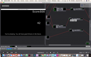
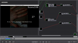
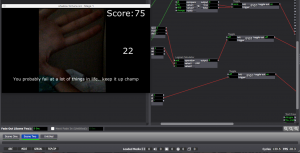
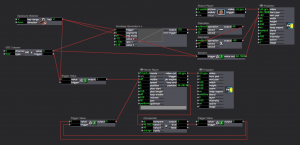
As I brainstormed for the the first pressure project (during the first few minutes of my 6 hour period), I knew I wanted to use Eyes++ and it’s computer vision as my user input. I thought that this would give me an element of randomness as the input was being fed in “real time” throughout the sequence. In contrast, my non-random response was the set of fortunes that were displayed as the user’s score declined in each interval. I used a pair of comparators to tie in the fortunes saying “You’re amazing. You will have good fortune in the future” for a score above 400, “So so, you’ve got a rocky road ahead of you.” for a score in between 400 and 150, and “You probably fail at a lot of things in life.. keep it up champ” for a score lower than 150. Yea, I know, harsh words for those who couldn’t sit 100% still for 60 seconds.
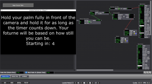
During this same brainstorming phase I envisioned a process that would prompt the user to stand in front of the camera with their arms stretched horizontally outwards and hold that position for as long as possible (within the bounds of an outline . I added a Difference actor my Eyes++ output so I could detect motion easily with the live webcam input. Unfortunately I couldn’t configure the difference/blob settings to pick up my ar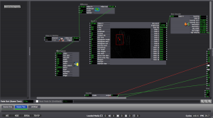 ms consistently, so I pivoted my idea and decided to just focus on picking up the velocity of one blob (aka my hand) and sensing the moments that it is moving.
I wanted this experience to have game mechanics so I decided to start the score at 500 and decrease the score rapidly whenever the Eyes++ detected a movement. It was pointed out that it would have been easier if the score regenerated. I initially intended for this but the idea was lost with my pivot and lack of time.
Feedback:
Going into the presentation I thought that my project structure felt too “basic” in comparison to the others who had gone before me. The experience was difficult for a majority of the people who tried it, which led to not as many people attempting (although the feedback was that everyone understood what would happen based on their movements and they didn’t feel the urge to try it out). An improvement would be a change to the rate of score decay and regeneration of score. This would ultimately maintain the feeling of being locked into a particular area and continue to fulfill my goal of working with the users nervous system and score based engagement. I also think suspenseful music in the background would have added entertainment value and obviously suspense.
Additional Shots:
Navy plans to use X-Box 360 Controllers to control (parts of) their submarines
Posted: September 18, 2017 Filed under: Uncategorized Leave a comment »http://gizmodo.com/why-the-navy-plans-to-use-12-year-old-xbox-360-controll-1818511278
MakeyMakey Fortune Telling Pressure Project
Posted: September 17, 2017 Filed under: Bita Bell Leave a comment »I knew from the beginning that I want this project to incorporate tactile objects. I felt that keeping everything inside a computer screen does not necesarily incorporate other senses (touch, and space). I wanted to create a personal and intimate experience. So knowing that I needed objects helped me know immediately that I could use the makeymakey.
Unfortunately, since my macbook was stolen two months before, I had a hard time finding a computer to work with. ACCAD’s computers also had an issue with saving Isadora files. So the computer drama took some of my time and creative energy. However, I came up with a new idea!
I thought why not create a mysterious experience that does not include much verbal instructions. A small, quiet, fortune telling secretive room, with no one in there but the person curious to know more about their future!
I made a tiny space (similar to a fort) where the user had to crawl in under a table covered with blankets.
Took me a while to know how to get started with makeymakey. on PC the keyboard watcher identified A W D S as the arrow keys but on Mac it was just ‘ ‘ – the space representing whichever arrow key was entered. It was important to label my actors by arrow direction or makeymakey colored cables.
The way it worked was, a key was clipped on the cable going to earth. The other four cables on the arrow keys were attached to paper clips, representing locks (wish I had real locks!). When the key would contact a paperclip and audio would go off. Every arrow key corresponded to a fortune telling, but the story was told in audio only. For example, a car engine starting and then crashing, or people clapping someone’s success/fame and then heart rate beep going off. They were ambient, and vague. One could imagine the scenes that the audio provided and make up their own story to it.
Shadertoy BETA https://www.shadertoy.com/view/MtXSzS
GLSL Actor –> iTime to iGlobal Time then Compile
–> HSL Adjust Actor → Wave Generator: Cooler colors and changing
In User Actor
Audio samples – Source:
Car Crash https://freesound.org/people/musicmasta1/sounds/131385/
Ambulance https://freesound.org/people/LanDub/sounds/184623/
Baby Laugh https://freesound.org/people/Stevious42/sounds/259611/
Baby Cry
Clapping https://freesound.org/people/ebcrosby/sounds/339483/
Heartrate https://freesound.org/people/palkonimo/sounds/197492/
Happy Dog https://freesound.org/people/Robinhood76/sounds/63261/
Sad Dog https://freesound.org/people/lewisinheaven/sounds/389581/
~fortune cookie cootie catcher~
Posted: September 17, 2017 Filed under: Calder White Leave a comment »During the announcement of our first pressure project as a fortune telling game, I immediately started brainstorming fortune-telling games from the schoolyard. My first inspirations were cootie catchers, the game M.A.S.H, and the lucky 8 ball. In my mind, and especially with the score of keeping the game non-random, I decided that a virtual cootie catcher would be the most doable of my options.
After a conversation about ease of access to a digital game – particularly in relation to language – I really wanted to create a non-language-based experience, and I imagined an experience with numerous Isadora buttons with only question marks and different shapes and sizes. Unfortunately, with the time constraint, this idea fell to the wayside and my game became heavily reliant on text and the English language in general.
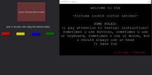
I started to develop my game linearly, creating my Welcome screen first with the idea of the unfolding of a cootie catcher. To achieve this effect, I attached a Wave Generator to the facets of a Shape actor, making it unfold and refold repeatedly. The first decision-making screen I made was a selection of the user’s favourite colour using buttons in Isadora, each specific colour leading to a new decision-making screen: one to choose a number, one to choose a letter, one to choose a shape, and one to choose an animal. It was at this point that I realized that only using buttons in Isadora to control exchange between scenes would a) take the user off of the main stage screen – not something I wanted to happen – and b) reveal all of the future options/questions/choices before the user gets to a designated scene.
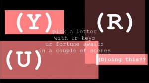
In an effort to find a solution to this problem, I decided that the actions needed to progress through the cootie catcher would be different for each scene: sometimes the user would need to hit a key on the keyboard, sometimes the user would use buttons in Isadora, and sometimes the user would need to click an area of the stage. I knew how to accomplish a key-prompted jump between scenes using the Keyboard Watcher actor, and Alex O helped me set up a patch to create clickable text and therefore a mouse-click-prompted scene jump. This clickable text can be seen all throughout my project in the form of “CONTINUE” and “TRY AGAIN” buttons on-stage.
After numerous proto-typing experiments in the green room of the Dance Department, I very quickly learned that instructions, particularly relating to selection during the cootie catcher, were necessary. Because I chose to alternate the method of selection between clicking with the mouse, using Isadora buttons, using the keyboard, and typing full words (using multiple Keyboard Watcher actors linked to a Simultaneity actor), it became immediately obvious that more direction was needed for a first time user to progress through the patch. This inspired me to add an “Instructions” screen at the beginning that prompted the user to pay close attention to cues in the text of each scene.
I started making the poems in each scene more descriptive of what action was required to progress. The cootie catcher worked in a color>letter or number>animal or shape experience, always with four choices and always with a logic that confused and either looped back to a preliminary stage or gave a fortune with the option to try for another…
It wasn’t until I created my Letters scene that I really began to loosen up with the project and bring humour into the fortune-telling experience. The overall aesthetic became internet-speak meets computer flash game, and I employed Courier New font as well as flashing CONTINUE/TRY AGAIN buttons to make it seem really cheesy yet recognizably digital.
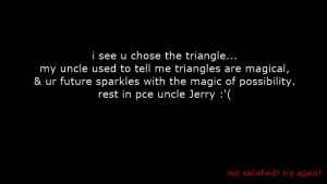
I initially wanted a huge range of fortunes, but due to time restrictions I settled on eight. The logic of arriving at each fortune was different. Generally, my goal throughout the patch was to create a logic that confused the user and looped them back to scenes in order to encourage them to try out different combinations of answers and arrive at new fortunes. Here’s a small sampling of some of the fortunes:
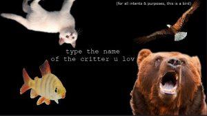
My final touch was adding some simple movement to the patch. I did this by attaching Wave Generator actors to the x and/or y axes of Text Draw and Picture Player actors and to the rotation of Shapes actors in the Shapes scene. I think this was especially effective in the Animals scene where it looks like the fish is swimming and the bird is soaring.
Overall, the class received the ~fortune cookie cootie catcher~ waaaay better than I had expected. They actually laughed at my fortunes! Ashlee complimented me on the choice in and continuity of a specific aesthetic throughout the patch and classmates seemed to enjoy getting caught in loops and figuring out how to progress through the fortune teller to an ending. People also seemed to appreciate the clarity in flashing text as a link. Bita reminded me of the amount that this patch depended upon a solid understanding of English language and rhetoric, and I would be very interested in trying to create an iteration of this patch that was more accessible to non-English speakers.
Enough of me explaining it, though. Try it out for yourself using the download link below!
https://osu.box.com/v/calderwhitePP1
Pressure Project #1: (Mostly) Bad News
Posted: September 16, 2017 Filed under: Pressure Project I, Uncategorized Leave a comment »Pressure Project #1
My concept for this first Pressure Project emerged from research I am currently engaged in concerning structures of representation. The tarot is an on-the-nose example of just such a structure, with its Derridean ordering of signs and signifiers.
I began by sketching out a few goals:
The experience must evoke a sense of mystery punctuated by a sense of relief through humor or the macabre.
The experience must be narrative in that the user can move through without external instructions.
The experience must provide an embodied experience consistent with a tarot reading.
I began by creating a scene that suggests the beginning of a tarot reading. I found images of tarot cards and built a “Card Spinner” user actor that I could call. Using wave generators, the rotating cards moved along the x and y axes, and the z axis was simulated by zooming the cards in and out.
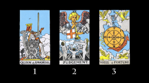
Next I built the second scene that suggest the laying of specific cards on the table. Originally I planned that the cards displayed would be random, but due to the time required to create an individual scene for each card I opted to simply display the three same cards.
Finally, I worked to construct a scene for each card that signified the physical (well, virtual) card that the user chose. Here I deliberately moved away from the actual process of tarot in order to evoke a felt sensation in the user.
I wrote a short, rhyming fortune for each card:
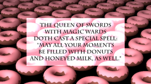
The Queen of Swords Card – Happiness/Laughter
The Queen of Swords
with magic wards
doth cast a special spell:
“May all your moments
be filled with donuts
and honeyed milk, as well.”
The scene for The Queen of Swords card obviously needed to incorporate donuts, so I found a GLSL shader of animated donuts. It ran very slowly, and after looking at the code I determined that the way the sprinkles were animated was extremely inefficient, so I removed that function. Pharrell’s upbeat “Happy” worked perfectly as the soundtrack, and I carefully timed the fade in of the fortune using trigger delays.
Judgment Card – Shame
I judge you shamed
now bear the blame
for deeds so foul and rotten!
Whence comes the bell
you’ll rot in hell
forlorn and fast forgotten!
The Judgement card scene is fairly straightforward, consisting of a background video of fire, an audio track of bells tolling over ominous music, and a timed fade in of the fortune.
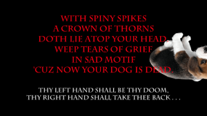
Wheel of Fortune – Macabre
With spiny spikes
a crown of thorns
doth lie atop your head.
Weep tears of grief
in sad motif
‘cuz now your dog is dead.
The Wheel of Fortune card scene was more complicated. At first I wanted upside-down puppies to randomly drop down from the top of the screen, collecting on the bottom and eventually filling the entire screen. I could not figure out how to do this without having a large number of Picture Player actors sitting out of site above the stage, which seemed inelegant, so I opted instead to simply have puppies drop down from the stop of the stage and off the bottom randomly. Is there a way to instantiate actors programmatically? It seems like there should be a way to do this.
Now that I had the basics of each scene working, I turned to the logics of the user interaction. I did this in two phases:
In phase one I used keyboard watchers to move from one scene to the next or go back to the beginning. The numbers 1, 2, and 3, were hooked up on the selector scene to choose a card. Using the keyboard as the main interface was a simple way to fine-tune the transitions between scenes, and to ensure that the overall logic of the game made sense.
The biggest challenge I ran into during this phase was in the Wheel of Fortune scene. I created a Puppy Dropper user actor that was activated by pressing the “d” key. When activated, a puppy would drop from the top of the screen at a random horizontal point. However, I ran into a few problems:
- I had to use a couple of calculators between the envelope generator and the projector in order to get the vertical position scaling correct such that the puppy would fall from the top to the bottom
- Because the sound the puppy made when falling was a movie, I had to use a comparator to reset the movie after each puppy drop. My solution for this is convoluted, and I now see that using the “loop end” trigger on the movie player would have been more efficient.
Phase two replaced the keyboard controls with the Leap controller. Using the Leap controller provides a more embodied experience—waving your hands in a mystical way versus pressing a button.
Setting up the Leap was simple. For whatever reason I could not get ManosOSC to talk with Isadora. I didn’t want to waste too much time, so I switched to Geco and was up and running in just a few minutes.
I then went through each scene and replaced the keyboard watchers with OSC listeners. I ran into several challenges here:
- The somewhat scattershot triggering of the OSC listeners sometimes confused Isadora. To solve this I inserted a few trigger delays, which slowed Isadora’s response time down enough so that errant triggers didn’t interfere with the system. I think that with more precise calibration of the LEAP and more closely defined listeners in Isadora I could eliminate this issue.
- Geco does not allow for recognition of individual fingers (the reason I wanted to use ManosOSC). Therefore, I had to leave the selector scene set up with keyboard watchers.
The last step in the process was to add user instructions in each scene so that it was clear how to progress through the experience. For example, “Thy right hand begins thy journey . . .”
My main takeaway from this project is that building individual scenes first and then connecting them after saves a lot of time. Had I tried to build the interactivity between scenes up front, I would have had to do a lot of reworking as the scenes themselves evolved. In a sense, the individual scenes in this project are resources in and of themselves, ready to be employed experientially however I want. I could easily go back and redo only the parameters of interactions between scenes and create an entirely new experience. Additionally, there is a lot of room in this experience for additional cues in order to help users move through the scenes, and for an aspect of randomness such that each user has a more individual experience.
Click to download the Isadora patch, Geco configuration, and supporting resource files:
http://bit.ly/2xHZHTO
The War on Buttons
Posted: September 11, 2017 Filed under: Uncategorized Leave a comment »https://www.theringer.com/tech/2017/9/11/16286158/apple-iphone-home-button
UPDATED READINGS – Sept. 2017
Posted: September 7, 2017 Filed under: Uncategorized Leave a comment »An updated list of readings:
10.1.1.60.1037 Understanding Knowledge Models: Modeling Assessment of Concept Importance in concept Maps
10.1.1.137.2955 The Theory Underlying Concept Maps and How to Construct and Use them
138041 The Bias of communication
A Simple Design Flaw Makes It Astoundingly Easy To Hack Siri And Alexa
Capturing experience- a matter of contextualising events
Frankfurt School_ The Culture Industry_ Enlightenment as Mass Deception
FultonSuriBuchenau-Experience_PrototypingACM_8-00 gladwell_twitter imageboards i
Oxman_THink Map 2004_Design-Studies P174-hollan
The_Hierarchy_of_Aesthetic_Experience
