Baudrillard: Short Introduction (Mann)
Posted: September 7, 2015 Filed under: Anna Brown Massey Leave a comment »[I am analyzing a five-page typo-riddled summary of a sixty-year span of work, so I am uncertain whether the vigorous disagreements I have with Baudrillard are actually with Mann, or with Baudrillard’s work itself.]
Added “sign exchange value” to Marx’s “use value” and “exchange value”
– signs of social distinctions
Vietnam War: we won through our own camera reality of victory-aimed cinema
My dear Baudrilliard, I do think you are entirely alone in this interpretation, at least about Vietnam, but perhaps you wrote this in the middle of the war, or were only reading the National Review?
The Gulf War didn’t take place because Americans experienced it solely through hypperreal images on tv.
“We” (this summary uses “we” instead of “Americans”) actually experienced the Gulf War as people who flew across, shipped across, and fought, and traveled, and died, and got hurt, and were okay and killed. And not “we,” but yes, “we” were also the 20,000+ Iraqis who died. Right, I get that there is a sense of the “hyperreal,” but this ain’t new my friend. For as long as there have been humans using language or drawn symbols to communicate, we have been living in the hyperreal. All stories are “hypperreal.” The advent of television did not bring those stories and that sepration of experience; instead it provided a different forum for those stories, and for different types of stories.
I appreciate later that Mann points out Baudrillard’s interpretations of misogyny, er, “love.” It always helps to have a sense of a person’s perspective on the ladies when examining their worldview. The gentleman was born in 1927 France, so his fixation on the binary of the sexes and women as “seductive, artificial, symbolic, manipulative of signs” (Mann, p 2) against the male direction and “rational” phallus enlightens us to his ignorance that perhaps he misread his own “map of reality.”
Orders of Simulcra
.. Because yes, we do trade in maps of reality. We always have. One essence of our human identity is our cognition with which we may interpret experience. We derive meaning from experience, and Baudrillard’s suggestion that this means that we live among simulcra I can stand behind, but his ethnocentric “Orders of Simulcra” is pathetically narrow at best and insidiously culturally harmful at worst. His orders also further exclude that living in a “desert of the real” is the nature of being human.
Interactive Dramaturges Ch. 3 (Krieg)
Posted: September 7, 2015 Filed under: Anna Brown Massey Leave a comment »Machines are on logic domain: not “dialoguing”
Dialogue etymology: “two” + “knowledge” / collegial reasoning
— probably enabled the development of self-consciousness and human identity
Computers: underlying architecture is logically closed
Search engines provide the “where” but not the actual answer
Knowledge system: : analyze all represented data and synthesize new knowledge
– ability to create new hypotheses
– complex, not complicated
– thinking is always analytical and intuitve
— (ahem, Western culture) has a history of privileging a hierarchy of “rational”/logical/analytical over intuitive, synthetic thinking considered irrational
> Let’s note that these two separate categories of attributes have been applied to sex: male to the former, female to the latter
Computers work with “if-then” hierarchy, which demands a beginning and an end
– mono-logic.
– humans are polylogic
“Autopoiesis” (coined by Humberto Maturana): humans can simulate through language
Virtual Reality games give the illusion of dialogue, but not dialogue itself
Krieg’s Interactive Cinema System for Electronic Video Interactive System:
– option to select “footnote” sequence via personal controller through majority voting
– no dialogue
Future aim: polylogic architecture + virtual data => cognitive computing + true human-machine dialogue
– Future computers would be able to “invite Shakespeare to dinner”
Krieg fails to note in his description of how a future polylogic computer could dialogue about Shakespeare that there would remain, like humans, multiple answers to the questions put to Computer Shakespeare, just as English scholars would respond with conflicting interpretations. This vision of a polylogic computer who can work in meaning and infinite interpretations is far from us, as until humanity determines a “right” answer, a computer will also be unable to provide much more than further fodder into the murky philosophy of life.
Cultural Probes and the Value of Uncertainty (Gaver, Brucher, Pennington, Walker)
Posted: September 7, 2015 Filed under: Anna Brown Massey Leave a comment »Designing for pleasure is different approach than designing for utility
Designing for utility is different approach
Pleasure is best with empathy, passion, humor
> This is a strangely narrow interpretation of pleasure: pleasure can be through rigor, surprise, change, familiarity, difference, etc..
> I suggest that utility and pleasure are interchangeable: something is not easily used if it causes displeasure. (We’re going to except here the circumstances where frustration is the goal of a “product.”) The well-balanced hammer is designed for utility and, one could argue, for pleasure. The sense of the dropped weight in each end of the product gives rise to to a more optimal–read: easier–use.
Cultural probes: design-led approach to understanding users through empathy and engagement
– knowledge has limits
– values uncertainty, play, exploration, subjective interpretation
Towards knowing your audience…
Designing for friends: “we know them well, but that doesn’t mean we know exactly what we should make for them” (6).
> Important to recall that when we “know” the “audience,” there are still possibilities of their having interpretations (or actions) that we could not have predicted.
Probes: “collections of materials posing tasks to which people respond over time.
Probology: uses probes to encourage sujective engagement, empathetic interpretation, and a pervasive sense of uncertainty as possible values for design.
> I like this phrase: pervasive sense of uncertainty. I would not aim for this, at least not in my following work, but returning to Forlizzi and Battarbee, this would fit into choices over what elements I provide that are fluent experiences, and which would present uncertainty through a cognitive experience. How much do I want my audience working mid-experience to figure it out.
Understanding Experience in Interactive Systems (Forlizzi, Battarbee)
Posted: September 7, 2015 Filed under: Anna Brown Massey Leave a comment »Themes: what is experience, especially in design
Design, human factors, interaction design
Ethnographic methods to mediate experience with specialized people & specialty roles of designers
Design research: interactions between people and products + the experience that results
“User experience” has many definitions:
– Product-centered
– User-centered
– Interaction-centered
User-product interactions: 3 ways to describe:
1. Fluent: automatic, e.g. coffee-making machine, bike/riding
2. Cognitive: requires focus on the product at hand, e.g. learning/using “foreign” toilets
3. Expressive: help user form a relationship with the produce, e.g. restoring old furniture, customizing car, appearance
> As I build interactive theater-works that appear through marketing media to present a contract of sit-down-in-the-dark-and-watch-listen, I’m interested in examining what “fluency” to retain when I subvert that expectation and “ask” (through a few methods of communication) my audience to move in the space, acknowledge each other, experiment with their own bodies and social interactions–what Forlizzi and Battarbee would call a “co-experience” with expressive and cognitive interactions. What methods would empower the audience to form their own relationship with the virtual and present media and fellow theater citizens?
“Co-experience”: in social contexts
– Experience in which users interpretations are influences by the physical or virtual presence of others.
– Provide new channels for social interaction
>This, above, is my intention for my approaching 2016 MFA project: to design an interactive experience in which I’ve delineated the fluent, cognitive, and expressive elements in the process towards redefining the theater social interaction with a focus on spoking ideas rising from empathy research.
Disruption
Posted: September 6, 2015 Filed under: Anna Brown Massey, Paper & Pen Leave a comment »Instruction: play a “paper & pen” game, and change one rule
Partner Jonathan and I chose tic-tac-toe.
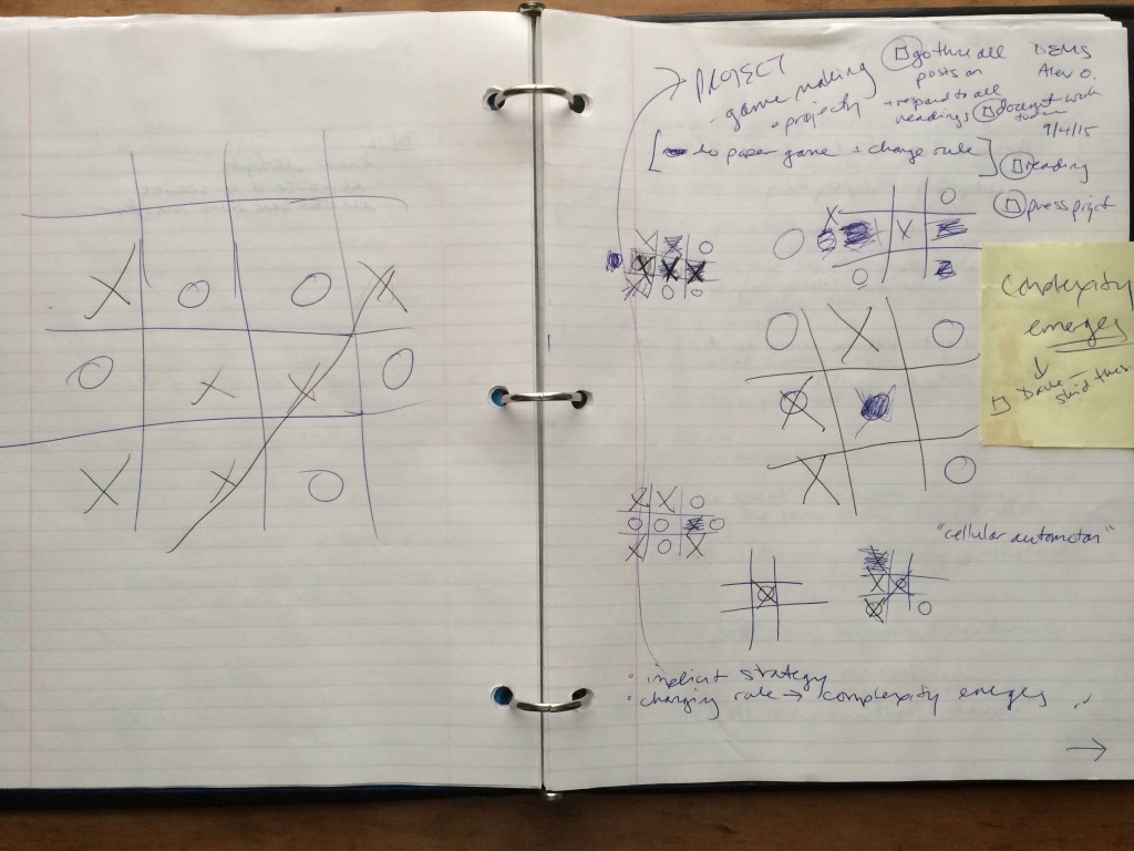
Reading from left to write, we played “normally”, with J. initiating with an “x” in the center square. The game was a draw, so we experimented with our first rule:
[As seen on the lefthand notebook page in the photo]
- When a game is a draw, players may together add a new row and new column, rendering the board a 16 square-space. (As I write I am aware there is likely unique nomenclature for “board” or “paper” games, e.g. a word for “board” that is more inclusive.) As part of this rule, a win is still gained by achieving 3 contiguous squares–not four.
–> Jonathan immediately won. We tried again,
… and got into an immediate discussion about the place of human behavior and computer-logic. As we build a new version of a game, are we building it so that there are multiple possible outcomes even for a computer, or are we depending on the human flaw of making error in not choosing the best square as a foundation of our new evolution? This came to light as we realized we needed to attempt multiple iterations of this new rule, with someone starting in the middle each time to determine whether Player 1 would “always” win (if both players are playing at their logical best) in this new rule. If that were the case, we were ready to throw out this rule and start anew. We were pressed for time, and decided to experiment with a replacement rule.
[As seen in the lower center & right two grid figures on the righthand page of the notebook in photo above]
2. A player may replace the other player’s mark on the grid by drawing their own mark over the other’s and forfeit any other move on that turn.
–> The player who first replaced one mark with another immediately won. So we threw out that rule.
3. (Must be played with pencils that have erasures) A player may erase another player’s mark, forfeiting their own turn. A player may replace an erased square (now newly “blank) with their own mark on their turn.
[As seen in the upper left and center grids on the righthand page of the notebook in photo above]
As we analyzed our own game and each other’s, we kept turning to the same question of the import of creating a game that would result in alternating wins by the most “rational” players, i.e. computers.
We shared with our colleagues. In examining S. & L.’s “Hangman” rules in which selected letters allow for a limb being erased, we discussed both implicit strategy–which may apply to the way rules contain many mini-rules, e.g. they allowed for more letters to be available in longer words. And, no doubt, that out of further rules, complexity may emerge. Jonathan and I discovered that rules can also pull in the opposite direction: some rules can engender a situation in which players automatically will win–if acting rationally–according to the order of turns.
Pressure Project I – Anna
Posted: September 5, 2015 Filed under: Anna Brown Massey, Pressure Project I 2 Comments »
Counterfeit Madison performs her Femme Fest set at Ace of Cups. Shot 09/04/15 at Femme Fest for Alive. (Meghan Ralston)
Showing up at a music venue on a holiday weekend with a clipboard and pen is a strong indication that you’re not only a graduate student, but you’re also a certified dweeb.
Putting that clipboard down, transfixed by Counterfeit Madison and her ability to set your feet deeply into the earth while landing you on the moon, is a strong indication that to be both wholly human and to devise experiential media systems (DEMS) you’ve got to fall headlong into the user-experience.
Devising EMSs requires analyzing existing media systems, which means approaching a local music show with an eye/ear/body-cognition towards scrutiny and (hypothetical) disruption. As a theater-maker, this is a familiar brain setting, but that night I practiced with some newly-attractive terms, like “present technology,” “user,” and “product.”
Public Place
2100 hours Friday 4th September
Ace of Cups, Femmefest
Columbus, Ohio
Users
Users: I am the user/audience member along with fellow ~200 payers-of-the-$7-cover.
Non-users / Purveyors of Product, in order of appearance:
- Bouncer
- Cashier
- Musicians
- Bartenders
- Barbacks
- Sound technician
- Merch seller
Products
Music and booze (also: social interaction, public space to smoke)
Existent Technology
- Electric Marquis
- Swinging Door
- Flashlight
- Drawer
- Overhead lights
- Standing lamps
- Wall lamps
- Fan overhead
- Air Conditioning (likely though undetected)
- Selected sound amplification: mics, speakers, control board
- Sound instruments: guitars, drumset, keyboard
Description of locomotive and stance choices by users:
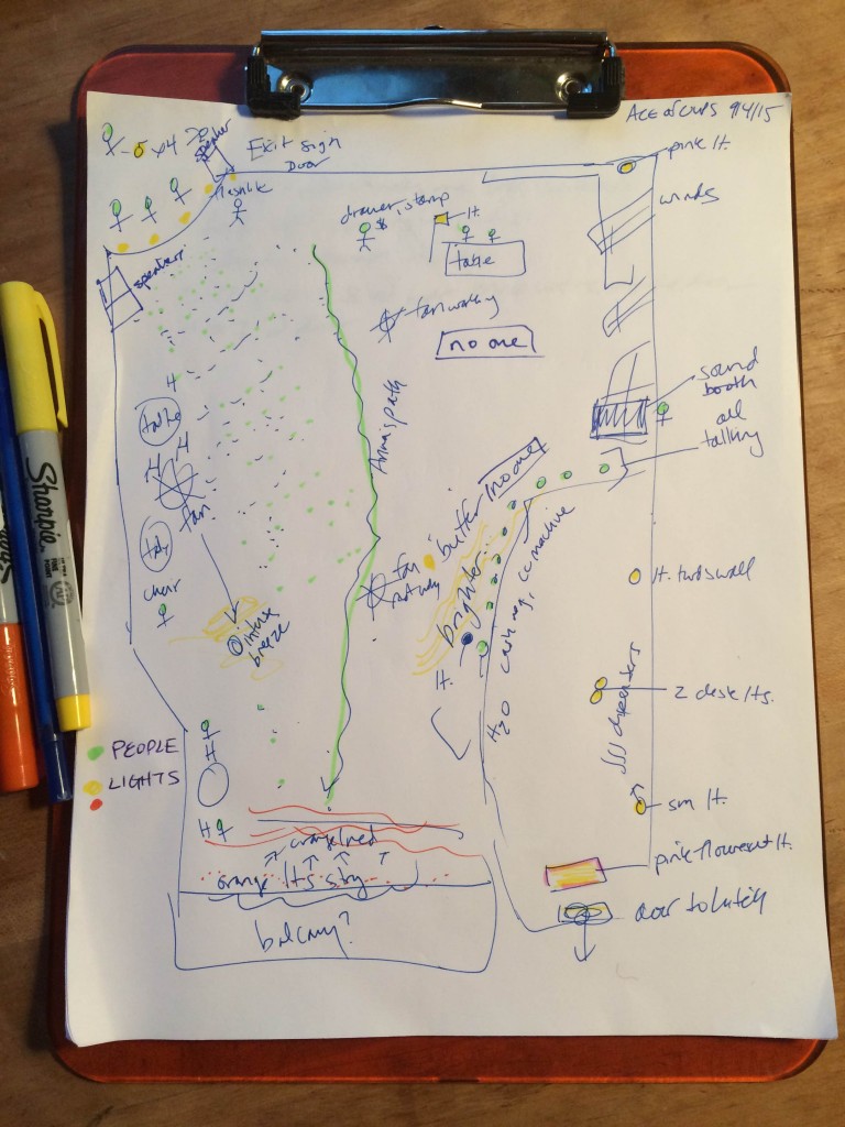
ABM: As I enter the space, to my right forward diagonal stands a person who cups their hand in the Western shape for “ID requested.” I provide it: flashlight used. “You can pay the $7 cover there.” I turn towards their gesture and exchange money for a stamp on my hand.
I pause. There is a wide swath of space between me and the other users, all turned not quite in my direction but slightly to their own left, away from my right shoulder. I square my shoulders and curve leftward around the ragged edges of the crowd in the light, looking into the room for people whom I know. I feel dozens of eyeballs peering blankly back. I walk quickly towards the bar, a place of physical refuge. It’s a wall I can lean against. I feel awkward. And I have a clipboard.
I think immediately in the same tone that Seinfeld used when exclaiming “Newman!”: lighting. This lighting is making me uncomfortable. It’s both too bright and, I discover, inconsistent, as I sashay up to a far stage left corner and feel spotlighted. I am also under an overhead fan, always an enemy for the cold-blooded, blowing a winter wind through me. There’s a strange cluster of high bar tables with empty chairs at house left with no one in them.
The decibel level sounds perfect. The music is loud enough to drop in and engage, and quiet enough for me to chat over the less-engaging songs (of a rather fantastic high school) opening band with friends.
But that light. I keep looking back at the bar, in front of which there is a single piercing light that creates a buffer zone–or is it just a natural shaping of people between bar and standing-as-audience-space? But the light, I’m having trouble determining–does it draw people to the bar or repel people from it? The light-level has two purposes here:
1. To light workers at a level at which they can execute their job.
2. To get users to buy the product.
These goals lend themselves to the reminder of the hierarchy of economic gain. Small music venues (let’s go with 250<) make the bulk of their income from the drinks slung. Cover cash goes to the musicians. Last night would have been within that system but for the nature of fundraiser: the musicians were working for free.
Interventions
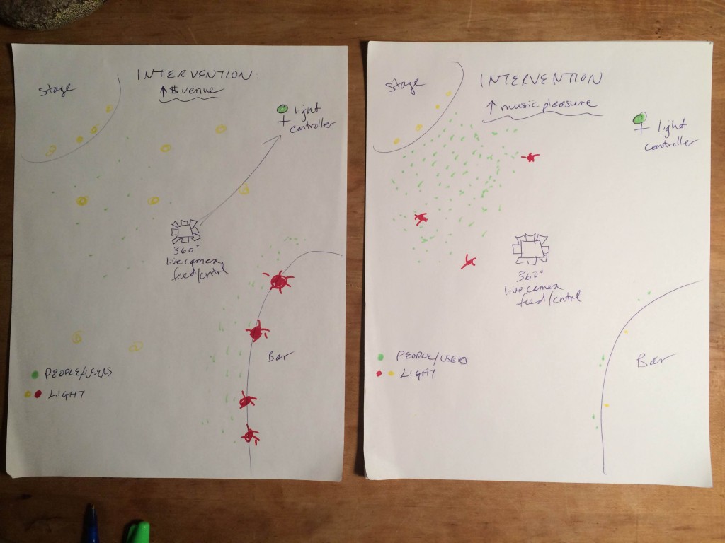
If our goal is to increase the monetary income of Ace of Cups:
Intervention: Alteration of lighting to draw users from the music and towards the bar.
Some facts:
Theaters are dark in order to provide an immersive experience. (Can we say that’s fact? Let’s just say that’s fact.)
Bars often have red lights because Western people think people look sexier under a red light. (Can we say that’s fact? Let’s just say that’s fact.)
Small music venues want to maximize the number of drinks sold by:
- Getting as many users in the door as possible to maximize possible users.
- Keeping those users in the venue so they buy drinks
- Making the bar/product attractive so they buy the drinks
I would apply a red “gel” to the lights at the bar and redirect this light not only onto the users, but also the non-users. Pupils dilate, people feel good about themselves at the bar, and hence, they’re drawn to the bar to buy product. I would not lower the lights in the rest of the venue; doing so would lend more other-product (live music) pleasure to the users, but fewer users would turn to the bar as refuge. Sound quality should remain at current levels – music is listen-able but talkable. The venue has is economic incentive for the sound quality to not just be good for the pleasure of listening–and the safety of ears–but for the sound/lights/space contours/temperature to steer customers to the bar.
If our goal is to increase the pleasure in the music product by users at Ace of Cups:
Intervention: a computer-responsive lighting system that darkens parts of the room to gather users closer to the stage. Computer-controlled sensors will pick up the presence of objects in space from a top-view, and the algorithm would darken areas according to a quantified distance of space between users, and raising lights in peripheral spaces to shift users towards each other. People feel more comfortable being closer to each other and closer to the stage when they’re in the dark, and have more pleasure in the music product. (Can we say that’s fact? Let’s just say that’s fact.) This system can also be controlled by a trained worker who has an elevated view of the crowd.


