Pressure Project 3
Posted: December 15, 2016 Filed under: Uncategorized Leave a comment »For the Pressure Project 3 I used 2 colors as a dice to activate different interactivity modes. Firstly I created a square shaped, paper, two sided (red & blue) colored dice on a piece of string.
I introduced the dice to the viewer and asked her to experiment with it by showing it to the camera. In order to see the “trick” she needs to match the right side of the camera and the dice. I divided the screen in two half with the crop object and assigned red or blue colors to each side. Blue is tracked only on the left side of the camera/ screen and red is only on the right.
Blue color activates a different sound and blue visuals also the color picker triggers a type object that indicates “ “ in addition to a whisper soundtrack on the background. Red color activates a jackpot! İllustration with a changing scale based on the movement value and a clap soundtrack in order to indicate the “win”.
I used the dice as a symbolization of two different image and sound results that are presented to the viewer. Red symbolizes a winner theme while blue symbolizes a random/neutral trigger with the murmur and whisper sounds on the background. I tried to use blue for keep trying to find the right side and red as a finish point of the game (with a win). It seemed to work on the audience. They found both red and blue sides.
I tried to come up with a simplistic dice idea in order to enable the motion and flexibility of the object in front of the camera. Color code seemed to work well, which is an important feature to use/learn in visual programming. Also in addition to using chroma key object, I used inside range and measure color object for the first time. Measure color object works great, especially for measuring the exact numbers of RGB pixel values. I am surprised how much I learned from a dice concept. A dice can be anything that triggers different functions.
Here is the Isadora file: karaca_pp3-izz
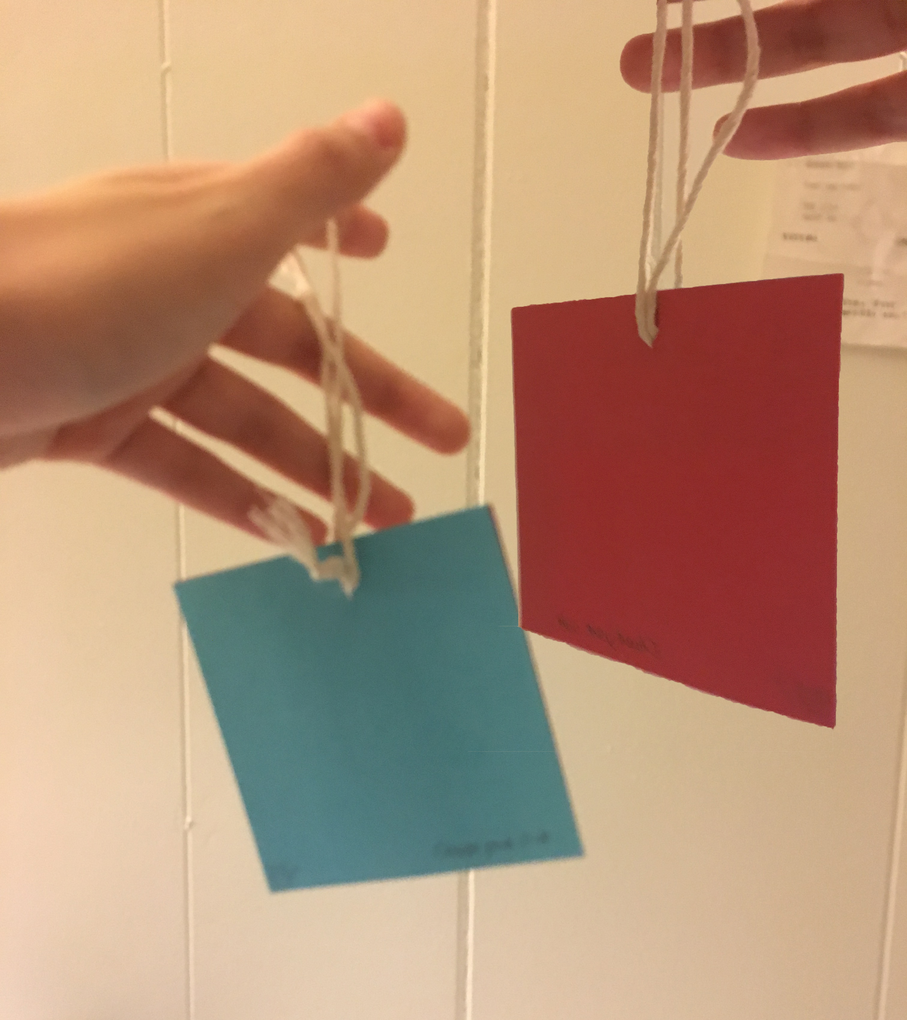
Two sided paper dice
Video is captured from the screens perspective, so when we see red side of the dice on the video, camera recognizes the blue and vice versa for red.
Cycle 1, 2 & 3
Posted: December 15, 2016 Filed under: Uncategorized Leave a comment »Hello,
I documented all parts of my process on my wordpress blog:
https://ecekaracablog.wordpress.com/2016/10/17/visualizing-the-effects-of-change-in-landscape/
I documented the process on my blog. All the visuals and sketches are on the website and the video is on the way.
Cycle 1:
While I was dealing with analysis of data, I came up with a very simple demonstration of variables in order to place them on a visual reference (map) to show the exact locations in the country. I wanted to show the main location by using a map, considering the audience might not know where exactly Syria is.
Text and simple graphic elements formed the main start of the project. After I shared it with the class the feedback I got was mainly around curious questions. One of my peers asked “What is sodium nitrate?” I could tell that he understood that chemical was not good for environment or health. Another classmate continued, “They attack to cultural areas during wars, like they are trying to destroy the culture or history of nations.” That comment helped me to add more on to the project and consider the different results of the war, connected to the same ending “damage”.
After more research and analysis I had to admit that I can’t use clear Satellite imagery or maps for the infographic, which would’ve been a great tool. I learned from Alex, since the war is still ongoing Google Maps have some restrictions in the war areas. All I got from Google Maps was pixelated, blurry maps. I moved on with abstract visualizations applied on map imagery, also included photographs from cities to the final outcome.
Cycle 2:
I believe the feedback that I got from the Cycles helped me a lot to consider the thoughts of my peers. When we work on our projects for long time periods, being subjective and critical towards the become harder. Since I worked on the collection, analysis, sketching and design of the dataset by myself, I was clear about the details of the dataset while I knew it was still too complex for the viewers. In the end the dataset and design is still too complex. It was decision I made for my first complex interactive information design project. Because the analysis of data showed me the complexity is the nature of this project. There is catastrophic damage given to a war country and even a small detail, an environmental issue I tried to visualize is connected to multiple variables on the data set. Therefore I used the wires to show the direct connection between variables and communicate the country is wired with these risks and damages.
Since my peers saw the work and heard me talking about the project, they were more familiar with it. So I was not sure the project was clear to them but I got a positive feedback in the second cycle. I’ve been told that the project looks more complete.
After I got feedback from Alex, I started to think about an active/passive mode for the project. I included a sound piece from the war area, that is activated by the audience walking by the hall in front of my project. The aim for the sound is to take the attention of the audience to the work and give an idea about the topic. Camera to track the motion sees the people passing by and activates the sound afterwards. Since I want the audience to focus on the data set, I targeted the potential audience for the sound part.
I believe sound completed the work and created an experience.
I know the work is not very clear or ideal for the audience, but I wanted to push the limits of layering and complexity in this project. Taking the risk of failure, I am happy to share that I learned a lot (from everyone in this class)!
Right now I have a general understanding of Unity, I know how to add more and manipulate the code (even I don’t know about complex coding). I learned the logic of Unity prefabs, inspector, interactivity and general interface. In addition to MAX MSP (used it last year), I learned using Isadora, which is way more user friendly. Finally I learned using a 3rd information design software called Tableau, which helped me to develop the images (under Infographic Data) on my blog.
I have very valuable feedback from my peers and professors. Even if the result was not perfect I learned using 3 softwares in total, had fun with the project, experimented, pushed the limits and learned a lot of things!
Please read the complete process from my blog. 🙂
Pressure Project 2
Posted: December 15, 2016 Filed under: Pressure Project 2 Leave a comment »The assignment requires physical material input, so I experimented with Makey Makey for the first time. While using marshmallows as an interactive board, I assigned 4 different cues to each of them. Also, I included the camera input and blob objects to control the speed and movement of the work, which are controlled by the viewer.
The opening scene is an automated/wave generated objects and filters. Filters respond to the sound level in the room. Also random text commands respond to the high sound level. Based on the level of sound the text appears/disappears on the screen.
A quick summary of the project:
Interacting with 4 marshmallows activate 4 different soundtracks and visuals. The final work on screen is controlled by the viewer:
- 4 different music track – Speed of the tracks controlled by sound level watcher, the louder sound level increase the speed of track.
- 4 different visual scenes – different colors, objects and filters are used for each scene (and each marshmallow) which are controlled by the motion tracking.
- The background sounds are different versions of instrumental music, even if they don’t sound like it! It was a happy accident (not the prettiest one). While I was experimenting with the sound level watcher, accidentally connected a wire to sound speed and it became a different sound then expected so I kept that system.
Working with Makey Makey added a fun, clear cue to work, giving a direction to the viewer. However the system was still mysterious and it took time for audience to understand the functions.
I believe using text objects create an interactive communication with the viewer. Almost starts a different type of conversation.
Overall it was a fun project and working with a new tool has been a new learning experience.
Here is the isadora file and a video of the project. karaca_pp2-izz
Taxonomies
Posted: September 27, 2016 Filed under: Reading Responses 1 Comment »The author uses taxonomication in order to create a framework to diagramize the different variables of interactive performances. Diagrams show the possible connections between different elements and makes it possible to break into steps. The article is a good source to learn about the media usage with key terms in order to distinguish the purpose of different channels
“For example, we might chart the array of interactions associated with a single dramatic function, such as dramatic media or coextensive media; or, alternatively, we may sort the interactions according to time and space and treat dramatic function as a subsidiary variable. The taxonomy is entirely nonhierarchical. No combination of variables is more fundamental than any other, and none of the variables or perspectives is privileged.” (pp. 123)
The taxonomy provides a clarification to finalize the endless possibilities of interaction. Therefore, it is possible to define the hierarchy of variables, in order to break the work into steps. Also the role of the audience (and performer) within the work can be defined in various ways.
Use of media as an autonomous object or instrument is a choice of the designer. Being aware of the distinction between the channels and consideration of time and space brings an advanced level of consciousness to work.
Pressure Project 1
Posted: September 20, 2016 Filed under: Pressure Project I Leave a comment »Pressure Project 1:
1. I aimed to control the jump between the scenes by using camera feed, also arranged auto jumps by using trigger delay. The sudden jumps between the scenes created a playfulness and unpredictability. The jump from first to second scene is controlled by the movement. After the triangle is pushed to upper part of the scene with the movement feed the scene jumps to next one.
2. I used the sound watcher to control the density of the explode filter.
3. There are two different colorizers in two different scenes. First one is controlled by the wave generator, second one is controlled by the movement and camera feed.
4. There is an animation in loop on the 4th scene, based on the horizontal movement of the viewer the colors change between cyan and magenta or yellow and purple.
5. Last scene is controlled by color. By using chromakey object I paired up a cyan square to blue chromakey and yellow square to yellow chromakey object. Therefore, each square follows the object it’s pair (blue object movement controls blue square, yellow object movement controls the yellow object.)
Very helpful assignment, I learned a lot about interactivity. Also, It is fun to watch the contribution of the classmates, it carries the project to a different level.karaca_pp1-izz
Folding Four
Posted: September 20, 2016 Filed under: Pen and Pencil Games Leave a comment »I realized I haven’t published my drafts yet. So here is the playing with game rules post:
https://www.dropbox.com/home/Camera%20Uploads?preview=2016-09-05+14.21.02.jpg
Axel and I modified the Connect 4 by adding new rules to the game.
- After every 3rd move of the players, player 1 is going to fold a line.
- Then the folded line is going to be unfolded after 3 more moves of each player.
- The first rule applies, 3 moves later of each player, player 2 is going to fold a line.
- Repeat rule 2.
The rule set is going to be repeated through the game.
Adding and hiding the lines for a short time frames add an unexpected and playful aspect to game. Now it is harder to predict who is going to win. Therefore it is more exciting.
It is fun to modify a game that all of us are familiar since the new rules change the dynamics of it. Therefore it takes sometime to understand and get used to game, it brings back the excitement of being a kid.
Also it is very interesting to see how little modifications and additive elements might change a simple system like a game. Going through the each step and rule of the game, in order to understand the dynamics and change or modify it is a simple but effective exercise to learn about systems.
RSVP Cycles
Posted: September 17, 2016 Filed under: Reading Responses, Uncategorized Leave a comment »“Scores are symbolizations of processes.” I’ve been taught that process has a crucial importance in design education. Documenting and reflecting the process help the student and instructor to understand the possible improvements of the design piece. Therefore RSVP cycle of each project will affect the learning process and future work. For instance, the main focus of an MFA thesis is getting a documented score as an outcome. It might be a project, research or both but it should be documented with thesis writing. Resources should be analyzed through secondary research. Scores should be documented in order to show the process of getting the actual outcome and valuaction of process enhance the possible revisions of outcome. Finally performance is the documented thesis work and possible solution or the project itself. Learning from the process and also reflecting process is possible through RSVP cycle.
“Scores face the possible, goals face the impossible.” Also scores make the impossible possible because success requires time and improvement of process.
“Scores are ways of symbolizing reality of communicating experience through devices other than the experience itself.” Then I assume that the software is a score. Very interesting.