Final Project Showing
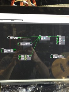
Posted: December 12, 2015 Filed under: Connor Wescoat, Final Project Leave a comment »I have done a lot of final presentations during the course of my college career but never one quite like this. Although the theme of event was “soundboard mishaps”, I was still relatively satisfied with the way everything turned out. The big take away that I got from my presentation was that some people are intimidated when put on the spot. I truly believe that anyone of the audience could of come up with something creative if they got 10 minutes to themselves with my showing to just play around with it. While I did not for see the result, I was satisfied that one of the 6 members actually got into the project and I could visually see that he was having fun. In conclusion, I enjoyed the event and the class. I met a lot of great people and I look forward to seeing/working with anyone of my classmates in the future. Thank you for a great class experience! Attached are screen shots of the patch. The top is the high/mid/low frequency analysis while the bottom is the prerecorded guitar piece that is synced up to the lights and background.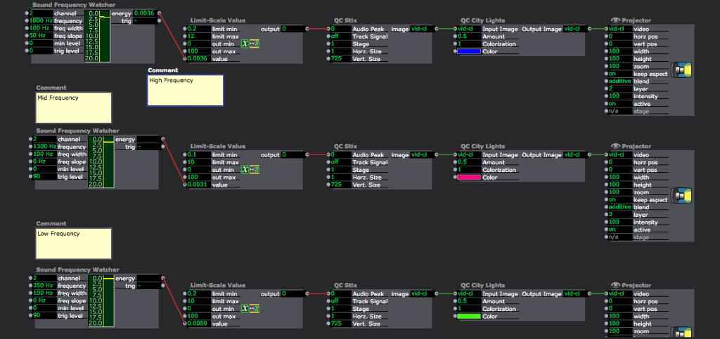
Checking In: Final Project Alpha and Comments
Posted: November 4, 2015 Filed under: Connor Wescoat, Isadora Leave a comment »Alpha:
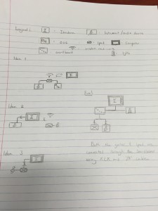
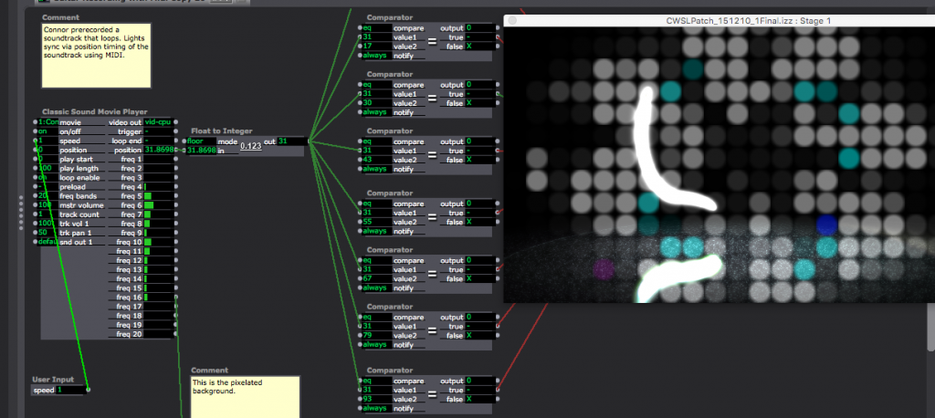
Today marked the first of our cycle presentation days for our final project. While I initially was stressing hard about this day, I was able to, with the help of some very important people, present a very organized “alpha” phase to my final project. While my idea initially took a lot of incubating and planning, I hashed it out and executed the initial connection/visual stage of my performance. Below is a sketch of my ideas for layouts, my beginning patch and my final alpha patch that I demonstrated in class today.
You will see the difference between my first patch and my second.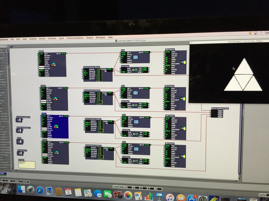
The small actor off to the right and bellow the image is a MIDI actor calibrated to the light board and my guitar. Sarah worked with me through this part and did a wonderful job explaining and visualizing this process.
Comments:
Lexi: Great start to your project! You made a really cool virtual spotlight using the Kinect. I know that the software may be giving you some initial troubles but I know you’ll be able to work through it and deliver an awesome final cut that incorporates your dance background. Keep it up!
Anna: I really like what you are doing with the Mic and Video connection. I believe that when it all comes together it will be something that’s really interactive and fun to play around with. I’m already having fun seeing how my voice influences the live capture. Keep it up!
Sarah: Words cannot describe how much you have helped me in this class and I look forward to working with you to not only complete but also OWN this project. I’m sure the final cut of your lighting project is going to be awesome and I look forward to working with you more.
Josh: How you implemented the Kinect with your personal videos is a very cool take on how someone can actually interact with video in a space. I cant wait to see what else you add to your project!
Jonathan: Dude, your project is practically self-aware! Even if you explained it to me, I would never know how you were able to do that. I look forward to seeing your final project. Keep it up!
Computer Vision Patch Post
Posted: October 5, 2015 Filed under: Alex Oliszewski, Connor Wescoat, Isadora, Josh Poston, Sarah Lawler 2 Comments »
Screen Shots included within zip!!!!
PP 2 “Planet A”
Posted: September 23, 2015 Filed under: Connor Wescoat, Pressure Project 2 Leave a comment »Intro:
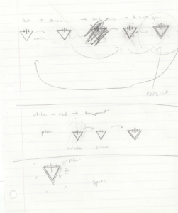
While the initial influence for this project was to be loosely based around a “Mondrian” piece of art, my musical influences got in the way of that and I chose to try something with a slightly different dynamic. I am a pretty big fan of metal and core music and one band in particular that I cannot seem to get enough of recently is “The Devil Wears Prada” who are a “metalcore” band from good ole Dayton, OH. This band on their recent recordings and stage shows have chosen to use this kind of provoking, slightly sadistic, triangle shape shown below.
- Level 1: Check, I was able to fire the whole scene with one trigger
- Level 2: Check, the scene fades from one simple image to another, more complex piece with different movements and animations
- Level 3: Check, my second scene takes a couple loops to figure out what is happening but is simple enough to predict the repeating action
- Bonus 1: Blank, The scenes follow a repeated pattern with no variability after the first loop
- Bonus 2: Maybe?, While the scene is simple, I believe that the pattern and interplay between the shape, background animation and movement creates a hypnotic feel within the piece.
A Very Short Introduction – Baudrillard
Posted: September 8, 2015 Filed under: Connor Wescoat Leave a comment »When Baudrillard talks about the “death of the real” it sounds like a reading I had to do in my history of pop culture class I took two semesters ago entitled “The Work of Art in the Age of Mechanical Reproduction” by Walter Benjamin. In this reading Benjamin states that in the age of mechanical reproduction, the “aura” of produced works of art are ripped and torn asunder due to accessibility. The “tradition” of making art is forgotten by the viewer and the aura of the work is ultimately diminished. This sounds like Baudrillard’s death of reality,
“we live our lives in a realm of hyperreality, connecting more and more deeply to things that merely simulate reality” – Baudrillard
There Is Only Software – Manovich
Posted: September 8, 2015 Filed under: Connor Wescoat Leave a comment »While this article makes complete sense and might be obvious to some, I never looked at “digital media” in such a straight forward manner. Manovich paints a pretty bleak picture of conventional media in that everything that “could” be, is ultimately controlled by the software at the end of the day.
“Digital media” does not have any unique properties by itself. What used to be ‘properties of a medium’ are now operations and affordances defined by software.
Squares – The Stop Rule of Death
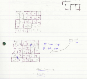
Posted: September 8, 2015 Filed under: Connor Wescoat, Josh Poston 1 Comment »Behold! The classic game of squares. While up to 4 players can participate in a single game, Only Josh and I participated in this strategic game of Mortal Kombat. The rules are simple, a grid of “dots” are drawn on a piece of paper. From these dots, players take turns drawing a connecting line from dot to dot going up & down or left to right. The objective of the game is to create a complete square by conjoining the drawn lines. This next rule is critical, once a square is completed by a player they get to draw another line. This “extra turn” is a reward for completing a square and can cause a lot of squares to be completed in one fell swoop. The game ends when all dots on the grid are drawn in and the number of squares are tallied.
After playing one full game of dots, Josh and I chose to implement a “STOP rule” to the equation. This stop rule would function as a one-time stop to a players square completion. Simply put, if a player realized that they were about to get a lot of squares stacked against them they could stop that momentum of the opposing player. This new rule brought an added dynamic to the game by offering a strategic last resort. If used correctly, this rule could completely flip the tables in your favor. Used incorrectly and you would become crippled by the opposing players onslaught of square completions! Play at your own risk.
PP1 – Fashion Meets Music Festival
Posted: September 8, 2015 Filed under: Connor Wescoat Leave a comment »Getting Started: I chose to document my time at Columbus’ 2nd annual Fashion Meets Music Festival (FMMF) that took place this past weekend. My organization “Heart Of It All” was featured at the festival as well as many different talented designers, brands, musicians and artists. While I have attended a few festivals in my life, this one stands out in that its lay out was a little “unconventional”. Is that good or bad? Lets find out!
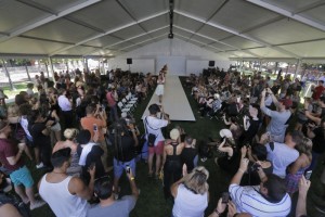
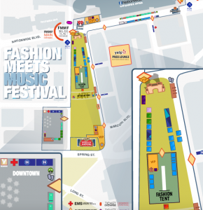
Note: While I have outlined a top-down diagram in my post, I will elaborate further on the installations and lay out of the event. I chose to observe both the “Fashion Stage” where my booth was present and one of the main music stages called the “Stella Stage”. Beginning with the Fashion Stage; this stage was constructed just like a fashion runway with 2 separate smaller stages on both sides. One functioned as a regular artist stage for musicians whose performance would accompany the fashion act and the other was a raised soundboard area which functioned as the technical hub for the runway. Seating was offered on the left and right sides of the runway. While seating was available, I observed that the majority of the audience chose to stand for the event.
Map: Overall map of the event
Note: The second stage that I observed was the “Stella Stage” which functioned as the main-stage of the festival. It was not only the largest of the 4 stages but it also was situated at the back of the field which housed the most people. I observed that while the other stages would only gradually get more and more packed when an artist was about the perform, this stage remained pretty crowded. In my opinion this was because the field offered a large social area to hang out in while also offering relief from the other aspects of the festival. I also observed that people started migrating to this stage 30 minutes to an hour before a performance. In contrast to the fashion stage which would progressively fill about 10 minutes before the designer went on.
Devise: For the fashion stage, I devised an idea to implement a visual aid to the back drop of the runway to reduce standing congestion. One idea of mine would come in the form of a downloadable app that would showoff the presented garment on the viewers smartphone. The other idea was to project either a picture or a video of the presented garment on the backdrop of the runway. I believe that these methods would dampen the amount of crowding around the stage. For the Stella Stage I took a page out of the band Metallica’s stage show in the form of a centralized main stage.

With this viewpoint, people cluster around the stage rather than being in front of it. This mode, while more expensive and harder to implement, would provide more people with better views and less centralized congestion.
Conclusion: While I believe these methods would dampen the overall congestion of these high traffic areas, the context in which these bottlenecks occur is a massive festival setting at the end of the day. People being packed in like sardines is an expected outcome and even the goal of many of these popular music festivals. In my opinion, I would like to see improvement on the fashion end of the spectrum rather than the contemporary “main stage” layout that is so prevalent at today’s major music festivals. By making the fashion stage more accessible and experiential for the consumer, more people will demand events like FMMF and the programmatic quality of these events will continue to grow.
Top-Down Diagram: PP1 FMMF
