Cycle 1 – Unknown Creators
Posted: April 9, 2024 Filed under: Uncategorized Leave a comment »For my final project I knew I wanted to do a perspective piece sort of thing after my work from last project. After thinking about it for a while I decided that I would go back a social issue that occurs in the games industry and other media that require large teams of people. There is a phenomenon where the creation of a piece of art is attributed to one person, even we know that there are more people behind the scenes. One might refer to a movie as a Hitchcock or Tarantino film, or a play as something by Sondheim. These individuals that get referenced, mostly male, are often leads in some way: main writers, directors, etc., and they often get more screen time and interviews. The games industry is no different, and there are several big names that get thrown around: Hideo Kojima, Hidetaka Miyazaki, Shigeru Miyamoto, Warren Specter, the list goes on. In order to address and convey this issue to those that don’t know so much about games, I wanted to take an example of a revered creator and juxtapose that person with some others that are relatively unknown, people who did programming, mocap, animation, etc.
In my piece I wanted to focus on a studio that I know quite well, Bethesda, and it’s lead designer Todd Howard. I found a short interview from GameInformer about his life and how he got into the industry, linked here: How Skyrim’s Director Todd Howard Got Into The Industry (youtube.com). For the people who were lesser known, I am pulling footage from some documentaries made by ex-employees at Bethesda: How Bethesda built the worlds of Skyrim and Fallout (youtube.com), and A SKYRIM DOCUMENTARY | You’re Finally Awake: Nine Developers Recount the Making of Skyrim (youtube.com). In terms of set up, my idea looked a little like this:
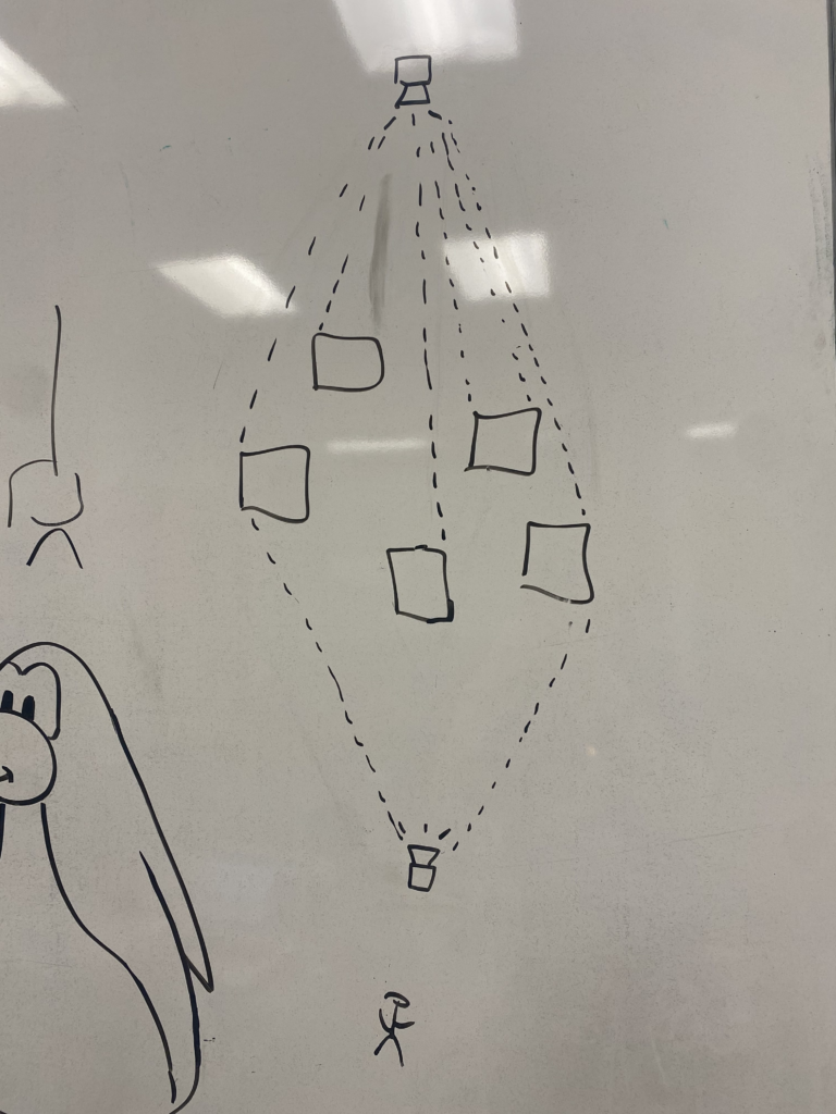
Essentially I wanted to have some tall boxes set up in the center of a space (ideally the motion lab). On one side of these boxes, there would be a large projection of Todd Howard, the footage would be stretched over all the boxes so that when looked at as a whole, the image would become clear. On the other side of the boxes, individuals that worked at Bethesda would be projected. Each person would be projected onto one box. The Isadora part is fairly simple, just a bunch of projection mapping and some videos, the setup and space would really be the big issues.
One of the first things I did was go into the motion lab and establish what sorts of resources I would be using, as well as try and get some projection mapping stuff working just to get familiar with the process and environment; Michael Hesmond was very helpful in this regard. I was going to need to use the Mac Studio, that way I could use two projectors at once. We decided to try two different kind of projectors, a short-throw and long-throw, just to see if one would be better than the other. After getting everything set up and using the grid I got something that kind of looked like this:
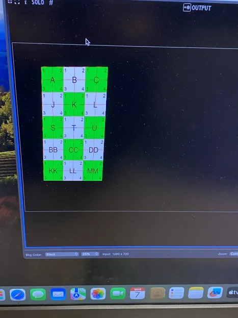
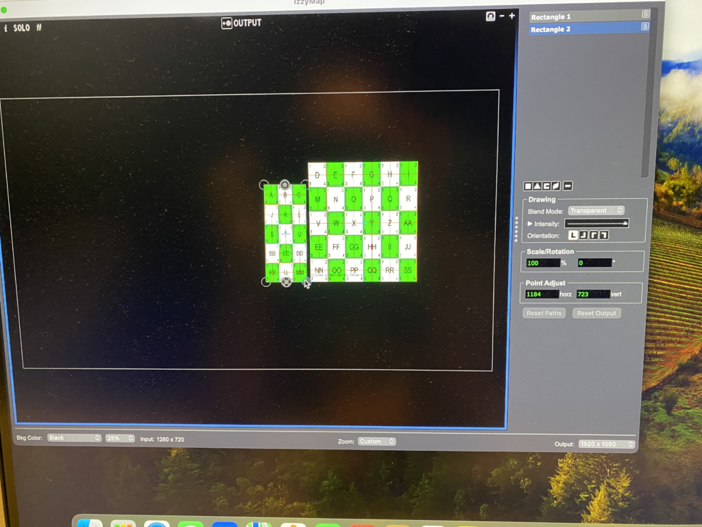
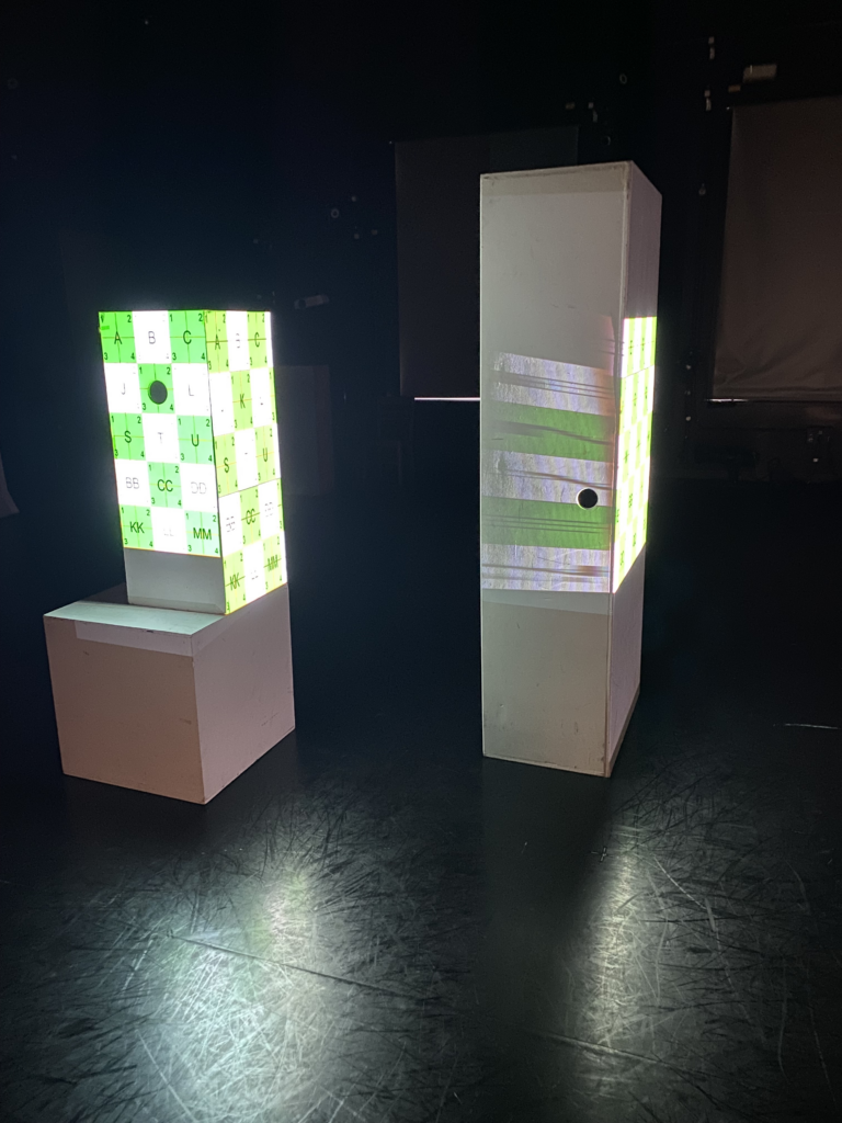
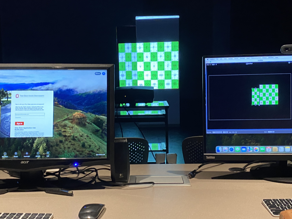
I was technically projecting on the side instead of across from each other, but this was okay, I really just needed a proof of concept and I wanted to also see how pixel smearing would look. After doing all this, I determined that I would need these resources:
- 2x Power Cables for the projectors
- 2x Extension cables that would plug into the wall
- 2x HDMI cables
- 2x Short-throw Ben-Q projectors, both projector types worked fine but I wanted to use the short throws because their color was better, and the space was relatively small
- The motion lab switcher, this was important for getting both of the projectors working; we had to do a little debugging to make sure the projections were going to the correct outputs
The only resources I wasn’t sure about were the boxes. There weren’t a lot of them, and I wanted more uniform shapes, so this would have to be reworked. When I came back, I did a bit more work thinking about the setup and resources with Nico and Michael, and I got another setup going:
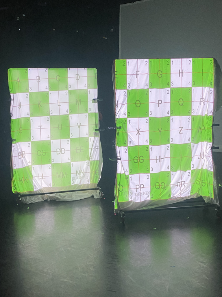
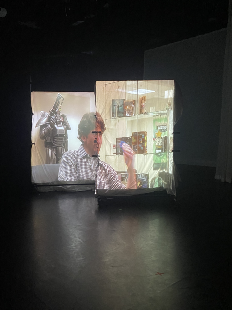
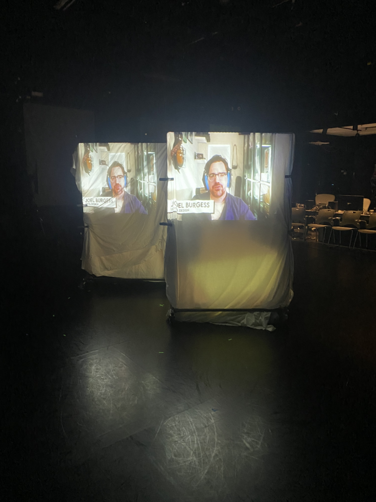
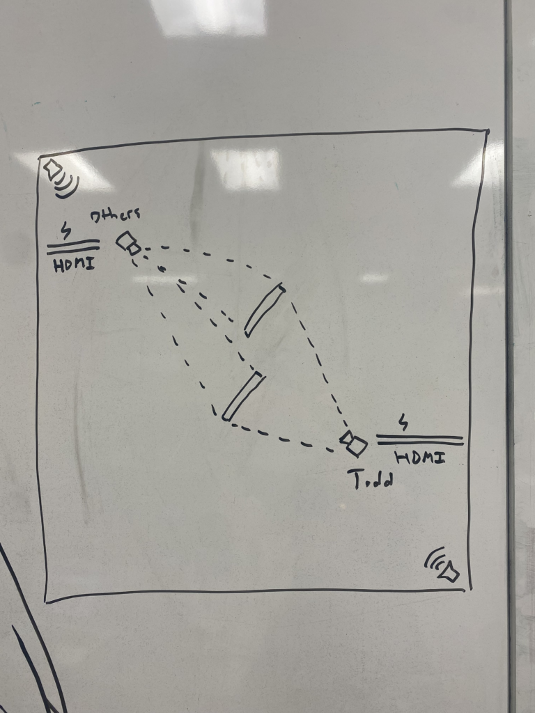
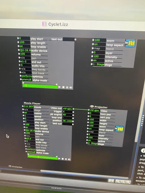
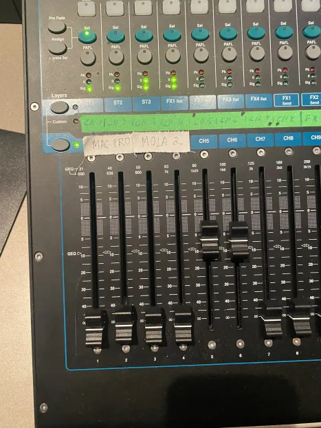
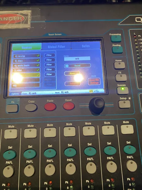
This time, the setup was moved diagonally. I wanted to do this to give myself more space to work with and because when audio would be incorporated, I needed speakers that I could project audio from in different locations. Instead of boxes, Nico had a great suggestion of using some draped sheets, so we took them and folded them over some movable coat racks. I also played with getting audio to play out of different speakers. I only wanted sound to come out of the back left and the front right speaker. Isadora had a little bit of trouble, the snd out parameter for my movies had to be set to e1-2 for the front speakers and e3-4 for the back speakers, then the panning needed to be adjusted so that audio would only play out of a specific speaker. After that was figured out though, we saved my audio settings to the sound board so that it could be loaded up quickly later.
For the cycle 1 presentation, I took a quick video:
I got a lot of great feedback about peoples’ thoughts and feelings on this project:
- Jiara felt that there was a resonance between the tone of the voice and the quality of the fabric, or perhaps the wrinkly appearance of the fabric. It seemed that for one coat rack the fabric was more pristine and ironed, while on another the fabric was more crumpled, which could connect to the quality of audio or perhaps the autobiographical nature of the footage
- There was some confusion about the meaning of the piece, for many the relationship between the people and footage wasn’t clear. Was it connected? Was there a back and forth? It almost seemed like one side of the footage was the interviewer and the other side was the interviewee
- People liked spatial aspect of what was going on. Alex noted that the sound could be disorienting because there are multiple sources faced towards each other, which is a very good thing to note. Michael and I had talked about this briefly and this issue could potentially be solved by having the speakers be under the coat racks and having them project in the opposite direction, rather than projecting towards each other. But one thing that was good about this audio setup was that there were dedicated viewing positions that we created since the audio would be less distracting in the corners where the perspective was best framed. Moreover, finding spots where both footage can be viewed and heard was fun
- The biggest thing is that the messaging isn’t clear for those that don’t have context about these people. In general, there needs to be some conveyance of information about these people’s backgrounds, positions, roles, etc. and there could be more done to imply that one person is more well-known than the others. For example, maybe there is more ornate framing around Todd, maybe there is something about the volume of the space that could be played with, maybe the footage of the normal developers is jumbled and fragmented
- Someone suggested having the racks move, which would be really interesting though I don’t know how that would work haha