PP2: Etch-a-Sketch
Posted: October 9, 2023 Filed under: Uncategorized Leave a comment »For Pressure Project 2, I created a sequential interactive experience that ends in a “human etch-a-sketch.”
The Project
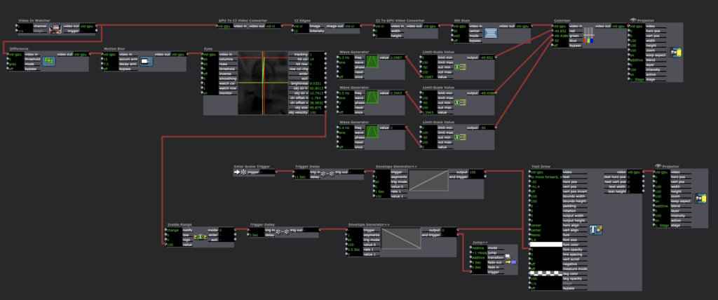
For the earlier scenes, I took inspiration from Charles Csuri’s “Swan Lake” piece. I isolated the user’s outline and applied different effects to it. Here are screencaps of my patches for some of these scenes:


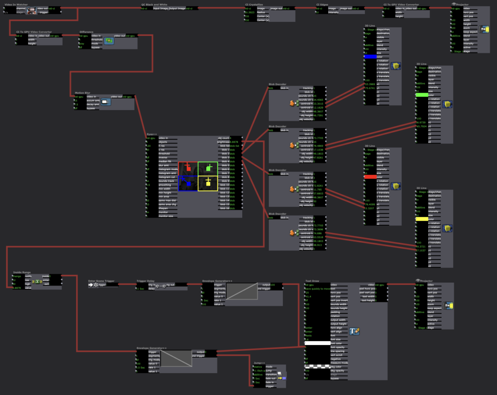
I was also inspired by Csuri’s “Sine Curve Man” and hummingbird drawing, so I wanted to include something that had a feeling of drawing to it. I stumbled upon the Live Drawing actor in Isadora, and figured out how to attach it to a user and have it draw along with their movement. Patch below:

The Eyes++ actor connects the position of the blob’s centroid to the position of the “cursor” in the Live Drawing actor. In order to erase, I connected a Keyboard Watcher to the Explode actor, so the drawing would seemingly erase into small particles whenever the user pressed the ‘c’ key.
As soon as I made this, I got the feeling it was like an etch-a-sketch, a kid’s toy where the user “draws” with two knobs and shakes the board to erase it. This vision gave me a much clearer image of my project as a whole, as I now saw it as a celebration of play and youthfulness. I spent a long time testing the etch-a-sketch scene to make sure the tracking was smooth enough to use intuitively. However, after testing for a long time, I realized I should include instructions as this would be shown both in class and in a gallery-style open house.
Knowing the details of the performance context gave me a new perspective with which to instruct the user. I decided to make them quick and to the point, just instructing them to press certain keyboard buttons to prompt an erase, for instance. I also set a user-controlled loop on the entire project, so it doesn’t require extra setup if a new user wants to start the experience over for themselves.
The Performance
I was very pleased with the outcome of this performance, but still glad we get a chance to iterate on it in preparation for the open house; there were many moments in which I realized new possibilities for “bugs” in the program when watching others test it. When creating the project, I was so used to testing it myself that there were certain user-interaction possibilities I overlooked. For instance, one of the scene changes triggers based on the speed of the user’s movement. After about five seconds, the program prompts them to wave quickly, which should trigger the next scene. However, this scene got skipped in the first run in class because Arvcuken (who did a great job of demonstrating the program) entered the scene while moving.
It was fascinating to see the class’ reactions to the project, especially the interaction aspect. I had a great time watching Arvcuken interact with the program; it gave a lot of new insight as to how someone new to the patch would experience it.
Hearing feedback was especially helpful. I appreciated CG’s comment on the aesthetic of the colors I used. Most times colors were involved, I had the Colorizer actor on three different Wave Generators: one for red, blue, and green respectively. This changed the colors somewhat randomly throughout the scenes. I added this aspect after I discovered the playfulness of the entire piece. The program encouraged discovery through movement, which is essential to childhood. I wanted to bring up those feelings of playfulness and discovery in the user by inserting bright colors to the scenes.
I also appreciated Amy’s comment about the playfulness of the etch-a-sketch scene. Her interpretation of the piece bringing up childhood memories was almost exactly my intention, and I was overjoyed that it actually came through for someone in the experience.
Niko made a good point about the instructions being helpful as a framing device from an accessibility standpoint. This was a new perspective that I hadn’t considered while inputting the instructions, but I greatly valued that as feedback. I originally intended the instructions to provide context and guidance for any user, but knowing that it’s helpful for accessibility is great information to have. Having a range of users in mind while iterating is essential to the RSVP cycle, so it was a welcome reminder of audience awareness.
Overall, I valued the experience of creating and receiving feedback on this project. Seeing people actually interact and “play along” with something I create was new to me, but a very welcome experience. I definitely know how I’m going to iterate on this for PP3, and I look forward to get to work on it more after testing it with users.