Pressure Project 2: Japanese Sign
Posted: October 18, 2025 Filed under: Uncategorized | Tags: Pressure Project Leave a comment »As soon as I heard the requirements for this pressure project, I immediately knew I wanted to use a livestream. Not because I didn’t want to physically observe people in the real world, but because a livestream allowed me to go anywhere in the world. This seemed like a great idea, until I started looking for livestreams. I actually found a playlist of Japanese livestreams on YouTube and as I was going through them I realized one major flaw: there really weren’t many interactive systems to observe.
There was a famous livestream of a major Tokyo intersection, but this seemed too unpersonal and generic. A smaller intersection, while more personal, was still just as generic. Although as a note, barely anyone ever jaywalked in the streams I watched, even when there were clearly no cars at all. I ended up going with a stream of people walking down a street. There were shops, restaurants, many signs, and it all looked very… Japanese. I chose this one because, on top of looking very characteristic for Japan, there was a sign in a great location for observing. Additionally, I watched from 12-1pm (their time) so there was a lot of activity happening. See below for the sign in a screenshot of the livestream.
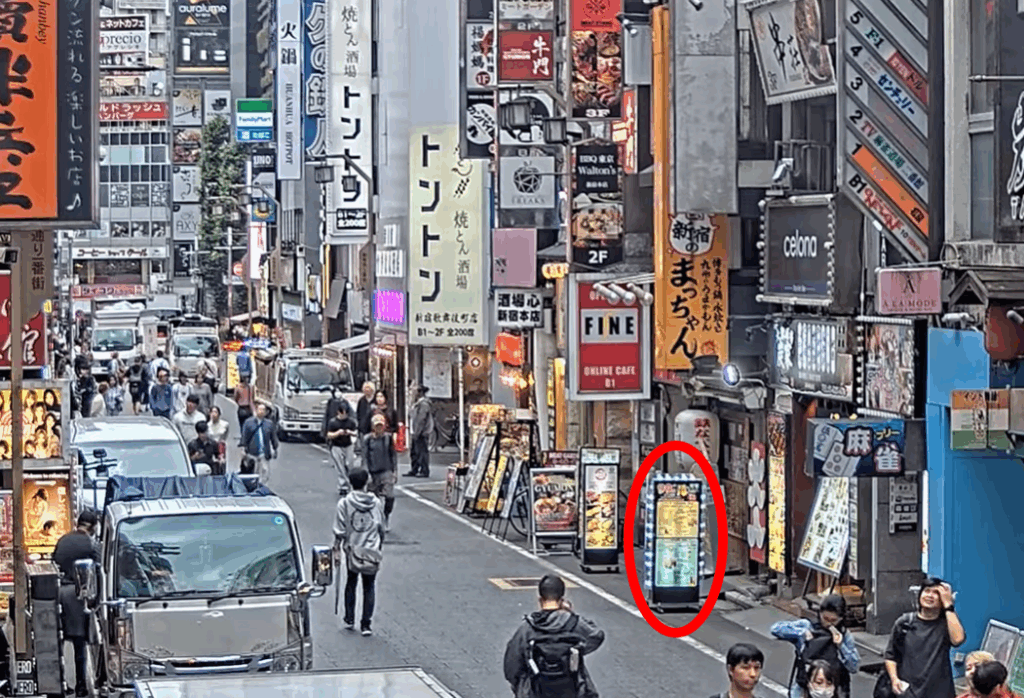
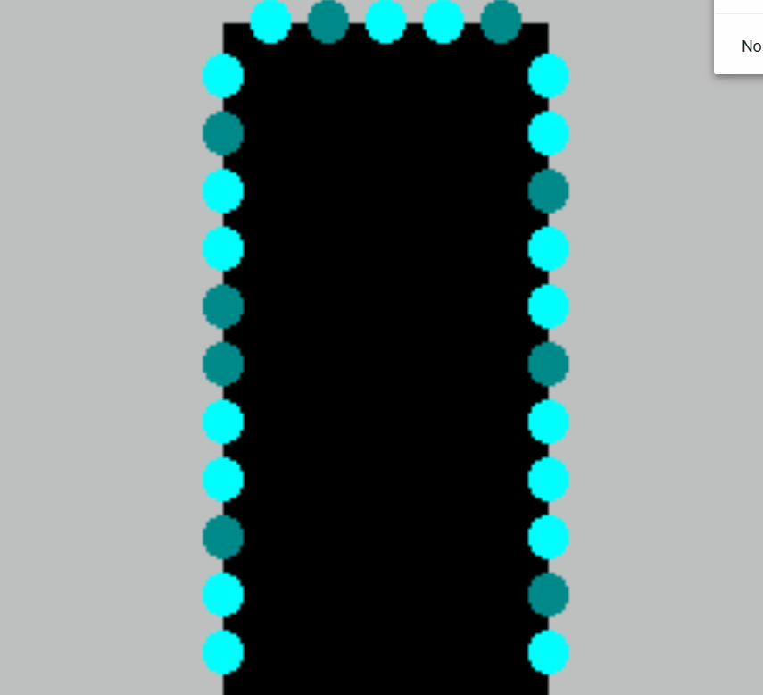
What made this sign a good candidate to observe though? Firstly, as I said above, it’s framed in a way where you can tell when people interact with the sign. Many of the other signs aren’t on street level, and sense we can’t see the exact location people’s eyes are looking, you can’t tell which sign they are looking at. The sign being on the ground makes it very clear when people look at it. Next, although you can’t really tell in the screenshot, this sign has lights around it that flash in a particular way. This was the “system” what people would interact with. Below is a mockup of exactly what the flashing light pattern looked like:
Now you may be thinking, is this really an interactive system? Perhaps it’s a bit of a stretch but first let’s cover how people interacted with this sign and signs in general. In my opinion, there are four key interactions:
Interaction #1:
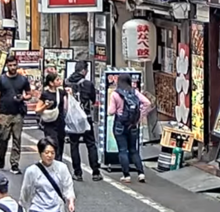
A person doesn’t even see the sign. This is the worst case scenario. Either our potential observer was too busy looking at their phone or was in a rush to get through the street who knows, but in the end our sign made no influence on them at all… 🙁
Interaction #2:
A person sees the sign but doesn’t look. This is what I believe to be the most common interaction. I know I said the first type of interaction was worst case scenario, but in a way this one feels worse. People could tell there was a sign there, maybe even glanced at it to see what it was, but the sign’s existence was so ambivalent to them they simply didn’t care to look further.
Interaction #3:
A person sees and processes what is going on with the sign but does not stop walking. This is a great improvement over the first two interactions. People become so interested in the sign that they become curious of what it is. This interaction comes in a range but has an ideal scenario: the head turn. If someone turned their head to read the sign, that means it was so interesting to them, that up until the point where they physically could not see the sign anymore, they were still looking. There is room for improvement here though, as these people still walked by the sign when the time came.
Interaction #4:
A person stops to look at the sign. This is the best case scenario. A person was so interested in the sign, that whatever reason they were walking for become overridden. They must learn more about this sign. This is the only acceptable scenario. I will now redesign the sign to accomplish this goal… 🙂
Simple Changes
Assuming we want to keep things tame with the changes, let’s focus on the lights before adding new components.
Possible Change #1:
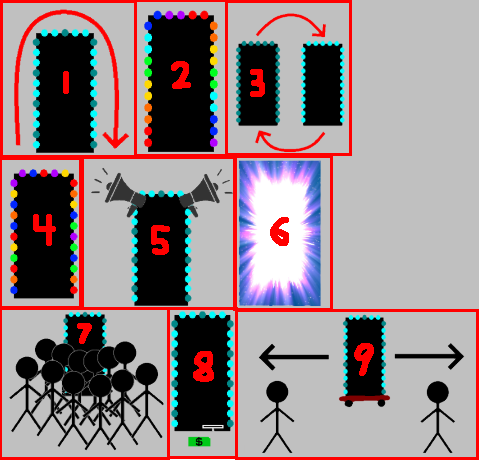
Make the light pattern more coherent and interesting. In the mock-up above, you can see the light pattern may vaguely be in a clockwise pattern, but adding more states and making it a clearly clockwise pattern could make people more likely to look, if just to see the pattern.
Possible Change #2:
Add more colors. A pattern of on/off is alright, but a pattern of different colors is definitely more likely to get people’s attention. This also adds an entire new layer to the lights, and that added complexity could keep people’s gaze longer.
Possible Change #3:
Make the pattern flashy. If the pattern has many lights on and then off in quick succession, people may be more likely to look. Especially someone who isn’t really paying attention as a sudden burst of activity may steal their focus.
Intense Changes
The simple changes are largely superficial. While they may get people to look more often and for longer, they’re less likely to get people to stop, which of course is the only goal that matters.
Possible Change #4:
Add many varied colorful and random patterns. The idea here is that there are just so many crazy lights and patterns and flashes occurring that people can’t possibly understand everything happening in the time it takes to walk down the street. People will have to stop in order to get the full pattern, if there even is one.
Possible Change #5:
Added speakers and proximity detectors to the sign. A speaker that just makes noise could get people to glance over, but if the audio is proximity based and makes noise depending on people’s distance to the sign, the personal aspect is more likely to get people to actually stop. The sign could say things like “Look at me!” or “You there, stop immediately!” in reaction to someone getting close to the sign and in many scenarios that person will stop.
Possible Change #6:
Makes the lights extremely bright. Now maybe this could have the opposite effect as people can’t look at the something that’s too bright because it hurts, but a light that is extraordinarily bright could cause people to stop in surprise. Although again looking away is not ideal, even if they stop.
Stop Them No Matter What
It’s still possible that the above changes won’t stop people. But what can we do to ensure that people stop no matter what?
Possible Change #7:
Add a fake crowd of people in front of the sign. It should really look like everyone wants to see this sign. How could anyone walking down the street resist the intrigue of what they could be looking at? They may even join the crowd and then strengthen its attraction towards other people…
Possible Change #8:
Add a piece of currency on the ground in front of the sign that is on a string. When people try to grab the money, the sign retracts it back into itself. The act of having to bed down and ground the string will stop someone, and then after they are stopped, they’ll likely look at the sign either in intrigue or confusion.
Possible Change #9:
All other changes have a chance of failure. In this change, a motorized system is added to the sign’s wheels that allow it to move back and forth freely. A motion detector tracks people’s movement and moves the sign to block people’s path so they physically must stop and look at the sign. This is the ultimate solution. I suggest all sign manufacturers invest immediately!
After presenting, the class discussed a few things that are worth noting. It was questioned if people are really “interacting with an automated computer system” by simply looking at a sign, however the changes I made, especially ones related to proximity, easily bring the system as a whole up to that specification. In terms of a less invasion approach, proximity lights were brought up as a possible idea. I kind of had moved this idea to the audio but it could easily work with lights as well. For example, maybe the color changes depending on your distance to the sign or maybe more and more lights turn on the closer you get. Either of these could definitely get a person to stop, especially if they notice that they are the ones controlling the lights.
This was definitely a fun project. I was a little disappointed that I couldn’t find something more interesting in a livestream, but I was satisfied with how I was able to spin something extremely simple into something a bit more complex.