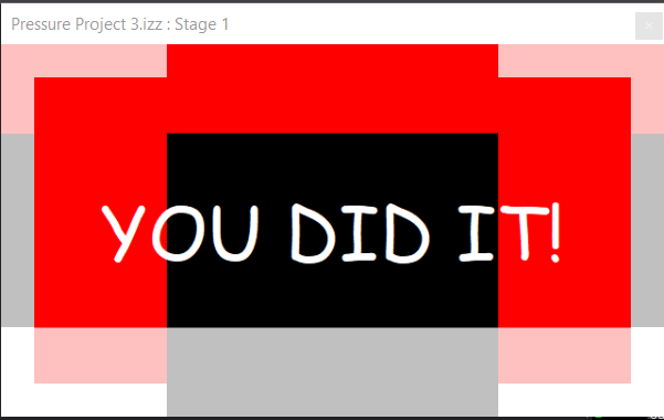
Pressure Project 3: Love Letters from Home
Posted: May 7, 2026 Filed under: Uncategorized | Tags: Pressure Project, Pressure Project 3, touchdesigner Leave a comment »This project was created as a purely audio experience, a three-minute piece with no visuals. It was meant to be cultural storytelling, but in the process of doing that, it became something very personal. Honestly, I’m not even sure if I made it for anyone other than myself.
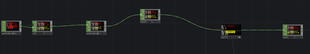
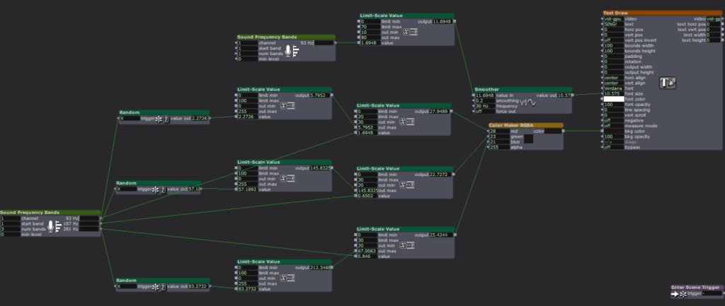
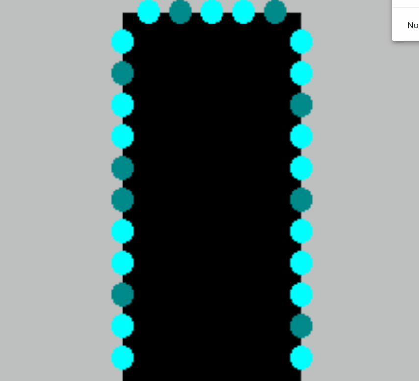
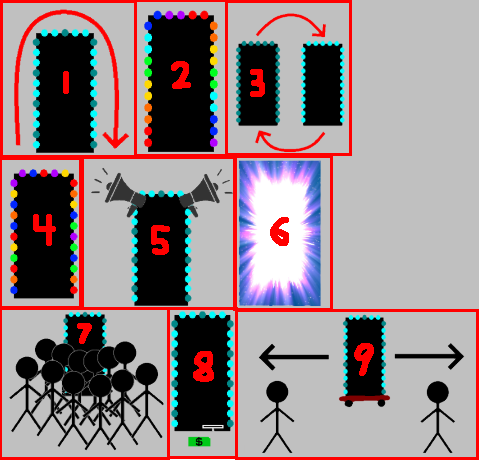
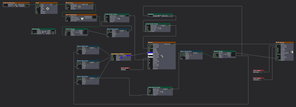
The interaction is built around proximity form the camera and the system. Using Mediapipe inside TouchDesigner, the system estimates the participant’s distance from the camera based on the space between their shoulders. That distance is then mapped into three separate zones: near, mid, and far. Each zone triggers a different audio sequence of a minute long, creating a shifting soundscape as you move through space. The interaction is very simple but it gets complex in what it means.
The zones are not just meant to be spatial, I also intended them to be emotional. The farthest zone holds the ambient sounds from back home. It contains sounds of a place I have very fond memories of, Liberty Market in Lahore. It’s full of life, voices, interesting characters, and movement. It holds the ambient chaos and the unique life of a place that feels familiar when you’ve lived inside it. Underneath it also runs the sound of a dhol, a traditional drum from South Asia which is often played during celebrations and festivals. The recording is from my wedding, which turns it into something both public but also secretly personal.
The middle zone moves closer to the system and my life, into family. My parents asking if I’m okay, telling me to take care of myself, giving blessings in the everyday way they do. There are also scattered pieces of time spent with my siblings, just being together, being absurd and being just us. There is also snippets of my dad telling us a ghost story around a bonfire. All of them are just small moments when they’re happening, but they kind of accumulate weight as time passes, especially now that being together like that is rare.
The closest zone is the most intimate. It has audio of me and my husband. Snippets of our vows, pieces of our wedding song, voice notes he sent me from long distance of him singing to me, and also us singing together. The songs are in Urdu, which is our mother tongue. So music in this case, is not just background. It’s part of how we stayed close across distance before we could be in the same room.
The piece doesn’t guide you or explain itself. You move, and it responds. What you hear depends entirely on how close you choose to stand, how long you stay, whether you move toward something or away from it. That felt like the right way to design this piece because that’s how memories also work: existing in a very non-announcing sort of a way.
I asked someone else if they would like to perform the piece (I didn’t feel like putting myself out there and I thought I would end up crying), and Chad volunteered. That did not go exactly as planned and it annoyed me because he was trying to figure out how the system worked and all of its interactions, and in doing so, he missed half of the experience. I realized I shouldn’t have told someone else to give a performance for something as personal as this project in my stead, because it wasn’t a puzzle meant to be figured out.
So I did what I had to, in order to fix the situation: I performed it myself. I may or may not have cried while creating this, but performing this made me so happy and I felt relieved to have done it “properly”.
The most surprising part was that even people who didn’t understand the language still felt something. Lou told me they got teary-eyed. That meant a lot to me. It showed that the piece wasn’t just about language or culture in a literal sense, but about something deeper, and also obviously about the performance since they did mention that they could tell how much this meant to me while seeing me perform.
If I develop this further, I want the zones to be less blocky, and to be more fluid and abstract, even floating around like memories. But even as it is, I really like this piece because of how much it means to me, and it does feel complete in a different way.
Pressure Project 2: One for All, All for one
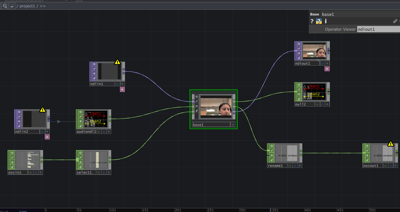
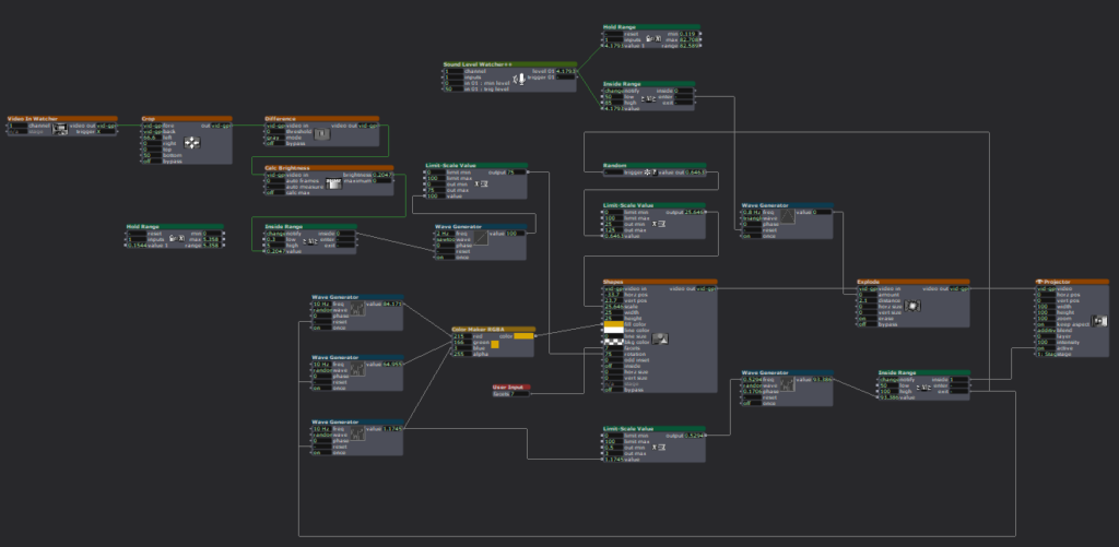
Posted: March 9, 2026 Filed under: Pressure Project 2 | Tags: Pressure Project, Pressure Project 2, touchdesigner Leave a comment »I named my cell One for All, All for One because it is built around the idea that an individual, and communities as a whole are constantly shaping each other. The cell itself is a constan conversation between the oneself and the communal archive. It takes a live video feed and layers it over a slideshow of images showing communities and people from different parts of the world.
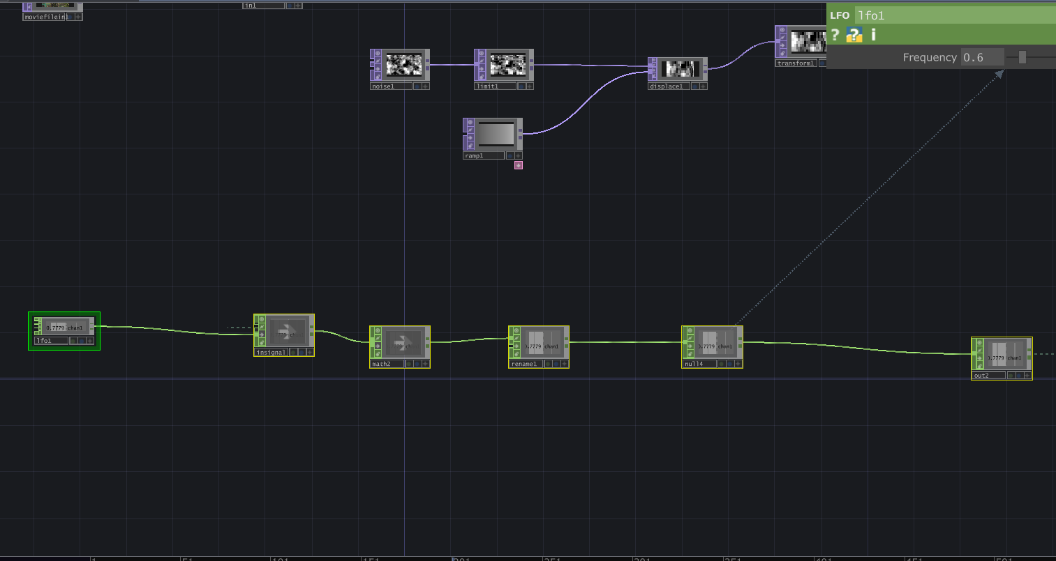
Then interactive sound enters the picture. A glitch effect driven by audio input levels determines how much the live video overlay fractures. The louder the audio, the more the live layer breaks apart and reveals the slideshow underneath. Alongside this, I built in an internal LFO paired with an Edge TOP to create a rhythmic pulse, something I called a “heartbeat”. Even without external input, the system works fine and feels alive.
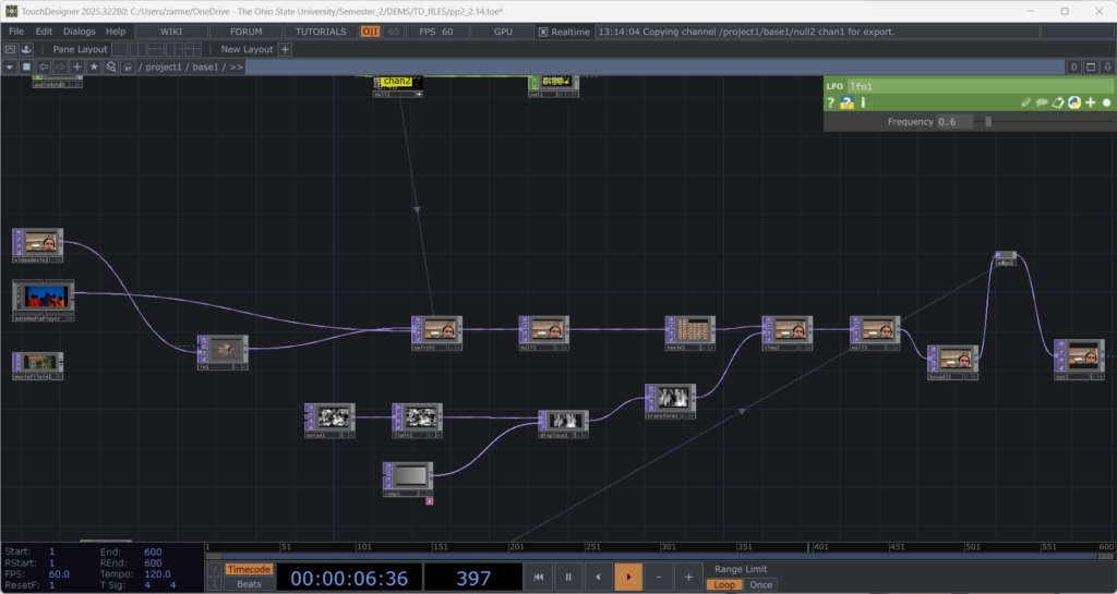
The structure is modular and layered, and honestly not that complicated. There is a live video input, and a media player (which controls the slideshow) which plug into a switch. The output of the switch goes into a glitch system, and a pulse system. Each could be replaced without breaking the overall logic. The audio input, live video input, and the signal (LFO) are designed so that they could be overridden by an external network signal as well. The cell has its own system, but it is designed to connect, following the true concept of one for all, all for one.
Reflection:
When all the cells assembled, things became unstable. Signals were constantly dropping and connections were dying. For a while, I thought something was wrong with my cell because nothing would show up (it was a problem with the input signals I was getting). When I finally got it to work, very interesting emergent behaviors appeared. The glitches danced to different rhythms. Video overlays ended up in very interesting stacked outputs. It was interesting because I did design my system while being aware that it had to be plugged into a bigger system. However, I did not envision the results I got during testing. What I controlled alone became either amplified or distorted by others. The network did not just combine outputs. It reshaped them. I think where my careful planning fell off was the heartbeat. I had not accounted for the fact that other cells can have signals of different types. Instead of a steady pulse, I got an irregular signal input, which changed the whole heartbeat effect. At first it felt like something went wrong. My cell was no longer just reacting to my inputs. It was reacting to everyone. That is exactly what One for All, All for One means. Each cell affects the others. Each signal influences the collective behavior. My cell had a life of its own. In the network, it learned to respond, adapt, and sometimes surrender to the collective.
Project File: pp2_Zarmeen.zip
Pressure Project#1: Pitch, Please.
Posted: February 10, 2026 Filed under: Pressure Project I | Tags: Interactive Media, Isadora, Pressure Project, Pressure Project One Leave a comment »Description: Pitch, Please is a voice-activated, self-generating patch where your voice runs the entire experience. The patch unfolds across three interactive sequences, each translating the frequency from audio input into something you can see and play with. No keyboard, no mouse, just whatever sounds you’re willing to make in public.
Reflection
I did not exactly know what I wanted for this project, but I knew I wanted something light, colorful, interactive, and fun. While I believe I got what I intended out of this project, I also did get some nice surprises!
The patch starts super simple. The first sequence is a screen that says SING! That’s it. And the moment someone makes a sound, the system responds. Font size grows and shrinks, and background colors shift depending on frequency. It worked as both onboarding and instruction, and made everyone realize their voice was doing something.
The second sequence is a Flappy Bird-esque game where a ball has to dodge hurdles. The environment was pretty simple and bare-bones, with moving hurdles and a color-changing background. You just have to sing a note, and make the ball jump. This is where things got fun. Everyone had gotten comfortable at this point. There was a lot more experimentation, and a lot more freedom.
The final sequence is a soothing black screen, with a trail of rings moving across the screen like those old screensavers. Again, audio input controls the ring size and color. Honestly, this one was just made as an afterthought because three sequences sounded about right in my head. So, I was pretty surprised when majority of the class enjoyed this one the best. It’s just something about old-school screensaver aesthetic. Hard to beat.
What surprised me most was how social it became. I was alone at home when I made this and I didn’t have anyone test it so, it wasn’t really made with collaboration in mind, but it happened anyway. I thought people would interact one at a time. Instead, it turned into a group activity. There was whistling, clapping and even opera singing. (Michael sang an Aria!) At one point people were even teaming up, and giving instructions to each other on what to do.
When I started this project, I had a very different idea in my mind. I couldn’t figure it out though, and just wasted a couple hours. I then moved on to this idea of a voice controlled flappy-duck game, and started thinking about the execution it in the most minimal way possible (because again, time). This one took me a while, but I reused the code for the other two sequences and managed to get decent results within the timeframe. There’s something about knowing there is a time limit. It just awakens a primal instinct in me that kind of died after the era of formal timed exams in my life ended. In short, I pretty much went into hyperdrive and delivered. I’m sure I would’ve wasted a lot more time on the same project if there was no time limit. I’m glad there was.
That said, could it be more polished? Yes. Was this the best I could do in this timeframe? I don’t know, but it is what it is. If I HAD to work on it further, I’d add a buffer at the start so the stage doesn’t just start playing all of a sudden. I would also smooth out the hypersensitivity of the first sequence which makes it look very glitchy and headache-inducing. But honestly, with the resources that I had, Pitch, Please turned out decent. I mean, I got people to play, loudly, badly, collaboratively, and with zero shame, using nothing but their voice. Which was kind of the whole point.
Pressure Project 2: Japanese Sign
Posted: October 18, 2025 Filed under: Uncategorized | Tags: Pressure Project Leave a comment »As soon as I heard the requirements for this pressure project, I immediately knew I wanted to use a livestream. Not because I didn’t want to physically observe people in the real world, but because a livestream allowed me to go anywhere in the world. This seemed like a great idea, until I started looking for livestreams. I actually found a playlist of Japanese livestreams on YouTube and as I was going through them I realized one major flaw: there really weren’t many interactive systems to observe.
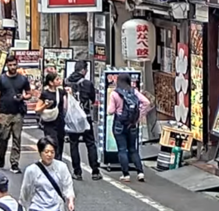
There was a famous livestream of a major Tokyo intersection, but this seemed too unpersonal and generic. A smaller intersection, while more personal, was still just as generic. Although as a note, barely anyone ever jaywalked in the streams I watched, even when there were clearly no cars at all. I ended up going with a stream of people walking down a street. There were shops, restaurants, many signs, and it all looked very… Japanese. I chose this one because, on top of looking very characteristic for Japan, there was a sign in a great location for observing. Additionally, I watched from 12-1pm (their time) so there was a lot of activity happening. See below for the sign in a screenshot of the livestream.
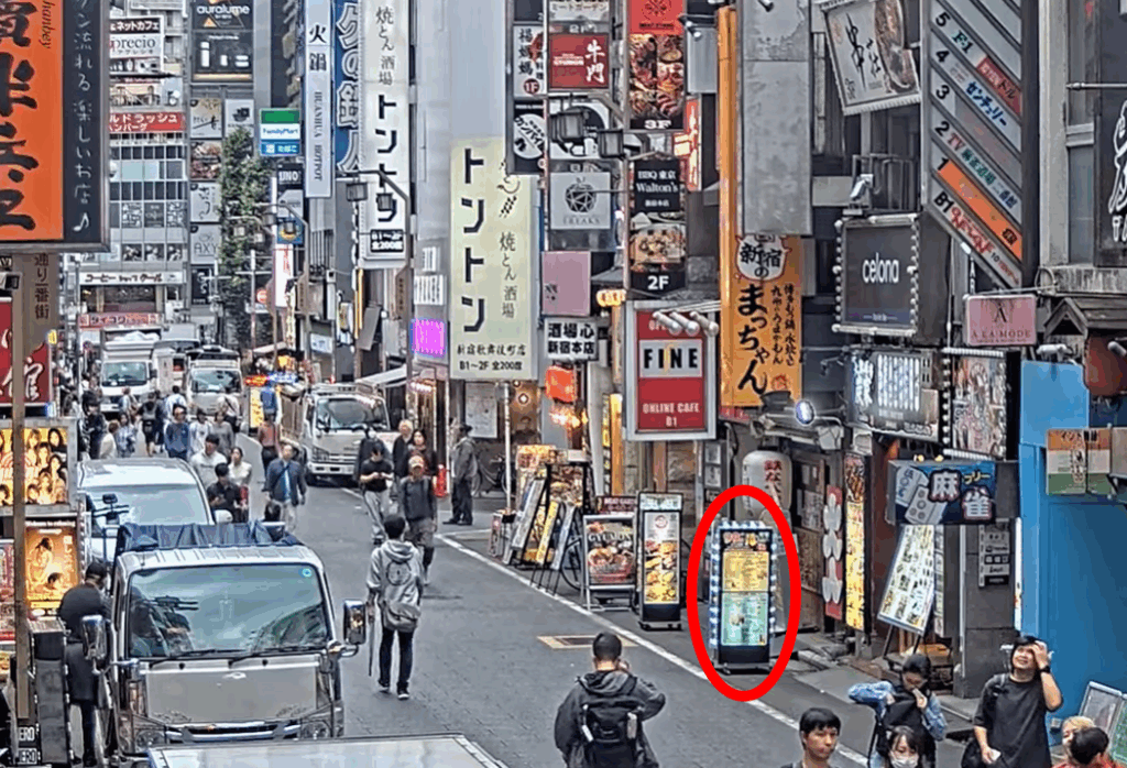
What made this sign a good candidate to observe though? Firstly, as I said above, it’s framed in a way where you can tell when people interact with the sign. Many of the other signs aren’t on street level, and sense we can’t see the exact location people’s eyes are looking, you can’t tell which sign they are looking at. The sign being on the ground makes it very clear when people look at it. Next, although you can’t really tell in the screenshot, this sign has lights around it that flash in a particular way. This was the “system” what people would interact with. Below is a mockup of exactly what the flashing light pattern looked like:
Now you may be thinking, is this really an interactive system? Perhaps it’s a bit of a stretch but first let’s cover how people interacted with this sign and signs in general. In my opinion, there are four key interactions:
Interaction #1:
A person doesn’t even see the sign. This is the worst case scenario. Either our potential observer was too busy looking at their phone or was in a rush to get through the street who knows, but in the end our sign made no influence on them at all… 🙁
Interaction #2:
A person sees the sign but doesn’t look. This is what I believe to be the most common interaction. I know I said the first type of interaction was worst case scenario, but in a way this one feels worse. People could tell there was a sign there, maybe even glanced at it to see what it was, but the sign’s existence was so ambivalent to them they simply didn’t care to look further.
Interaction #3:
A person sees and processes what is going on with the sign but does not stop walking. This is a great improvement over the first two interactions. People become so interested in the sign that they become curious of what it is. This interaction comes in a range but has an ideal scenario: the head turn. If someone turned their head to read the sign, that means it was so interesting to them, that up until the point where they physically could not see the sign anymore, they were still looking. There is room for improvement here though, as these people still walked by the sign when the time came.
Interaction #4:
A person stops to look at the sign. This is the best case scenario. A person was so interested in the sign, that whatever reason they were walking for become overridden. They must learn more about this sign. This is the only acceptable scenario. I will now redesign the sign to accomplish this goal… 🙂
Simple Changes
Assuming we want to keep things tame with the changes, let’s focus on the lights before adding new components.
Possible Change #1:
Make the light pattern more coherent and interesting. In the mock-up above, you can see the light pattern may vaguely be in a clockwise pattern, but adding more states and making it a clearly clockwise pattern could make people more likely to look, if just to see the pattern.
Possible Change #2:
Add more colors. A pattern of on/off is alright, but a pattern of different colors is definitely more likely to get people’s attention. This also adds an entire new layer to the lights, and that added complexity could keep people’s gaze longer.
Possible Change #3:
Make the pattern flashy. If the pattern has many lights on and then off in quick succession, people may be more likely to look. Especially someone who isn’t really paying attention as a sudden burst of activity may steal their focus.
Intense Changes
The simple changes are largely superficial. While they may get people to look more often and for longer, they’re less likely to get people to stop, which of course is the only goal that matters.
Possible Change #4:
Add many varied colorful and random patterns. The idea here is that there are just so many crazy lights and patterns and flashes occurring that people can’t possibly understand everything happening in the time it takes to walk down the street. People will have to stop in order to get the full pattern, if there even is one.
Possible Change #5:
Added speakers and proximity detectors to the sign. A speaker that just makes noise could get people to glance over, but if the audio is proximity based and makes noise depending on people’s distance to the sign, the personal aspect is more likely to get people to actually stop. The sign could say things like “Look at me!” or “You there, stop immediately!” in reaction to someone getting close to the sign and in many scenarios that person will stop.
Possible Change #6:
Makes the lights extremely bright. Now maybe this could have the opposite effect as people can’t look at the something that’s too bright because it hurts, but a light that is extraordinarily bright could cause people to stop in surprise. Although again looking away is not ideal, even if they stop.
Stop Them No Matter What
It’s still possible that the above changes won’t stop people. But what can we do to ensure that people stop no matter what?
Possible Change #7:
Add a fake crowd of people in front of the sign. It should really look like everyone wants to see this sign. How could anyone walking down the street resist the intrigue of what they could be looking at? They may even join the crowd and then strengthen its attraction towards other people…
Possible Change #8:
Add a piece of currency on the ground in front of the sign that is on a string. When people try to grab the money, the sign retracts it back into itself. The act of having to bed down and ground the string will stop someone, and then after they are stopped, they’ll likely look at the sign either in intrigue or confusion.
Possible Change #9:
All other changes have a chance of failure. In this change, a motorized system is added to the sign’s wheels that allow it to move back and forth freely. A motion detector tracks people’s movement and moves the sign to block people’s path so they physically must stop and look at the sign. This is the ultimate solution. I suggest all sign manufacturers invest immediately!
After presenting, the class discussed a few things that are worth noting. It was questioned if people are really “interacting with an automated computer system” by simply looking at a sign, however the changes I made, especially ones related to proximity, easily bring the system as a whole up to that specification. In terms of a less invasion approach, proximity lights were brought up as a possible idea. I kind of had moved this idea to the audio but it could easily work with lights as well. For example, maybe the color changes depending on your distance to the sign or maybe more and more lights turn on the closer you get. Either of these could definitely get a person to stop, especially if they notice that they are the ones controlling the lights.
This was definitely a fun project. I was a little disappointed that I couldn’t find something more interesting in a livestream, but I was satisfied with how I was able to spin something extremely simple into something a bit more complex.
Pressure Project 1: Bouncing Idle Screen
Posted: October 15, 2025 Filed under: Uncategorized | Tags: Isadora, Pressure Project Leave a comment »The idea for this pressure project came to me based on the “achievements” that Alex gave us to work towards. At first I was concerned about how I could possibly keep an audience engaged for over 30 seconds with something non-interactive. But then I thought about something completely noninteractive that does keep people engaged, and that’s the DVD bouncing idle screen. I specifically remember doing this myself whenever I saw it, but I knew other people liked doing it too from seeing it in internet memes or referenced in pop culture. This idea seemed perfect as it could definitely be done within Isadora.
The only issue was that it didn’t feel like it would be enough work for 5 hours. I then decided that because this idle screen plays on a TV, I could simulate someone changing channels. My first thoughts for other channels were full static and the color bars as obviously I can’t animate anything too complex (although maybe a live feed camera could have worked…). This was when I started creating the project in Isadora.
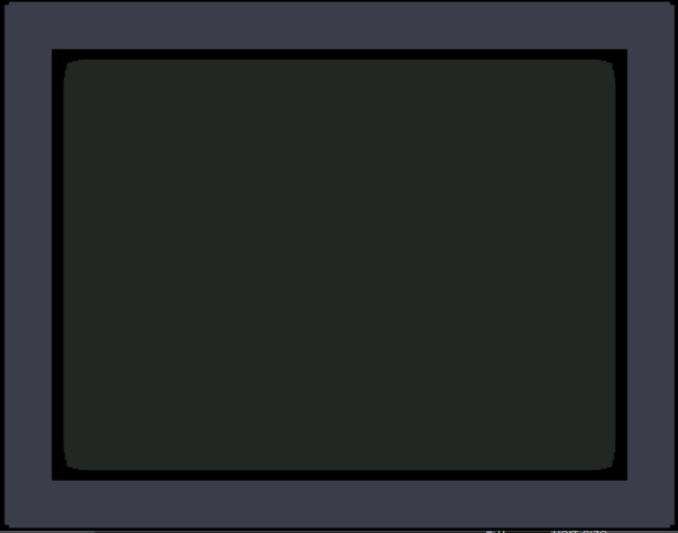
The first thing I made was the TV. I wanted an actual TV to be visible instead of just using the edges of the stage because it looks nicer but also because it just makes it feel more authentic. I also wanted it to be in the classic 4:3 resolution that old CRT TVs had. Another aspect of these older TVs that I wanted to emulate was the curved corners of the screen (technically the entire screen is bulging out but this is a 2D representation). With that plan in mind, I created the first TV with two boxes: the outer TV casing and the screen. I made the outer casing a darkish grey hue and the screen was a sort of dark grey/green thing that I associate with turned-off TVs of this type (the screen also has a thick black border so the entire thing doesn’t go from outer casing to the screen). The first issue came with adding the curved corners of the screen. The best way I could figure out how to do this was to use a shape with odd insets as that was the closest thing to a negative space curve. The issue with this however, was that it couldn’t be layered under border while on top of the screen, as those were both being represented by a single square. See below:
To solve this, I recreated the border casing as 4 individual rectangles so that the layering would allow the corner shape to be on top of the screen and under the border. The also allowed the entire TV itself to have softer edges as the rectangles ended up not perfectly flush. The TV was also made into a user actor where the color of the screen was controllable. The completed turned-off TV is below:
Next was to make the main attraction: the bouncing idle screen. The first thing I did was create a default white square. I used two wave generators for its vertical and horizontal position, with the wave generators in triangle mode as the movements should constant the entire time. To my surprise, this immediately worked in making the square bounce around the screen exactly as I wanted, the only exception is that it was bouncing around the borders of the entire stage. After some scaling and position subtracting (mostly done through trial and error) the square correctly bounced within the TV.
Now that I have something bouncing, it’s time to make that thing change colors every time it hits as edge. I did this by using an inside range actor connected to the wave generators. Every time the wave generators left the range of 0.5 – 99.5 it sent out a signal. This perfectly corresponds to when the shape bounces off a wall. I then connecting this signal to three random actors and connected those to a color maker RGBA actor’s red, green, and blue values to generator a random color for the shape. Now every time the square bounces off a wall, it also changes color.
The final thing I needed to do was replace the default square shape with something else. I didn’t want to recreate the original exactly, so I replaced the “DVD” text with “ACCAD” and just put a small empty oval underneath it similar to the original. I turned this into a user actor to simplify the views and after a few more operations it looked great. See below:

I was extremely happy with how this turned out, but I still needed a bit more to complete the project. The next thing I created was the static screen. At first I wanted it to be as accurate as possible by having a large number of shapes act as pixels, but this quickly showed to be not possible. At one point I had over a hundred little “pixels” that would get a random black and white color and position in the screen but the lag this caused was too great to continue. Not to mention the fact that it looked horrible! I then briefly thought about using several images of static screen and cycling between them, but I couldn’t remember how to display and swap images and this seemed like the easy approach any way. I ended up using a couple dozen large “pixels” to simulate a sort of static. By coincidence, they ended up in a similar pattern to how the color bars looked and so I was satisfied enough. The squares simply get a random black and white color in a pretty fast frequency. See below:

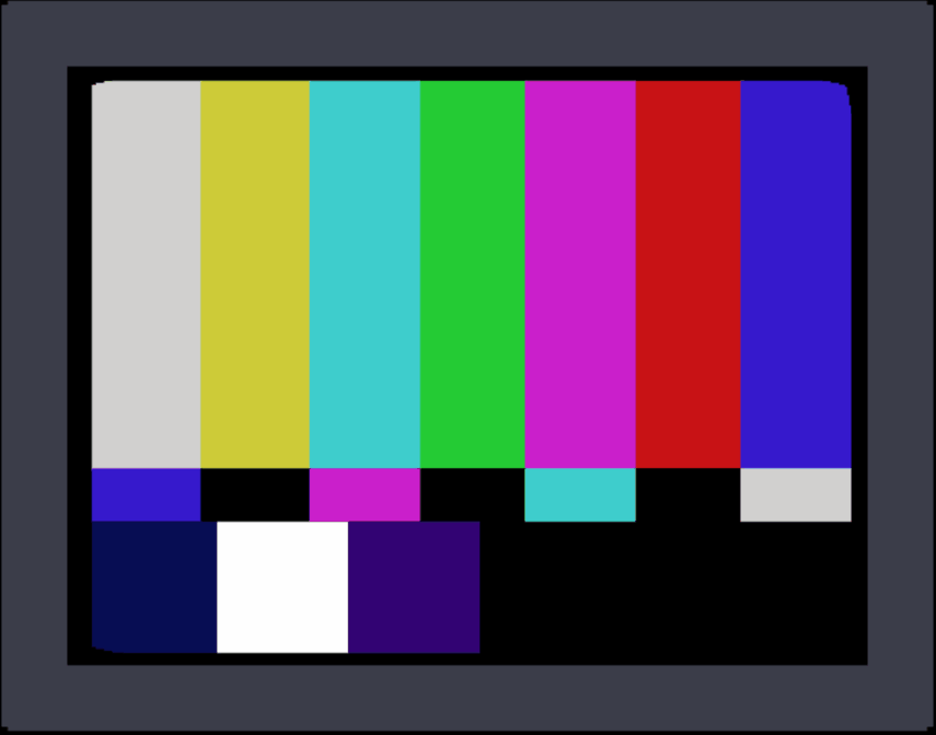
The last screen I made was the color bars. This was very simple as it was just static colors, although getting the exact correct positions was a little annoying sometimes.
Finally, I decided to simulate the TV turning off as it felt like a pretty iconic old TV action and a satisfying conclusion. For this animation, I used two wave generators set to sawtooth and to only play once. One wave generator squishes a big white square vertically into a line, and then the other squishes it horizontally until it’s gone. The end result was surprisingly satisfying! See below for the color screen into turning off:
Now that I had all the scenes complete, I needed to link them together. For the idle screen, I decided to start a counter for the number of times it bounces off the top or bottom wall. After 20 bounces it switches to static. For both static and the color bars I simply had a pulse generator activating a counter to switch after an amount of pulses. There was probably a better way to do this, but I was running out of time and there was one more thing I wanted to do.
The very last thing I added was channel text to the corners of the static and color bar scenes. This would further signify that this was a TV the viewer was looking at. Ideally, this would be solid and then slowly fade away, but given the time crunch it was just a very slow constant fade. Because these scenes only play briefly, it isn’t too noticeable.
The complete (although slightly shortened) result can be seen below:

The feedback I received on this project was amazing! I seemed like everyone made at least some noise while it was playing. One person said they were getting physically engaged in the idle bounces. Some people didn’t realize it was a TV until it changed channels which actually surprised me as it seemed obvious given the context of the idle bouncing. I hadn’t thought about how someone who wasn’t completely familiar with it wouldn’t know what was happening or what the border was supposed to represent. I was extremely happy when someone pointed out the curved corners of the screen as I thought nobody would even notice or care about it. There were also feelings of nostalgia and anticipation among the viewers as well.
This pressure project was a ton of fun! Isadora is just a blast to create things with and pushing its capabilities is something I loved exploring. If I had more time, I definitely could have done a lot more with this project, but I’m looking forward to creating more interactive experiences in future projects!
Pressure Project 1 – Interactive Exploration
Posted: February 4, 2025 Filed under: Uncategorized | Tags: Interactive Media, Isadora, Pressure Project Leave a comment »For this project, I wanted to prioritize joy through exploration. I wanted to create an experience that allowed people to try different movements and actions to see if they could “unlock” my project, so to say. To do this, I built motion and sound sensors into my project that would trigger the shapes to do certain actions.
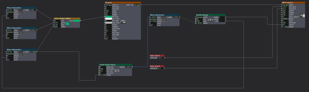
Starting this project was difficult because I didn’t know what direction I wanted to take it, but I knew I wanted it to have some level of interactivity. I started off small by adding a User Input actor to adjust the number of facets on each shape, then a Random actor (with a Limit-Scale Value actor) to simply change the size of the shapes each time they appeared on screen. Now it was on.
I started building my motion sensor, which involved a pretty heavy learning curve because I could not open the file from class that would have told me which actors to put where. I did a lot of trial-and-error and some research to jog my memory and eventually got the pieces I needed, and we were off to the races!
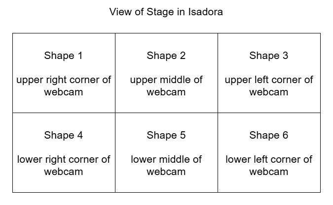
A mockup diagram of which section of the motion sensor is attached to each shape. The webcam is mirrored so it is actually backwards, which made it difficult to keep of which portion of the sensor attached to which shape.
Figuring out the motion sensor from scratch was just the tip of the iceberg; I still needed to figure out how to implement it. I decided to divide the picture into six sections, so each section triggered the corresponding shape to rotate. Figuring out how to make the rotation last the right amount of time was tricky, because the shapes were only on-screen for a short, inconsistent amount of time and I wanted the shapes to have time to stop rotating before fading. I plugged different numbers into different outputs of a Wave Generator and Limit-Scale Value actor to get this right.
Then it was time to repeat this process five more times. Because each shape needed a different section for the motion detector, I had to crop each one individually (making my project file large and woefully inefficient). I learned the hard way how each box interacts and that not everything can be copied to each box as I had previously thought, causing me to have to go back a few times to fix/customize each shape. (I certainly understand the importance of planning out projects now!)
I had some time left after the motion sensor was done and functional, so I revisited an idea from earlier. I had originally wanted the motion sensor to trigger the shapes to explode, but realized that would likely be overwhelming, and my brain was melting trying to get the Explode actor plugged in right to make it work. Thus, I decided on an audio sensor instead. Finding the sweet spot to set the value at to trigger the explosion was difficult, as clapping and talking loudly were very close in value, so it is not a terribly robust sensor, but it worked well enough, and I was able to figure out where the Explode actor went.
I spent a lot of time punching in random values and plugging actors into different inputs to figure out what they did and how they worked in relation to each other. Exploration was not just my desired end result; it was a part of the creative process. For some functions, I could look up how to make them work, such as which actors to use and where to plug them in. But other times, I just had to find the magic values to achieve my desired result.
This meant utilizing virtual stages as a way to previsualize what I was trying to do, separate from my project to make sure it worked right. I also put together smaller pieces to the side (projected to a virtual stage), so I could get that component working before plugging it into the rest of the project. Working in smaller chunks like this helped me keep my brain clear and my project unjumbled.
I worked in small chunks and took quick breaks after completing a piece of the puzzle, establishing a modified Pomodoro Technique workflow. I would work for 10-20 minutes, then take a few minutes to check notifications on my phone or refill my water bottle, because I knew trying to get it done in one sitting would be exhausting and block my creative flow. Not holding myself to a strict regimen to complete the project allowed me the freedom to have fun with it and prioritize discovery over completion, as there was no specific end goal. I think this creative freedom and flexibility gave me the chance to learn about design and creating media in a way I could not have with a set end result to achieve because it gave me options to do different things.
If something wasn’t working for me, I had the option to choose a new direction (rotating the shape with the motion sensor instead of exploding them). After spending a few hours with Isadora, I gained confidence in my knowledge base and skill set that allowed me to return to abandoned reconsidered ideas and try them again in a new way (triggering explosions with a sound sensor).
I wasn’t completely without an end goal. I wanted to create a fun interactive media system that allowed for the discovery of joy through exploration. I wanted my audience to feel the same way playing with my project as I did making it. It was incredibly fulfilling watching a group of adults giggle and gasp as they figured out how to trigger the shapes in different ways, and I was fascinated watching the ways in which they went about it. They had to move their bodies in different ways to trigger the motion sensors and make different sounds to figure out which one triggered the explosions.
Link to YouTube video: https://youtu.be/EjI6DlFUof0
Pressure Project 3: Puzzle Box
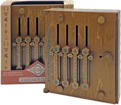
Posted: April 2, 2024 Filed under: Uncategorized | Tags: Isadora, Pressure Project, Pressure Project 3 Leave a comment »Well uh the thing is is that the project didn’t work. The idea was for a box to have a puzzle entirely solvable without any outside information. Anyone with any background can have a fair chance at solving the puzzle. So, because I am not a puzzle making extraordinaire, I had to take inspiration from elsewhere. It just so happens that a puzzle with just those requirements was gifted to me as a gift from my Grandpa. It is called a Caesar’s Codex. The puzzle works by presenting the user with a four rows of symbols that can slide up and down then right next to it is a single column of symbols. Then on the back is a grid full of very similar symbols to the ones with the four rows. Finally, their are symbols on the four sides that are similar to the ones on the column next to the four rows.
Now the challenge is to get this fully mechanical system to interact with the user interface created in Isadora. The solution was to use a Makey Makey kit. So the wat the user moves the pieces to solve the puzzle needed to change, but the hints to solve the puzzle needed to stay the same. The mechanical puzzle requires flipping the box over constantly to find the right symbol on the grid and then flip it over again to move the row to the right position. I opted to just have the grid portion be set up to directly solve the puzzle.
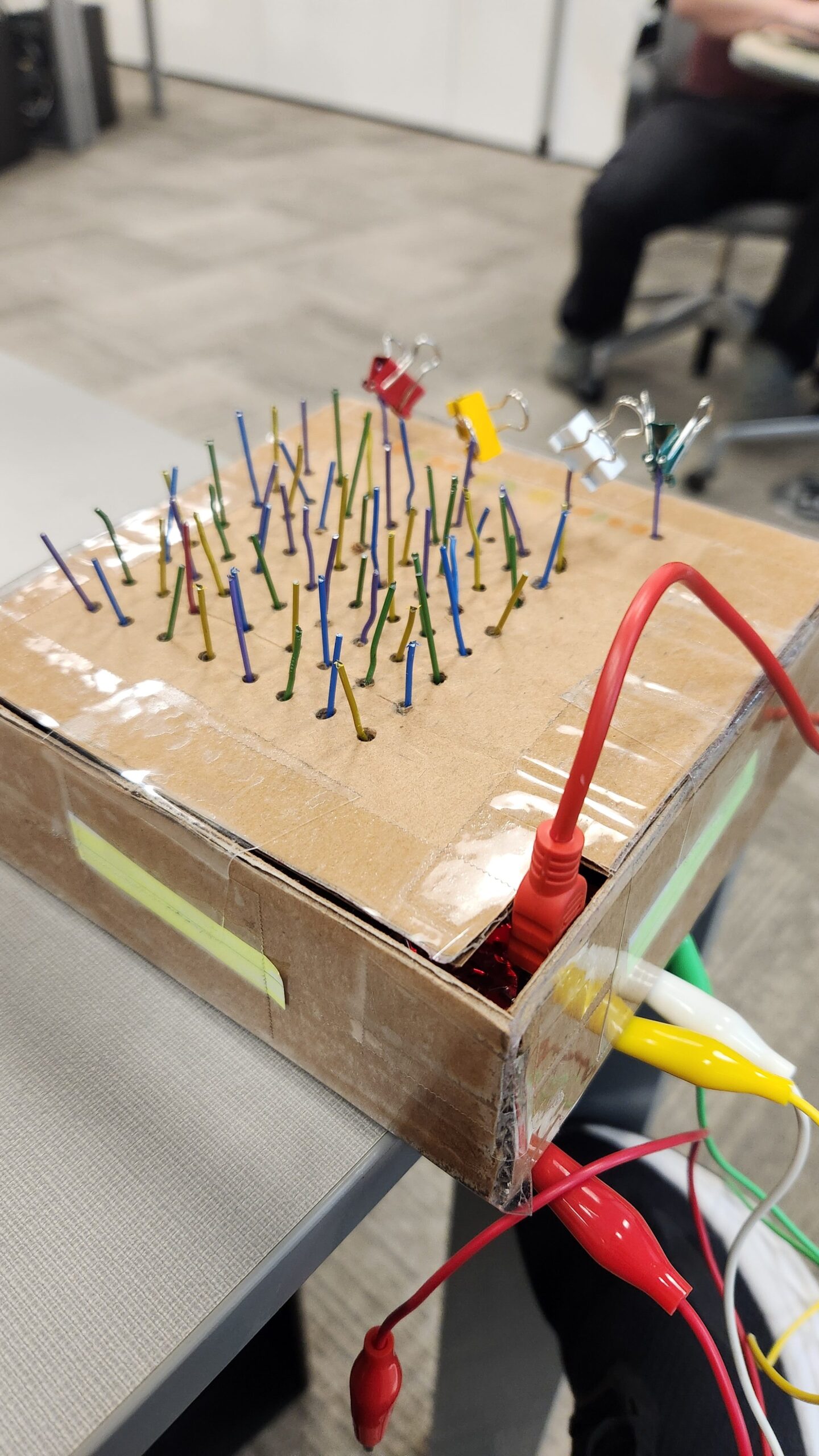
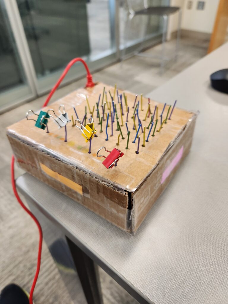
The paperclips are aligned in a grid like pattern for the users to follow. There is one unique paperclip color to indicate the start. The binder clips are used to indicate when an alligator clip needs to be attached to the paperclip. When the alligator clip is attached to the right paper clip, the screen shown on Isadora will change. Unfortunately, I never tested whether or not the paperclips were conductive enough. I assumed they would, but the coating on the paper clips was resistive enough to not allow a current to flow through them. So, lesson learned, always test everything before it is too late to make any changes, or you make your entire design based on it.
Pressure Project 3
Posted: March 28, 2024 Filed under: Uncategorized | Tags: Pressure Project Leave a comment »A Mystery is Revealed | Color By Numbers
Initially, I began this project with uncertainty about the mystery I wanted to explore. Reviewing past student work, I stumbled upon a personality test concept that intrigued me, expanding my understanding of what constitutes as a mystery.
Following my usual design process, I sought inspiration from Pinterest and various design platforms. A comic called “Polychromie” by artist Pierre Jeanneau caught my attention, particularly its use of anaglyph—a technique where stereo images are superimposed and printed in different colors, creating a 3D effect when viewed through corresponding filters. I was intrigued by how the mystery unfolded depending on the filter used.


While exploring the feasibility of implementing anaglyph on web screens, I encountered challenges due to my unfamiliarity with the term. Nonetheless, I pivoted towards a “color by numbers” concept, drawing inspiration from “Querkle,” a coloring activity based on circular designs developed by graphic designer Thomas Pavitte, who drew inspiration from logos designed using circles.

For practicality and time constraints, I chose simple images and creted them using Adobe Illustrator, layering the circles into colorable sections. Using MakeyMakey for interaction and Isadora’s Live Capture for audio cues, I facilitated engagement. Additionally, I devised a method using MakeyMakey and alligator clips for answering multiple-choice questions.
Implementing keyboard watchers, trigger values, and jump++ actors, I orchestrated transitions between scenes in the patch, ultimately unveiling the mysteries.


PP3 – Scarcity & Abundance
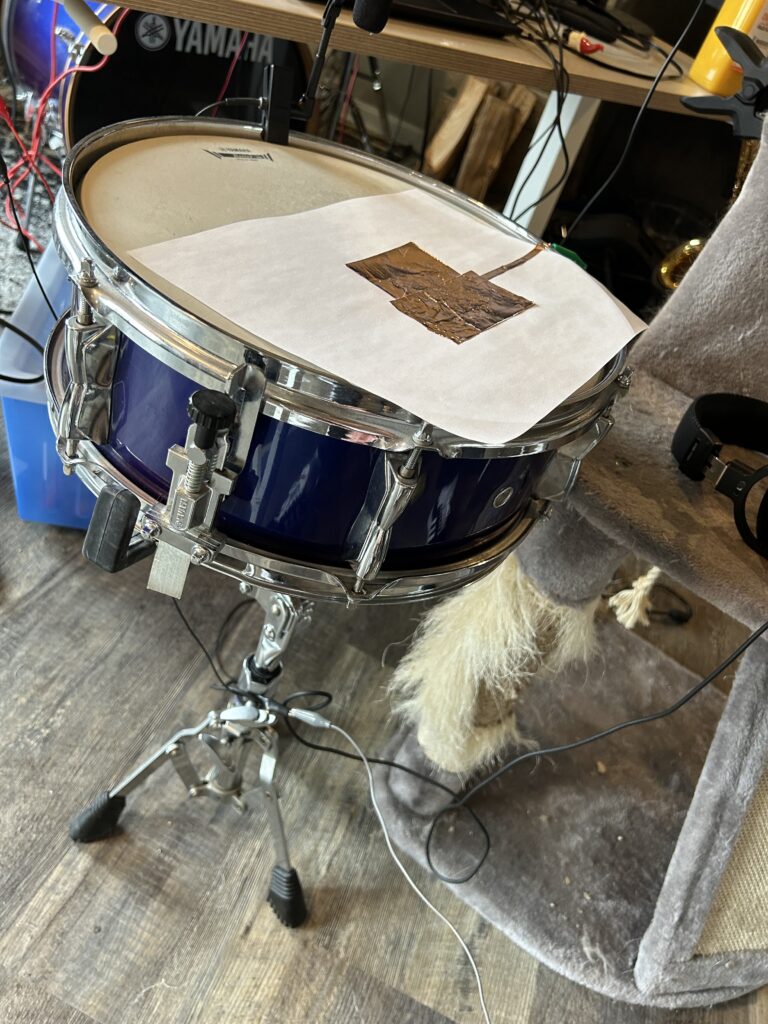
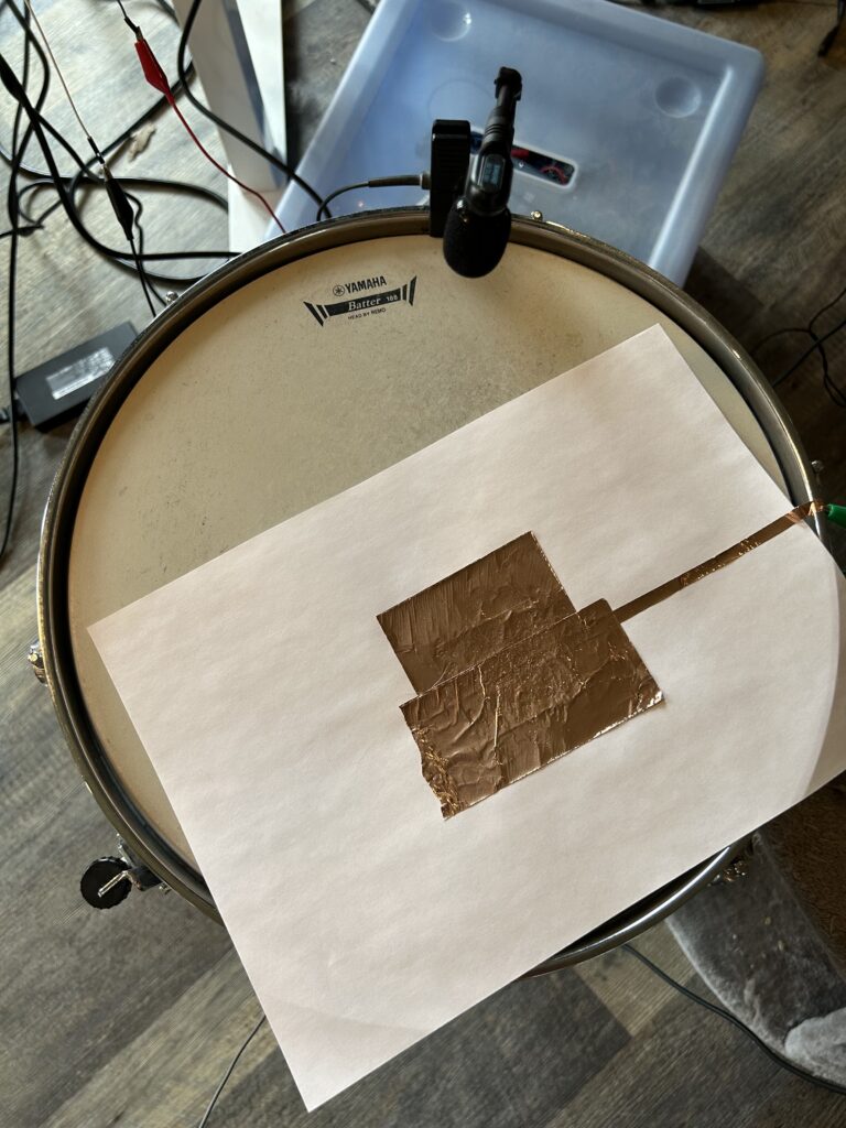
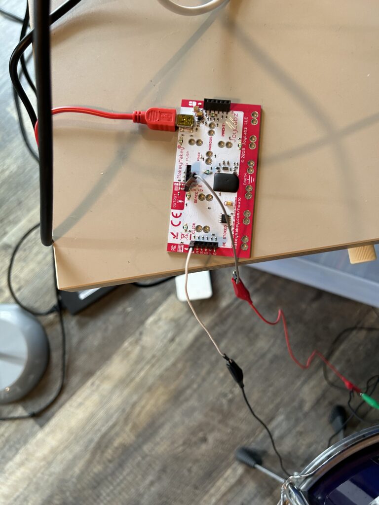
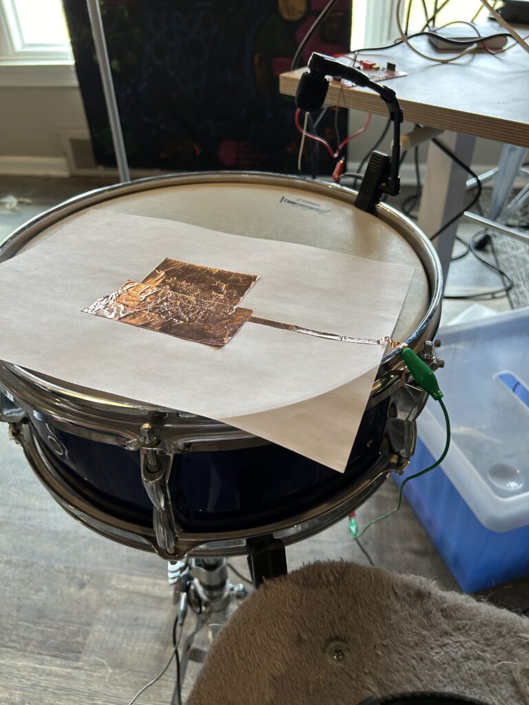
Posted: March 4, 2024 Filed under: Uncategorized | Tags: Pressure Project Leave a comment »This project began with the idea to use a snare drum as a control event in relation to the Makey Makey device and Isadora. With the prompt of ‘a surprise is revealed’, I wanted to explore user experiences involving sharp contrasts in perspective through two parallel narratives. One narrative (‘clean path’) contains imagery suggestive of positive experiences within a culture of abundant resources. The second narrative (‘noisy path’) includes imagery often filtered out of mainline consciousness as it is a failure byproduct within the cultures of abundant resources. By striking the snare drum in accordance with an audible metronome, the user traverses a deliberate set of media objects. In photo based scenes, there is a continuum of images scaled from most to least ‘noisy’. Hitting the drum in synchronous with the metronome will enhance the apparent cleanliness of the image. While hitting off beat renders the reverse effect giving more noisy or distasteful images. In video based scenes, two videos were chosen which illustrate opposing viewpoints and similarly, the timing of drum beats alters the display of positive or negative imagery.
The first images are of random noise added to a sinusoid. A Python script was written to generate these images and an array of noise thresholds were selected to cover the variation from a pure sinusoid to absolute random noise. This serves as a symbol for the entire piece as Fourier mathematics form the basis for electrical communication systems. This theory supports that all analog and digital waveforms can be characterized by sums of sinusoids of varying frequency and amplitude. As such, all digital information (video, image, audio…) can be represented digitally in the form of these sinusoids for efficient capture, transmission, and reception. In the digital domain, often unwanted signal artifacts are captured during this process, so digital signal processing (filtering) mechanisms are incorporated to clean up the signal content. Just as filtering adjusts signal content from the binary level of media objects, it exists at higher computing levels, most notably algorithmic filtering in search engine recommendation, social media feeds, and spam detection in email inbox to name a few. Further, on the human cognitive level, societies with abundance of resources may be subjected to the filtering out of undesirable realities.
One such undesirable reality is that of consumer waste which is conceptually filtered through the out of sight, out of mind tactic of landfills. Even when in sight, such as in a litter prevalent city, the trash may be filtered out cognitively just as is done by audible ambient noise. The grocery store shopping and landfill scenes serve to illustrate this concept. The timelapse style emphasizes the speed and mechanicalness at which the actions of buying colorful rectangular food items and compressing massive trash piles occur. Within the system of food consumption, this video pair the familiar experience of filling up a cart at the grocery store with the unfamiliar afterthought of where those consumables are disposed.
The third scene takes influence from Edward Burtynsky’s photography of shipbreaking in countries like Pakistan, India, and Bangladesh in which a majority of the worlds ships and oil tankers are beached for material stripping. These countries are not abundant in metal mines and their economies are dependent on reception of ships for recyclability of iron and steel. The working conditions are highly dangerous involving toxic material exposure and regular demolition of heavy equipment which dehumanize workers and cause environmental damage. This video is contrasted by an advertisement for Carnival cruise line and a family enjoying the luxury of vacationing at sea on a massive boat containing a waterpark and small rollercoaster. This scene reveals an excessive leisure experience available to those in areas of abundance and the disposal process when these ships are no longer of use. Further emphasizing the sentiment of ‘what is one man’s trash is another man’s treasure’.
The last scene includes a series of screenshots taken from Adobe photoshop showing the digital transformation of a pregnant woman into a slim figure. Considering the human body as having an ideal form, akin to that of the pure sinusoid, manual and automated photoshop tools provide ways to ‘cleanup’ individual appearance to a desired form. With body image insecurity, obesity, and prevalence of cosmetic surgeries pervading the social consciousness of abundance societies, this scene registers the ease at which these problems can be filtered away.
The choice of the drum and metronome as a control interface is designed to reconstruct the role that conformity plays in decision making and exposure to alternate perspectives. It is suspected that most users will hit the drum on beat because that is what sounds appealing and natural. Here the metronome represents the social systems underpinning our formation of narratives around consumption and self identity. With the design of this media system, it is possible for the user to only experience positive imagery so long as they strike in phase with the metronome. But for those daring to go against the grain and strike off beat, they are greeted by a multitude of undesirable realities. It is my hope that in participating with this media system, that users realize the role that digital systems play in shaping perceptions as well as how our the style of our interactions alter the possibilities on what can be seen.
Resources used in this project:
- Makey Makey
- Snare Drum
- Copper Tape
- Drum Stick
- Isadora
- 10 Hours of time
Media Artifacts Used:
Otherworldly Experience
Posted: February 8, 2024 Filed under: Uncategorized | Tags: Pressure Project, Pressure Project 2 Leave a comment »This room is one of the first rooms I experienced. It is immediately after the room that Rick rolls guests and allows them to mess with other guests throughout the facility. It is a dimly lit room with three ominous human sized capsules. They all surround a giant sphere suspended in the air with what looks like wires from each of the capsules leading into it.
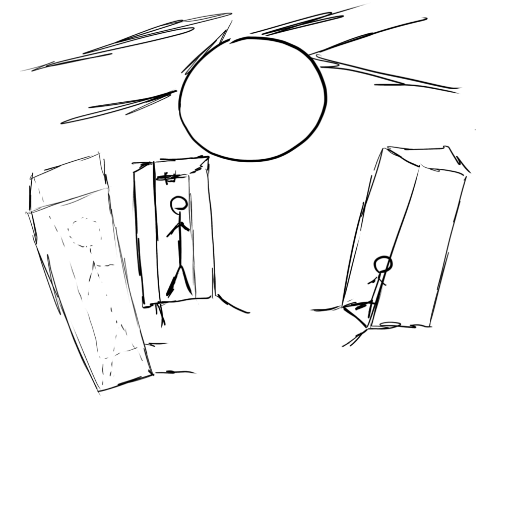
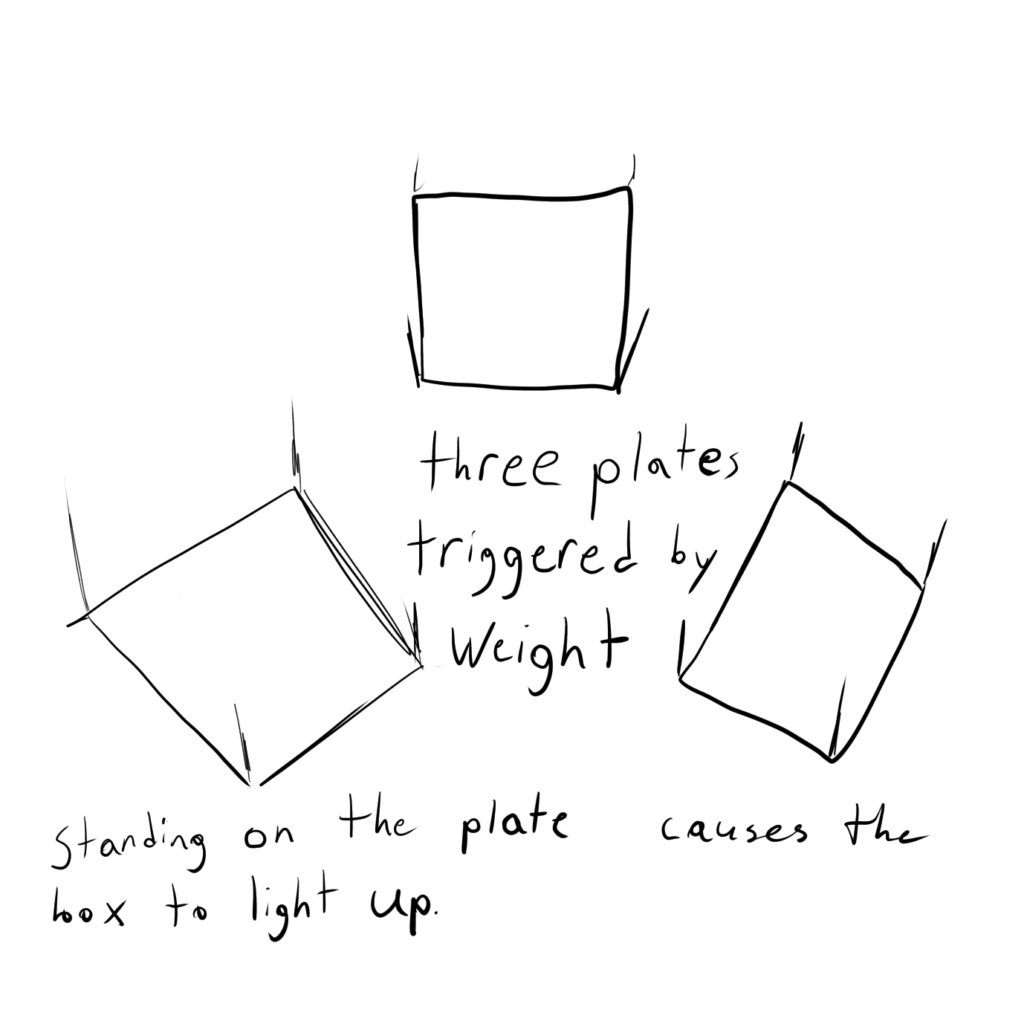
The capsules are really eye catching so many guests that entered the room immediately walked into them to check it out. Then they hear a noise in the pod and can see the side light up. This prompted nearly all of them to go looking for other people nearby to fill the other two pods to see what may happen. Once three people are standing in the pods They begin to flash black and white as well as the lights leading to the orb. At the same time a noise that sounds like static electricity is whirling around the room. Finally, the room goes dark and all is quiet then the guests standing in the pods are sprayed with gusts of air. Caught off guard, the guests let out a scream or flee from the container.
There is not much I would want to redesign with how the system is able to capture people’s attention and clearly convey what needs to be done to activate. So, what I would add would be some sort of fog like effect that is also ejected with the puff of air as well as maybe tone down the air pressure, but keep it spraying for longer. This would hopefully make it a bit less of a jump scare and make it seem cooler when the guest leaves the pod.