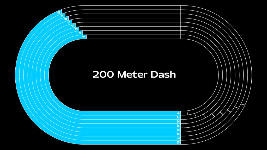
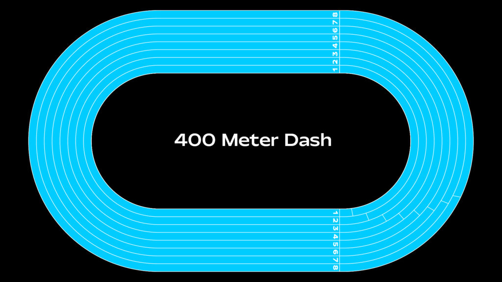
Cycle 3 | 400m Dash | MakeyMakey
Posted: May 6, 2024 Filed under: Uncategorized Leave a comment »To continue with the cycles, for cycle 3, I chose to incorporate a MakeyMakey and foil to create a running surface for participants, replacing the laptop’s arrow keys. I expected the setup to be relatively straightforward. In previous cycles, I had trouble with automatic image playback, so I decided to make short videos on Adobe Express (which is free). Using this platform, I created the starting video, the audio cue video, and the 400m dash video with the audio cues.
After finalizing my videos and audio cues to my satisfaction, I encountered difficulties getting the MakeyMakey foil to function properly. Through various tests, troubleshooting, and help from Alex, I discovered that participants needed to hold the “Earth” cord while stepping on the foil. Additionally, they either needed sweaty socks or bare feet to activate the MakeyMakey controls. I copied the 400m dash race onto two separate screens and arranged two running areas for my participants. For the two screens and separate runs to work I had to devise a race logic with user actors.


During the presentation, I encountered technical difficulties again. It became apparent that because the participants had possibly sweaty feet, the foil was sticking to them, keeping the MakeyMakey control stay activated. Which caused issues with the race. We quickly realized that I needed to tape down the foil for the race to function properly.


If I were to work on another cycle, I would prioritize ensuring that the running setup functions smoothly and reliably, with both participants able to hear audio from their devices. Additionally, I would expand the project by incorporating race times, a running clock, and possibly personalized race plans tailored to participants’ goal race times or their best race times.
Cycle 2 | 100m Dash
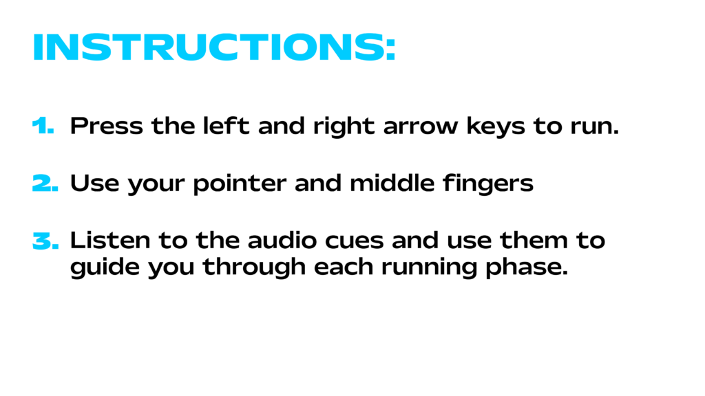
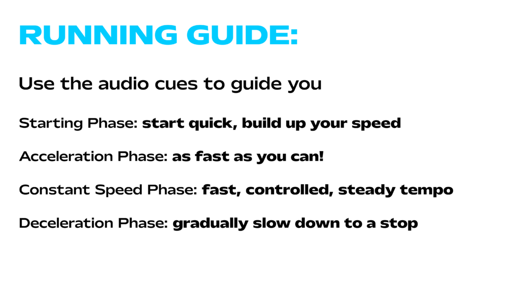
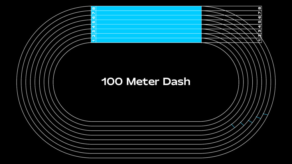
Posted: May 5, 2024 Filed under: Uncategorized Leave a comment »I found myself lacking motivation for my cycle 2 idea, feeling that sticking with my cycle 1 concept was becoming forced. After a discussion with Alex about my thesis interest, we explored some ideas I had been considering. We thought it might be engaging to develop a running simulation where participants experience a first-person sprint, aided by audio cues for speed adjustments. For cycle 2, we decided participants could use their middle and pointer fingers along with the arrow keys to simulate the run, with each button press incrementally advancing the video.
During the presentation, I encountered some technical issues. I realized I needed a better method for sound implementation since I was relying on GarageBand on my phone, which was not effective because the first-person POV 100m dash video to progressed too rapidly. This led to my first feedback suggestion. It was proposed that instead of a 100m dash, a longer race would better showcase the audio cues, allowing participants more time to hear them. Overall, I was pleased with the feedback. Hearing my classmates’ responses to the experience, I decided that for cycle 3, I would incorporate a MakeyMakey and foil to create a running surface for participants, replacing the laptop’s arrow keys.


Cycle 1: Personal Metrics
Posted: April 4, 2024 Filed under: Uncategorized Leave a comment »Overview:
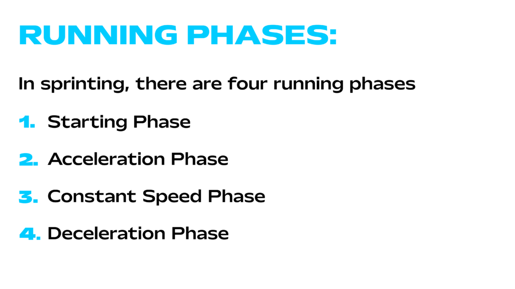
Cycles 1-3 aims to explore the data behind providing personalized running phase zones to a sprinter based on user input. Eventually leading to efficient training strategies to improve performance.
Implementation:
The project will utilize Isadora’s control panel feature for interactive user input (Cycle 1). Algorithms for phase zone calculation will be developed, drawing on secondary research for running phase terminology and incorporating height as a variable (Cycle 2). The system will be designed to present users with clear and actionable results, potentially visualizing phase zones on a track diagram for better comprehension (Cycle 3).
Cycle 1 Features:
- User Input Interaction: Utilizing Isadora’s control panel feature, users will input their fastest running time, goal time, and height, providing essential data for the calculation process that I will be workshopping in Cycle 2.
- Personalization Based on World Records: Users will be able to set their persona best time and goal time, with reference ranges derived from the current Men’s and Women’s world records for sprint events (100m, 200m, and 400m dashes).
- Height Adjustment: Height will be factored into the calculation process, potentially influencing the distribution of running phase zones to accommodate individual physical characteristics.

Pressure Project 3
Posted: March 28, 2024 Filed under: Uncategorized | Tags: Pressure Project Leave a comment »A Mystery is Revealed | Color By Numbers
Initially, I began this project with uncertainty about the mystery I wanted to explore. Reviewing past student work, I stumbled upon a personality test concept that intrigued me, expanding my understanding of what constitutes as a mystery.
Following my usual design process, I sought inspiration from Pinterest and various design platforms. A comic called “Polychromie” by artist Pierre Jeanneau caught my attention, particularly its use of anaglyph—a technique where stereo images are superimposed and printed in different colors, creating a 3D effect when viewed through corresponding filters. I was intrigued by how the mystery unfolded depending on the filter used.


While exploring the feasibility of implementing anaglyph on web screens, I encountered challenges due to my unfamiliarity with the term. Nonetheless, I pivoted towards a “color by numbers” concept, drawing inspiration from “Querkle,” a coloring activity based on circular designs developed by graphic designer Thomas Pavitte, who drew inspiration from logos designed using circles.

For practicality and time constraints, I chose simple images and creted them using Adobe Illustrator, layering the circles into colorable sections. Using MakeyMakey for interaction and Isadora’s Live Capture for audio cues, I facilitated engagement. Additionally, I devised a method using MakeyMakey and alligator clips for answering multiple-choice questions.
Implementing keyboard watchers, trigger values, and jump++ actors, I orchestrated transitions between scenes in the patch, ultimately unveiling the mysteries.


Pressure Project 1: Circles
Posted: January 30, 2024 Filed under: Uncategorized Leave a comment »I approached this assignment without a specific goal in mind, focusing on actors that had caught my interest during our initial exposure to the software, such as the Movie Player, Shimmer, and Wave Generator. My aim was to experiment with these actors and explore the various variables I could manipulate. That served as my starting point.
Additionally, I considered actors recommended for experimentation, like the Shape actor and Video In Watcher. Before delving into the patch, I sought visual inspiration by looking at how designers and artists utilized patterns in their work and how they went about animating them. The images I explored influenced my creative process.
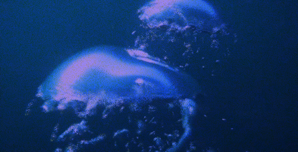
After gathering inspiration, I experimented with the Shapes tool and the Wave Generator to create and animate patterns in Isadora. Upon completing my first scene, I searched for a video to use with the Movie Player actor, choosing one supplied by a classmate featuring water and bubbles. To maintain engagement, I aimed for playing with the different perceptions of circles—moving from repetitive motion to free-flowing, organic visuals, and interactive movement.
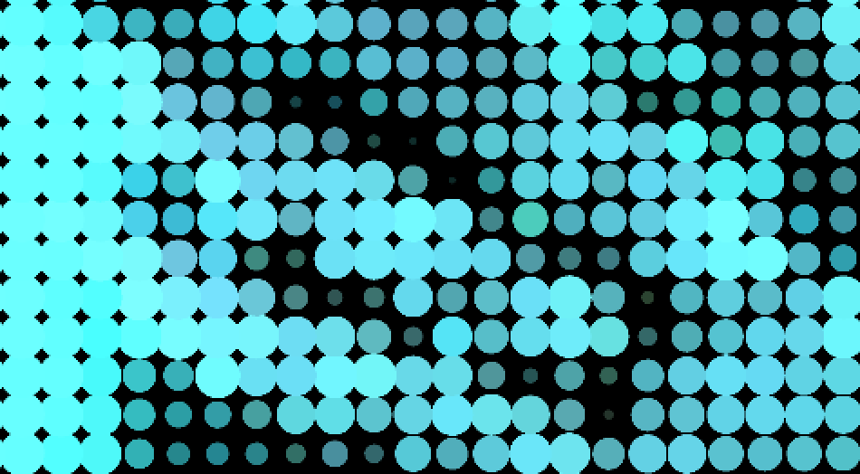
While interactivity wasn’t a requirement, I implemented the Mouse In Watcher to grant users control over variables like shape dimensions, sound volume, and Shimmer effects intensity. The Movie In Watcher, paired with the Dots effect, facilitated circle movement using light, shadows, and colors captured from the camera input.
See screen recording below (does not include sound 🙁 ).
One aspect I wanted to incorporate was computer vision, intending for movement captured by the Video In Watcher to influence the music volume. Although I couldn’t achieve this before the presentation, I learned how to make it work afterward.
I’m pleased that viewers stayed engaged with the patch, and achieving interesting transitions was a success. A classmate even mentioned enjoying the evolution of circles from spacious and mobile to tight and grid-like in the final scene, a detail I hadn’t initially considered but found satisfying upon reflection.
While I don’t regret adding interactivity, my future goal is to master using actors to autonomously manipulate variables for a more self-generated patch, aligning with the requirements of the assignment.