PP1- randomness and dark humor
Posted: September 25, 2025 Filed under: Uncategorized Leave a comment »The day our Pressure Project 1 was assigned, I was immediately excited about the possibilities waiting for me in the process of the endeavor to achieve making someone laugh. We had 15 minutes of class left and I began working on the patch. My first thought was to create ‘a body’ through the shapes actors, and have something happen to that body that was absurd. As I was creating the shapes, I began changing the fill colors. The first color I tried was blue, and that made me think of making the body drink water, get full of water, and something with that water happens that creates some type of burst.
While I liked the idea at the moment, it wasn’t funny enough for me. After I sat down to work on it longer, I recreated my ‘body’ and stared at it for some time. I wanted to make it come alive by giving it thoughts and feelings beyond actions. I knew I had to have some randomness to what I was doing for the random actor to make sense to me.
So I turned inward. My MFA research is utilizing somatic sensations as a resource for creative expression through a queer lens. The inward-outward contrast, alignments and misalignments are exciting for me. I enjoy training my mind to look at things in non-normative ways, as both a queer and a neurodivergent artist. While I have a lot of coherent thoughts relative to the situations, I sometimes have hyperfixations or interest in random stuff many people might not think of thinking.
I wanted my Isadora ‘body’ to be hyperfixated on magic potions. I wanted it to be consumed by the thought of magic potions that led to some sort of absurd outcome, hence the randomness. I searched for magic potion images with .png extensions and found one that I would like to use. After adding that image, I needed a ‘hand’ to interact with the potion. So I searched for a .png image of a hand.


To help my ‘body’ convey its inner experiences, I decided to give it a voice through the text draw actor and included short captions to my scenes. The next part was giving my magic potion a storyline to have two characters in my story. I achieved that through showing how the magi potion affected the body beyond the body’s initiated actions. Carrying the magic potion from a passive role to an active role.


I connected a wave generator the magic potion’s width that created a spinning visual and connected another wave generator to the head’s intensity that created a sense of lightheadedness/dizziness or some type of feeling funny/not normal.
In the next scene, the head of my body disintegrates after consuming the magic potion. I achieved that with an explode actor.

To exeggarete the explosion and the effect of the magic potion on the person, I connected a random actor to the explode actor and connected a pulse generator to the random actor.
The last scene reveals the dark truth of the story, using humor. The body disappears and the only thing on the scene is the magic potion with its inner voice (through text draw) for the first time. I needed to give a facial expression to my magic potion so I searched for a .png image of a smiley face that I could layer on top of the previous image. After finding the image I liked, I looked at my scenes and found myself laughing alone in my room. That’s when I decided my work on this project has been satisfactory on my end and I stayed within the 5 hour limit we had to work on it.

In my presentation, everything went according to plan on my end. And the expected achievement of making someone laugh was achieved as I heard people making noises in reaction to the scenes, especially the final scene.
There was a feedback on the scale of images. I worked on it on my personal computer and presented on the big screen in the Motion Lab. Because I didn’t project this there before, the images were very big especially given the proximity of the audience to the screen. But I received the feedback that due to the texts not being long and readable both in attention span and timewise, it still worked.
I am quite content with how the process went and how the product ended up. Having used Isadora in previous classes, building on my skills is very exciting to me. I usually don’t use humor in my artistic works, but I had a craving for it. With the goal of making someone laugh, using Isadora as a canvas or a ‘stage’ for storytelling and connecting beyond the ‘cool’ capabilities of the software was the part I enjoyed the most in this process.
Pressure Project 1 – The best intentions….
Posted: September 21, 2025 Filed under: Uncategorized | Tags: PP1 Leave a comment »I would like to take a moment and marvel that a product like Isadora exists. That we can download some software, and within a few hours create something involving motion capture and video manipulation, is simply mind blowing. However, I learned that Isadora makes it very easy to play with toys without fully understanding them.
The Idea
When we were introduced to the Motion Lab we connected our computers into the “magic USB” and were able to access the rooms cameras, projectors, etc… I picked a camera to test and randomly chose what turned out to be the ceiling mounted unit. I’m not sure where the inspiration came from, but I decided right then that I wanted to use that camera to make a Pac-Man like game where the user would capture ghosts by walking around on a projected game board.
The idea evolved into what I was internally calling the “Fish Chomp” game. The user would take on the role of an angler-fish (the one with the light bulb hanging in front of it). The user would have a light that, if red, would cause projected fishes to flee, or if blue, would cause the fish to come closer. With a red light the user could “chomp” a fish by running into it. When all the fish were gone a new fish would appear that ignored the users light and always tried to chase them, a much bigger fish would try to chomp the user. With the user successfully chomped, the game would reset.
How to eat a big fish? One bite at a time.
To turn my idea into reality it was necessary to identify the key components needed to make the program work. Isadora needed to identify the user and track its location, generate objects that the user could interact with, process collisions between the user and the objects, and process what happens when all the objects have been chomped.
User Tracking:
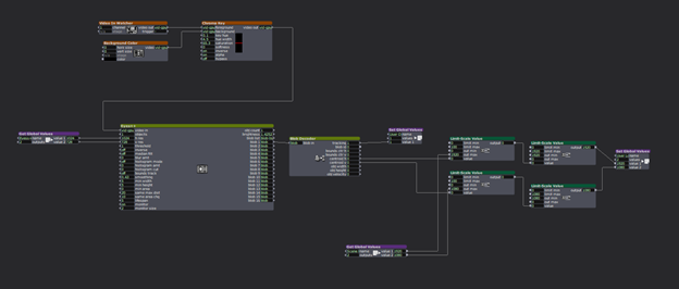
The location of the user was achieved by passing a camera input through a chroma key actor. The intention was that by removing all other objects in the image the eyes actor would have an easier time of identifying the user. The hope was that the chroma key would reliably identify the red light held by the user. The filtered video was then passed to the eyes++ actor and its associated blob decoder. Together these actors produced the XY location of the user. The location was processed by Limit-Scale actors to convert the blob output to match the projector resolution. The resolution of the projector would determine how all objects in the game interacted, so this value was set as a Global Value that all actors would reference. Likewise, the location of the user was passed to other actors via Global Values.
Fish Generation:
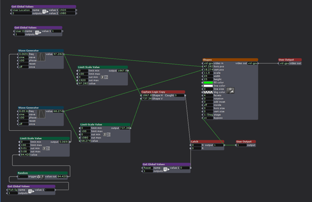
The fish utilized simple shape actors with the intention of replacing them with images of fish at a later time (unrealized). The fish actor utilized wave generators to manipulate the XY position of the shape, with wither the X or Y generator updated with a random number that would periodically change the speed of the fish.
Chomped?
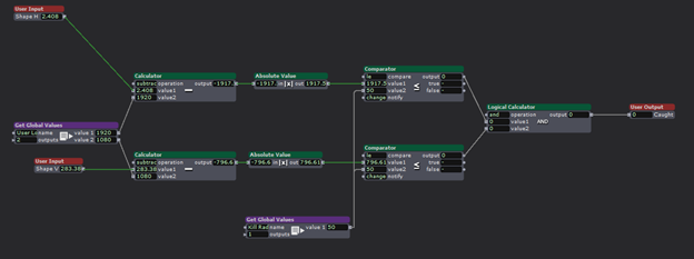
Each fish actor contained within it a user actor to process collisions with the user. The actor received the user location and the shape position, subtracted their values form each other, and compared the ABS of the result to a definable “kill radius” to determine if the user got a fish. It would be too difficult for the user to chomp a fish if there locations had to be an exact pixel match, so a comparator was used to compare the difference in location to an adjustable radius received form a global variable. When the user and a fish were “close enough” together, set by the kill radius, the actor would output TRUE, indicating a successful collision. A successful chomp would trigger the shape actor to stop projecting the fish.
Keeping the fish dead:
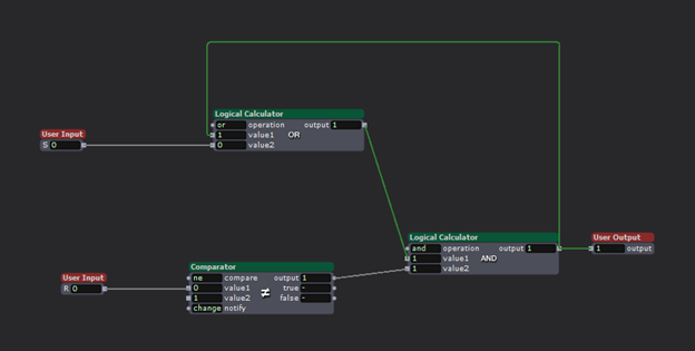
The user and the fish would occupy the same space only briefly, causing the shape to reappear after their locations diverged again. To avoid the fish from coming back to life, they needed memory to remember that they got chomped. To accomplish this, logic actors were used to construct a SR AND-OR Latch. (More info about how they work can be found here https://en.wikipedia.org/wiki/Flip-flop_(electronics) .) This actor, when triggered at its ‘S’ input, causes the output to go HIGH, and critically, the output will not change once triggered. When the collision detection actor recognized a chomp, it would trigger the latch, thus killing the fish.
All the fish in a bowl:
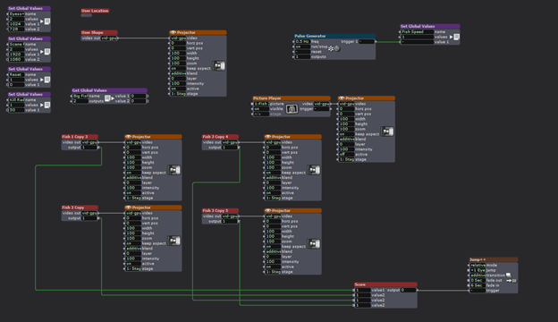
The experience consisted of the users and four fish actors. For testing purposes the user location could be projected as a red circle. The four fish actors projected their corresponding shapes until chomped. When all four fish actors latches indicated that all the fish were gone, a 4-inpur AND gate would trigger a scene change.
We need a bigger fish!


When all the fish were chomped, the scene would change. First, an ominous pair of giant eyes would appear, followed by the eyes turning angry with the addition of some fangs.
The intention was for the user to go from being the chomper to being the chomped! A new fish would appear that would chase the user until a collision occurred. Once this occurred, the scene would change again to a game over screen.

The magic wand:
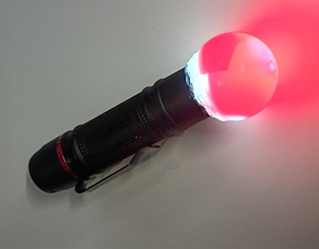
To give the user something to interact with, and for the EYES++ actor to track, a flashlight was modified with a piece of red gel and a plastic bubble to make a glowing ball of light.
My fish got fried.
The presentation did not go as intended. First, I forgot that the motion lab ceiling webcam was an NDI input, not a simple USB connection like my test setup at home. I decided to forgo the ceiling camera and demo the project on the main screen in the lab while using my personal webcam as the input. This meant that I had to demo the game instead of handing the wand to a classmate as intended. This was for the best as the system was very unreliable. The fish worked as intended, but the user location system was too inconsistent to provide a smooth experience.
It took a while, but eventually I managed to chomp all the fish. The logic worked as intended, but the scene change to the Big Fish eyes ignored all of the timing I put into the transition. Instead of taking several seconds to show the eyes, it jumped straight to the game over scene. Why this occurred remains a mystery as the scenes successfully transitioned upon a second attempt.
Fish bones
In spite of my egregious interpretation of what counted as “5 hours” of project work, I left many ambitions undone. Getting the Big Fish to chase the user, using images of fish instead of shapes, making the fish swim away or towards the user, and the ideas of adding sound effects were discarded like the bones of a fish. I simply ran out of time.
Although the final presentation was a shell of what I intended, I learned a lot about Isadora and what it is capable of doing and consider the project an overall success.
Fishing for compliments.
My classmates had excellent feedback after witnessing my creation. What surprised me the most was how my project ended up as a piece of performance-art. Because of the interactive nature of the project I became part of the show! In particular, my personal anxiousness stemming from the presentation not going as planed played as much a part of the show as Isadora. Much of the feedback was very positive with praise being given for the concept, the simple visuals, and the use of the flashlight to connect the user to the simulation in a tangible way. I am grateful for the positive reception from the class.
Bumping Alisha’s post
Posted: August 28, 2025 Filed under: Uncategorized Leave a comment »
Reading Alisha Jihn’s Cycle 3: PALIMPSEST post and viewing the accompanying videos was insightful. It provided a clear example of how projections can be used in a concert dance context. I’ve encountered Alisha’s work before, both in movement and technology, and seeing her process, her iterations, questions, and curiosities resonated with me.
Her approach reminded me that stepping away from a piece and returning to it later can offer fresh eyes and new ideas. It also reinforced the idea that just because I can add more to a work doesn’t mean I should. Sometimes, subtraction can be more effective than addition.
Bumping Old Discussion
Posted: August 26, 2025 Filed under: Uncategorized Leave a comment »I found Peter’s pressure project utilizing an Arduino to be an interesting idea. Using the microcontroler as a means for creating unusual interfaces is a fantastic idea. He mentions that the hardware caused things to change “on screen”, which is particularly fascinating. I assume that the Arduino was providing input to some other application that processed the audio/video aspect of the project. I’m curious if in addition to what was described, can the Arduino also receive information from the A/V application while also serving as an input device? For example, could touching the fruit controllers also cause lights or motors to activate based on instructions form the computer controlling everything?
Cycle 3 – Interactive Immersive Radio
Posted: May 1, 2025 Filed under: Uncategorized | Tags: Cycle 3 Leave a comment »I started my cycle three process by reflecting on the performance and value action of the last cycle. I identified some key resources that I wanted to use and continue to explore. I also decided to focus a bit more on the scoring of the entire piece, since many of my previous projects were very loose and open ended. I was drawn to two specific elements based on the feedback I had received previously. One of which was the desire to “play” the installation more like a traditional instrument. This was something that I had deliberately been trying to avoid in past cycles, so I decided maybe it was about time to give it a try and make something a little more playable. The other element I wanted to focus on was the desire to discover hidden capabilities and “solve” the installation like a puzzle. Using these two guiding principles, I began to create a rough score for the experience.

I addition to using the basic MIDI instruments, I also wanted to experiment with some backing tacks from a specific song, in this case, Radio by Sylvan Esso. In a previous project for the Introduction to Immersive Audio class, I used a program called Spectral Layers to “un-mix” a pre-recorded song. This process takes any song and attempts to separate the various instruments into their isolated tracks, to varying degrees of success. It usually takes a few try’s, experimenting with various settings and controls to get a good sounding track. Luckily, the program allows you to easily unmix and separate track components and re-combine elements to get something that is fairly close to the original. For this song I was able to break it down into four basic tracks; Vocals, Bass, Drums and Synth. The end result is not perfect by any means, but it was good enough to get the general essence of the song when played together.
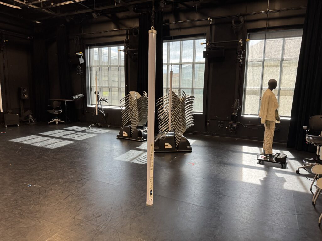
Another key element I wanted to focus on was the lighting and general layout and aesthetic of the space. I really enjoyed the Astera Titan Tubes that I used in the last cycle and wanted to try a more integrated approach to triggering the lighting console from Touch Designer. I received some feedback that people were looking forward to a new experience from previous cycles, so that motivated me to push myself a little harder and come up with a different layout. The light tubes have various options for mounting them and I decided to hang them from the curtain track to provide some flexibility in placement. Thankfully, we had the resources already in the Motion Lab to make this happen easily. I used spare track rollers and some tie-line and clips left over from a previous project to hang the lights on a height adjustable string that ended up working really well. This took a few hours to put together, but I think this resource will definitely get used in the future by people in the Motion Lab.

In order to make the experience “playable” I decided to break out the bass line into its component notes and link the trigger boxes in Touch Designer to correspond to the musical score. This turned out to be the most difficult part of the process. For starters, I needed to quantify the number of notes and they cycles they repeat in. Essentially, this broke down into 4 notes, each played 5 times sequentially. Then I also needed to map the boxes that would trigger the notes into the space. Since the coordinates are Cartesian x-y and I wanted the boxes arranged into a circle, I had to figure out a way to extract the location data. I didn’t want to do the math, so I decided to use my experience in Vectorworks as a resource to map out the note score. This ended up working out pretty well and the resulting diagram has an interesting design aesthetic itself. My first real life attempt in the motion lab was working as planned, but the actual playing of the trigger boxes in time was virtually impossible. I experimented with various sizes and shapes, but nothing worked perfectly. I settled on some large columns that a body would easily trigger.
The last piece was to link the lighting playback with the Touch Designer triggers. I had some experience with this previously and more recently have been exploring the OSC functionality more closely. It took a few tries, but I eventually sent the correct commands and got the results I was looking for. Essentially, I programmed all the various lighting looks I wanted to use on “submaster” faders and then sent the commands to move the faders. This allowed me to use variable “fade times” by using the “Lag” Chop in Touch Designer to control the on and off rate of each trigger. I took another deep dive into the ETC eos virtual media server and pixel mapping capabilities, which was sometimes fun and sometimes frustrating. It’s nice to have multiple ways to achieve the same effect, but it was sometimes difficult to find the right method based on how I wanted to layer everything. I also maxed out the “speed” parameter, which was unfortunate because I could not match the BPM of the song, even though the speed was set to 800%.

I was excited for the performance and really enjoyed the immersive nature of the suspended tubes. Since I was the last person to go, we were already running way over on time and I was a bit rushed to get everything set up. I had decided earlier that I wanted to completely enclose the inner circle with black drape. This involved moving all 12 curtains in the lab onto different tracks, something that I knew would take some time and I considered cutting this since we were running behind schedule. I’m glad I stuck to my original plan and took the extra 10 minutes to move things around because the black void behind the light tubes really increased the immersive qualities of the space. I enjoyed watching everyone explore and try to figure out how to activate the tracks. Eventually, everyone gathered around the center and the entire song played. Some people did run around in the circle and activate the “base line” notes, but the connection was never officially made. I also hid a rainbow light cue in the top center that was difficult to activate. If I had a bit more time to refine, I would have liked to make more “easter eggs” hidden around the space. Overall, I was satisfied with how the experience was received and look forward to possible future cycles and experimentation.
Cycle 3: It Takes 3
Posted: May 1, 2025 Filed under: Uncategorized | Tags: Cycle 3, Interactive Media, Interactive Shadow, Isadora, magic mirror Leave a comment »This project was the final iteration of my cycles project, and it has changed quite a bit over the course of three cycles. The base concept stayed the same but the details and functions changed as I received feedback from my peers and changed my priorities with the project. I even made it so three people could interact with it.
I wanted to focus a bit more on the sonic elements as I worked on this cycle. I started having a lot of ideas on how to incorporate more sonic elements, including adding soundscapes to each scene. Unfortunately I ran out of time to fully flesh out this particular idea and didn’t want to incorporate a half baked idea and end up with an unpleasant cacophony of sound. But I did add sonic elements to all of my mechanisms. I kept the chime when the scene became saturated, as well as the first time someone raised their arms to change a scene background. I did add a gate so this only happened the first time, to control the sound.
A new element I added was a Velocity actor that caused the image inside the silhouettes to explode, and when it did, it triggered a Sound Player with a POP! sound.This pop was important because it drew attention to the explosion to indicate that something happened and something they did caused it. This actor was also plugged into a Inside Range actor that was set to trigger a riddle at a certain velocity just below the range to trigger the explosion.
The other new mechanism I added was based on the proximity to the sensor of one of the users. The z-coordinate data for Body 2 was plugged into a Limit-Scale Value actor to translate the coordinate data into numbers I could plug into the volume input to make the sound louder as the user gets closer. I really needed to spend time in the space with people so I could fine-tune the numbers to the space, which I ended up doing during the presentation when it wasn’t cooperating. I also ran into the issue of needing that Sound Player to not always be on, otherwise that would have been overwhelming. I decided to have the other users have their hands raised to turn it on (it was actually only reading the left hand of Body 3 but for ease of use and riddle-writing, I just said both other people had to have them up).
I have continued adjusting the patch for the background change mechanism (raising the right hand of Body 1 changes the silhouette background and raising the left hand changes the background). My main focus here was making the gates work so it only changes one time while the hand is raised (gate doesn’t reopen until hand goes down), so I moved the gate to be in front of the Random actor in this patch. As I reflect on this, I think I know why it didn’t work; I didn’t program it to turn the gate on based on hand position, it only holds the trigger until the first one is complete, which is pretty much immediately. I think I would need an Inside Range actor to tell the gate to turn on when the hand is below a certain position, or something to that effect.
I sat down with Alex to work out some issues I had been having, such as my transparency issue. This was happening because the sensor was set to colorize the bodies, so Isadora was seeing red and green silhouettes. This was problematic because the Alpha Mask looks for white, so the color was not allowing a fully opaque mask. We fixed this with the addition of an HCL Adjust actor between the OpenNI Tracker and the Alpha Mask, with the saturation fully down and the luminance fully up.
The other issue Alex helped me fix was the desaturation mechanism. We replaced the Envelope Generators with Trigger Value actors plugged into a Smoother actor. This made for smooth transitions between changes because it allowed Isadora to make changes from where it’s already at, rather than from a set value.
The last big change I made to my patch was the backgrounds. Because I was struggling to find decent quality images of the right size for the shadow silhouettes, I took the information of one image that looked nice and created six simple backgrounds in Procreate. I wanted them to have bold colors and sharp lines so they would stand out against the moving backgrounds and have enough contrast both saturated and not. I also decided to use recognizable location-based backdrops since the water and space backdrops seemed to elicit the most emotional responses. In addition to the water and space scenes, I added a forest, mountains, a city, and clouds rolling across the sky.
These images worked really well against the realistic backgrounds. It was also fun to watch the group react, especially to the pink scene. They got really excited if they got a sparkle full and clear on their shadow. There was also a moment where they thought the white dots in the rainbow and purple scenes were a puzzle, which could be a cool idea to explore. I did have an idea to create a little bubble-popping game in a scene with a zoomed-in bubble as the main background.
The reactions I got were overwhelmingly positive and joyful. There was a lot of laughter and teamwork during the presentation, and they spent a lot of time playing with it. If we had more time, they likely would have kept playing and figuring it out, and probably would have loved a fourth iteration (I would have loved making one for them). Michael specifically wanted to learn it enough to manipulate it, especially to match up certain backgrounds (I would have had them go in a set order because accomplishing this at random would be difficult, though not impossible). Words like “puzzle” and “escape room” were thrown around during the post-experience discussion, which is what I was going for with the addition of the riddles I added to help guide users.
The most interesting feedback I got was from Alex who said he had started to experience himself ‘in third person’. What he means by this is that he referred to the shadow as himself while still recognizing it as a separate entity. If someone crossed in front of the other, the sensor stopped being able to see the back person and ‘erased’ them from the screen until it re-found them. This prompted that person to often go “oh look I’ve been erased”, which is what Alex was referring to with his comment.
I’ve decided to include my Cycle 3 score here as well, because it has a lot of things I didn’t get to explain here, and was functinoally my brain for this project. I think I might go back to this later and give some of the ideas in there a whirl. I think I’ve learned enough Isadora that I can figure out a lot of it, particularly those pesky gates. It took a long time, but I think I’m starting to understand gate logic.
The presentation was recorded in the MOLA so I will add that when I have it :). In the meantime, here’s the test video for the velocity-explode mechanism, where I subbed in a Mouse Watcher to make my life easier.
Cycle Three: The Forgotten World of Juliette Warner
Posted: April 30, 2025 Filed under: Uncategorized Leave a comment »For my third cycle, I wanted to revisit my cycle one project based on the feedback I had received, which centered mostly on the audience’s relationship with the projections. One sticking point from that earlier cycle was that all three projectors featured the same projected surface. This choice was originally made as a preventative measure to keep Isadora’s load low. That being said, the first point of focus for my cycle three project was determining whether three separate projected video streams would be sustainable. Once I confirmed that they were, I began sourcing media for the entire script.
After gathering my media, I moved onto an element I’ve wanted to incorporate since cycle one but hadn’t felt fully ready to tackle, depth sensors. I used the Orbec sensor placed in the center of the room, facing down (bird’s-eye view), and defined a threshold that actors could enter or exit, which would then trigger cues. I accessed the depth sensor through a pre-built patch (thank you, Alex and Michael) in TouchDesigner, which I connected to Isadora via an OSC Listener actor. This setup allowed Isadora to receive values from TouchDesigner and use them to trigger events. With this in mind, I focused heavily on developing the first scene to ensure the sensor threshold was robust. I marked the boundary on the floor with spike tape so the performers had a clear spatial reference.
Outside of patch-building, I devoted significant time to rehearsing with three wonderful actors. We rehearsed for about three hours total. Because class projects sometimes fall through due to cancellations. as happened with my first cycle, I wanted to avoid that issue this time around. It was important to me that the actors understood how the technology would support their performances. To that end, I began our first rehearsal by sharing videos that illustrated how the tech would function in real time. After that, we read through the script and discussed it in our actor-y ways, and I explained how I envisioned the design unfolding across the show.
In our second rehearsal, we got on our feet. I defined entrances and exits based on where the curtains would part and placed mats to indicate where the bench would be in the Motion Lab. These choices helped define the shared “in-the-round” experience for both audience and performers.
Over the weekend, I worked extensively on my patch. The full script juxtaposes the Heroine’s Journey with the stages of Alzheimer’s, so I wanted the audience to know which stage they were in as the performance unfolded. Using a combination of enter-scene triggers, trigger delays, envelopes, and text-draw actors, I created a massive patch for each scene that displayed the corresponding stage. This was by far my biggest time investment.
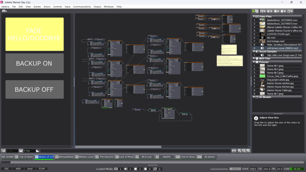
When I was able to get into the lab space with my actors for a mini tech run, I realized that these title cards, which I had spent so much time on, were not serving the immersive experience and to be honest, they were ugly. The entire concept of the piece was to place the audience alongside Juliette on her journey, sharing her perspective via media. Having text over that media disrupted the illusion, so I cut the text patches and Isadora’s performance load improved as a result.
I spent another two hours between tech and performance fine-tuning the timing of scene transitions, something I had neglected earlier. This led to the addition of a few trigger delays for sound to improve flow.
When it came time to present the piece to a modest audience, I was surprisingly calm. I had come to terms with the idea that each person’s experience would be unique, shaped by their own memories and perspectives. I had my own experience watching from outside the curtains, observing it all unfold. There’s a moment in the show where Juliette’s partner Avery gives her a sponge bath, and we used the depth sensor to trigger sponge noises during this scene. I got emotional there for two reasons. First, the performer took his time, and it came across as such a selfless act of care, exactly as intended. Second, I was struck by the realization that this was my final project of grad school, an evolution of a script I wrote my first year at OSU. It made me appreciate just how much I’ve grown as an artist, not just in this class, but over the past three years.
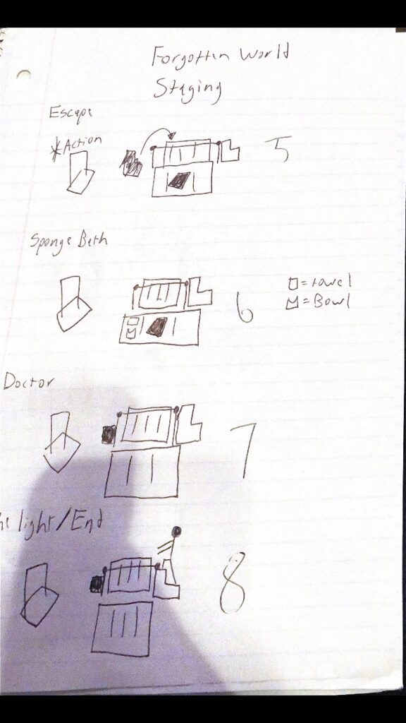
The feedback I received was supportive and affirming. It was noted that the media was consistent and that a media language had been established. While not every detail was noticed, most of the media supported the immersive experience. I didn’t receive the same critiques I had heard during cycle one, which signaled a clear sense of improvement. One comment that stuck with me was that everyone had just experience theatre. I hadn’t considered how important that framing was. It made me reflect on how presenting something as theatre creates a kind of social contract, it’s generally not interactive or responsive until the end. That’s something I’m continuing to think about moving forward.
Once the upload is finished, I will include it below:
Cycle 3: Grand Finale
Posted: April 29, 2025 Filed under: Uncategorized Leave a comment »For the final project, I decided to do some polishing on my Cycle 2 project and then try to add to it to create a more complete experience. During feedback for Cycle 2, a few people felt the project could be part of a longer set, so I decided to try to figure out where that set might go. This allowed me to keep playing with some of the actors I had been using before, but also to try to see how I could alter the experience in various ways to keep it interesting. I, again, spent less time than I did in the beginning of the semester looking for assets. I think I knew what I was looking for more quickly than I did in the beginning, and I knew the vibe I wanted to maintain from the last cycle. While I, for the second cycle in a row, neglected to actually track my time, a decent portion of it was spent trying to explore some of the effects and actors I hadn’t used before that could alter the visuals of what I was doing in smaller ways, by swapping out one actor for another. As always, a great deal of time was spent adjusting and fine-tuning various aspects of the experience. Unlike in the past, far, far too much time was spent trying to recover from system crashes, waiting for my computer to unfreeze, and generally crossing my fingers that my computer will make it through a single run of the project without freezing up. Chances seem slim.

Cleaned Up and Refined Embers
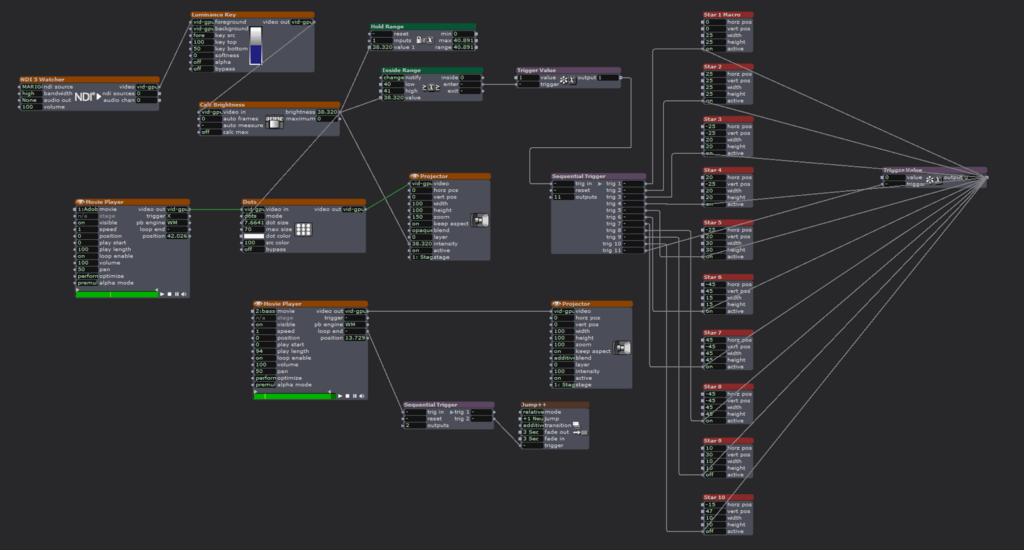
Flame Set-up
I again worked with the Luminance Key, Calc Brightness, Inside Range, and Sequential Triggers actors. Sequential Triggers, in particular, are a favorite because I like tying “cues” together and then being able to reset the experience without anyone needing to touch a button. Throughout the class, I’ve been interested in making experiences that cycle and don’t have an end, things that can be entered at any time, really, and can be abandoned at any point. To me, this most closely mimics the way I’ve encountered experiences in the wild. Think of any museum video, for instance. They run on a never-ending loop, and it’s up to the viewer to decide to wait until the beginning or just watch through until they return to where they entered the film. For me, I want something that people can come back to and that isn’t strictly tied to a start and stop. I want people to be able to play at will, wait for a sequence they particularly enjoyed to come back around, leave after a few cycles, etc. I am still using TouchDesigner and a depth sensor to explore these ideas. This time around, I also the TT Edge Effect, Colorizer, and Sound Level Watcher ++ to the mix. I was conservative with the Sound Level Watcher because my system was already getting overloaded, at that point, and while I wanted to incorporate it more, I wanted to err on the side of actually being able to run my show.

“Neuron” Visuals
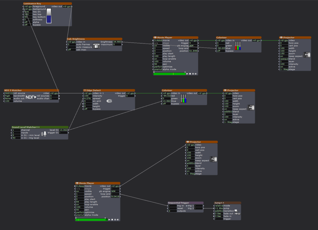
“Neuron” Stage Set-up
The main challenge I faced this time was that my computer is starting to protest, greatly, and Isadora decided she had had enough. I ran into errors a number of times, and while I didn’t lose a significant amount of work, I did lose some, and the time I lost to the program crashing, restarting my computer in hopes it would help, and various other troubleshooting attempts was not insignificant. In retrospect, I should have found ways to scale back my project so my computer could run it smoothly, but it everything was going fine until it very much wasn’t. I removed a few visual touches and pieces to try to get the last scene, in particular, to work, and I’m hoping that will be enough.
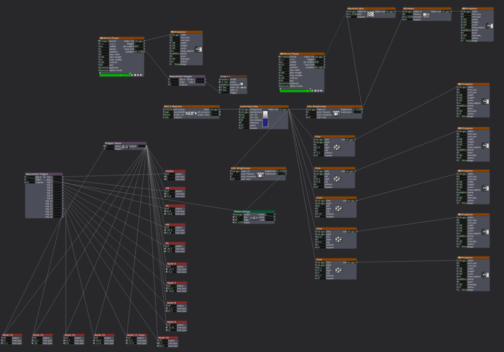
Initial Set-up of Final Scene
Final Scene Visuals before Edits
For this project, I mostly was focusing on expanding on my Cycle 2 project to make a longer experience. I don’t know that the additional scenes ended up being as developed as the first, but I think they still added to the experience as a whole. I worked hard to incorporate music to make a more holistic experience, as well. As stated above, I couldn’t do so to the level I would have liked, but I hope the impulse toward that is recognized and appreciated, such as it is. I also wanted to address some of the visual notes I received in the last cycle, which I was able to do with relative ease. I tried to find new ways for people to interact with the project in the added scenes, but I feel they are a little lacking in the interactive department. Ultimately, it was a combination of struggling with Isadora logic, still, and a lack of ideas. I still feel my creativity in these projects is somewhat stymied by my beginner status with media. I can’t quite get to the really creative exploration, still, because I’m working on figuring out how to make things work and look somewhat finished. I’m satisfied with what I’ve been able to put together, I just wish I were able to create at a higher level (it’s an unrealistic wish, but a wish, nonetheless).
If I were to continue to work on this project, I would work to increase the interactivity in each scene and make things more sound reactive. I would continue to look for different ways people could play with the scenes. I think there’s a world where something like this is maybe 5 or 6 scenes long, and it runs 20-30 minutes. I think this one runs maybe 15 minutes with three scenes, which maybe would work well with more interactivity woven in. Regardless, I’m happy with what I managed to put together and all I managed to cram into my noggin in one semester.
ADDENDUM: I ended up cutting the third scene of the experience before I presented it. By the time I removed enough of the effects to get it to run smoothly, it felt too derivative, and I decided to stick with the two scenes that were working and “complete.” If I had more time, I would work on the getting the third scene to a simpler patch that was still engaging.
Cycle 2 | Mysterious Melodies
Posted: April 20, 2025 Filed under: Uncategorized 1 Comment »For my cycle 2 project, I wanted to expand upon my original idea and add a few resources based on the evaluation I received from the initial performance. I wanted to lean away from the piano-ness of my original design and instead abstract the experience into a soundscape that was a bit more mysterious. I also wanted to create an environment that was less visually overwhelming and played more with the sense of light in space. I have long been an admirer of the work of James Turrell, an installation artist that uses light, color and space as his main medium. Since my background is primarily in lighting and lighting design, I decided to remove all of the video and projection elements and focus only on light and sound.
ACCAD and the Motion Lab recently acquired a case of Astera Titan Tubes. They are battery powered LED tubes that resemble the classic fluorescent tube, but have full color capabilities and the ability to be separated into 16 “pixels” each. They also have the ability to receive wireless data from a lighting console and be controlled and manipulated in real time. I started by trying to figure out an arrangement that made sense with the eight tubes that I had available to me. I thought about making a box with the tubes at the corners, I also thought about arranging them in a circular formation. I decided against the circular arrangement because, arranged end to end, the 8 tubes would have made an octagon, and spread out, they were a bit linear and created more of a “border”. Instead, I arranged them into 8 “rays”. Lines that all originated from the center and fanned out from a central point. This arrangement felt a bit more inviting, however it did create distinct “zones” in-between the various sections. The tubes also have stands that allow them to be placed vertically. I considered this as well, but I ended up just setting them flat on the ground.
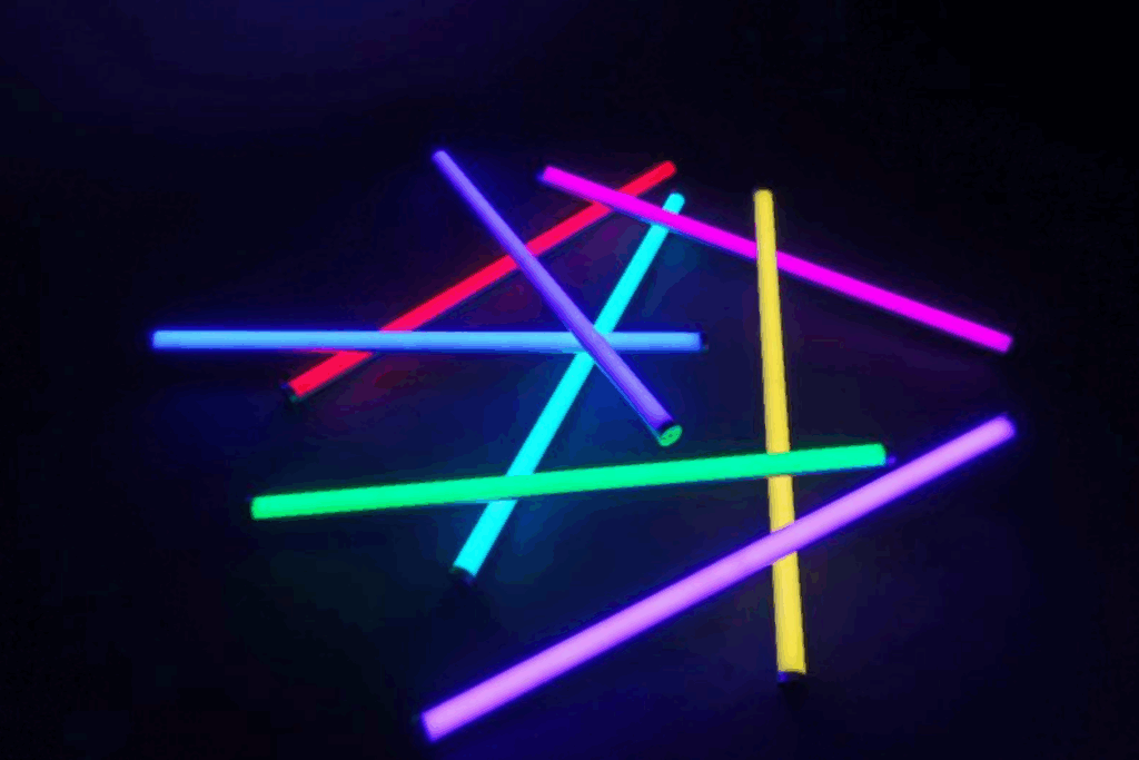
In order to program the lights, I opted to go directly from the lighting console. This was the most straightforward approach, since they were already patched and working with the ETC ion in the Motion Lab. I started by putting them into a solid color that would be the “walk in” state. I wanted to animate the pixels inside the tubes and started by experimenting with the lighting console’s built in effects engine. I have used this console many times before, but I have found the effects to be a bit lacking on usability and struggled to manipulate the parameters to get the look I was going for. I was able to get a rainbow chase and a pixel “static” look. This was okay, but I knew I wanted something a bit more robust. I decided to revisit the pixel mapping and virtual media server functions that are built into the console. These capabilities allow the programmer to create looks that are similar to traditional effects, but also create looks that would otherwise be incredibly time consuming if not completely impossible using the traditional methods. It took me a bit to remember how these functions worked since I have not experimented with them since my time working on “The Curious Incident of the Dog in the Night”, programming the lighting on the set that had pixel tape integrated into a scenic grid. I finally got the pixel mapping to work, but ran out of time before I could fully implement the link to triggers already being used in Touch Designer. I manually operated the lighting for this cycle, and intend to focus more on this in the next cycle.
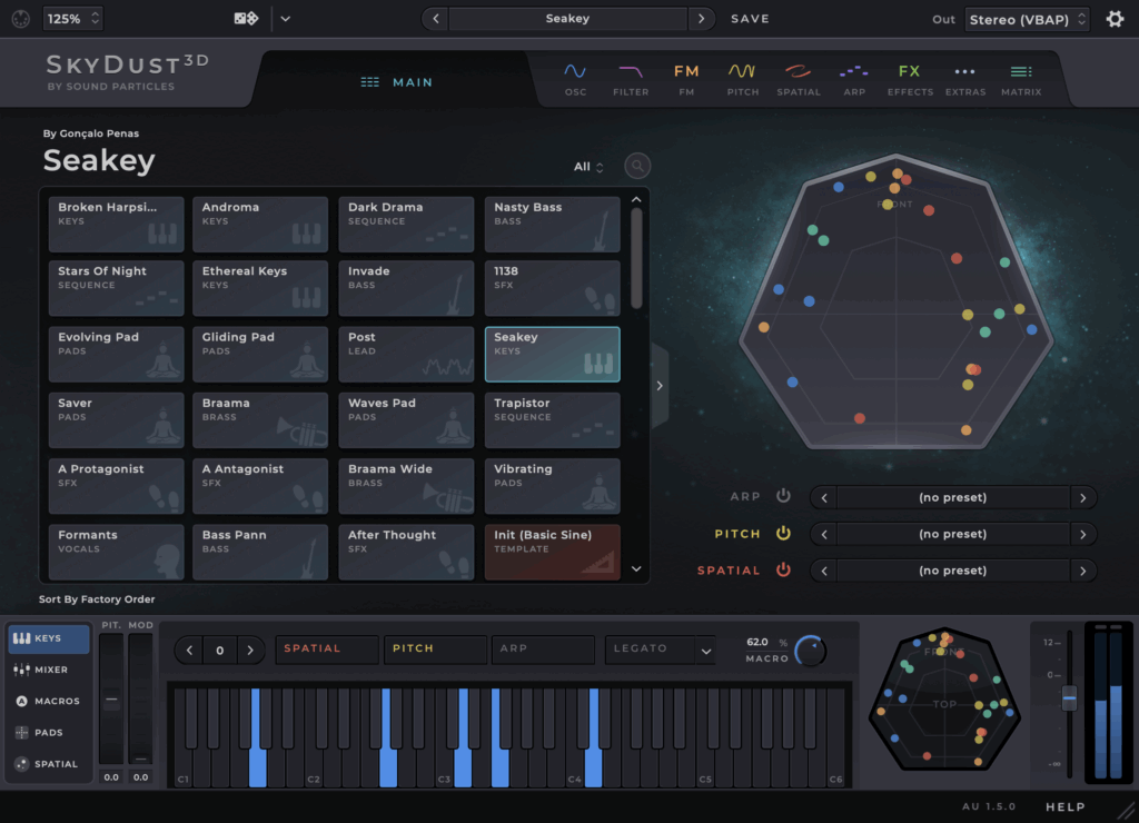
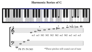
For the audio portion, I decided to use “Skydust” a spatial synthesizer that Professor Jean-Yves Munch recommended. This allowed me to use the same basic midi integration as the last cycle, but expand the various notes into spatial sound without the need for an extra program to take care of the panning. Similar to the last cycle, I spent a lot of time listening to the various presets and the wide variety of sounds and experiences they produced. Everything from soft and southing to harsh and scary. I ended up going with the softer side and finding a preset called “waves pad” which produced something a bit ethereal but not too “far out”. I also decided to change up the notes a bit. Instead of using the basic C chord, I decided to use the harmonic series. I had a brief discussion with Professor Marc Ainger and this was recommended as a possible arrangement that went beyond the traditional chord structure.
For the patch, I kept the same overall structure but moved the trigger boxes around into a more circular shape to fill the space. Additionally, I discovered that I could replace the box with other shapes. Since the overall range of the depth sensor is a circle, I decided to try out the “tube” or cylinder shape in touch designer. When adding boxes and shapes into the detector, I also noticed that there is a limit of 8 shapes per detector. This helped a bit to keep things simplified and I ended up with 2 detectors, one that had boxes in a circular formation, and another with tubes of various sizes, one that was low and covered the entire area, with another that was only activated in the center, and a third tube that was only triggered if your reached up in the center of the space.

The showing of this project was very informative since only one other person had experienced the installation previously. I decided to pull the black scrim in front of the white screen in motion lab to darken the light reflections, while also allowing the spatial sound to pass through. I also pulled a few black curtains in front of the control booth to hide the screens and lights inside. I was pleasantly surprised by how long people wanted to explore the installation. There was a definite sense of people wanting to solve or decode a mystery or riddle, even though there was no real secret. The upper center trigger was the one thing I hoped people would discover and they eventually found it (possibly because I had shown some people before). For my next cycle I plan to continue with this basic idea but flesh out the lighting and sonic components a bit more. I would like to trigger the lighting directly from touch designer. I am still searching for the appropriate sound scape and am debating between using pre recorded samples to form a song or continuing with the midi notes and instruments. Maybe a combination of both?
Pressure Project 3 | Highland Soundscapes
Posted: April 20, 2025 Filed under: Uncategorized | Tags: Pressure Project 3 Leave a comment »Our prompt for pressure project 3 was to create an audio soundscape that reflects a cultural narrative that is meaningful to you. Since I am 75 percent Scottish, I choose to use the general narrative of Braveheart as an inspiration. My biggest challenge for this project was my motivation. Since I am concurrently taking Introduction to Immersive Audio, I have already done a project similar to this one just a few weeks ago. I struggled a bit with that project, so this one seemed a bit daunting and unexciting. I must admit, the biggest hurdle was just getting started.

I wanted to establish the setting of the Scottish countryside near the sea. I imagined the Cliffs of Moher, which are actually in Ireland, but the visual helped me to search and evaluate the many different wave sounds available. I used freesound.org for all of my various sound samples. In order to establish the “country side” of the soundscape, I found various animal noises. I primarily focused on “highland cow” and sheep. I found many different samples for these and eventually I got tired of listening to the many moos and trying to decide which sounded more Scottish. I still don’t know how to differentiate.

To put the various sounds together I used Reaper. This is the main program we have been using for my other class, so it seemed like the logical choice. I was able to lay a bunch of different tracks in easily and then shorten or lengthen them based on the narrative. Reaper is easy to use after you get the hang of it and it is free to use when “evaluating” which apparently most people do their entire lives. I enjoyed the ease of editing and fading in and out which is super simple in Reaper. Additionally, the ability to automate panning and volume levels allowed me to craft my sonic experience easily.

For the narrative portion, I began by playing the seaside cliffs with waves crashing. The sound of the wind and crashing waves set it apart from a tranquil beach. I gradually began fading in the sound of hoofs and sheep as if you were walking down a path in the highlands and a herd of cattle or sheep was passing by. The occasional “moo” helped to establish the pasture atmosphere I wanted to establish. The climax of the movie Braveheart is a large battle where the rival factions charge one another. For this, I found some sword battle sounds and groups of people yelling. After the loud intense battle, I gradually faded out the sounds of clashing swords and commotion to signify the end of the battle. To provide a resolution, I brought back in the sounds of the cattle and seaside, this was to signify that things more or less went “back to normal” or, life goes on.

For the presentation portion, I decided to take an extension since my procrastination only lead me to have the samples roughly arranged in the session and the narrative portion wasn’t totally fleshed out. This was valuable not only because I was not fully prepared to present on day 1, but I was also able to hear some of the other soundscapes that helped me to better prepare and understand the assignment. While I am not proud that I needed an extension, I am glad I didn’t decide to present something that I didn’t give the proper amount of effort to. While, I don’t think it was my best work, I do think it was a valuable exercise in using time as a resource and how stories can sometimes take on a life of their own when a listener has limited visual and lingual information and must rely totally on the sounds to establish the scene and story. I felt the pressure of project 3 and I am glad I got the experience, but I’m also glad it’s over 🙂