PP3 – Aut ’17
Posted: October 10, 2017 Filed under: Uncategorized Leave a comment »
Pen & Paper + (LEVEL 3 Pressure Project)
Context:
According to wikipedia, examples of Pen & Paper Games include ” Tic-tac-toe, Sprouts, and Dots and Boxes. Other games include: Hangman, Connect 5, M.A.S.H., Boggle, Battleships, Paper Soccer, and MLine.”
Assignment:
Choose a known (at least to you) pen & paper game*.
Combine it with another game. The second game can be another pen and pencil game, a card game, a dice game, or a interactive projection.
You have no more than 5 hours to complete this project. (Not including research.)
*Please feel free to keep things simple. Yet, here are some more adventurous examples:
- http://zenseeker.net/BoardGames/PaperPenGames.htm ,
- http://www.thegamesjournal.com/articles/GameSystems4.shtml,
Basic Limitations:
- new game can have no more than 5 rules
- a novice player must be able to play without your verbal or gestural intervention. (provide an instruction sheet with the rules.)
Basic Level 3 Achievements :
- Fun to play
- Game is delightfully repayable
Legendary Achievements:
- includes a plot driven narrative
- includes an interactive projection
Audio Urban Legend
Posted: October 9, 2017 Filed under: Calder White, Pressure Project 2 Leave a comment »Our second Pressure Project challenged us to tell a narrative using audio as the star of the show. This narrative could be in any form, and at the recommendation of telling an urban legend, I was inspired to make a sound score of a classic urban legend that I used to hear at ~literally~ every bonfire of my childhood.
The urban legend takes many forms, but it generally involves a couple driving out to a make-out point only to be interrupted by a serial killer with a hook hand. With this narrative in mind, I started to rummage through FreeSounds.org for the meat of my story, and once I had found them I layered the audio using GarageBand. By using a grab-bag of sounds from different user sources on the website, I felt as though I was embracing the piecemeal nature of urban legends to shift over time and space — how the same urban legend can have slightly different details depending on who tells it.
Working with the one-minute time constraint was the mos
t difficult part of this project, particularly because this specific urban legend sources it’s fear from the loneliness and uncanny duration of the girl’s wait in the car after her boo has excused himself for a pee break. The story thrives off of the building of tension, and this is hard to do in such a short amount of time. In an attempt to remedy this constraint, I experimented with volume and panning of the tracks as well as cross-fading to elude to the idea of time passing. With more than five hours, I think I could have done a better job of this.
Similarly, I think that I could have clarified the latter half of the score better as it left many people confused and left the story unresolved for some. I was referencing this version of the urban legend (told at the 47 second mark):
…but some versions of the story that others in the class had heard either didn’t end this way or ended slightly differently. The pros and cons of the fluidity of these urban legends…
Feel free to check out the audio narrative by clicking here and please comment with any suggestions you might have for me to improve upon this project!
Pressure Project #2: Alligators in the Sewers!
Posted: October 8, 2017 Filed under: Uncategorized Leave a comment »This audio exploration is designed to evoke sensation through sound in a whimsical way. Working from the myth of the alligators who live in the New York City subway system, I sketched out a one-minute narrative encounter that would be recognizable (especially to a city-dweller), a little creepy, and just a bit funny.
- A regular day on a busy New York City street
- The clatter of a manhole cover being opened
- Climbing down into the dark sewer
- Walking slowly through the dark through running water (and who knows what else)
- A sound in the distance . . . a pause
- The roar of an alligator!
Assembling these sounds was simply a matter of scouring YouTube, but mixing them proved to be a bit more challenging. I layered each track in GarageBand, paying special attention to the transition from the busy world above and the dark, industrial swamp below. I also worked to differentiate the sound of stepping down a ladder from the sound of walking through the tunnel. An overlay of swamp and sewer sounds created the atmosphere belowground, and a random water drop built the tension. It was important to stop the footsteps immediately after you hear the soft roar of the alligator in the distance, pause, and then bring in the loudest sequence of alligators roaring I could find.
The minute-long requirement was tricky to work with because of the relationship between time and tension. I think the project succeeds in general, but an extra minute or two could really ratchet up the sensations of moving from safety, to curiosity, to trepidation, to terror. Take a listen for yourself! I recommend turning off all the lights and lying on the floor.
Pressure Project 2 – Human Nature
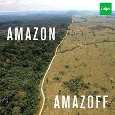
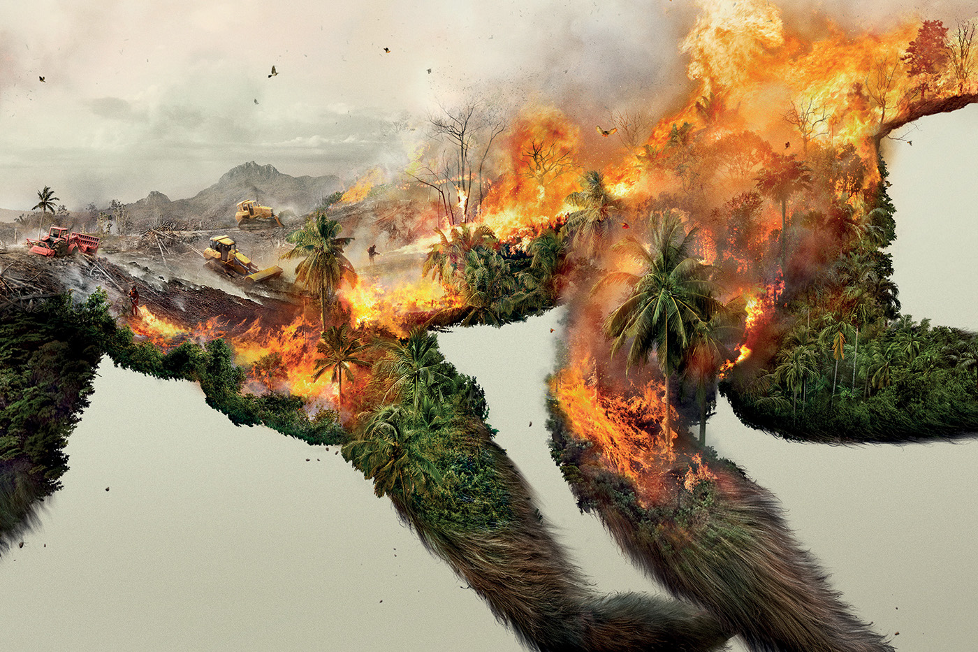
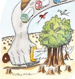
Posted: October 8, 2017 Filed under: Adam O'Reilly, Pressure Project 2 Leave a comment »I spent most of my project time trying to decide which level of perception would be the most beneficial for telling a story of strong cultural significance. I thought about using a fictional story but I wanted to make an impact on the experiencer without suspending their disbelief, which is why I chose to tell the story of human beings destroying the planet’s environments with trash, pollution, and greenhouse gasses. I found a song from my personal library that used a sample of Alan Watt’s talking about humans and our relationship to the environment:
“We need to experience ourselves in such a way that we could say that our real body is not just what’s inside the skin, but our whole, total external environment. Because if we don’t experience ourselves that way, we mistreat our environment. Beat it into submission. And if we do that, comes disaster. We exploit the world we live in. We don’t treat it with love and gentleness and respect…”
The beginning of the song opened up to a bright and natural sound, so I found a utopic scene to use as the first picture in order to give the viewer a taste of what could be. Then, I displayed a series of pictures showing vast fields of pollution and deforestation as well as a couple comics portraying how humans would appear objectively.
To reflect on my second pressure project I think it could have gone better in terms of the quality of the presentation but i think the message was communicated on a basic level. There were some issues with the picture resolution and song audio drowning out the voice of Alan Watts, but most of audience gave was able to understand the intentions of the audio given the visual context. If I could revise this project I would tie in some sort of dynamic/custom elements into the film/audio using Isadora to make the experience more immersive.
Here is a link to the video: https://osu.box.com/s/z7mvzbp36gixwu4ejw7unpl20oz26jqg


Pressure Project 2: We Choose the Moon
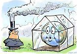
Posted: October 3, 2017 Filed under: Zach Stewart Leave a comment »In the second pressure project we were asked to create an experience documenting a significant cultural event or story using audio as our primary medium. The story I chose to tell was the story of the Apollo 11 moon landing and the events that led up to its occurrence from the perspective of the astronaut. This historical event is one of my favorites because it is an amazing story ofhuman ingenuity, drive, and creativity. Also when picking this event, I was thinking of the resources I had in hand. Knowing I would be presenting in the Motion Lab, picking a story about a lunar space journey made since because the experience would automatically become very experiential because the room is so dark. In addition to the audio, I added in several suggestive visuals to guide the journey and create a more immersive experience.
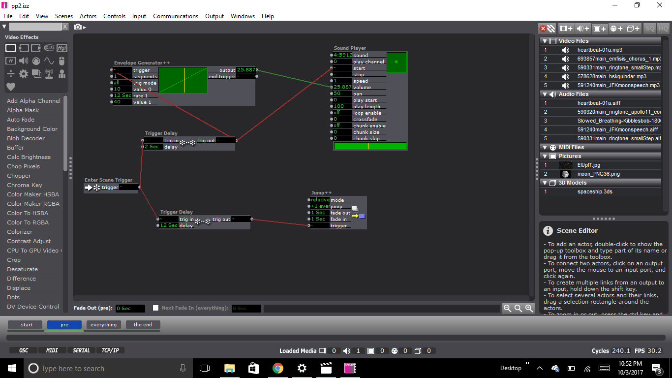
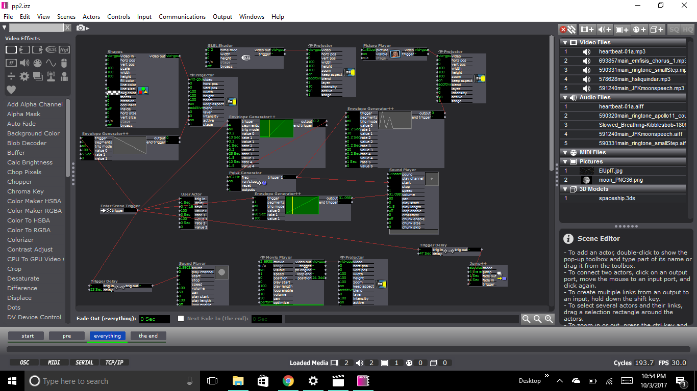
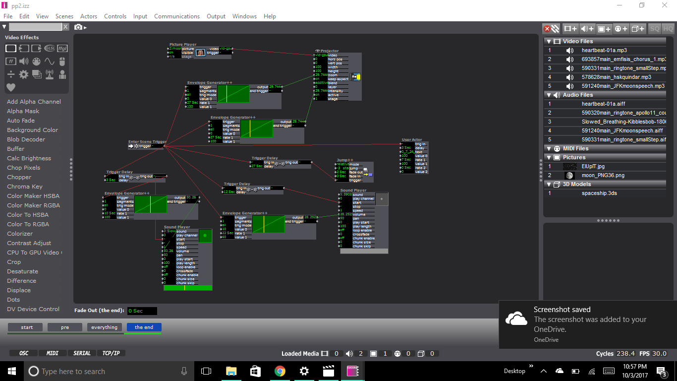
The system consisted of 4 scenes. The first scene was merely a trigger that activated the rest of the system when you would press the space bar. The second scene was merely a black scene with JFK’s famous “We Choose the Moon” speech. The third scene is where the visuals start to kick in. The scene opens to a very light “nebula” glsl shader, which misread, could also be interpreted as smoke from the rocket launch. In over top of the shader is another image of stars that is linked to a pulse generator that flickers on and off along with the sound of a beating heart. Overtop of the heart audio is sound of the launch (the test, the countdown, followed by the noise of the fuel being burned upon takeoff). During the entire audio sequence, the heartbeat sound and the star image flash gets steadily faster to dramatize the events. In the fourth scene, once everything from the previous scene has stopped and a nervous exhale of breath is played. An image of the moon starts fading in and growing bigger on the screen. We then hear Neil Armstrong say one of the most iconic quotes in the history of the human race. After that, the system cycles back to the beginning. Other than the first scene, the entire system is free of user input. The system only relies on enter scene triggers and trigger delays to coordinate the occurrence of events.

Reflecting back on my presentation I was very quick to notice all of its flaws. I felt had clunky my transitions between my audio and visuals and my audio and visuals never exactly matched up how I wanted them too. All of this was almost completely unnoticed by my classmates though. When I brought up the topic for discussion after I presented they said that it was hardly noticeable. Though I know that these flaws exist, my paranoia was maybe uncalled for.
Discussion also led to how to make this system an interactive one. Though my system was deliberately not, I found the ideas interesting and worthy of an introduction in the next iteration of this system if there was one. One of the ideas was to make it controllable though buttons. The user could decide when (or if) to launch, control the speed of the system, or the audio. It was also brought up that I might try to use a stethoscope to control the heartbeat audio of my system.
One last reflection on my system, is the use of silence. Because the experience was limited to 1 minute, I was pressured to put as much audio and visuals into that time period as I could so that the story would be legible. Benny brought up the point of space being devoid of sound. Speaking toward the fourth scene, where we move toward the moon, he suggested it might benefit from the dramatic silence, and I agree. The silence would throw the attention towards the image and highlight the gravity of the experience. If only there was more time!
Trump For An Afternoon Break
Posted: October 2, 2017 Filed under: Bita Bell Leave a comment »Pressure Project 2 had to be a minute of audio telling something that had cultural significance.
I had trump’s face projected on a pear, Persian cucumbers, and a bawl of Cheetos! In Iranian culture, pear and cucumbers signify dumbness. Carrots signify ignorance. On the carrots there was no projection: to add to the meaning of ignorance and also to cut audience’s expectation of seeing projections on all the fruits! The videos were from CNN reporting the signing of the first Travel Ban. The audio was cut and edited from Fox News, announcing the latest version of the Executive Order. This was to show the trajectory of these bans and the ongoingness of them. Next to the snacks, was a fruit knife that had a projection of protests in Columbus after the first ban. Metaphorically, saying that the people were “sharper”, meaning more powerful. The Fox News audio faded into the protestors singing “Hey Hey, Ho Ho, Donald Trump had to go.” After the audio finished, the lights came up, and I invited the audience to cut some fruits and vegetables, and enjoy the snacks!
I liked the fact that it had a sense of dailyness to it. As we eat, these political actions and decisions are made, and we are just there, in our homes, eating some fruits and vegetables !
I also liked cutting the pear that Trump’s face was on. I felt that I was able to release some of my anger in a positive and healthy way!
Video of the piece/performance:
Video in class showing with feedback:
Materials:
First Travel Ban – CNN: https://www.youtube.com/watch?v=OuDZit1lOkU
Latest Travel Ban – Fox: https://www.youtube.com/watch?v=jC9g07DbpiQ
Columbus Protests: https://www.youtube.com/watch?v=resMbl0mxB8
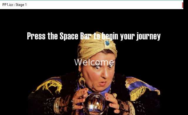
Pressure Project 1-Fortune Teller
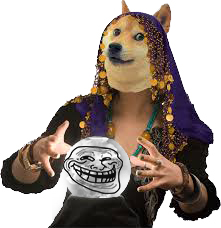
Posted: September 26, 2017 Filed under: Kelsey Gallagher, Pressure Project I Leave a comment »My original idea for this pressure project was a flash game type experience where you had to answer questions to get an outcome. In the quick nature of the project I couldn’t quite figure out how to make each of the questions matter so i made the first two questions red herrings.
This first image is from my pre-show screen. Instructing the audience to use the space bar.
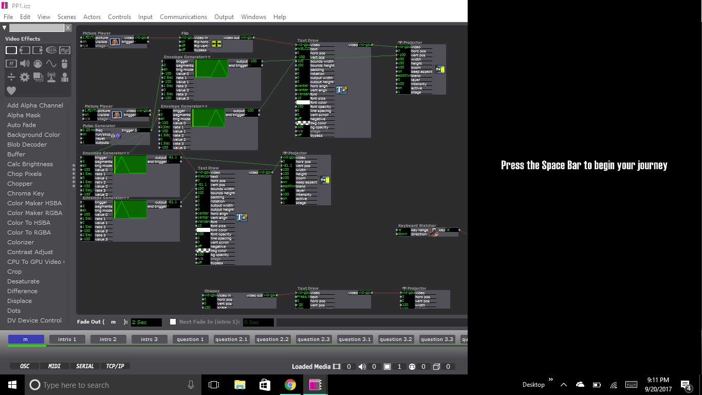
This image is of one of my question pages, that included keyboard watchers, so you could answer with typing corresponding letters and Text Draw actors, shapes actors or picture payers, depending on which question you were on.
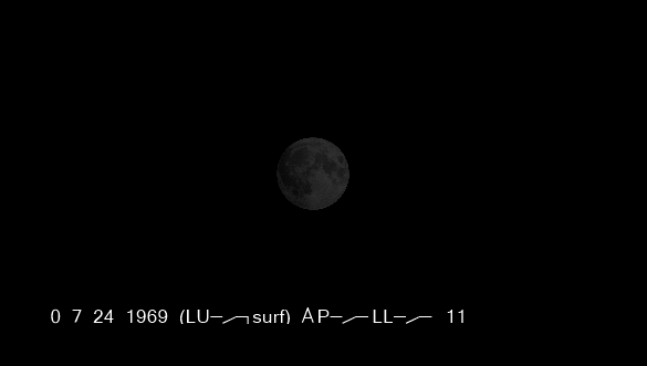
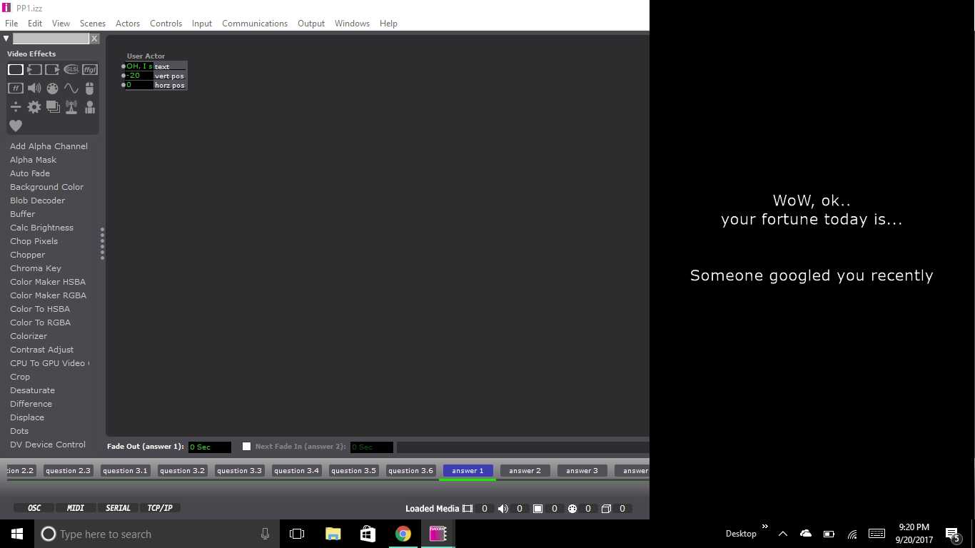
This Image is from the filler image just before the end, where you get your fortune.
Most of my process was pretty linear and fluid. I was unsure of how to structure the program, so I did it the way I was most comfortable, which was like cueing a lighting board. Each change is within a new scene. I learned from the VR class last year that clear instructions are paramount, so I worked hard to make sure it was easy to figure out what you needed to do.
Reflections-
I definitely needed to add sound to the experience, it was very stark without the sound. Otherwise, other improvements could have been made by stretching the amount of possible answers, making more questions and linking them together, or possibly finding ways to make infinite loops. I also should have accentuated the troll face in the crystal ball at the end a bit more.

I was happy to use my personality in this project.
Pressure Project 1: Fortune Teller
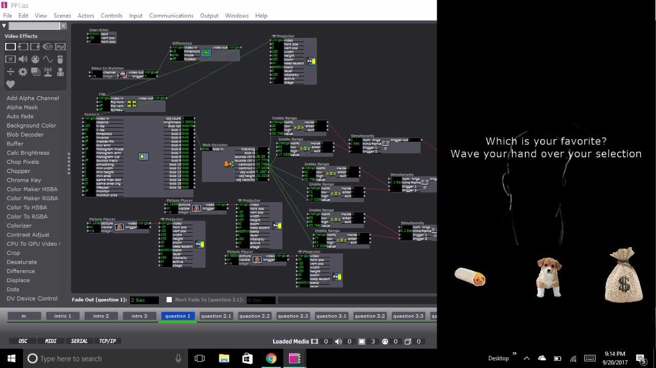
Posted: September 22, 2017 Filed under: Zach Stewart Leave a comment »My fortune telling system put visitors through a silly yet engaging interface to reveal to them some their deepest, darkest, most personal fortunes…. or, more than likely, just an odd, trolling remark. From the beginning of the project I wanted to keep the experience fun and not too serious. I wanted to keep some aspects of the stereotypical fortune telling experience but critique the traditional experience in that the questions I ask and the final response have essentially nothing to do with each other. It was also important for me to remove the user from the traditional inputs of the computer (i.e. the keyboard and the mouse) to create a more interactive experience.
My system started by prompting the user to begin their journey by pressing the space bar (the only time they used the keyboard during the experience) which took them through several scenes that set the up for what was about to happen. The purpose of these scenes wasn’t to take in user input but set the mood for the experience. The slides were simply just text that had a wave generator applied to its rotation input to give the text a more psychedelic, entrancing feeling that falls in with the theme of the fortune telling experience. The idea here being to create some predetermined conversation that would carry throughout the entire project.
Once through the initial scenes, the user was introduced to the first scene with a question which had 3 possible responses. On the scene, the top part of the screen was devoted to the text. On the lower portion were 3 icon representing responses to the question. In the background of the scene is the projection of the user. The projection is using the video input from my computer’s web cam and then running it through the difference actor to calculate the movement of the user. The output of the difference actor was also plugged into an eyes++ actor which tracked the movement of the user through the blob decoder actor. To respond to the question the user was prompted to wave their hand over the icon that matched with their answer. The scene would then jump to the next scene that corresponded with the answer. This happened due to the inside range actor that were placed over each icon that watched for the blob’s movement over the actors. The scene would change once the x and y coordinates of the blob were inside the range prescribed by the inside range actors.
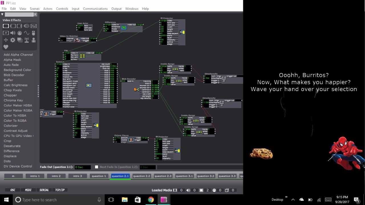
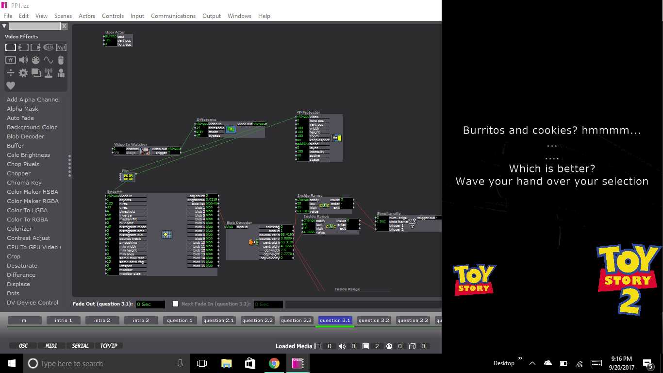
This set up for the scene continued throughout the remainder of the project. Each set of questions that followed tried to keep up with the user’s inputs with text presented at the top of each scene. The text continued the conversation that was started at the beginning of the presentation. After the first question, depending on the user’s choice, they could have been brought to any one of three scenes with a question featuring two possible answers. From there, the user was then directed to a third question with another two potential answers. The third question for all possible question paths was the same, but it appeared on six separate scenes as to still be considerate of the user’s previous inputs and the user’s answer to the question. From the last question the user was then fed into a scene containing 1 of 6 possible fortunes. And that was it!
During the presentation of the system, I ran into some tricky bumps in the road. The big one being that the system would skip scenes when users would wave their hands too long over an icon. Additionally, and confusingly, it would in some cases not respond after several seconds of violent waving by a user. When the system’s tolerance was calibrated it was calibrated in a lot of natural light which could have given rise to discrepancies when the system was then turned on in the computer lab which is only lit by artificial light. The system could be fixed using several alternative methods. The first being a trigger delay for when moving from scene to scene. This would prevent that eyes++ actor from prematurely recognizing inputs from the user. The second being a stricter calibration of the eyes++ actor. In the actors inputs you can control size of the recognized blob being tracked and the smoothness of its movement. Both of these inputs would have given greater tolerance to user’s movement. The last solution may have been to consider a different form of input that used a more sensitive camera or Leap Motion.
Additional improvements could be made around how the system interacts with user and the type of outputs the system produces. After watching some of the other presentations it was very clear that my system could have benefited from the introduction of sound. The element of sound created another level of thematic experience that could have played up the concept of my goofy fortune telling experience. The second being the idea of the system looping back to the beginning. After every user finished their interaction the system had to manually prompted back to the being scene. A jump actor could have easily fixed this.
I feel like I could say more, but I should probably stop rambling, so here is my project, check it out and enjoy!
https://osu.box.com/s/dd6sopphqnxa5uu8cgjboa0xzsam2u0r
Pressure Project 2 – 2017
Posted: September 22, 2017 Filed under: Uncategorized Leave a comment »PP2 – Media and Narrative:
This Pressure Project was originally offered to me by my Professor, Aisling Kelliher:
Topic – narrative sound and music
Select a story of strong cultural significance. For example this can mean an epic story (e.g. The Odyssey), a fairytale (e.g. Red Riding Hood), an urban legend (e.g. The Kidney Heist) or a story that has particular cultural meaning to you (e.g. WWII for me, Cuchulainn for Kelliher).
Tell us that story using music and audio as the the primary media. You can use just audio or combine with images/movies if you like. You can use audio from your own personal collections, from online resources or created by you (the same with any accompanying visuals). You should aim to tell your story in under a minute.
You have 5 hours to work on this project.
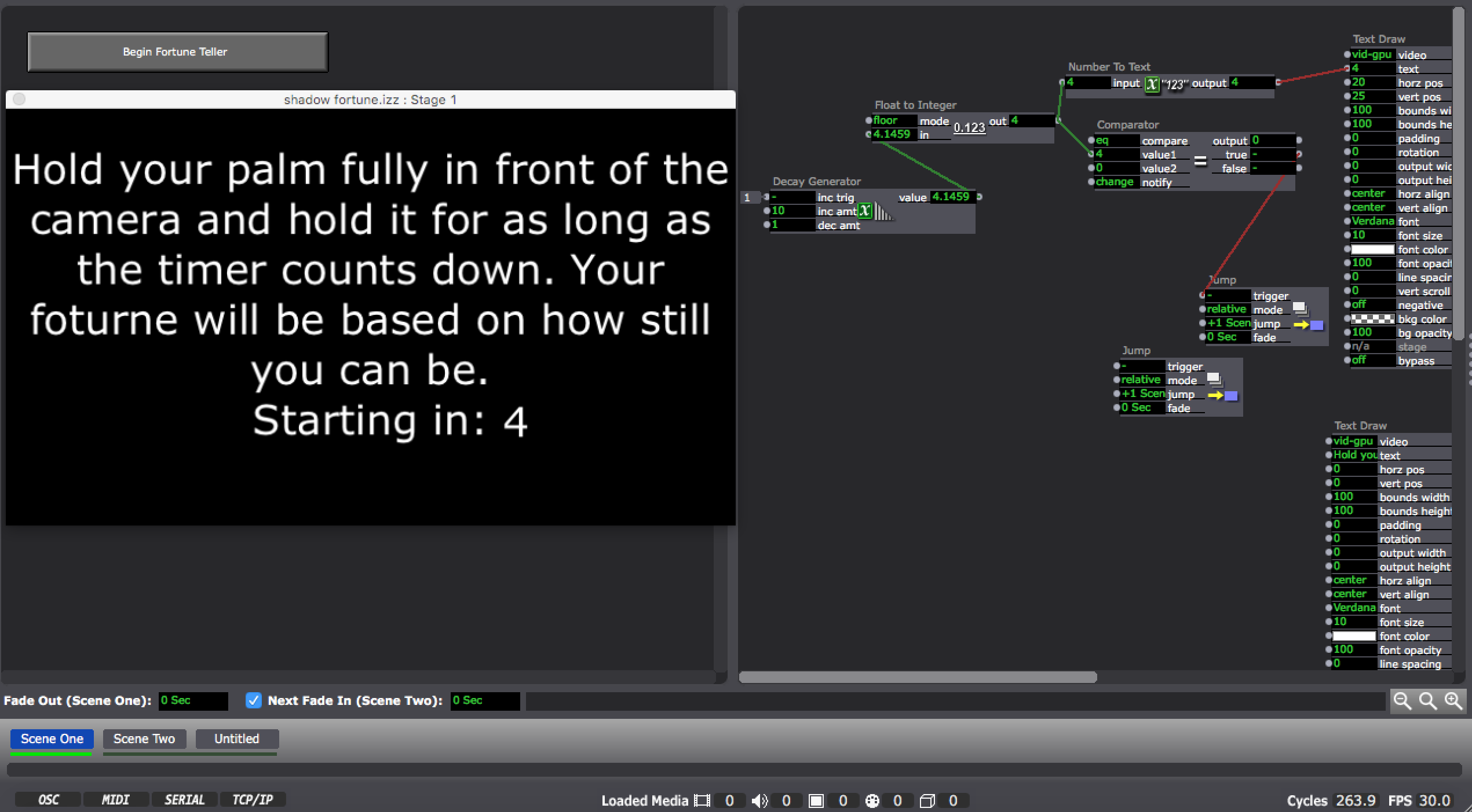
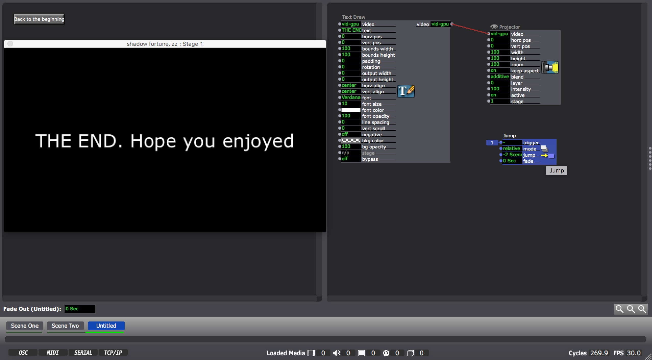
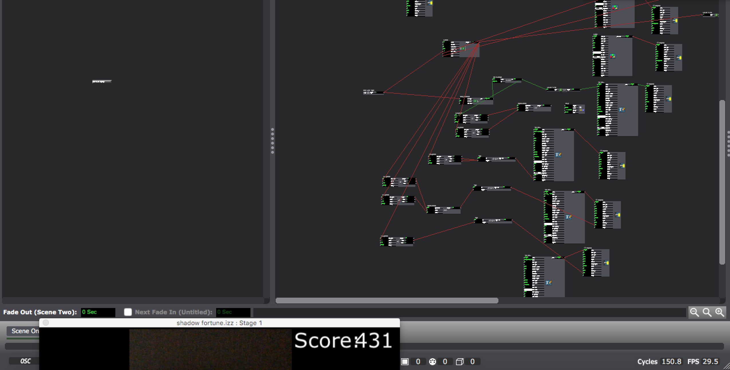
Palm Stillness Reader/Fortune Teller
Posted: September 18, 2017 Filed under: Adam O'Reilly, Pressure Project I Leave a comment »Pressure Project #1
As I brainstormed for the the first pressure project (during the first few minutes of my 6 hour period), I knew I wanted to use Eyes++ and it’s computer vision as my user input. I thought that this would give me an element of randomness as the input was being fed in “real time” throughout the sequence. In contrast, my non-random response was the set of fortunes that were displayed as the user’s score declined in each interval. I used a pair of comparators to tie in the fortunes saying “You’re amazing. You will have good fortune in the future” for a score above 400, “So so, you’ve got a rocky road ahead of you.” for a score in between 400 and 150, and “You probably fail at a lot of things in life.. keep it up champ” for a score lower than 150. Yea, I know, harsh words for those who couldn’t sit 100% still for 60 seconds.
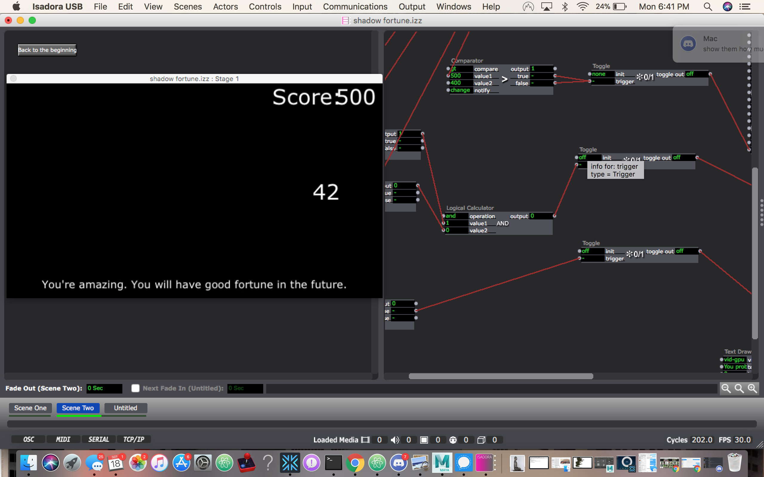
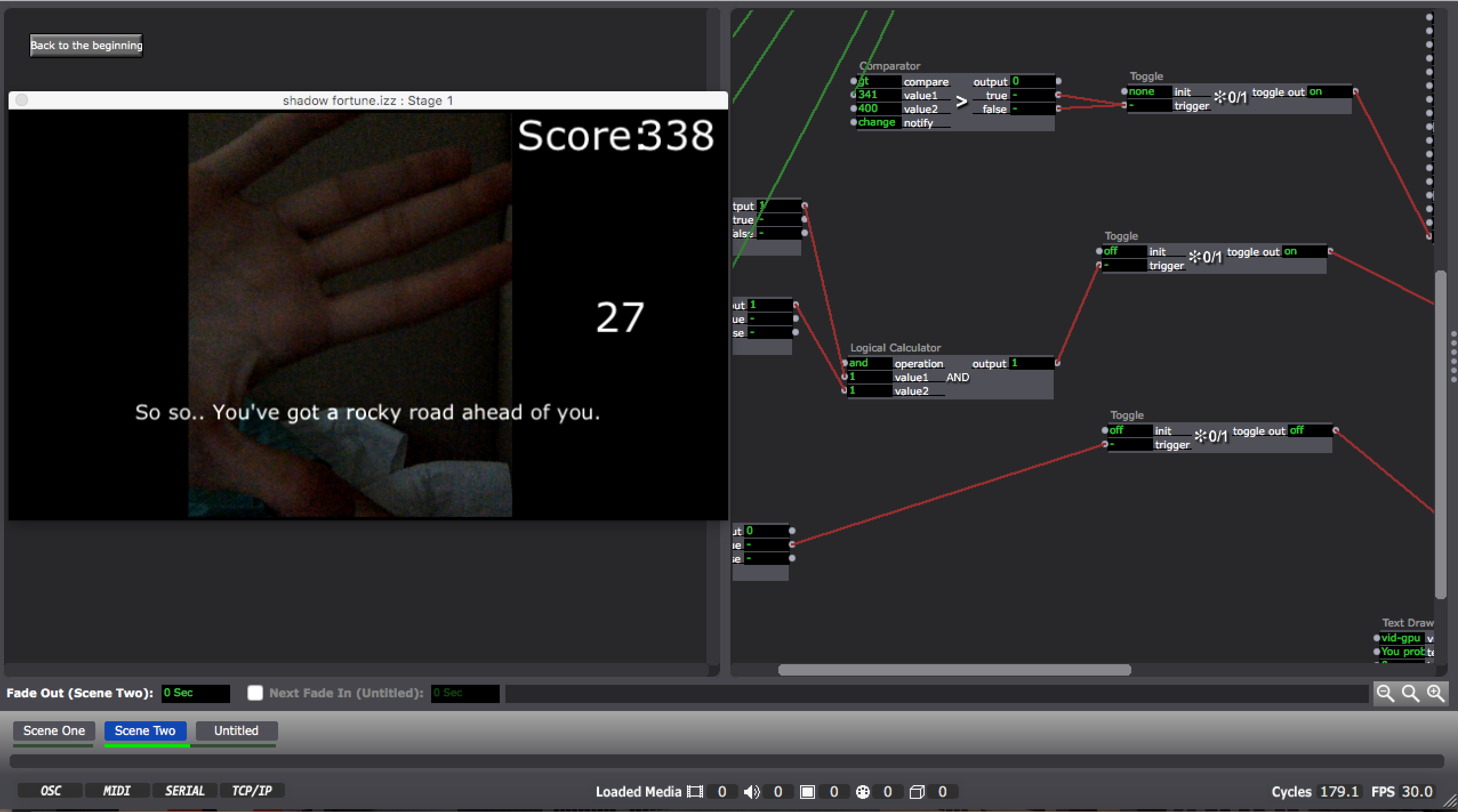
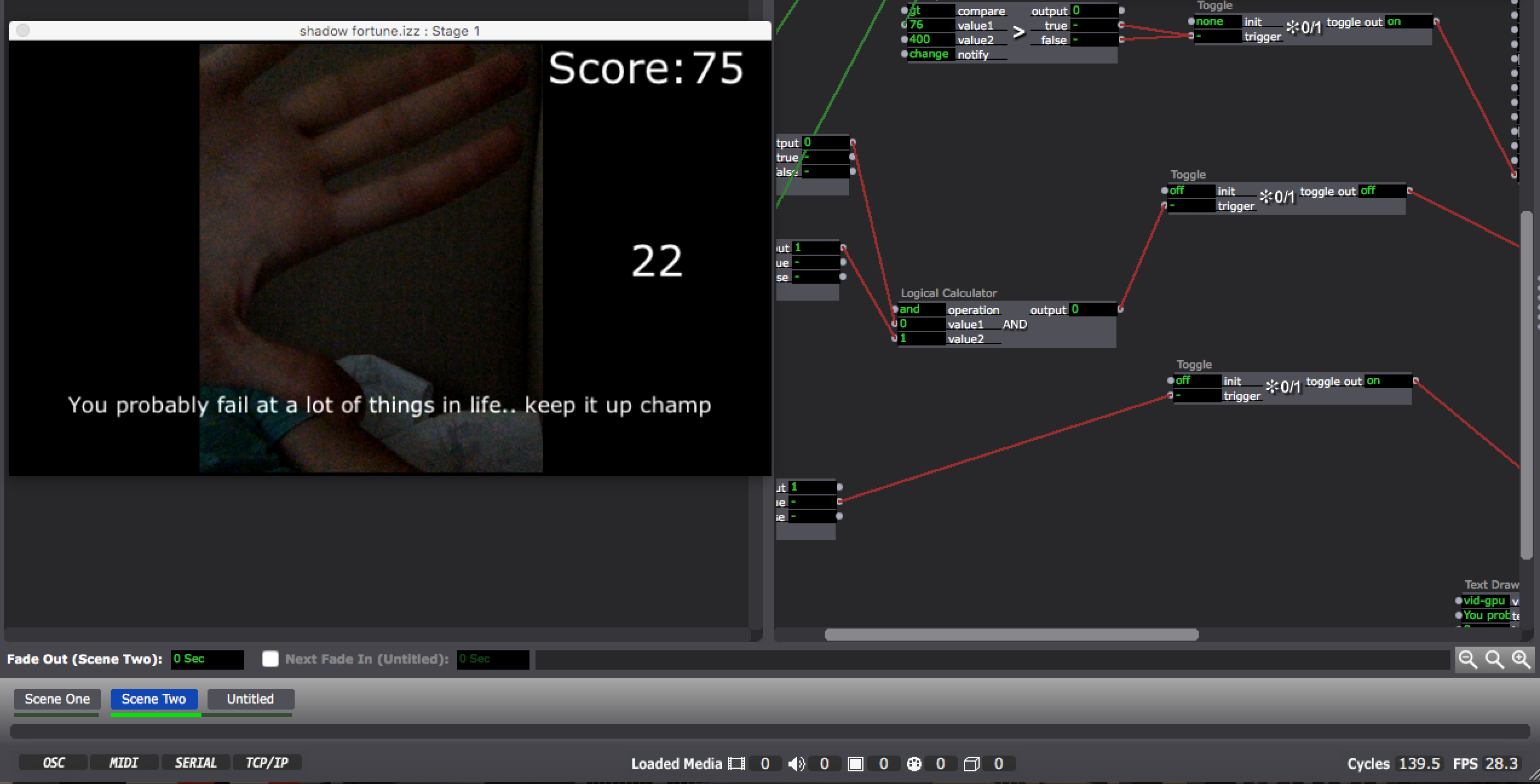
During this same brainstorming phase I envisioned a process that would prompt the user to stand in front of the camera with their arms stretched horizontally outwards and hold that position for as long as possible (within the bounds of an outline . I added a Difference actor my Eyes++ output so I could detect motion easily with the live webcam input. Unfortunately I couldn’t configure the difference/blob settings to pick up my ar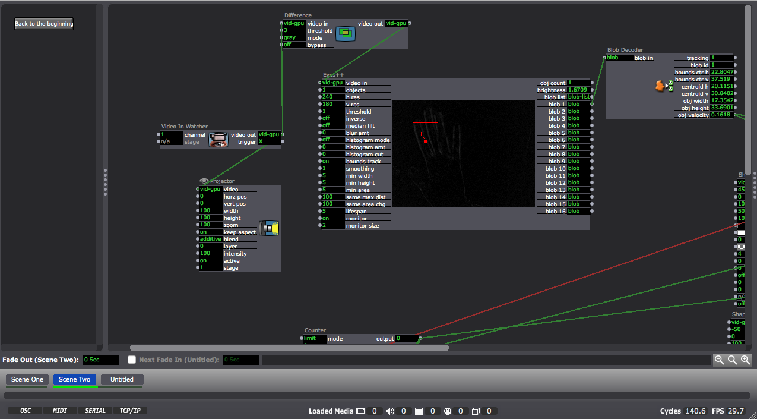 ms consistently, so I pivoted my idea and decided to just focus on picking up the velocity of one blob (aka my hand) and sensing the moments that it is moving.
I wanted this experience to have game mechanics so I decided to start the score at 500 and decrease the score rapidly whenever the Eyes++ detected a movement. It was pointed out that it would have been easier if the score regenerated. I initially intended for this but the idea was lost with my pivot and lack of time.
Feedback:
Going into the presentation I thought that my project structure felt too “basic” in comparison to the others who had gone before me. The experience was difficult for a majority of the people who tried it, which led to not as many people attempting (although the feedback was that everyone understood what would happen based on their movements and they didn’t feel the urge to try it out). An improvement would be a change to the rate of score decay and regeneration of score. This would ultimately maintain the feeling of being locked into a particular area and continue to fulfill my goal of working with the users nervous system and score based engagement. I also think suspenseful music in the background would have added entertainment value and obviously suspense.
Additional Shots: