GGEZ: An Audio-Reactive Visualizer
Posted: October 1, 2026 Filed under: Uncategorized Leave a comment »Description
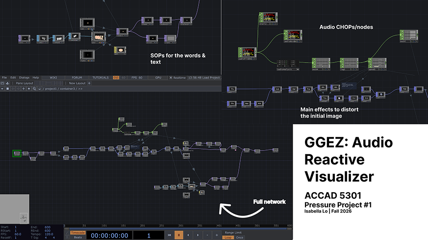
For this project, I made a self-generating audio-reactive visualizer in TouchDesigner using the song “GGEZ” by Kaien Nuen, SUGAR (CNCA), and M.Sasuke. The visual includes 3D “GGEZ” text, and organic blob, particles, and different effects that react to the audio. Once the patch is started, it runs on its own and the audio continuously changes different visual parameters.
Process Reflection
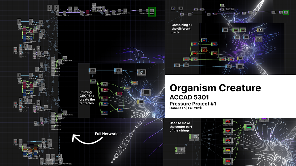
When I first started this project, I wanted to make a digital organism that woudl grow, change, and eventually die. Since I was getting comfortable with TouchDesigner, I started looking a tutorials to figure out how I could actually build something like that. I first followed Pao Olea’s Organic Creature tutorial, which helped me learn more about SOPs, CHOPs, instancing, geometry, 3D space, materials, feedback, and bloom. I ended up making a tentacle-like spiral while experimenting with these techniques, and this made me much more comfortable working with 3D geometry.
After that, I become more interested in audio reactivity, so I followed Nicholas P.J.M’s tutorials on audio-reactive particles and 3D text. I learned how to use POPs, Audio Analysis, Math, Transform, Noise, and Random, and then started combining those techniques with what I had learned from the first tutorial.
The five-hour limit definitely affected my process. I oiginally had a pretty specific plan, but ended up exploring two connected directions instead of spending the entire time on one organism. I think this actually helped me learn more becuase I was able to experiment with different parts of TouchDesigner and then bring them together in the final piece.
I originally planned to use “American Girl” by Tiffany Day, but I changed the song to “GGEZ” becuase I thought its recognizable and intentionally cringe quality would get more of a reaction from the class. I also added the 3D “GGEZ” text becuase I thoguht it would be funny to make the song itself part of the visual. Unfortunately, after listening to it for five hours, it definitely got stuck in my head.
One thing that suprised me was how much the different parts of TouchDesigner build on each other. TOPs, SOPs, CHOPs, and POPs initally felt very separate, but it started to understand how they can all work together. I also realized how much a small parameter change can completely hange the final visual.
For the presentation, the patch ran on its own and held the class’s attention for at least a minute. I also got a noticeable reaction from the class. If I had more time, I would turn the “GGEZ” text into a full lyric visualizer and return to my original organism idea to create a clearer growth adn death cycle.
Documentation
Pressure Project 1
View the final project release or explore the GitHub repository containing the TouchDesigner project and supporting files.
Answering Questions
What is causing the audio reactivity, and what is the input?
The main input is the song itself. I use an Audio File In CHOP to bring the song into TouchDesigner, which then goes into Audio Analysis. From there, I use Math and Lag to adjust and smooth the values before sending them into different parameters. Different parts of the audio control different parts of the visual, including the galaxy shape and the “GGEZ” text. This is what allows the visual to keep changing as the song plays.
How are the particles moving?
I used POP operators to create and control the particles. I used Math and Transform nodes along with Noise and Random to change their movement and make it less predictable. Originally, the particles looked more like little boxes, so I used a Trail to make their movement more continuous. This made them look more like particles flowing through the space instead of separate objects moving around.
How did you layer everything?
I started with the different visual elements separately and then combined them through different TOPs and a Geometry component. The galaxy image was converted into a 3D object, which gave me the main organic shape in the piece. I also created the “GGEZ” text as a 3D element and rendered it back into a TOP so I could keep manipulating it. From there, I layered things like Noise, Slope, Displace, Feedback, color effects, and Bloom to create the final look. The feedback helped create trails and build on previous frames, which made the visual feel more constantly in motion.
What is the organic shape, and how did I arrive at it?
The organic-looking shape is actually an image of a galaxy that I converted into a 3D object. I originally started the project wanting to make a digital organism that would grow and eventually die. I started by following Pao Olea’s Organic Creature tutorial, which taught me more about geometry, instancing, SOPs, CHOPs, and 3D space. I then experimented with a tentacle-like spiral before moving into the audio-reactive particle tutorial. While experimenting, I realized I could take an image and turn it into a 3D form, which is how I ended up with the galaxy shape in the final piece.
Where did I start, and how did I get here?
I definitely did not start with the final idea. I started with the organism concept, then went through a tentacle/geometry exploration, and eventually became more interested in audio-reactive visuals. I used a few tutorials to learn specific techniques and then combined parts of them into my own patch. The five-hour limit meant I had to experiment while I was learning, so the final piece became a combination of several things I learned rather than one idea that I had completely planned from the beginning.
I also originally planned to use “American Girl” by Tiffany Day, but switched to “GGEZ” because I thought the song would get more of a reaction from the class. I wanted the giant “GGEZ” text to make the piece a little funny instead of just being a serious audio visualizer.
What would I do with more time?
If I had more time, I would turn the “GGEZ” text into a full lyric visualizer instead of having the same word throughout the piece. I would also like to return to my original organism idea and make the galaxy/organic shape actually grow, change, and eventually break apart or die. I think that would make the piece feel more like the self-generating organism I originally imagined.
AI Expert Audit – Evaluating AI-Generated Multimodal Material
Posted: September 10, 2026 Filed under: Uncategorized Leave a comment »A. Source Material
For this assignment, I used my essay, “Early Chinese Dumplings (Wonton) from Qimin Yaoshu,” which I wrote last semester for the final project in a food history general education course. The project required us to recreate a historical food using a recipe from historical sources. I made a simplified reconstruction of early Chinese wontons and reflected on the cooking process and the differences between historical and modern ingredients and tools.
Because I researched the topic, prepared the food, and wrote the essay myself, I am familiar with both its content and the experience it describes. This allows me to evaluate whether the AI accurately represents my work. The project is meaningful to me because it connected a familiar food with its history through hands-on experience.
B. The AI-Generated Materials
AI-Generated Podcast
https://file.garden/ap8TDC2-D925c-lY/The_1500_year_old_survival_dumpling.mp3
AI-Generated Mind
AI-Generated Infographic
C. My Expert Audit
Accuracy Check
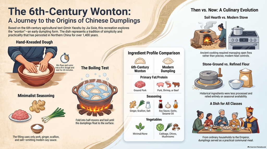
Overall, I did not notice any obvious factual errors in the AI generated materials. The podcast explained the basic information about wontons clearly. The mind map was easy to follow and I did not notice anything important missing. The infographic was also well organized and covered the basic content of my essay.The main issue was the podcast’s emphasis. It repeated simple information and spent more time explaining ordinary details than I thought necessary. One specific example is the infographic’s instruction to let the dough “rest for 20 minutes.” This matches what I did in my cooking project, but my essay does not establish that this exact timing came from the historical recipe. By placing this instruction under the title “The 6th-Century Wonton,” the infographic could lead a reader to mistake my modern reconstruction choices for documented historical instructions. The detail itself is accurate to my experience, but its presentation makes the historical connection seem more certain than my essay supports.
My essay discusses a familiar food through my own cooking experience, but the podcast sometimes made the topic sound more complicated or remarkable than it felt to me. This did not necessarily change the facts, but it changed how the material came across. Someone unfamiliar with my essay might not notice that difference in tone.
Usefulness for Learning
If I were learning about this topic for the first time, I think these resources would help. The podcast explained the basics clearly, which could benefit someone unfamiliar with wontons. However, its thoroughness also made it feel unnecessarily long. At times, it sounded like two people reading an essay aloud rather than having a natural conversation. They repeated straightforward points that I would not expect a typical podcast to spend so much time discussing.
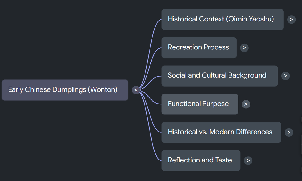
The mind map worked well because its structure was clear and the content felt complete. It made the information easy to follow without requiring a long explanation. The infographic also presented the basic content in an orderly way and was useful for a quick overview.
Based on my experience, the mind map was the most effective format because it was clear and direct. The podcast was the least effective for me because of its repetition, although its detailed explanations might be more useful to a beginner. However, the structure of my essay is fairly simple, so it may not be representative of more complex texts. However, in my previous experience, AI has been especially helpful for breaking down texts with complex arguments and making their logic clear at a glance.
The Aesthetic of AI
The most noticeable “AI weirdness” was the podcast hosts’ exaggerated emotions such as surprise or questions. My original essay is about a fairly normal cooking experience. However, the hosts sometimes reacted as though the information was surprising or extraordinary. These reactions seemed intended to imitate human enthusiasm, but they felt out of place. Their small talk and exchanges were also slightly stiff.
The podcast had an enthusiastic, explanatory voice, but the enthusiasm did not always match the subject. It seemed to prioritize keeping the conversation lively and explaining everything thoroughly. As the author, I would have preferred less repetition and more attention to the personal experience behind the essay.
The infographic looked organized, but its uniform font styling gave it a somewhat formulaic appearance that I associate with AI generated posters. This is a personal impression rather than proof of AI authorship, since human designers can also use a consistent font.
Trust & Limitations
My experience with these materials connects to how my use of AI has changed. I started using AI to help write essays in high school because English is my second language. At that time, organizing my ideas into a complete English essay felt extremely difficult. As my English improved, I began noticing recurring structures and expressions in AI-generated writing. The writing could be fluent, but it often failed to express my feelings accurately.
Now, I mainly use AI to suggest a broad outline or help identify the main points of an assignment. I write the important ideas and emotional content myself. This gives me support while keeping the writing closer to what I actually want to say.
AI Expert Audit: LeBron vs Michael Jordan
Posted: September 9, 2026 Filed under: Uncategorized Leave a comment »A. Your Source Material
- What document(s) did you use?
- Why are you an expert in this content?
- What makes this material important or meaningful to you?
I utilized two documents that I felt would give the AI a well-rounded and robust overview of the topic. I first gave the AI an article that simply showcases side by side statistical comparisons. This covered the objective and mathematical portion of the debate. I then gave AI a link to the most popular reddit thread on this topic, so it can have access to the more subjective side where oddly specific details were discussed to a greater extent. Every possible argument people made, the AI had access to now. What makes me an expert in this content is the fact that I’ve been talking about it and posing the question for years now even writing a paper on it in high school which I eventually switched stances from. I’ve done the research and due diligence. This material is meaningful to me because the game of basketball happens to be my favorite sport and I believe it is human nature to want to recognize the absolute pinnacle of any sporting event or endeavor. At least it’s in my nature.
B. The AI-Generated Materials
- Embed or link to the podcast, mind map, and infographic NotebookLM created
- (You can screenshot the mind map and infographic, or describe them if embedding isn’t possible)
- MindMap
- Podcast
- Report
- Claude Infographic
C. Your Expert Audit
Respond to ALL of the following:
1. Accuracy Check
- What did the AI get right?
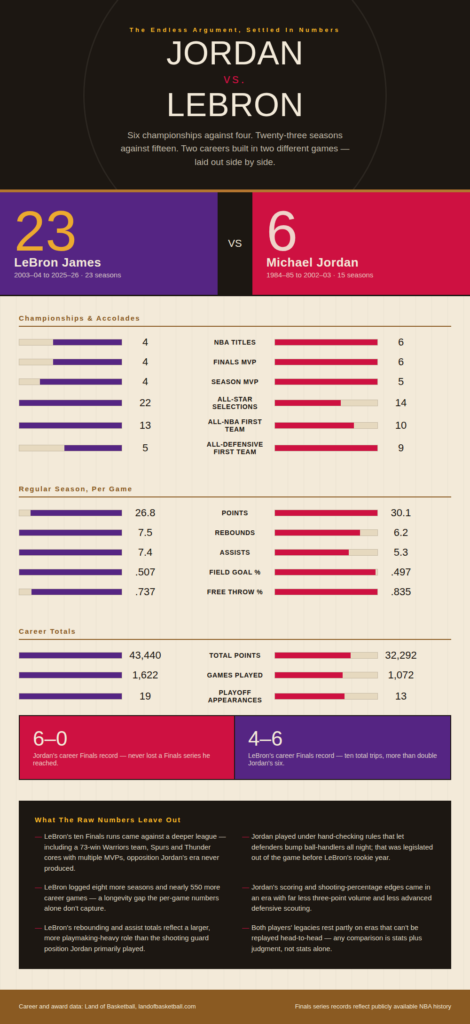
- The AI got a lot right in this analysis. It correctly noted that not all opponents are created equal, and that a ring isn’t just a ring, since MJ never had to face a team like the 73-9 Warriors that LeBron did. It also recognized that the modern NBA is a fundamentally different and harder game, with greater talent depth and ball knowledge across the league. The AI did a solid job tracing LeBron’s different team phases as he moved around, compared to Jordan’s primarily Bulls-centric career, and it accurately pointed out that MJ never lost a Finals series when he was favored, unlike LeBron’s losses in critical series like the one against the Mavericks. It also picked up on how offensive and defensive strategies have evolved, along with physical factors like court conditions. One of its stronger points was recognizing that you can’t just teleport a player into a different era without accounting for the transfer of era-specific knowledge and resources, showing genuinely good era recognition. It also acknowledged that differing definitions of greatness mean this debate will likely never be fully settled, and overall it compared accolades between the two players well.
- What did it get wrong, oversimplify, or miss entirely?
- On the other hand, there were some notable shortcomings. The AI oversimplified LeBron’s longevity by framing it as an unanswerable marathon-versus-sprint comparison, when in reality his extra seasons should have been treated as a real, substantive point of comparison rather than dismissed. It also spent too much time diving into the players’ business footprints and finances, effectively defining their value too heavily around how good a financial asset each of them is rather than their on-court impact. It missed their physical attributes entirely, failing to mention that LeBron is the bigger player while MJ had the higher vertical. And it leaned too much on points per game without giving enough attention to shooting percentages, which left an important efficiency dimension of the comparison underexplored.
- Were there any subtle distortions or misrepresentations that a non-expert might not catch?
- Not that I noted, what the AI spoke on seemed to be accurate.
2. Usefulness for Learning
- If you were encountering this material for the first time, would these AI-generated resources help you understand it?
- What do the podcast, mind map, and infographic each do well (or poorly) as learning tools?
- Which format was most/least effective? Why?
If I were encountering this material for the first time, the AI-generated resources would definitely help me understand it. The podcast did really well at exploring specific arguments like era-specific differences, but spent a lot of time on a few when I think spending less time on more arguments would’ve been more all encompassing. The mind map laid out all of the data in a really neat and organized way only coming short when it came to oversimplifications. For example in the cumulative totals nodes, only three stat lines are presented. The report was an all around great document of information that dove the deepest into statistical comparisons.
3. The Aesthetic of AI
- What “AI weirdness” did you notice? (Strange phrasings, generic language, odd emphases, uncanny tone, oversimplifications, etc.)
- Did the AI have a particular “voice” or style? How would you describe it?
- What does the AI prioritize or emphasize that a human expert might not?
Some AI weirdness I noticed was at times in the podcast it almost seemed to crash and freeze for a few seconds. Leaving us with a creepy long stutter. The AI didn’t really have a particular voice or style because the three different sources it generated all came at the debate from different angles. I don’t think in the context of the topic I chose the AI emphasized a specific point that I couldn’t see a human expert emphasizing. Although it was partially based on a reddit thread so it’s almost echoing human thought.
4. Trust & Limitations
- Based on this experiment, what would you warn someone about trusting AI-generated educational materials?
- Where does AI seem most reliable? Where is it most likely to mislead?
I would say to use AI as a general overview offering the comfort to trust the salient points. It seems the most reliable in covering the big arguments and doing so in a fully cohesive way. Where I would caution someone is about the finer details. It seems AI can oversimply or overlook them in an effort for a more efficient conclusion/explanation. In my experience though AI didn’t necessarily state any incorrect information.
#2 AI Expert Audit: Attack On Titan
Posted: September 9, 2026 Filed under: Uncategorized Leave a comment »Briefing Doc: Here
Character Mind Map: Here
Podcast: Here
For my investigation on NotebookLM, I decided to do an overview of both the Attack on Titan the manga, and the anime. I imputed the sources of both the wikis for the different mediums, and a few other articles on bigger episodes of the series. I chose Attack on Titan because it is a piece of media that I have obsessed over for awhile now, due to its intense world building and focus on deep storytelling between characters, and an overarching story. Now after inputting these sources, I found that AI had a good grasp on what the story is, but isn’t able to know finer details without me letting it learn other sources. I want to go over some of the parts that AI got right, and the parts that AI got wrong.
The AI had a good grasp on what the general idea of the story was, along with the characters and what they represent. But, it had mistakes on certain things like pronunciation, character connections, and small, yet key parts of the story. It oversimplifies a lot of the parts of the story, leaving out what really makes the show intense and intricate. For example, I generated the mind map to create connections between characters, yet it just divided them into sub-group, diminishing what the depth of character connection there is in the story.
I believe that if I didn’t know much about the story, it would be a good way for me to get a basic understanding of it. I found the podcast to be the most useful, and entertaining way of learning the material because it feels more engaging and goes further in depth. The mind map didn’t really do much, and the briefing doc was informative, but not engaging. The idea of it being AI made me feel weird in itself, especially with how more human AI is sounding, with expressions and banter. I told the AI to make the voices engaging and funny, which made the podcast feel more enjoyable. With these human emotions though, it wasn’t felt with the words they said always, a lot of it sounded scripted, along with occasional voice glitches that took me out of it.
After going through this research, I found that it is a new possible way to learn about more specific topics that there might not be many resources for. Even then, I wouldn’t use it as something to rely on. You have to make sure your sources you’re uploading first are good sources, and even after that, it can focus on the wrong information if you don’t prompt it correctly. If they were able to find a way for it to take up less resources, along with more accuracy, I could find myself using something like this. The medium that led me to feel this way is the podcast option. It was very engaging when it wasn’t glitching out, and it dove deep into the storytelling and world building that I asked it to, and the information was mostly accurate. I think it has the possibility of being a big learning medium compared to things like ChatGPT that just spew information back out at you.
AI Expert Audit: The Vanishing Art of Taohuawu Woodblock Prints
Posted: September 9, 2026 Filed under: Uncategorized Leave a comment »A. Source Material
For this task, I used a previous project – a study on the phenomenon of the gradual disappearance of traditional Chinese culture, with a focus on Taohuawu Woodblock New Year Prints. I chose this project because I am very familiar with the relevant data. Before researching this topic, I conducted extensive investigations to find ways to document and study these traditional crafts, and to pass them on to future generations.
To me, this topic is very meaningful, as I am interested in the relationship between design and culture, as well as history. I believe it’s also important to understand what happens when traditional crafts become less common in modern life. Since I am already familiar with the content of the raw data, I think this is an excellent topic for testing whether artificial intelligence can accurately summarize and reinterpret this information.
B. AI-Generated Materials
- I used Google NotebookLM to generate three different materials from my source:
- Audio Overview: Digital Muscle Memory of Taohuawu Prints
- Mind Map: Woodblock Mindmap
- Infographic: The Taohuawu Woodblock Print Artisan
Audio Overview
C. Expert Audit
- Accuracy Check
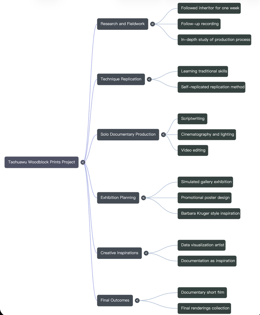
Overall, I believe NotebookLM has correctly understood the core direction of my project. The topics listed in the mind map include concepts such as the disappearance of traditional cultures, intangible cultural heritage, recording and preservation, exploration, and cultural continuity. These concepts align well with what my original project aimed to explore.
However, I also noticed that AI has simplified these topics considerably. For example, it often reduces the content of the project to statements like “protecting culture” or “maintaining traditions”. While these statements are correct, they are too broad. My original project included more personal observations, design decisions, and questions regarding how to experience traditional cultures in a modern context.
Non-experts may not be able to notice this difference, as the information generated by AI sounds very confident and well-organized. This makes the topics seem simpler and more complete than they actually are.
The podcast also showed a similar problem. It explained the topic clearly, but some ideas were repeated several times, especially the importance of preserving traditional culture. Because of this, the 20-minute audio felt a little longer than necessary. It was easy to understand, but the Mind Map was more useful for quickly understanding the main ideas.
2. Usefulness for Learning
If this is my first time learning about this topic, I believe all three methods can be helpful, but in different ways.
Mind maps are particularly useful for me, as they allow me to quickly understand the relationships between various concepts. It’s possible to grasp the information easily without having to read a large amount of text.
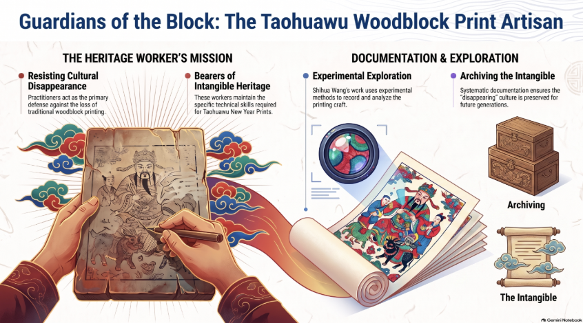
Infographic diagrams also make it easy to understand information visually. They effectively convey information related to craftsmen, documents, and cultural traditions. However, they also simplify complex cultural topics into simpler parts.
Audio presentations are better suited for longer explanations, as they give listeners more time to process the content. But compared to using mind maps or infographics, audio presentations require more time.
For quick understanding, I think mind maps are the most effective option. For deeper learning, I would prefer to refer back to the original sources.
3. The Aesthetic of AI
I noticed that the most obvious “characteristic of artificial intelligence” is that everything becomes very organized and clear. Artificial intelligence tends to categorize items into different categories and provide clear descriptions for each one.
For example, the infographic uses terms like “the mission of inheritors of heritage” and “the preservation of intangible things”. These descriptions sound professional, but they seem too generic and lack uniqueness. Human designers might use more specific or more personalized language to describe such projects.
I also noticed this in the visual style of the infographic. It uses symbols such as clouds, scrolls, and traditional patterns, which immediately convey a sense of “Chinese culture”. Although these elements are attractive, some of them are merely symbols of Chinese culture, rather than elements that are closely related to the core content of the project.
This makes me realize that artificial intelligence is indeed good at quickly creating works that appear correct, but “appearing correct” does not mean that the works have any real meaning or depth.
4. Trust and Limitations
From this experiment, it can be seen that educational materials created by artificial intelligence can serve as a starting point. However, I do not fully trust them; it is necessary to carefully verify their sources.
When artificial intelligence is responsible for organizing information, identifying main themes, and establishing the basic structure of the content, its reliability is highest. But when the content involves cultural details, personal experiences, or complex concepts, its reliability becomes lower.
The biggest risk is that even if artificial intelligence manages to simplify the content effectively, those who do not understand the subject matter may not be able to identify the elements that have been overlooked.
For me, the best way to use these tools is to let artificial intelligence help organize and present the information, while still relying on human knowledge and original sources to determine which aspects are important.
AI Expert Audit: The Lord of the Rings Film Trilogy
Posted: September 9, 2026 Filed under: Uncategorized Leave a comment »Source Material and My Familiarity
I chose Peter Jackson’s The Lord of the Rings film trilogy as the subject of my AI expert audit. I used a SparkNotes plot summary of the trilogy as my source material in NotebookLM. I chose The Lord of the Rings because it has been one of my favorite film series for a long time, and I have watched the films many times. I have also read part of Tolkien’s original novels. I am very familiar with the main characters, their relationships, major events, and many of the details throughout the story. Because of this familiarity, I feel that I can recognize not only obvious mistakes made by AI, but also information that may be technically correct while still being incomplete or oversimplified.
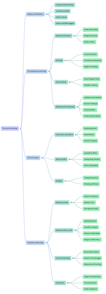
Accuracy and Missing Details
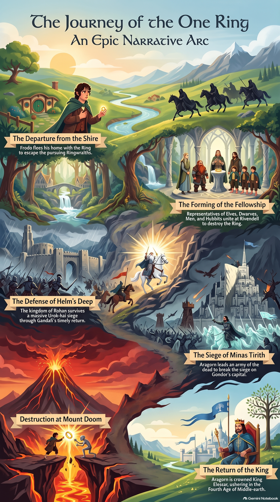
Overall, NotebookLM accurately described the major events of the trilogy. For example, the Mind Map correctly included important events such as the Council of Elrond, the Battle of Helm’s Deep, the defense of Minas Tirith, and the destruction of the One Ring. However, I noticed that the AI focused more on “what happened” and left out a lot of character development. Aragorn is a good example. The Mind Map summarizes his story through a few points, such as his heritage, the Army of the Dead, and his eventual coronation as king. These details are not wrong, but they do not fully show his doubts and struggles, his relationship with the Elven princess Arwen, or the process of gradually accepting his identity and responsibility as the future king. Someone who has never seen the films might understand the basic plot from these AI-generated materials, but they could easily miss an important part of Aragorn’s character development.
Usefulness for Learning
If I were learning about The Lord of the Rings for the first time, I think all three materials would be useful, but for different reasons. The Mind Map was the most useful to me because the trilogy contains many characters, locations, and connected events, and the map makes those connections easier to follow. The Infographic is better for getting a quick overview, but it removes even more detail. The Audio Overview is more engaging because it does not simply repeat the entire plot and instead develops a specific idea about mercy. However, audio also makes it harder to quickly return to a specific character or event. I would therefore use these materials as introductions rather than replacements for watching or closely studying the films.
Trust and Limitations of AI
AI is relatively reliable when it comes to organizing basic facts, timelines, characters, and major events. However, it becomes less reliable when it comes to understanding character motivations, emotional development, or more subtle themes. Therefore, I think these AI-generated materials are useful as a starting point for quickly learning about a topic, but if we really want to understand a work in depth, we still need to return to the original material and form our own interpretations and judgments.
AI Expert Audit
Posted: September 9, 2026 Filed under: Uncategorized Leave a comment »1. Background and Source Material
For this assignment, I used a paper I wrote in the fall of 2024 for the course EDUTL 1902 as source material. This paper primarily explores the copyright issues raised by generative AI in the field of art and whether such use constitutes plagiarism. It explains how generative AI models deconstruct and reorganize unauthorized training data from the internet, as well as potential solutions for avoiding copyright issues in the future.
The main theme of this paper overlaps to some extent with the topic of our current assignment, and the issues it addresses remain relevant today. Having had some personal experience with the question of whether AI constitutes plagiarism, I decided to focus on this topic. This article means a lot to me not only because it addresses a topic relevant to me and to artists in general, but also because it is the first truly rigorous academic paper I have written—one that perfectly adheres to APA 7th edition formatting, something my previous papers failed to achieve.
Main Body of the Article:https://osu.instructure.com/courses/171009/assignments/4173950?module_item_id=12968769
2. AI-Generated Materials
2.1 Podcast
2.2 Mid Map
2.3 Infographic
3. Expert Audit
3.1 Accuracy Check
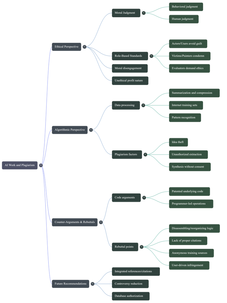
In general, the AI-generated content is quite accurate; it provided a perfect summary of the arguments in my paper—a level of summarization that humans rarely achieve. I admit that my arguments in this paper weren’t very clear, but the AI was able to distill the main points from the text, which is one of its strengths. My paper consists of two major sections, but the distinction between them was not clear; the AI clearly outlined the content of these two sections. The first section is the “ethical perspective,” and the second is the “algorithm perspective.”
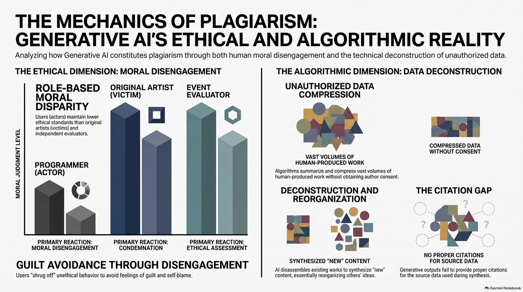
The diagrams provided in the infographic are very helpful for people who are unsure whether AI constitutes plagiarism to understand how AI image generation works. This is much more intuitive than the paper itself. As for the mind map, I think it’s quite detailed; it highlights the specifics of most of the arguments in the article, as well as its causal structure.
So, to sum it up, when it comes to accuracy, I think AI performs quite well; it can perfectly summarize and synthesize the content of all articles and accurately present them in a different format.
3.2 Usefulness for learning
In my opinion, if I were encountering this material for the first time, I believe these AI-generated resources would be very helpful in understanding the main points of the topics I’m interested in. I find the infographics particularly intuitive, as they use images to illustrate the process of generating AI-created works. This is far more intuitive than having someone explain it through language or other means, because visual language is always the most accurate. Similarly, podcasts are an excellent format. I listened to the entire 20-minute episode, and I found the host’s narration very engaging. The way the topic was explored through a conversation between two people made it feel just like listening to two friends chatting. This approach to learning is a subtle and natural way to absorb knowledge.
I think mind maps were actually the least helpful for me personally. To be honest, I don’t like reading—just seeing text gives me a headache. So even though mind maps clearly outline the logical structure and causal relationships of an article, I still find that looking at them makes me feel bored. I believe that although this mind map has streamlined much of the content discussed in the paper, it remains, at its core, rather complex. It hasn’t been simplified enough to allow readers to grasp at a glance what the article is about, because the details included in the mind map are too exhaustive—it covers nearly every subtle point I, as the author, have raised.
3.3 The Aesthetic of AI
In fact, AI can also cause some problems; the content it generates does not always fully reflect what the author intended to convey. One obvious issue is that AI tends to present a person’s arguments as established facts.
AI presents the more complex and controversial viewpoints in the original paper with excessive certainty. For example, the infographic uses very strong terms such as “Unauthorized Data Compression,” leading readers to easily assume that AI’s use of training data necessarily constitutes plagiarism. However, the original paper actually distinguishes between AI algorithms, training data, and users, pointing out that the real problem does not necessarily lie in the AI algorithms themselves, but rather in unauthorized data and the ways in which humans use that data and AI systems.
Therefore, while the AI did not completely alter the author’s core arguments when reorganizing the paper, it did downplay the qualifying conditions and complexities involved. Furthermore, the AI-generated content links concepts such as plagiarism, unauthorized data use, and copyright too closely together, making a complex issue involving multiple layers—including ethical, technical, and legal dimensions—appear as a simple cause-and-effect relationship. This fallacy is particularly difficult for non-experts to detect, as these claims sound very reasonable on the surface and employ a wealth of academic-sounding terminology.
3.4 Trust & Limitations
Through this learning experience, I’ve come to realize that people should maintain a certain level of caution when it comes to AI-generated educational materials. However, this doesn’t mean that AI has no educational value. When AI generates mind maps, infographics, and podcasts, these formats serve as effective tools for facilitating human learning. At the same time, AI’s greatest strength lies in its ability to organize, summarize, and restructure existing information. Although it has these advantages, it does not mean it can achieve 100 percent accuracy. When AI addresses complex ethical, legal, and technical issues, it tends to present controversial viewpoints as if they were proven facts. Anyone who isn’t particularly sensitive to such issues would easily believe what it says. Thus, the most dangerous error AI can make isn’t outright misinformation or fabricated facts, but rather information that may be broadly correct yet sounds extremely accurate because it omits context and qualifying conditions. Once this information enters a person’s mind, it leads them in the opposite direction of what the original knowledge provider intended to convey.
Therefore, AI is best utilized for simple organization and reference—sifting through fragmented information so people do not lose sight of the big picture, while also serving as a straightforward guide to help them determine their next steps. AI tools should be viewed as resources to assist us, rather than as the ultimate authority for determining academic facts.
#2 AI Audit
Posted: September 8, 2026 Filed under: Uncategorized Leave a comment »For my AI audit, I chose to have Gemini scan and generate study materials concerning Danny Gonzalez’s video “Speedrunning Conspiracy Theory Rabbit Holes with Drew Gooden”. I have seen this video many times from start to finish, and it is one of my comfort videos. I have a lot of other in-depth hobbies and interests I could have done this assignment about, but I fear that most media I enjoy is very vast and complicated, so even I am not an expert on them. This video is one of the only things I can quote, possibly start to finish.
MIND MAP
PODCAST
VIDEO OVERVIEW (It wouldn’t let me make an infographic 🙁 )
ACCURACY
After reviewing the generated materials, I am not shocked to see that it got most of the facts from the video correct. Though, in the podcast, it did get a fact wrong about the alien story told in the video. In the video, the alien story is told by a guy, supposedly named Clifford, who ran into an alien while fighting in Vietnam, and the alien says his name and warns him against fighting. But the podcast says that the alien is Clifford, which is just plain wrong. Also, in the video overview, it portrays the bent part of the dowsing rods in the wrong orientation in some clips.
I thought it was odd that in the podcast, the “hosts” go on a weird AI tangent at the end; it seems disingenuous for the robot to be talking about the future negative effects of robots.
USEFULNESS
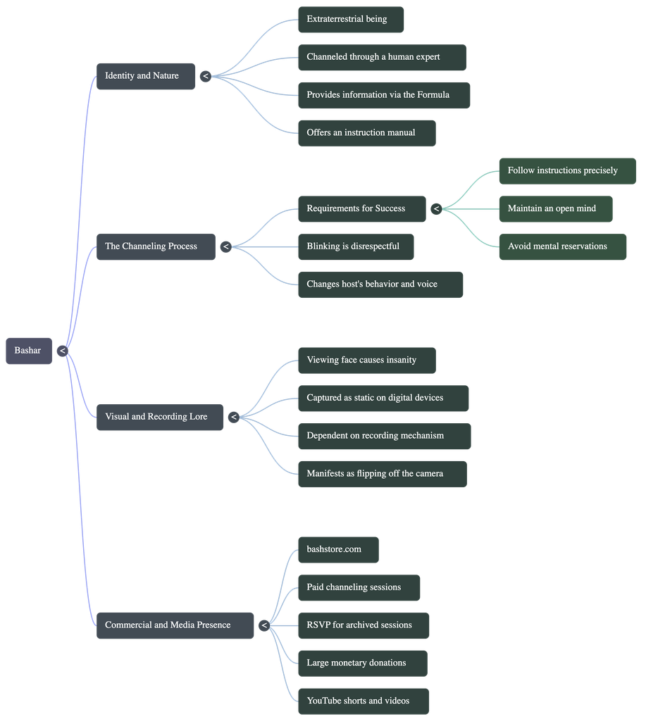
Well, neither the mind map nor the video overview is even about the video, really. They are both made of the conspiracies talked about in the video; actually, they almost display the conspiracies like they are facts, and not humorous like in the actual video. The podcast does, however, speak about the source video as a whole, so I think it was the most effective medium. But I don’t think it helps me understand the source any more than just watching it. I think it was the most effective because it was the only medium that acknowledged that the information from the video is based on conspiracies.
AI WEIRDNESS
The most notable hints given that the materials were AI-generated were the art style and the voice cadence. There isn’t much to say about the mind map because I do believe a real person could make a mind map and have it look like that. The only odd part is that someone would make a mind map about this video at all.
The podcast doesn’t sound like your usual monotone AI voice, but there are still stumbles. The male voice was less authentic-sounding, more robotic, and both voices had the noticeable “AI tone”.
The video overview is OBVIOUSLY AI. The art style used in the video is almost synonymous with AI now. Also, the subtitles included in the video are not accurate to what is being said.
Overall, AI voice and art style are very noticeable to anyone who cares to know the difference. AI prioritizes what is most common in existing media to make something that looks the most “real”. But humans can’t scan through everything on the internet like AI, so humans don’t make all of the most common choices. AI uses the most commercial voice, the most used motion graphics, and the most common art style.
TRUST
Based on this experiment, I would warn people against using AI to summarize or go in depth on comedic YouTube videos, or anything with any level of sarcasm or satire. I can imagine these tools being helpful when consuming actual academic material. But I think it would only be trustworthy with topics that have little discrepencies and are not too complicated. When the AI is faced with differing opinions on one topic, it tends to get confused, which I have noticed in past experiences. Overall, I wouldn’t trust AI any more than you trust a friend who is a little bit smarter than you.
#2: AI EXPERT AUDIT
Posted: September 8, 2026 Filed under: Uncategorized Leave a comment »Materials
Last semester, I applied to Siggraph with a visual system I had created using multiple programs (VDMX, OBS, and Tux Paint). Although it lacked the complexity to get accepted, I still found it incredibly useful in my editing workflow, and it is important to me because it is catered to how I create. The document detailing the system is what I submitted to the Gemini notebook (it is four pages long, but I included the intro page in this post, which has mosts of the relevant details).
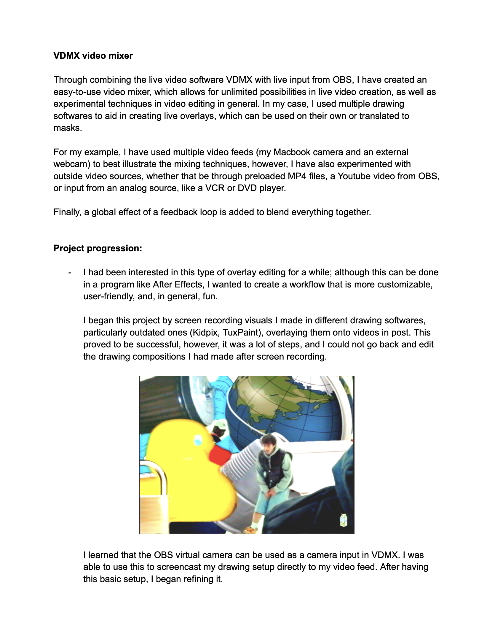
Generated Materials
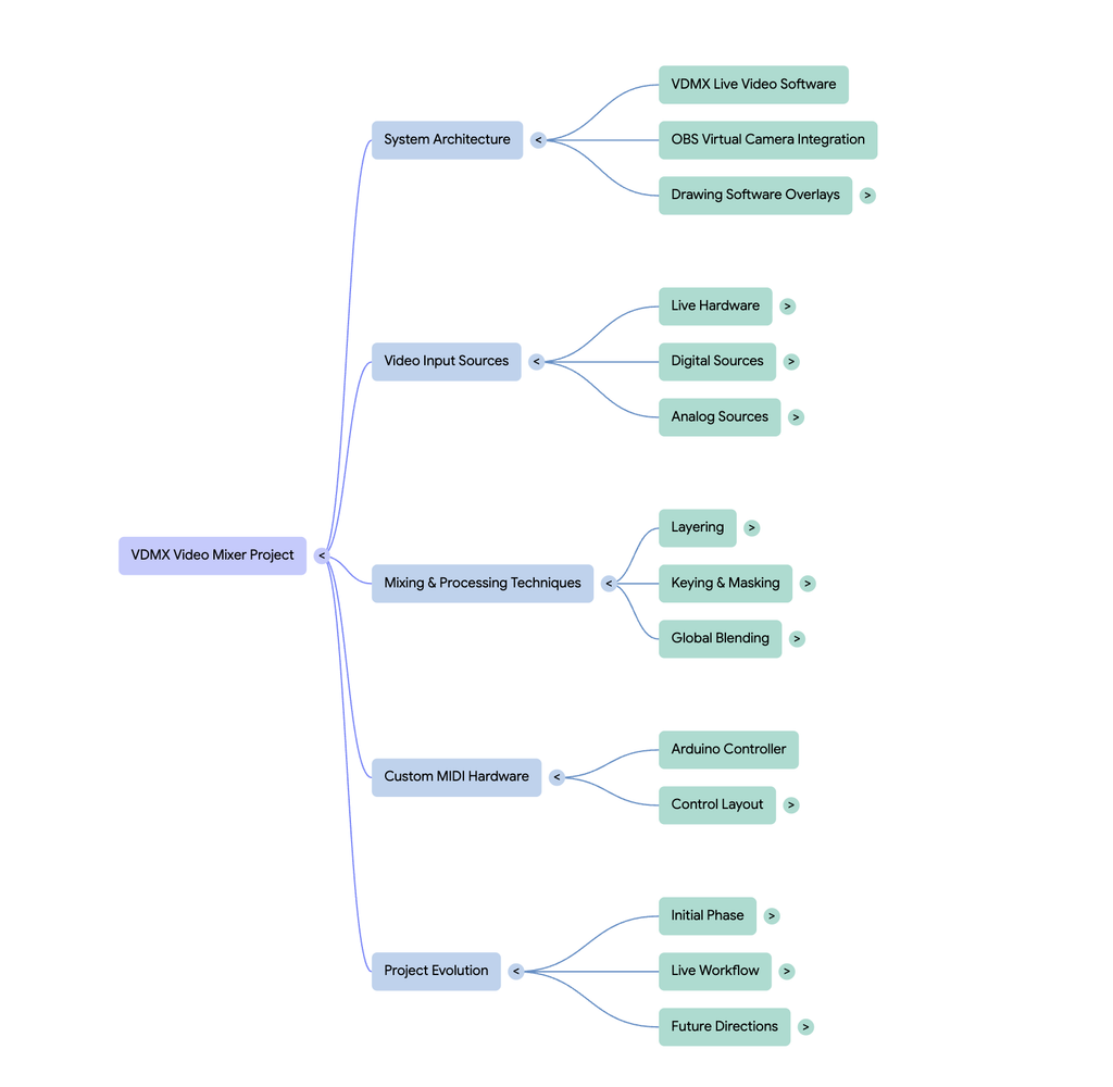
Accuracy Check
The AI did a good job of understanding all the base components. It clearly understood the workflow, and nailed down the reason why I wanted to create the project in the first place (to speed up my editing workflow). However, I feel Gemini gave me too much credit in some aspects, saying that I built the video mixer “completely from scratch,” when in reality I just combined various tools.
The “AI” Look
It is pretty obvious that what has been generated is AI. This can be seen with the audio overview, specifically with the monotone cadence. What I did notice, however, is that the more detailed the audio overview is, the more realistic it seems. I generated a deep dive and a brief, with the deep dive coming out on top in terms of realism. When it comes to the graphics (besides looking very AI), what I noticed is that AI treats a lot of systems linearly. Someone that would find this tool useful understands the importance of modularity and its place in live video, something that the AI fails to cover. In my workflow, a lot of elements can be swapped and routed back to each other, making it a more complex system than what the AI has outlined. Gemini has outlined its basic functionality pretty well, but it lacks the expertise of seeing the potential of the system, and all the possible effects that can be done.
AI as a Learning Tool
I would say that the AI resources are pretty helpful in getting a grasp of the project, with each resource being helpful in their own right. The audio overview, which I deemed to be the most helpful, gives a straightforward overview, while also outlining the intent of the project. I found this useful, because when I am trying to understand something I also like to know the why behind it. I also found the mind map to be fairly helpful, as it gives a good framework for the different elements of the workflow. This is not the most beginner friendly method, however, as the map only contains terms rather than a description of each element. Then comes the infographic, which is a double-edged sword. On the positive side, it adds the description for each element that I wanted in the mindmap, making it easier to understand each part of the workflow. On the contrary, the layout of the infographic is difficult to grasp, and I think it could have been arranged in a more digestible manner. It also completely disregards or jumbles some of the tools that I used: I used a computer and a very simple breadboard MIDI controller, however, the infographic displays this as multiple iPads and a super sleek controller that somehow connects to the iPad. All in all, each resource was helpful in its own way, but each one also has its downsides.
Final Statement + Trusting AI
From what I have seen, AI is really good with breaking down systems to be easily understood. However, especially in a creative field, it is important to use AI as a reference and not as an end all be all, as it lacks human creativity to see beyond basic limitations. AI serves as a rule follower, so if you want to stay in a linear, basic line of thinking, I would highly recommend using AI. If you want more complexity, use AI as a jumping off point.
AI EXPERT AUDIT
Posted: September 7, 2026 Filed under: Uncategorized Leave a comment »by Ella Neiderer
Twilight: AI vs. Expert
AI Materials…
Why_Bella_Swan_Chose_the_Monster.m4a
AI Podcast ^
My Thoughts…
For this project, I used a PDF of the entire Twilight book. I am well-versed in this content as I have not only read the entire Twilight series, but I have watched the movies and continuously engage in and consume Twilight-related content. This material is meaningful to me as I enjoyed the books and have become obsessed with the story as a whole. I grew up watching the movies with my mother and am overall very acquainted with everything Twilight related.
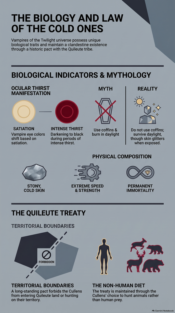
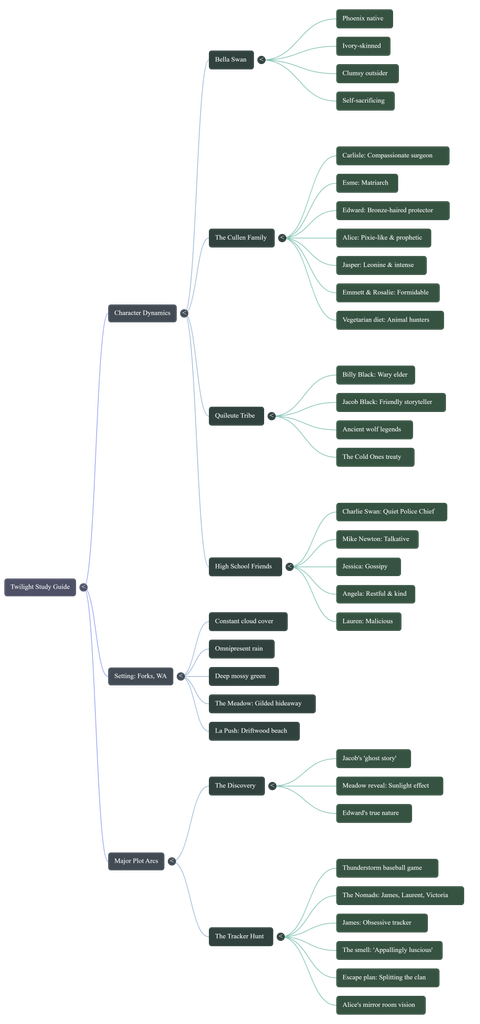
The AI got most of the source material correct, and in certain aspects it would pull direct quotes from the book. It was correct in explaining things such as details regarding the setting, how Bella felt during the events of the story, and facts about how the vampires in the story function. However, there were parts that it would get wrong, such as in the mind map it listed Bella’s dad under her “high school friends” instead of just listing her general relationships. It also oddly simplified the FAQ infographic sheet by listing aspects of the vampires as if they were biological facts. Overall, though, the entire project was quite accurate and listed the most important aspects of the book.
If I were encountering this material for the first time and knew nothing about Twilight, I do believe that these resources would somewhat help to gather a basic understanding of the general storyline. Each material, however, does tend to oversimplify things and leaves out certain deeper aspects of each character’s dynamic. If I were cramming for a test about this material, though, I think that the sources did well at easily and succinctly putting all of the most important aspects of the book together.
The most effective tool was the podcast, as it was not only interactive and engaging, but it also did well at delving into the environment and key plot points in the novel.
The most noticeable “AI weirdness” in the materials was in the podcast. There were two voices interacting with each other, but in multiple different parts of the whole audio there were weird noises or random words spoken that didn’t make sense in any context, almost as if one of the voices was trying to interrupt but couldn’t finish a thought. The AI sounded like AI, but had a human-like inflection of words and would even pause or say interjections like “like”. Towards the end of the podcast, though, I did notice a weird robotic aspect to the voice as they slowly started to sound less human. The AI overall seemed to prioritize just about the same aspects that a human would, and wasn’t particularly impressive when it came to noticing details to express.
I would warn people about trusting anything remotely AI-generated because there is always a chance of false information as well as the general fact that AI is very bad for society and the environment. AI can easily pass up important information and focus on less important things or even spread information that isn’t true. While AI can be a handy tool to summarize things and make someone’s life easier, it is always better to rely on yourself and your own ability to dissect media. We as a society are getting more and more stupid because people idiotically want to make AI do everything for them.
Recent Comments