#2: AI EXPERT AUDIT
Posted: September 8, 2026 Filed under: Uncategorized Leave a comment »Materials
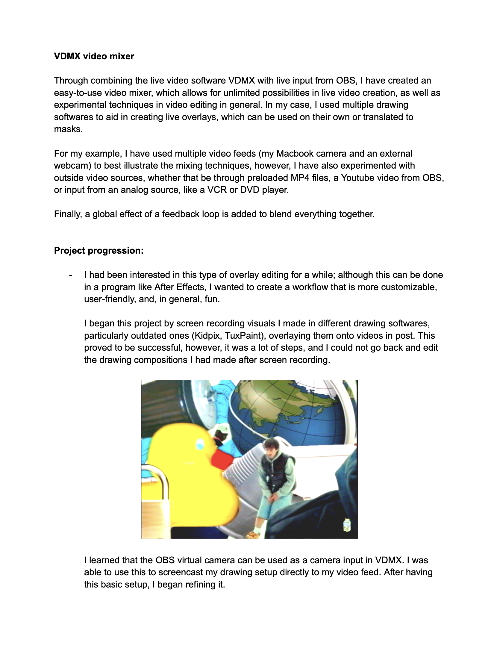
Last semester, I applied to Siggraph with a visual system I had created using multiple programs (VDMX, OBS, and Tux Paint). Although it lacked the complexity to get accepted, I still found it incredibly useful in my editing workflow, and it is important to me because it is catered to how I create. The document detailing the system is what I submitted to the Gemini notebook (it is four pages long, but I included the intro page in this post, which has mosts of the relevant details).
Generated Materials
Accuracy Check
The AI did a good job of understanding all the base components. It clearly understood the workflow, and nailed down the reason why I wanted to create the project in the first place (to speed up my editing workflow). However, I feel Gemini gave me too much credit in some aspects, saying that I built the video mixer “completely from scratch,” when in reality I just combined various tools.
The “AI” Look
It is pretty obvious that what has been generated is AI. This can be seen with the audio overview, specifically with the monotone cadence. What I did notice, however, is that the more detailed the audio overview is, the more realistic it seems. I generated a deep dive and a brief, with the deep dive coming out on top in terms of realism. When it comes to the graphics (besides looking very AI), what I noticed is that AI treats a lot of systems linearly. Someone that would find this tool useful understands the importance of modularity and its place in live video, something that the AI fails to cover. In my workflow, a lot of elements can be swapped and routed back to each other, making it a more complex system than what the AI has outlined. Gemini has outlined its basic functionality pretty well, but it lacks the expertise of seeing the potential of the system, and all the possible effects that can be done.
AI as a Learning Tool
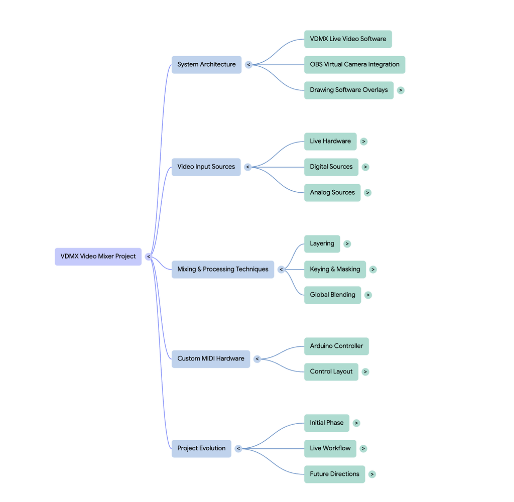
I would say that the AI resources are pretty helpful in getting a grasp of the project, with each resource being helpful in their own right. The audio overview, which I deemed to be the most helpful, gives a straightforward overview, while also outlining the intent of the project. I found this useful, because when I am trying to understand something I also like to know the why behind it. I also found the mind map to be fairly helpful, as it gives a good framework for the different elements of the workflow. This is not the most beginner friendly method, however, as the map only contains terms rather than a description of each element. Then comes the infographic, which is a double-edged sword. On the positive side, it adds the description for each element that I wanted in the mindmap, making it easier to understand each part of the workflow. On the contrary, the layout of the infographic is difficult to grasp, and I think it could have been arranged in a more digestible manner. It also completely disregards or jumbles some of the tools that I used: I used a computer and a very simple breadboard MIDI controller, however, the infographic displays this as multiple iPads and a super sleek controller that somehow connects to the iPad. All in all, each resource was helpful in its own way, but each one also has its downsides.
Final Statement + Trusting AI
From what I have seen, AI is really good with breaking down systems to be easily understood. However, especially in a creative field, it is important to use AI as a reference and not as an end all be all, as it lacks human creativity to see beyond basic limitations. AI serves as a rule follower, so if you want to stay in a linear, basic line of thinking, I would highly recommend using AI. If you want more complexity, use AI as a jumping off point.