Pressure Project 1: Tidal Memory: An Audio-Reactive Particle Sea
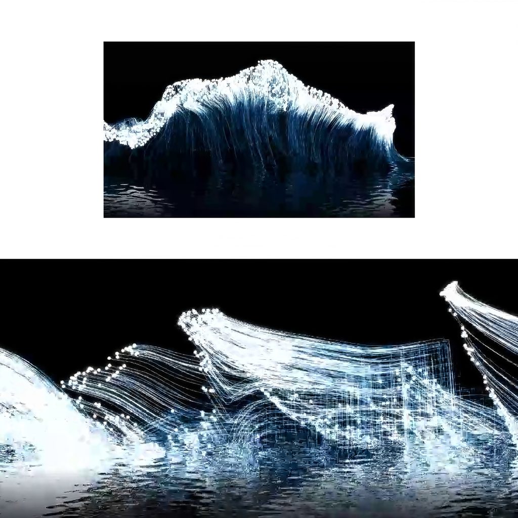
Posted: October 2, 2026 Filed under: Uncategorized Leave a commentBrief description: Tidal Memory is a self-generating TouchDesigner patch that turns music into shifting white particle waves. The points rise, curl, leave glowing trails, and appear to reflect in moving water.
Process reflection
I approached the five-hour limit by committing to one visual idea: an ocean made from moving points and lines. I used the Bilibili particle wave TouchDesigner tutorial as a starting point, then concentrated on building a version I could run and document. I first established a long wave shaped particle source, then worked on motion and trails. I kept the last part of the session for connecting audio, shaping the reflection, and recording the result.
The patch scatters points over a stretched spherical form and disturbs it with noise. A feedback loop carries the points forward, while animated noise changes their paths. Trail POP records where the moving points have been, drawing fine strands that collect into a crest. Audio analysis turns changes in the music into control signals, so the result follows a rhythm without repeating exactly the same shape each time.
I chose white particles, cool blue highlights and a black background. This limited palette keeps the delicate lines visible. The moving reflection below the wave gives the abstract structure a sense of place. I left out extra text, scenery, and camera effects: within five hours, those additions would have distracted from the central motion and taken time away from testing the patch.
The biggest surprise was how much the trails changed the image. Individual points looked sparse, but their recent paths made the wave feel dense and almost fabric like. The reflection also made the image read more clearly as water. I had to balance energy against legibility: too little movement felt static, while too much obscured the wave’s form.
My main achievement was completing an audio-reactive system and recording a final output that continues to change while it runs. I cannot claim a formal course badge without checking my course record. With more time, I would add a keyboard control to reset or change the wave and test how it responds to several songs.
How the patch works
How are the particles generated? Sphere POP provides the stretched form; Noise POP disturbs it; Sprinkle POP places about 3,000 points on it.
Are the particles “alive”? They keep moving through Feedback POP, but the patch does not specify an individual birth-and-death cycle.
How is the water reflection made? The lake effect network mirrors the image and distorts it with noise to create ripples.
How are the tails made? Trail POP stores recent point positions; Line Metrics and Lookup Attribute POPs shape the visible strands.
Process
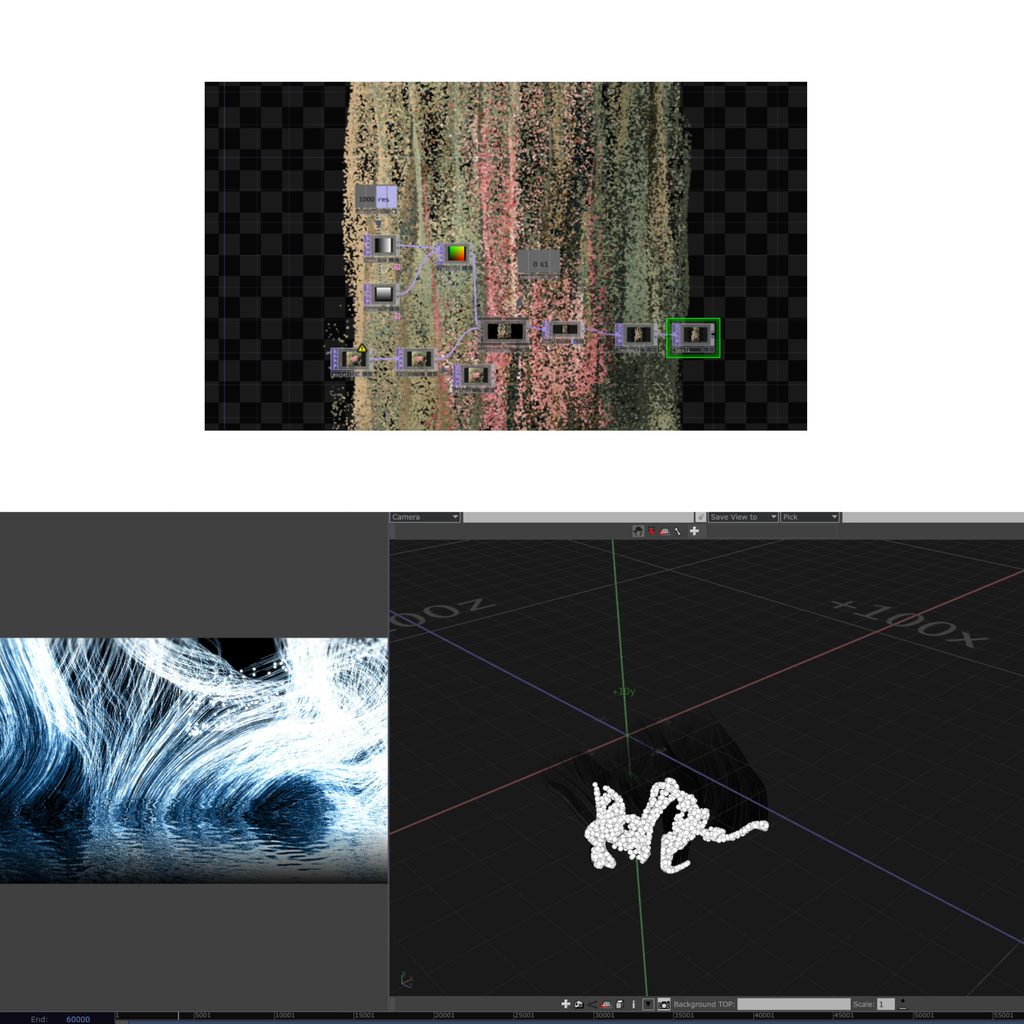
2D to 3D particles
I started with a 2D particle experiment to explore how color, density, and movement could create a flowing image. It helped me understand the basic particle controls, but I wanted the final work to have more depth. After finding the particle-wave TouchDesigner tutorial, I began a second version in 3D. I used a three dimensional form as the particle source, then added noise, feedback, and trails to create a wave that could curl and change over time. Moving from the 2D test to the 3D patch was the main development in my process: the first version taught me how the particles behaved, while the second gave them the sense of space and movement I wanted for the final piece.
Techniques and Acknowledgments
Particle-wave tutorial: “粒子海浪—TouchDesigner教程|音乐可视化 Vol.2.01” by 布鲁斯Qing on Bilibili
Beat-detection tutorial: “A More Accurate Beat Detection—TouchDesigner Tutorial” by bileam tschepe (elekktronaut)
Music: “珠玉” by Shan Yichun (单依纯)
Techniques used: Sphere, Noise, Sprinkle, Feedback, and Trail POPs; audio analysis with CHOPs; mirrored water reflection
AI Expert Audit – Evaluating AI-Generated Multimodal Material
Posted: September 10, 2026 Filed under: Uncategorized Leave a commentA. Source Material
For this assignment, I used my essay, “Early Chinese Dumplings (Wonton) from Qimin Yaoshu,” which I wrote last semester for the final project in a food history general education course. The project required us to recreate a historical food using a recipe from historical sources. I made a simplified reconstruction of early Chinese wontons and reflected on the cooking process and the differences between historical and modern ingredients and tools.
Because I researched the topic, prepared the food, and wrote the essay myself, I am familiar with both its content and the experience it describes. This allows me to evaluate whether the AI accurately represents my work. The project is meaningful to me because it connected a familiar food with its history through hands-on experience.
B. The AI-Generated Materials
AI-Generated Podcast
https://file.garden/ap8TDC2-D925c-lY/The_1500_year_old_survival_dumpling.mp3
AI-Generated Mind
AI-Generated Infographic
C. My Expert Audit
Accuracy Check
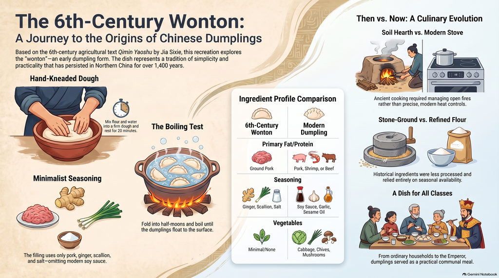
Overall, I did not notice any obvious factual errors in the AI generated materials. The podcast explained the basic information about wontons clearly. The mind map was easy to follow and I did not notice anything important missing. The infographic was also well organized and covered the basic content of my essay.The main issue was the podcast’s emphasis. It repeated simple information and spent more time explaining ordinary details than I thought necessary. One specific example is the infographic’s instruction to let the dough “rest for 20 minutes.” This matches what I did in my cooking project, but my essay does not establish that this exact timing came from the historical recipe. By placing this instruction under the title “The 6th-Century Wonton,” the infographic could lead a reader to mistake my modern reconstruction choices for documented historical instructions. The detail itself is accurate to my experience, but its presentation makes the historical connection seem more certain than my essay supports.
My essay discusses a familiar food through my own cooking experience, but the podcast sometimes made the topic sound more complicated or remarkable than it felt to me. This did not necessarily change the facts, but it changed how the material came across. Someone unfamiliar with my essay might not notice that difference in tone.
Usefulness for Learning
If I were learning about this topic for the first time, I think these resources would help. The podcast explained the basics clearly, which could benefit someone unfamiliar with wontons. However, its thoroughness also made it feel unnecessarily long. At times, it sounded like two people reading an essay aloud rather than having a natural conversation. They repeated straightforward points that I would not expect a typical podcast to spend so much time discussing.
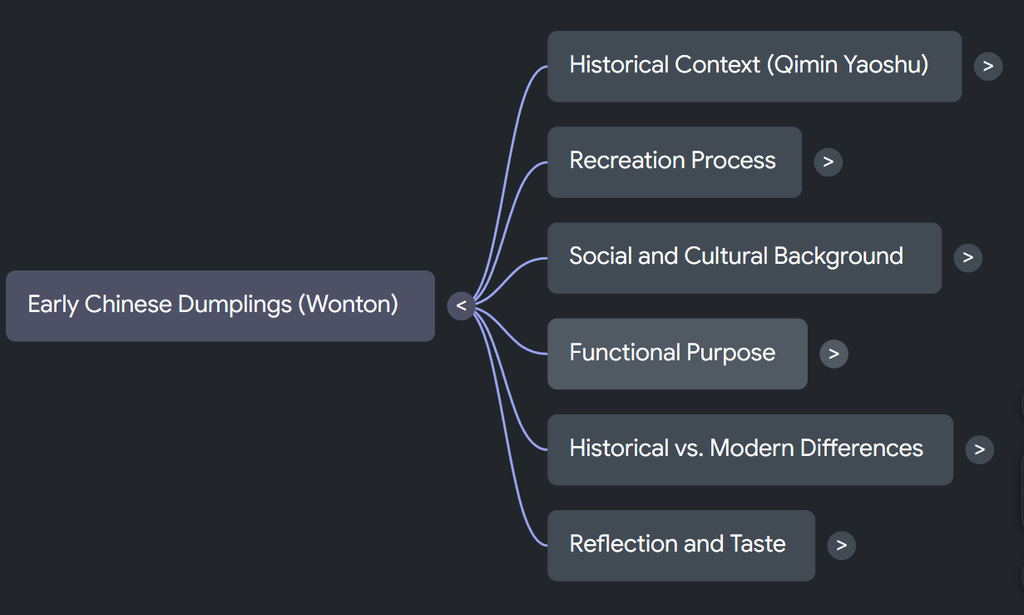
The mind map worked well because its structure was clear and the content felt complete. It made the information easy to follow without requiring a long explanation. The infographic also presented the basic content in an orderly way and was useful for a quick overview.
Based on my experience, the mind map was the most effective format because it was clear and direct. The podcast was the least effective for me because of its repetition, although its detailed explanations might be more useful to a beginner. However, the structure of my essay is fairly simple, so it may not be representative of more complex texts. However, in my previous experience, AI has been especially helpful for breaking down texts with complex arguments and making their logic clear at a glance.
The Aesthetic of AI
The most noticeable “AI weirdness” was the podcast hosts’ exaggerated emotions such as surprise or questions. My original essay is about a fairly normal cooking experience. However, the hosts sometimes reacted as though the information was surprising or extraordinary. These reactions seemed intended to imitate human enthusiasm, but they felt out of place. Their small talk and exchanges were also slightly stiff.
The podcast had an enthusiastic, explanatory voice, but the enthusiasm did not always match the subject. It seemed to prioritize keeping the conversation lively and explaining everything thoroughly. As the author, I would have preferred less repetition and more attention to the personal experience behind the essay.
The infographic looked organized, but its uniform font styling gave it a somewhat formulaic appearance that I associate with AI generated posters. This is a personal impression rather than proof of AI authorship, since human designers can also use a consistent font.
Trust & Limitations
My experience with these materials connects to how my use of AI has changed. I started using AI to help write essays in high school because English is my second language. At that time, organizing my ideas into a complete English essay felt extremely difficult. As my English improved, I began noticing recurring structures and expressions in AI-generated writing. The writing could be fluent, but it often failed to express my feelings accurately.
Now, I mainly use AI to suggest a broad outline or help identify the main points of an assignment. I write the important ideas and emotional content myself. This gives me support while keeping the writing closer to what I actually want to say.
Recent Comments