Pressure Project 2 – New Age CD Player
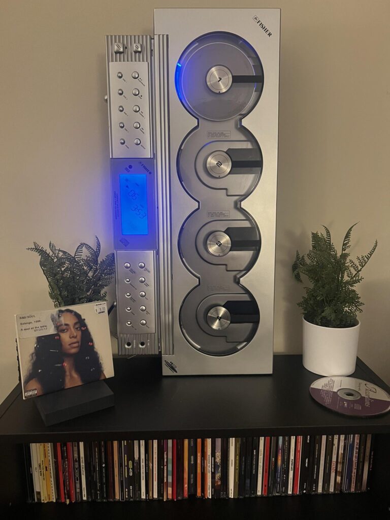
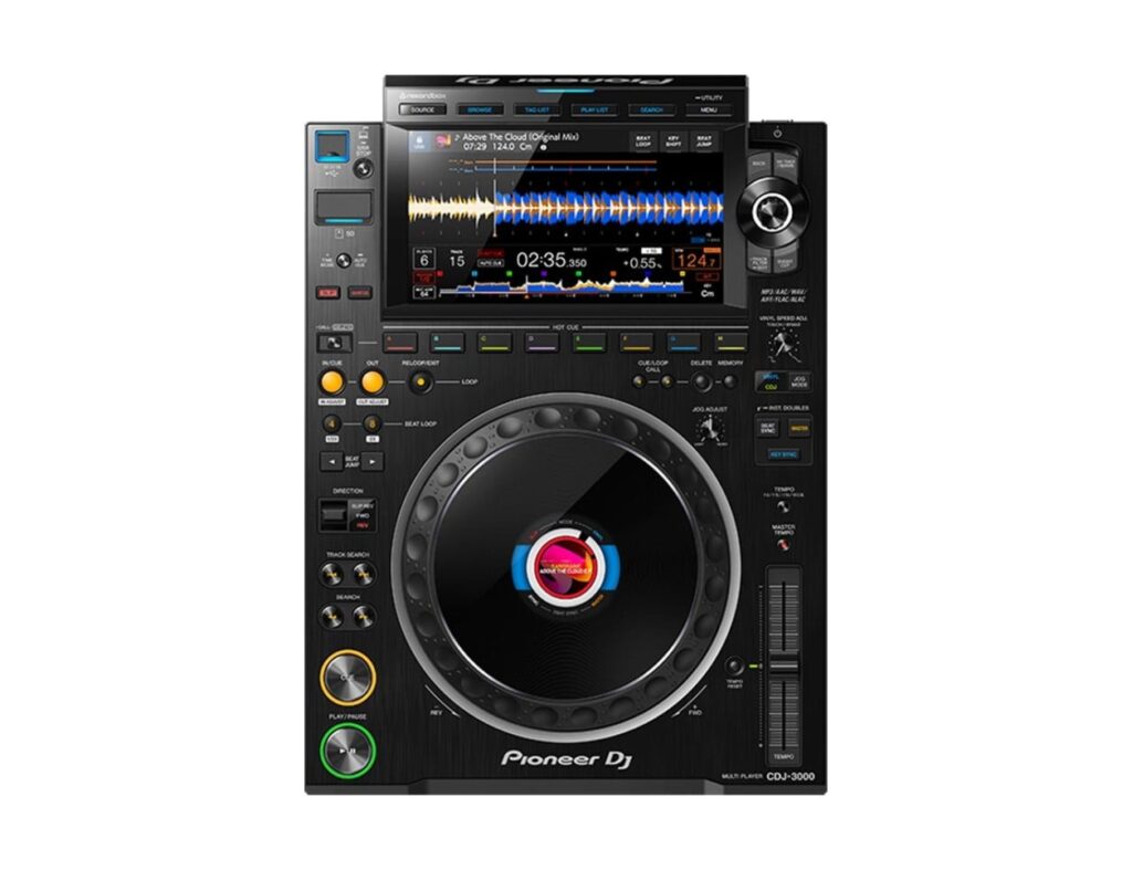
Posted: October 22, 2026 Filed under: Uncategorized Leave a comment »My intention with this project was to create an interactive music experience. I was inspired by CD players, specifically the Fisher Slim 4000 (a CD player that allows the listener to see the disc spinning, while also having the capability to change between CDs) and basic CDJs (which allow for pitch correction of discs, sort of like a record player).
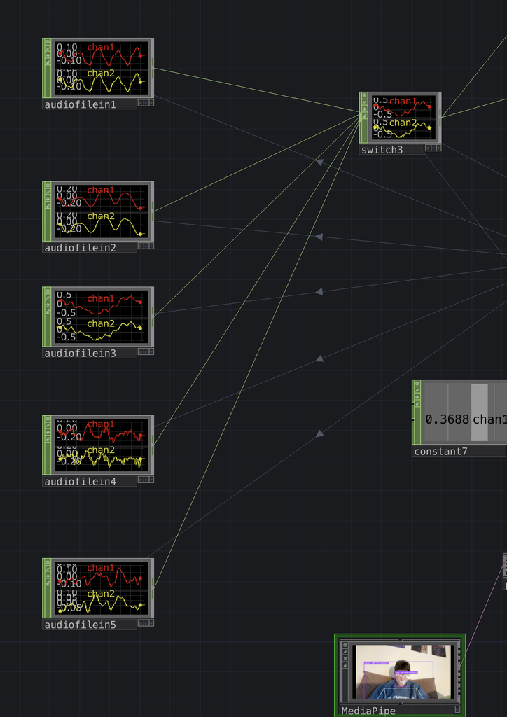
My node setup is fairly straightforward, and is driven by a set of switches. I have a switch for my audio and a switch for my images, both of which are controller by the same data (“nose X” in MediaPipe). This allows the user to cycle between the 5 songs I provided depending on where they are standing. Further, I incorporated pitch correction by using the nose Y in MediaPipe, using the value to change the speed of the audio files. To sync the audio speed the with speed in which each disc turns, I added a transform TOP after my image switch, with the rotation driven by a ramp LFO. I referenced nose Y to the LFO speed, which makes the CD turn faster or slower depending on the speed of the audio.
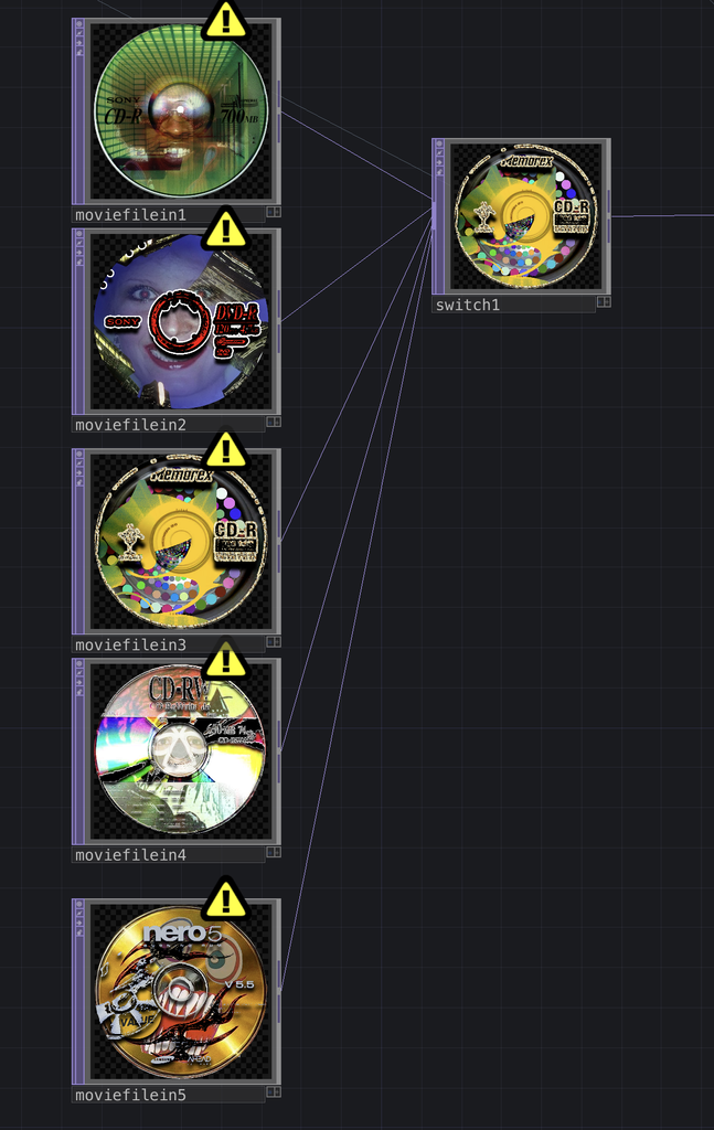
In terms of aesthetics, I designed all my visual elements in Adobe Photoshop, looking to make them as engaging as possible. I chose my songs first (I opted for more electronic sounds that would sound the most interesting when pitch corrected), and then designed each CD based on the vibe of each track. I originally wanted to create some feedback visualizers behind the discs, however, instead of complex loops I settled on a simple loop that increases in size. This resembled a CD player tray, which I liked, and also helped to emphasize the main disc. I framed the whole scene with some speaker designs, which helps to keep the attention on the center.
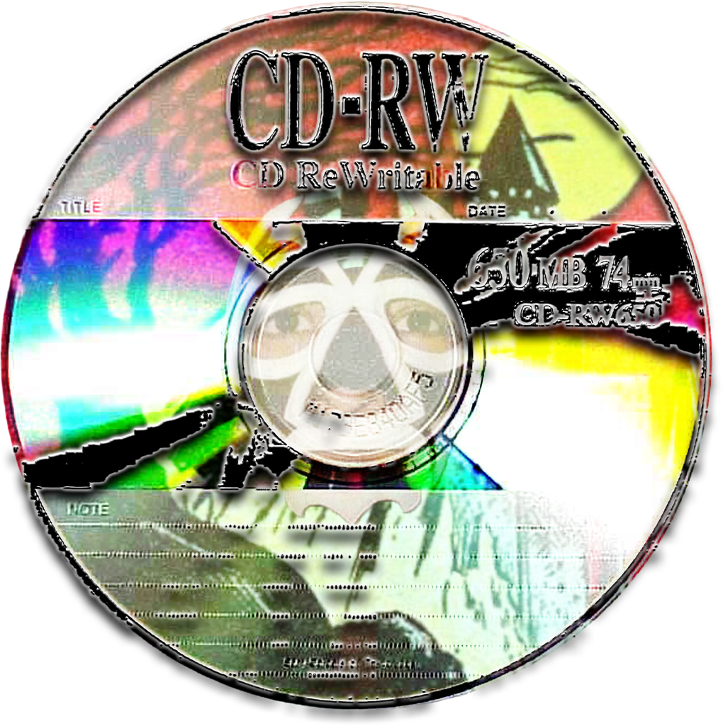
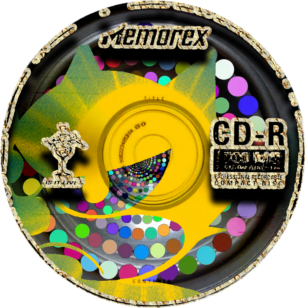
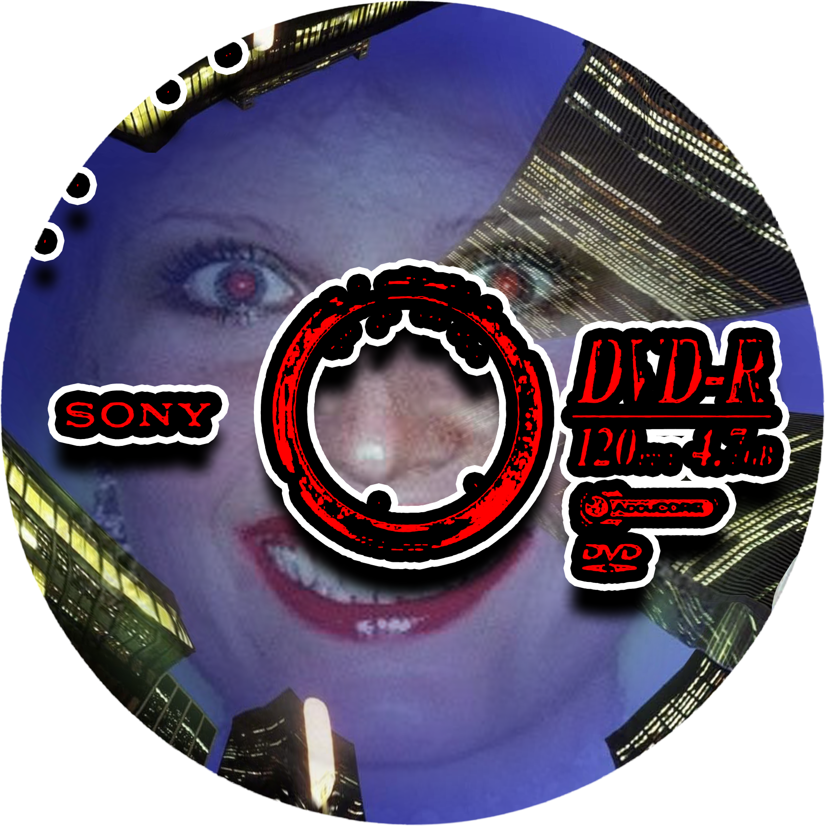
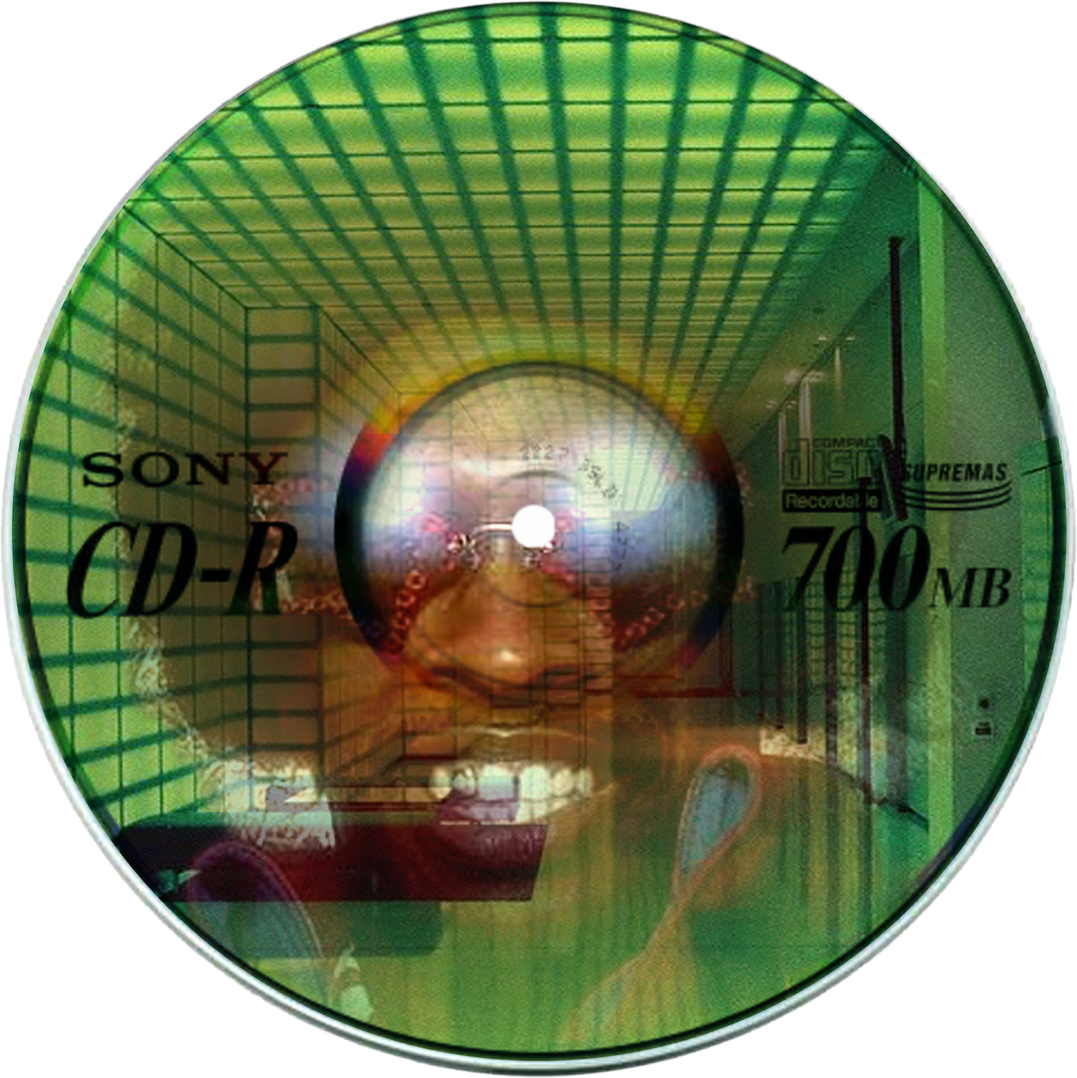
4/5 of my CD designs (the 5th one would not load)
During the demonstration, some of the movement cues were not apparent. I think this is because the projects we did in class focused mainly on hand tracking, while this experience involved body tracking. However, once everyone realized how the system works, everything ran smoothly.
Between the Signal
Posted: October 21, 2026 Filed under: Uncategorized Leave a comment »In this project, I used webcam cameras and MediaPipe hand tracking technology to create an interactive TouchDesigner experience. The main limitation is that it’s not possible to use a keyboard or mouse; therefore, I decided to use the participants’ hands as the interface. Different hand movements trigger visual changes, and the participants gradually realize that their own bodies are actually controlling the entire environment, thereby revealing another layer of meaning associated with that environment.
Concept and Mystery
The core idea of this project is that the cameras are not merely used to display the participants themselves, but act like a damaged communication system that attempts to connect with another space. Initially, participants cannot fully understand the effects of their hand movements. As they continue to experiment with different gestures, the visual effects change, and those hidden digital worlds begin to become visible.
Therefore, this puzzle isn’t presented in the form of a traditional puzzle; instead, it allows participants to learn about this system through their own bodies. Their hands become the bridge between the physical world and the hidden digital world.
I chose to use hand tracking technology because I wanted this interaction to be more immersive. Clicking the mouse feels like controlling software, while moving hands in front of the camera makes the interaction more direct. Participants can immediately see the impact of their actions on the system, thereby making this process more personal.
Story and Audio
The atmosphere was inspired by Hideo Kojima’s Death Stranding 2: On the Beach. I was especially interested in its themes of connection, isolation, and uncertainty about whether connecting two different places is always a positive thing.
I used music from Death Stranding 2 because I wanted the sound to make the experience feel like the participant was discovering an unfamiliar space rather than simply testing a hand-tracking program. The slow and atmospheric music also helped connect the different visual transformations into one continuous experience.
Reflection
During the demonstration, people were particularly interested in how gestures control various changes. They also asked about the stories behind this experience. These feedbacks made me realize that the interaction itself is understandable, but the descriptions of the related stories can be conveyed more clearly.
If I continue to develop this project, I will add more demonstration elements, so that each gesture can reveal different aspects of the hidden world. Additionally, I will make the sounds more directly related to the participants’ movements, so that both visual and auditory systems can respond together to body movements.
Pressure Project: Audio Visualizer
Posted: October 12, 2026 Filed under: Uncategorized Leave a comment »The goal of our first pressure project was to create a self-generating patch, given the time limit
of five hours. I was stuck at first, due to the openness of the project. But, I knew that when
starting in the class, I wanted to make an audio visualizer, so that is what I tried to do.
The time constraint didn’t feel like a massive issue, because I knew this pressure project was
more about exploring the different tools and seeing what we could make with a base
understanding. I had a very loose understanding of touch design, with only a few basic nodes
under my belt, so I knew I needed to start by watching some tutorials if I wanted to make a full
blown audio visualizer. I watched a few different videos, letting me a better understanding of
how certain audio and visual nodes work. I was able to mess with the values along the way, and
combine certain knowledge from each video to make something that was mine. I could choose
what I felt looked best and where in my composition, giving me so much room to work with.
What surprised me the most about this first pressure project was the sheer amount of different
nodes you can work with in touch designer. Given all of these nodes, and all of the different
combinations of the nodes, I can’t imagine how many different programs you could run with this
application. I felt like I grew a lot and got more understanding of the potential and opportunities
with touch designers, working mostly with the audio nodes and how they can affect the visual
nodes, but I am really looking forward to what I can do with the application in the future and how
far I can push my knowledge of it!
Pressure Project: Leaves
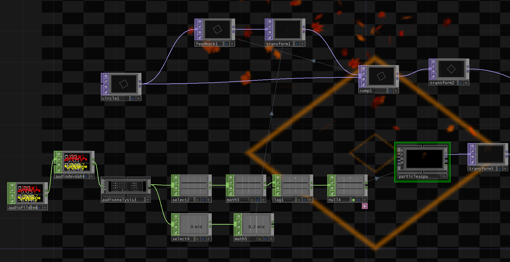
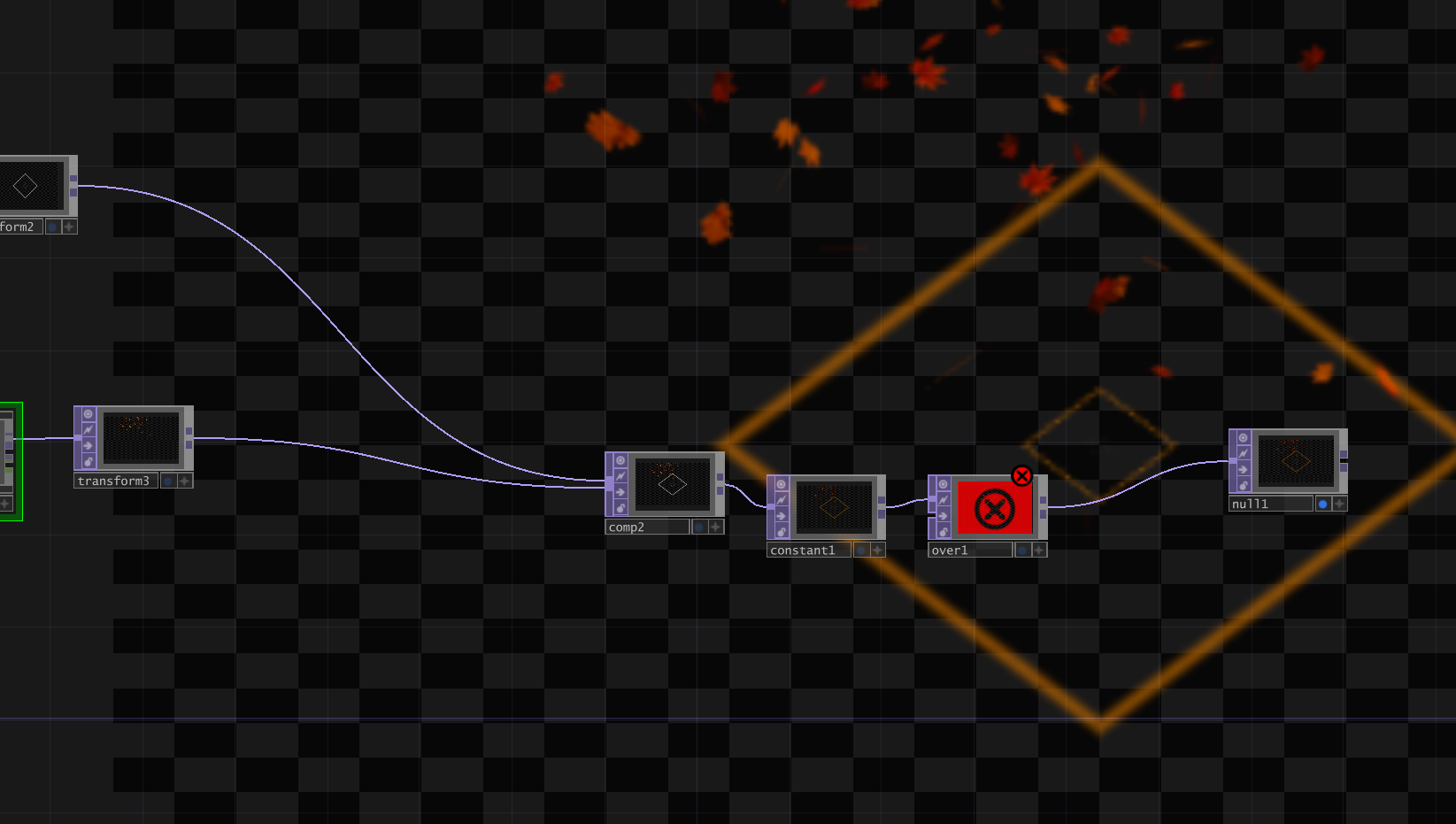
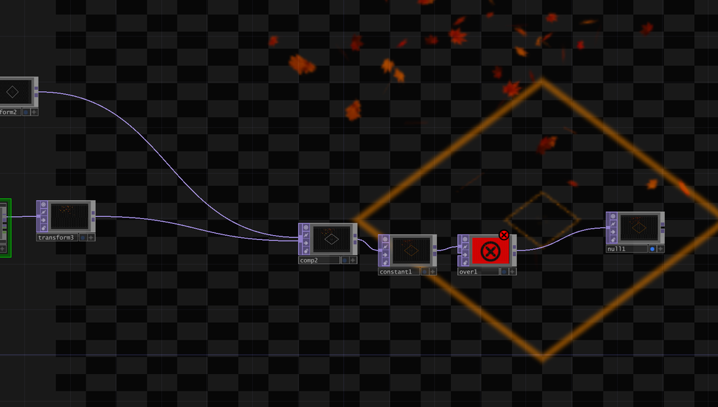
Posted: October 7, 2026 Filed under: Uncategorized | Tags: Pressure Project, Pressure Project One Leave a comment »The goal of this project was to make a self generating patch in 5 hours using touch designer. My personal goal was to learn something new and challenge myself. With the goal of challenging myself I wanted the patch to include sound and then coloring to go along with the sound.
I have never had such a time constraint for an assignment let alone one for a program I didn’t know how to use. To conquer this I came up with a simple idea and looked up tutorials on how to achieve it. The original plan was a patch that was a sliding screen with different shapes moving and changing color to the sound of people around or a song. Difficulties kept arising so I complexly changed my idea to something simpler. I wanted to represent a song with particles and have an almost speaker look to a shape. I wanted to add more shapes and have them moving but time was running out and nothing would move or do what I needed. That is why I stuck to one shape. The particles was something new but that was my challenge, I was happy that the particles were automatically leaves because of all the problems I kept running into not having to change something helped me.
The final part was the sound, I wanted a more fall feel and sound so I choose a song to match. When importing the sound I encountered the issue of separating the sounds so I could have different things react to it. Due to the nature of the song some of the levels were very low and required a few more steps. I thought that idea was going to be trashed as well because the sound at one point decided it would not play. After the sound was working I wanted a viewer to not only hear it but see the sound and almost feel it. I included the leaves moving to the base of the sound but it was more of them falling and regenerating instead of just staying in the center and moving to the sound. After trial and error I left the leaves to fall for the sack of time and to have something that actually worked. During this process I kept being surprised by the amount of little adjustments that would break the entire project. I ended at a point of what can I get to work and still have an engaging project because of the amount of issues. However I am very happy with what come out of this. The best thing to come out of this is I know I can create something in a short time span and still get my main goal completed.
TouchcDesigner Look

Final Video
Pressure Project: The Self-Generating Patch
Posted: October 6, 2026 Filed under: Uncategorized Leave a comment »Description
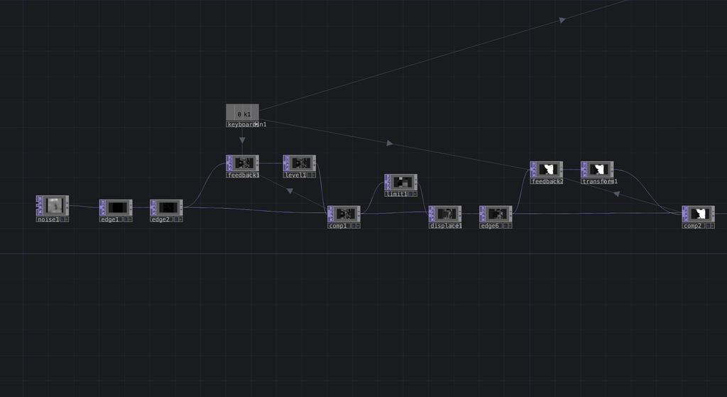
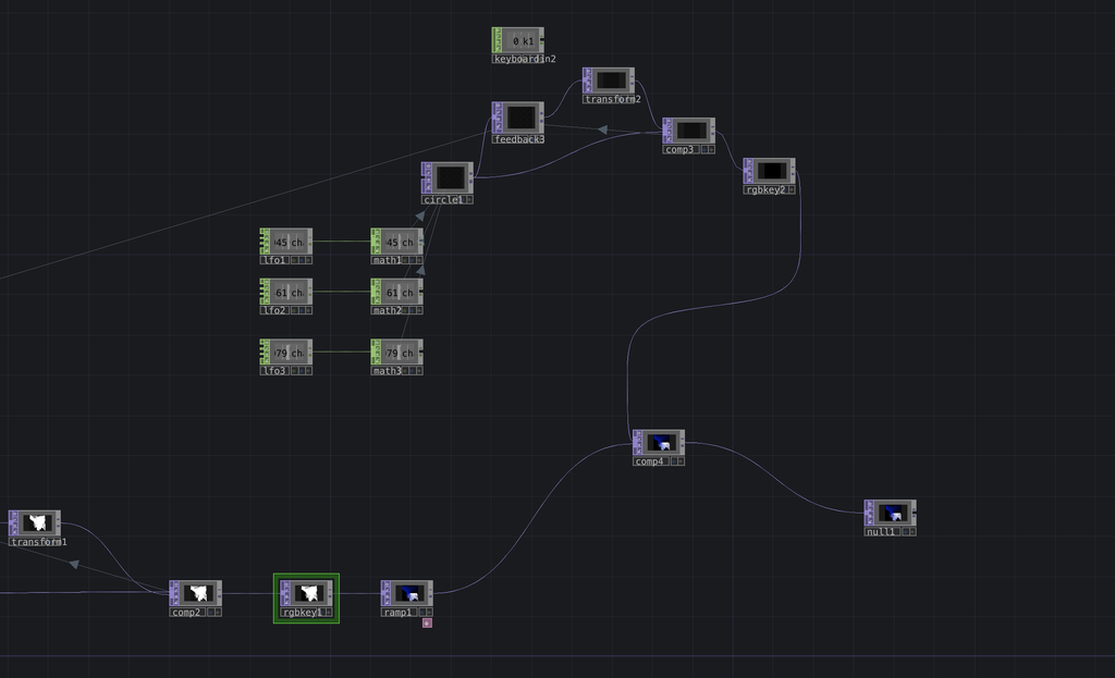
The pressure project is a project that has a time constraint. This one has a 5 hour time constraint that you have to build a self-running visual system built in TouchDesigner. Once it starts, it runs on its own and needs no input. A noise source passes through a chain of edge detection, feedback loops, and displacement, then gets keyed and colorized. The result is a field of deep blue with a glowing magenta central radial, and a bright white area that rotates with the blue aspect. Three LFOs create a circle in the upper layer, so the magenta shape keeps pulsing and drifting and the feedback never settles into a repeat. You can watch it for a minute and not see the same frame twice. The only input is a keyboard shortcut by pressing 1 sends a pulse that resets the system.
Process Reflection
How did you approach the 5-hour time constraint?
I used the five hours to practice skills I wanted to grow instead of repeating what I already knew. We learned LFOs in class, so I layered them over a noise-based feedback system, which gave me a lot of motion from a small number of nodes. I stopped when time was nearly up and I felt the piece could hold attention. I had hoped to expand the LFO circles or arrange them into a cleaner pattern.
What choices did you make about what to include or exclude?
I included feedback loops, edge detection, and displacement because they keep simple noise changing indefinitely, which lets the system run alone. I left out audio, since getting two visual systems to work together took most of my hours. I also kept the system loose and abstract instead of patterned, which made it less predictable. The reset key used with the node keyboard in was my only interactive element.
What surprised you during the process?
How unpredictable the system is. Feedback responds strongly to small changes, so I could steer it but never fully control it. In class, people watched longer than I expected, even without audio. They seemed to enjoy not knowing what would happen next. The result differs from my original idea, but I’m happy with it. With more time, I’d clean up the visuals and add audio.
Which achievements did you unlock?
I earned the 30+ seconds of attention achievement. People in class stayed with the piece for over 30 seconds, which I didn’t expect, given there was no sound. I think the unpredictability was what kept them watching.
Pressure Project – Stimulation
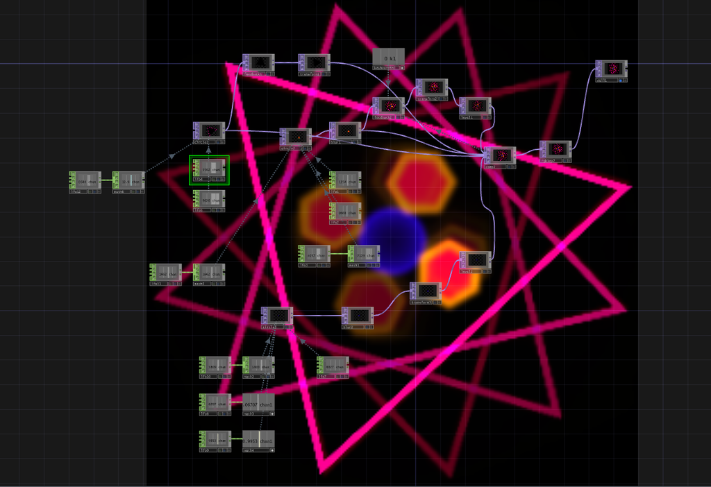
Posted: October 4, 2026 Filed under: Uncategorized Leave a comment »For my self-generating patch, I was primarily focused on learning new techniques and getting familiar with Touch Designer as a software. I wanted my project to be colorful and stimulating, but I am also unfamiliar with this program, so I was limited with my own techniques.
For the five hour time constraint, I spent most of my time doing trial and error with this project. For the first couple of hours, I was trying to figure out what to even do. I was consistently making and then deleting nodes to figure out what I wanted from this project. Eventually, I moved on to outsourcing other people’s projects and tutorials in order to actually learn more about what I was doing. Because we only learned a shallow amount of Touch Designer in class, I had to rely heavily on other tutorials in order to properly figure out how to navigate through the software. Once I found a few adequate videos to follow along with, I used that as a starting point for my project. I spent the remainder of my time limit following along with tutorials on easy visuals and then subsequently made them my own. I added color and shape changes so that it wasn’t just a copy and paste version of the tutorial. From there, I also added some of my own visuals from techniques that I already knew and had the hand of. Finally, I put everything together and made sure I had multiple visual stimuli so that it wasn’t just one shape or color that was changing.
The main choice throughout this project was choosing what to add and how to do it. I wanted more than just one or two things, so I tried to add a multitude of different nodes and objects that would catch the viewers attention. I didn’t want to add too much, though, in order to not overstimulate the viewer.
Overall, this project was surprisingly difficult and I wish I had more time to learn more about the software and how to make things in it. I am disappointed with the lack of information I had going into this project and I felt as though there wasn’t enough time given to properly execute a project that I would be proud of.
Pressure Project 1 – Particles
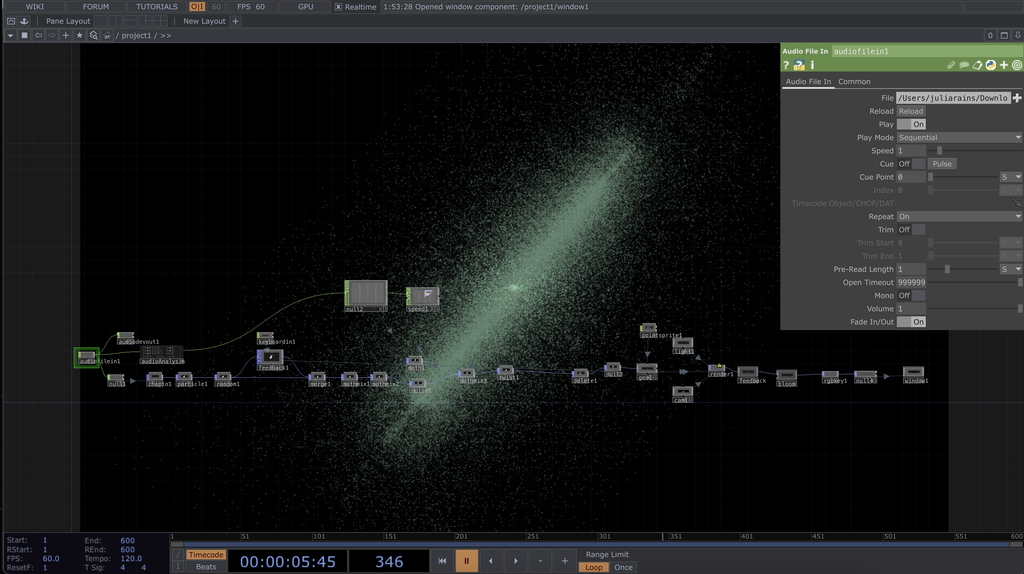
Posted: October 3, 2026 Filed under: Uncategorized | Tags: Pressure Project, touchdesigner Leave a comment »For my auto-generating patch, I decided to make an audiovisualizer using primarily POPs to generate a particle system. The patch is audio-reactive and was tested with multiple songs that fall under the EDM genre.
I approached the 5-hour time limit optimistically, knowing I could at least make something in that time. My first instinct was to search for a tutorial to follow since I didn’t want to just make a repeat of one of our practice patches from class. I knew from the jump that I wanted to make an audiovisualizer for the song Scream Saver by Subtronics. To find inspiration, I first went on TikTok and searched “Touchdesigner audio visualizer”. I found some really cool stuff, but a video that used a particle system really stood out to me, and it just so happened to be made by a guy who had a tutorial for it. The tutorial was “Audio Reactive Particles using Pops! – Touchdesigner Beginner Friendly Tutorial” by nicholaspjm on YouTube.
In my process of working from the tutorial, I ended up messing with a parameter by accident that led to my program crashing before I could even name the project, so I had to start over pretty late into the game. But when I restarted, I ended up fixing a problem my first patch was having, which led to a better outcome. In the end, I got to a point I liked after about 4 hours, then messed around with music for the remaining hour.
Most of the POPs-related elements of the patch, like the maths, went over my head, so I didn’t change them much from the tutorial. But when it got to the end, I started to customize more. I linked and relinked audio components to get the effects I wanted and messed with the color of the particles. The glow effect when the particles get close together is from a filter called bloom, and the color of the particles was edited by using a point sprite. Both the point sprite and filter came from the tutorial, but I edited them to look different from the guy in the video.
My biggest surprise during this process was at the end, when things all came together. Once I connected the audio to the math and things started moving, I got really pumped. From there, everything new I tried just added to the experience. I changed the song from Scream Saver to Falling Flying by Griz, and I felt the song fit the composition so much more. I feel like this is just the start of what I want to make potentially with audio reactivity. Seeing my favorite songs move and breathe was very gratifying to me.
Pressure project1-Geometric Starfield
Posted: October 2, 2026 Filed under: Uncategorized Leave a comment »Brief Description
I used simple geometric shapes such as circles, rectangles, and triangles in TouchDesigner and combined them with movement, feedback, noise, and other visual effects. Once the program starts, the shapes continue to move and change without requiring any interaction. I also added audio to the project so that the movement and visual effects of the shapes develop along with the sound, creating an audiovisual piece that can run and loop on its own.
Process Reflection
My original idea was to create something similar to the game Snake, where a shape would continuously move around the screen and create new changes after touching or “eating” other shapes, such as changing its size, movement, or visual effects. However, once I started working on the project, I realized that creating a complete game system with too many interactions would be difficult to finish and polish within five hours, especially based on what I currently know about TouchDesigner. Because of this, I changed my direction and started with simple geometric shapes, focusing more on their movement and visual relationships with each other.
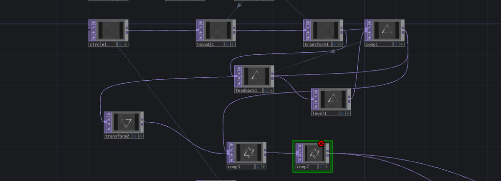
I used LFOs to create continuous movement and connected different values to Transform parameters to control the position, size, and movement of the shapes. One of the visual elements I created was a small white ball with a trailing effect that moves along an equilateral triangular path. I then duplicated it and reversed the direction of the path. When the two triangular paths overlapped, they created the appearance of a six-pointed star. I also experimented with Feedback, Noise, Level, and Composite to create more visual changes. At first, I considered adding more shapes, interactions, and colors, but I realized that too many elements would not only be difficult to complete within five hours, but could also make the visuals feel too busy. My first version used mostly rainbow colors. Although it looked colorful, the overall result felt messy and even a little cheap. I eventually changed to a simpler color palette so that the movement of the shapes could become the main focus. I also added particle effects in the background to create an atmosphere that feels like a starry sky.
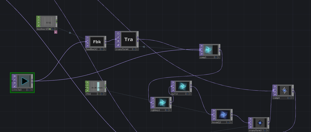
While learning TouchDesigner and working on this project, I was surprised by how much a small change in a parameter could affect the final result. For example, changing the speed of an LFO or adjusting the position, size, and movement range of a shape could completely change the rhythm and feeling of the composition. Combining different nodes also gave me a lot of flexibility to create different effects. Compared with After Effects, which I have used before, I found that I prefer TouchDesigner for creating this kind of looping animation. Its real-time workflow allows me to adjust parameters and immediately see the results, which makes the experimental process more direct.
During the in-class presentation, I felt that most of my classmates watched at least one full cycle of my piece. Although I did not achieve the “make someone laugh” achievement, I still received some positive feedback. The presentation also gave me a chance to see how other people responded to the pacing and visual changes in my work. Overall, this project helped me become more familiar with TouchDesigner and gave me my first experience creating a visual system that can continuously run on its own. In the future, I would like to experiment with more complex systems and audio controls to make the work more dynamic and engaging.
Pressure Project 1 – Music Visualization
Posted: October 2, 2026 Filed under: Uncategorized Leave a comment »Before starting this project, I spent a long time agonizing over what exactly to do. From my perspective—as someone who works very slowly—five hours is a very tight timeframe. So, after spending nearly an hour thinking about what to do, I decided I needed to pick up the pace. I’ve always been fascinated by music visualization, and I wanted to see if I could recreate it in Touch Designer.
My work primarily consists of several interconnected visual and audio systems. To begin with, I created small, constantly moving particles on the screen and used various motion parameters to make them rotate, move, and change size within the space. Rather than having all particles move in exactly the same way, I incorporated continuously varying values so that their movements would not repeat exactly. Next, I adjusted effects such as blur, displacement, and color, allowing the originally simple geometric shapes to gradually evolve into the organic forms seen today.
A key element of this project is the particle trail effect. I used a Feedback system so that the previous frame does not disappear immediately but instead re-enters the next frame. Then, using nodes such as Level, Blur, and Composite, I gradually reduced the intensity of the old image and recombined it with the new particle image. This way, when a particle moves, the position it previously occupied is briefly retained, creating a continuous trail. By adjusting the feedback strength and blur intensity, I can control how long the trail persists. If the feedback is too strong, the entire image gradually builds up; if it’s too weak, the trail disappears too quickly, so I spent quite a bit of time finding the right balance between the two.
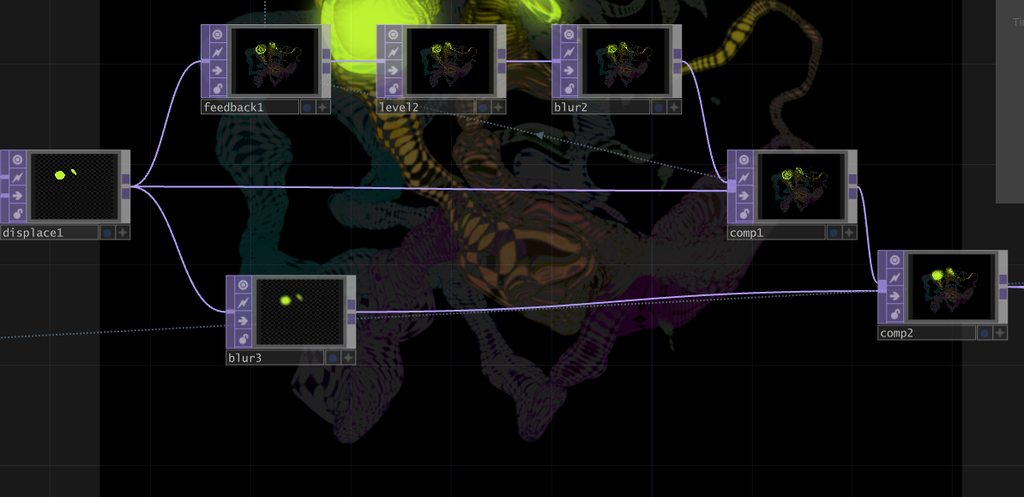
The integration of sound and visuals is one of the most important aspects of this work. I first imported the music into TouchDesigner, then used nodes such as Noise and Math to analyze the sound, converting the original music into data that could control visual parameters. As a result, sounds of different frequencies and intensities are no longer simply played back; instead, they directly influence changes in the visuals. I remapped and constrained this audio data so that it could be used to control visual effects, rather than using the raw audio data, which fluctuates too wildly.
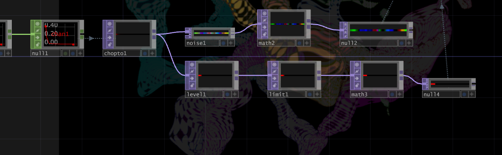
One of the most obvious visual responses is the variation in the number of particles. The intensity of the music is analyzed and converted into a numerical value, which is then used to control the number of particles generated on screen. When the music becomes louder, or when the rhythm or certain frequencies become more pronounced, the system generates more small particles; when the sound fades, the number of particles decreases. Consequently, particles do not appear in a fixed quantity but constantly fluctuate in response to the music. Since each newly generated particle enters the feedback loop, when the sound is louder, not only does the number of particles increase, but the motion trails and visual density in the image also become more pronounced.
My approach to creating this project is similar to many generative art projects: I start by building a simple system and then gradually increase its complexity. At first, I focused solely on making basic shapes move; then I added musical responses, followed by variations in particle count, feedback trails, blur, displacement, and color changes. During the production process, I experimented with many different connection methods; some feedback settings caused the visuals to disappear too quickly, while others made them too chaotic. Through constant adjustments, I finally found an effect that preserves the particles’ motion trails without completely obscuring the original shapes.
This project gave me a deeper understanding of the relationship between sound and visuals in TouchDesigner. In the past, I tended to view music and visuals as two separate elements, but this time I tried turning the sound itself into data that controls the visual system. The music determines when the number of particles increases or decreases, while the particles’ movement leaves trails through Feedback, and the colors and other automatic changes allow the system to continuously generate new visuals even without manual intervention. This also transforms the entire piece into a generative visual system that runs on its own while constantly evolving in response to the music.
Link to original work: https://github.com/HexisHere/ACCAD.git
Pressure Project #6 – Cosmic Slop
Posted: October 2, 2026 Filed under: Uncategorized | Tags: 2026 Leave a comment »I had nothing in mind going into this project, and wanted to use the 5 hours I had to experiment with as many things as I could. I have worked with feedback loops in the past, but never in TouchDesigner, so it took some time to get used to. Still, I brought with me my knowledge of video synthesis to help guide me through.
My patch has three different components, which are all manipulated by respective sets of LFOs. Everything is then composited together using blend modes. I began my 5 hour time period by experimenting with a variety of feedback methods until I found something that was cool. I ended up with a circle pattern, which is composited over a rotating square feedback loop. To add some unpredictability, the LFO that controls the feedback rotation is turned off every second, creating subtle movement changes. Once I had this base, I experimented further by masking the circle with another shape: a circle TOP that changes its amount of sides through an LFO. I tiled this pattern in a 2×2 grid, and added a secondary feedback loop, which I incorporated using a “difference” blending mode.
This formed my base, however, I wanted to add some additional layering on top to make the pattern more unpredictable. I made two basic feedback loops using shapes, making sure their movement was offset using LFOs. These loops were a lot simpler than the base loop, providing for an interesting contrast. Both are incorporated using comp nodes. For final processing, I keyed out all the black areas, replacing them with the radial ramp node from earlier. I liked the pixelated nature of the shapes, so I grabbed a pixelate effect from the palette to make it more defined.
I approached this project like I do with a lot of my video work, working simple to complex. It was helpful to make standalone systems before adding them together as it gave me a modular patch that allowed for interesting possibilities. I’m aware of the power of LFOs from eurorack video synthesis, and this was a fun project to test those possibilities without needing an expensive rig. This project opened my eyes to the complex possibilities of TouchDesigner, and I am excited to learn more and explore.
The final video can be seen below, with a documentation video outlining each component of my final loop.
Recent Comments