Cycle 3: مہمان – Mehmaan (The Guest)
Posted: May 8, 2026 Filed under: Uncategorized | Tags: Cycle 3, touchdesigner Leave a comment »The Score
For Cycle 3, I knew exactly what to work on: the harmony between the particle effects and the floor pattern, the fact that there needed to be a visual feedback of the body in some way or form, and that the body needed to leave a mark. The last thing on the checklist came from the concept that the guest or the user should change the space by being in it, because that’s how mehman-nawazi works. The house holds the warmth of whoever was there.
So Cycle 3 added the trace. A silhouette of the users’ body’s that follows them in color-shifting cache through the space and stays for a few seconds. The colors cycle and change as the trace lingers. It’s not a shadow, it’s more like a very colorful version of a heat map of being in a specific position. The users can see where they were. This also caters to the visual feedback of the body that was missing in cycle 2.
The experience also expanded outward. Two additional scrims on the sides of the space were used to carry the partcile system of the falling petals. These were not interactive, just ambient. Just to give a feel of an enclosed space. The front screen remains interactive. There was also a screen at the back – showing everything that was going on in the space.
Resources
- TouchDesigner
- Orbecc depth camera for body/blob detection
- My trusty laptop
- Top down projector, and the rug
- Projection screen
- Motion Lab
- Tripod mounted Camera
- Scrims
Process and Pivots
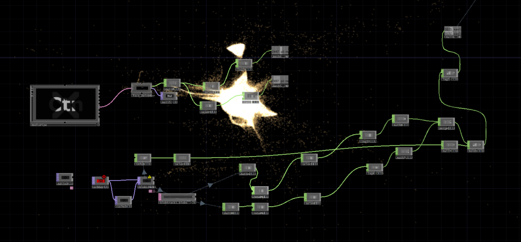
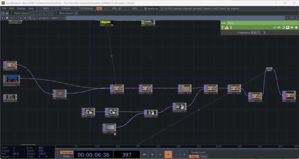
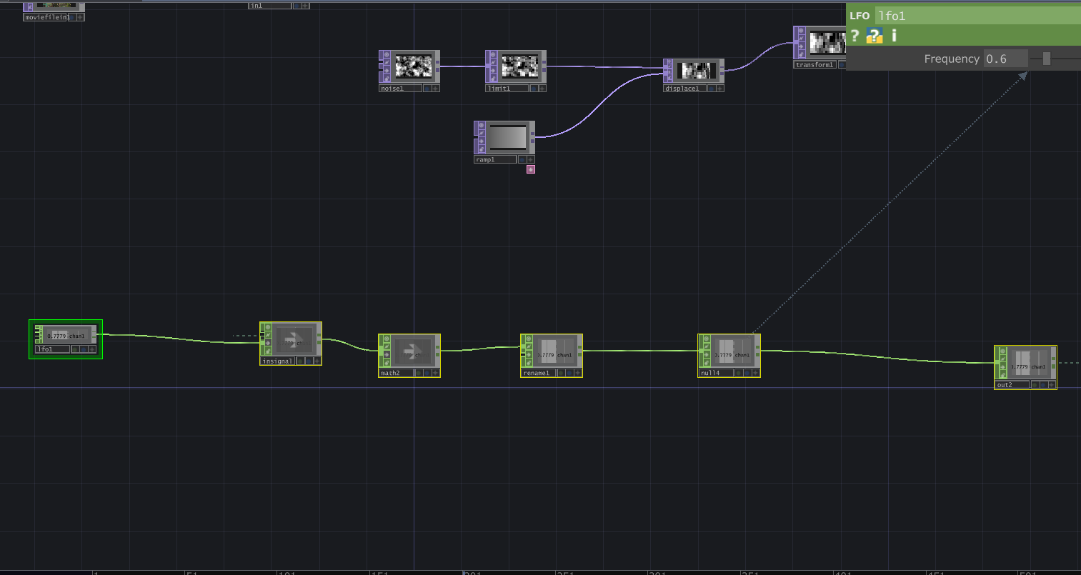
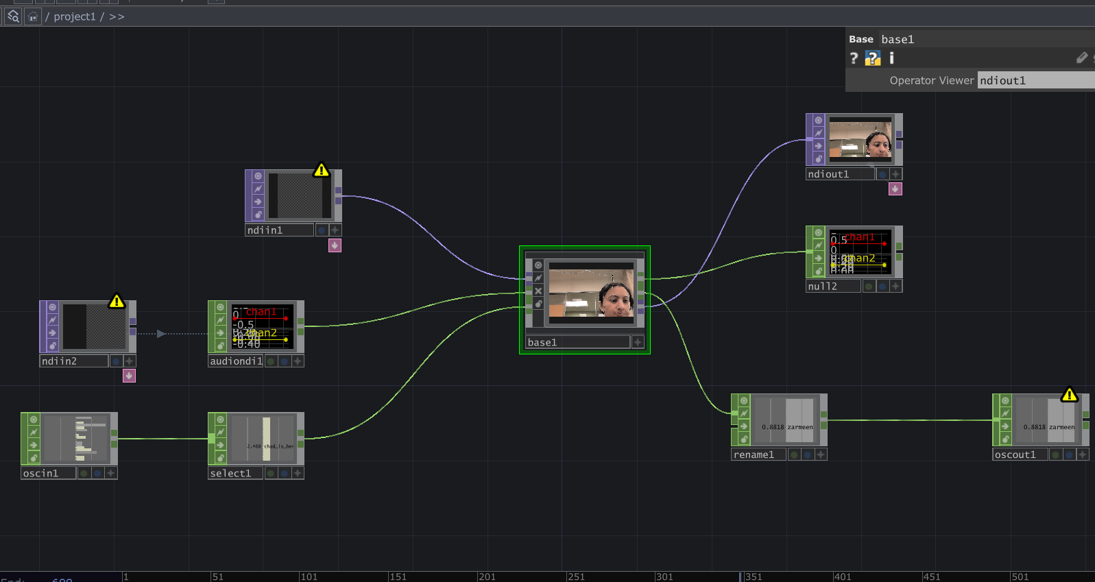
The silhouette trail was the main new challenge. It uses a cache and feedback system inside TouchDesigner. Since there was only one orbecc available, the problem was to create accurate silhouettes using something else. This led me to the nvidia background top – which is surprisingly accurate. The body mask from that was put in a feedback loop with a cache top that makes the silhouette decay slowly. I also added a time-based color ramp function which makes the color change for each frame. The result is a trail that shifts through colors as it fades. Adding such dynamic colors to the particle system was also meant to act as a bridge between the zen particle system and the fast audio reactive floor projections. The floor pattern from Cycle 2 was slowed down.
The two side screens were simpler. They were just additional outputs fed from the same petal particle system but without the optical flow input. They made the space feel larger and more continuous. This meant that the users would no longer be just standing in front of a single screen. The environment was meant to wrap around you them, with screens all around.
What Worked, What Didn’t, What I Learned
What worked: I went in first, interacted with the system, and then invited everyone over to the space. I didn’t say take turns or anything. I just mad ethe gestures for everyone to come over and they did! That was a good idea as it worked as a good ice breaker for the initial awkwardness experienced in the previous cycle. Everyone was in the space from the get-go. The silhouette trail also worked great! It was an immediate visual feedback that was easy to understand. Everyone moved and watched themselves leave marks. They stood in one spot, did all sorts of gestures, danced around, twirled, and there was also a train happening at some point. So the whole experience was very very social. It was like watching people play in a fun playground.
I was told that the addition of the two side screens made the space feel complete in a way the single-screen version didn’t. It felt like an environment enveloping you. Lou mentioned that even though the side screens didn’t have any interactions, it was nice to go up to them and see their projections on your body.
What I’m still thinking about: The silhouette and the petals exist together but I dont know, there isn’t really much of an iinteraction between the two. Which is okay, BUT it would be nice if they could effect each other in some way. That feels like the next thing to do. Also for the previous cycle, I had tried to do a position based trigger. So I dissected the circular space of the rug in 4 quadrants, and depending on where a user is, it triggers some visuals on the screens. I couldnt get it to work but I keep thinking what if about it. I would also love to explore some physical interactions triggering some events in a cool physical-digital way.
What I learned across all three cycles: I started off by trying to make an AI listen to the user and ended up making a space that receives the user instead. These are two very different orientations, but I learned throughout the process that making a good experience requires you to pay attention to even the most seemingly-insignificant interactions and feedbacks of the users. Things that don’t even feel like findings when they’re happening are sometimes the most useful data you can collect. It’s just very easy to miss them because we (atleast me – I dont speak for everyone) are looking at the system instead of looking at the people.
Cycle 2: مہمان – Mehmaan (The Guest)
Posted: May 8, 2026 Filed under: Uncategorized Leave a comment »After the unsuccessful debut of my Cycle 1 project, where I had built a conversational system and dressed it in fancy spatial experience clothes. I realized I was trying to do too much and jumping in too quick into the technicalities of what was at the time my very broad area of research with, without having alot of knowledge of the area. Just for reference: my area of research interest is designing an AI companionship experience which embodies the aspects of companionship that a text-based companion would not – especially for South Asian adults experiencing loneliness. So, for the next cycles, I thought it would be great if I strip my goals down to creating an experience that achieves part of it. So, I pivoted to creating an embodied experience where the space acknowledges you, with a flair of South Asian culture. In short: I just needed a body in a space and something the space could do in response.
So, the concept became Mehmaan. Mehmaan means guest in Urdu. Mehman-nawazi (the hospitality, care, and honoring of the guest) is a specific South Asian, or in my case, the Pakistani cultural practice. I translated that into a spatial experience where the host (the space) does all the work. The guests (the users) don’t have to operate or figure out anything. They are just received and honored. That is the opposite of every interactive experience I have ever used, but it felt like the right thing to create after Cycle 1 where the user was expected to do all the labor of making the system work.
Resources
- TouchDesigner
- Orbecc depth camera for body/blob detection
- My trusty laptop (I have not named her yet)
- The song “Mehmaan” -> https://youtu.be/mtIjUH4aQSA?si=mkKMoMGcJ28JOHrX
- Top down projector, and THE rug
- Projection screen
- Motion Lab
- Tripod mounted Camera
The score
The user steps into a dimly projected floor of Pakistani geometric patterns (truck art). As the user enters, the space becomes more alive: the projections get brighter, and music begins playing. On the large projection screen in front of the user, flower petals fall and respond to the movements of the user. So, not deliberately doing anything – the space just blooms because someone is in it.
Process
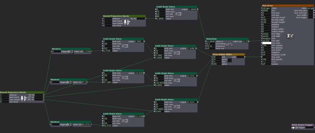
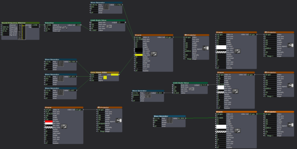
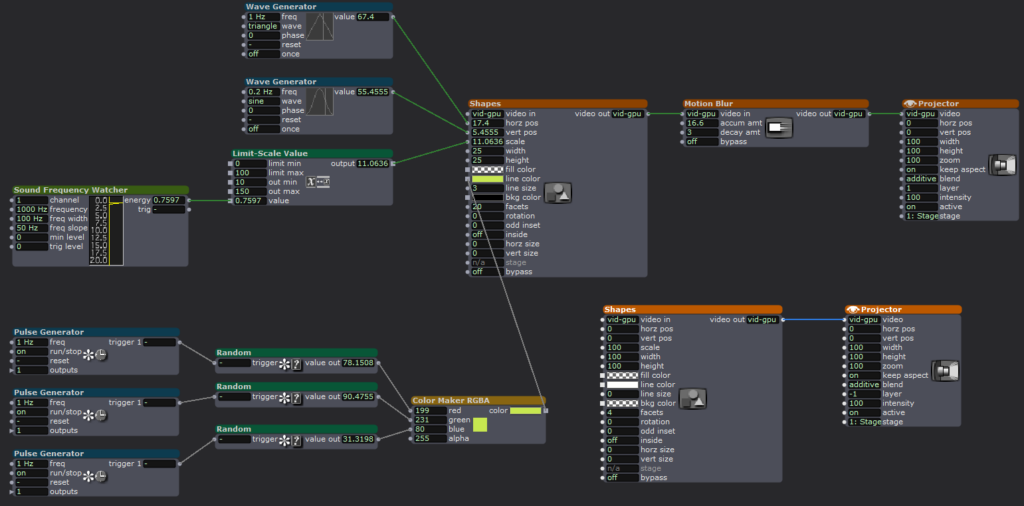
Blob detection from the Orbecc signaled the start of the experience: blob detected -> song starts, floor pattern brightens. No blob, no experience. The space is dormant until you enter it. The projector screen shows slowly falling petals in the background throughout the experience. The floor pattern is a sequence of Pakistani truck art motifs animated with beat detection from the song. I used a mirror top so that the pattern dances with the music.
The optical flow for the petal- particle effect interaction was the most fun part to build. You move, and the petals physically respond to your body. It’s immediately perceptible without any detailed instructions.
What Worked, What Didn’t, What I Learned
What worked: Almost everything that I hoped to, which was great! The feedback told me the piece was very fun and made people want to dance, which was not the plan but it felt right. The cultural aspects like the patterns and the song was immediately warm rather than alienating even to people unfamiliar with it. The optical flow interaction was intuitive enough that people discovered it themselves, which is exactly what I was going for after Cycle 1 where nothing was intuitive. The experience also became very social. It started with everyone taking turns to it turning into a dance-playground for everyone!
What I learned: the performative discomfort of being alone in front of a system watching you is a design problem, not a personality problem. The system needed to give people something of themselves back. They needed to see that they were inside it, not just in front of it.
Pressure Project 3: Love Letters from Home
Posted: May 7, 2026 Filed under: Uncategorized | Tags: Pressure Project, Pressure Project 3, touchdesigner Leave a comment »This project was created as a purely audio experience, a three-minute piece with no visuals. It was meant to be cultural storytelling, but in the process of doing that, it became something very personal. Honestly, I’m not even sure if I made it for anyone other than myself.
The interaction is built around proximity form the camera and the system. Using Mediapipe inside TouchDesigner, the system estimates the participant’s distance from the camera based on the space between their shoulders. That distance is then mapped into three separate zones: near, mid, and far. Each zone triggers a different audio sequence of a minute long, creating a shifting soundscape as you move through space. The interaction is very simple but it gets complex in what it means.
The zones are not just meant to be spatial, I also intended them to be emotional. The farthest zone holds the ambient sounds from back home. It contains sounds of a place I have very fond memories of, Liberty Market in Lahore. It’s full of life, voices, interesting characters, and movement. It holds the ambient chaos and the unique life of a place that feels familiar when you’ve lived inside it. Underneath it also runs the sound of a dhol, a traditional drum from South Asia which is often played during celebrations and festivals. The recording is from my wedding, which turns it into something both public but also secretly personal.
The middle zone moves closer to the system and my life, into family. My parents asking if I’m okay, telling me to take care of myself, giving blessings in the everyday way they do. There are also scattered pieces of time spent with my siblings, just being together, being absurd and being just us. There is also snippets of my dad telling us a ghost story around a bonfire. All of them are just small moments when they’re happening, but they kind of accumulate weight as time passes, especially now that being together like that is rare.
The closest zone is the most intimate. It has audio of me and my husband. Snippets of our vows, pieces of our wedding song, voice notes he sent me from long distance of him singing to me, and also us singing together. The songs are in Urdu, which is our mother tongue. So music in this case, is not just background. It’s part of how we stayed close across distance before we could be in the same room.
The piece doesn’t guide you or explain itself. You move, and it responds. What you hear depends entirely on how close you choose to stand, how long you stay, whether you move toward something or away from it. That felt like the right way to design this piece because that’s how memories also work: existing in a very non-announcing sort of a way.
I asked someone else if they would like to perform the piece (I didn’t feel like putting myself out there and I thought I would end up crying), and Chad volunteered. That did not go exactly as planned and it annoyed me because he was trying to figure out how the system worked and all of its interactions, and in doing so, he missed half of the experience. I realized I shouldn’t have told someone else to give a performance for something as personal as this project in my stead, because it wasn’t a puzzle meant to be figured out.
So I did what I had to, in order to fix the situation: I performed it myself. I may or may not have cried while creating this, but performing this made me so happy and I felt relieved to have done it “properly”.
The most surprising part was that even people who didn’t understand the language still felt something. Lou told me they got teary-eyed. That meant a lot to me. It showed that the piece wasn’t just about language or culture in a literal sense, but about something deeper, and also obviously about the performance since they did mention that they could tell how much this meant to me while seeing me perform.
If I develop this further, I want the zones to be less blocky, and to be more fluid and abstract, even floating around like memories. But even as it is, I really like this piece because of how much it means to me, and it does feel complete in a different way.
Cycle 1: The (bad) Friend
Posted: April 7, 2026 Filed under: Uncategorized | Tags: cycle 1, touchdesigner Leave a comment »The Score
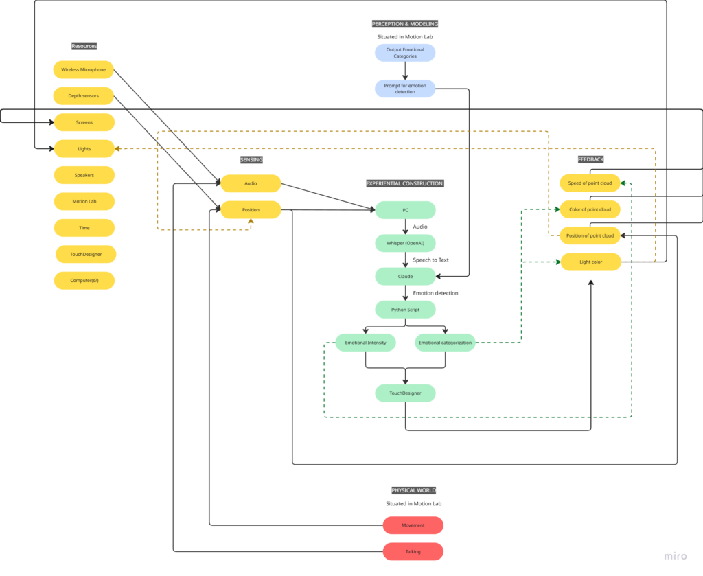
My idea for this cycle was simple (or atleast it seemed so in my head): make an AI-powered interactive experience where the user shares a space with an AI ‘presence’. It lives on a screen, but its there for you and it listens to whatever you have to say – or dont have to say. The score: a participant enters a space, speaks naturally, and the environment responds to the quality of what they shared through a particle system. No text output, no voice back. Just the space changing around them. The framing I gave participants was: “this is a friend you can talk to.” That framing is what became the main problem.
Resources
- TouchDesigner for the visual/particle system
- Python + PyAudio for microphone input
- OpenAI Whisper for speech-to-text transcription
- Claude API to interpret the speech and return atmospheric parameters (brightness, movement, weight, density) as JSON
- OSC to pipe values from Python into TouchDesigner
- Orbecc depth camera for body tracking (ceiling-mounted, blob detection)
- Motion Lab
- A Michael for troubleshooting (1)
Process and Pivots
I wrote a python script that takes user input through the microphone, then uses OpenAI Whisper for speech-to-text transcription. It then sends the speech to claude in order to parse it according to the system prompt I gave it, which were metrics like emotional register, weight, intensity etc. The python script in turn sends these metrics to touchdesigner through OSC. Inside touchdesigner, I made table DATs that were storing the values of the incoming signals in order to apply those values to the visual system (a particle system). The values were suppsoed to effect the movement and color of the particle system.
I initially built my system on MediaPipe for body tracking, but then when I shifted the system to the motionlab, I had revelations. The system worked fine for a laptop but for it to work in an open space and a big projection screen, it would need a camera directly in front of the participant’s face (and the screen) to work, which sounds horrible for an immersive experience. So, I switched to blob detection through the Orbecc ceiling camera. That took a while to get right. It wouldn’t even detect me and I couldn’t figure out why so I made the very obvious assumption that it hates me lol. Turns out it needs something to reflect off of and I was wearing all black.
The original prompt to Claude was trying to do an emotional analysis, as in read how the person was feeling and respond to that. At some point I rewrote it to just read the texture and quality of what was shared, not the emotional content. That was actually the most important design decision I made: the difference between “I understand you” and “I am here.” The particle system was jerking between states and it felt mechanical, so I also had to apply some smoothing for it to not act crazy.
What Worked, What Didn’t, What I Learned
What didn’t work: ALOT. I think apart from the framing of the system, I had not realized the amount of time I needed to properly do this. I had only gotten a limited amount of time in the MOLA so I was only able to troubleshoot the projection and not run through the whole pipeline. I did not anticipate alot of things as they went wrong the biggest example of this would be the lag. There’s bad bad latency in the pipeline (mic → Whisper → Claude → OSC → TouchDesigner) and it was long enough that participants got confused. They’d speak, nothing would happen, they’d speak again, then two responses would arrive at once. A few people got genuinely frustrated. The “friend you can talk to” framing made this much worse because it set up an expectation of conversational timing that the system couldn’t meet. Lou said it was a bad bad friend. Like one of those people who keep looking at their phone when you’re trying to talk to them.
What worked unexpectedly: The observers. People watching someone else use the system felt something – specifically, they felt empathy for the participant who was being poorly served by the AI. That observation became the most interesting research finding of the whole cycle.
What I learned: Time is the biggest resource, and you have to plan according to it. Instead of trying to force all of your bajillion ideas into the time that you have. Also, framing matters more than you think it does! Had the same system been framed a different way, I would’ve gotten away with it, but since I had framed it a specific way, there were specific expectations.
Pressure Project 2: One for All, All for one
Posted: March 9, 2026 Filed under: Pressure Project 2 | Tags: Pressure Project, Pressure Project 2, touchdesigner Leave a comment »I named my cell One for All, All for One because it is built around the idea that an individual, and communities as a whole are constantly shaping each other. The cell itself is a constan conversation between the oneself and the communal archive. It takes a live video feed and layers it over a slideshow of images showing communities and people from different parts of the world.
Then interactive sound enters the picture. A glitch effect driven by audio input levels determines how much the live video overlay fractures. The louder the audio, the more the live layer breaks apart and reveals the slideshow underneath. Alongside this, I built in an internal LFO paired with an Edge TOP to create a rhythmic pulse, something I called a “heartbeat”. Even without external input, the system works fine and feels alive.
The structure is modular and layered, and honestly not that complicated. There is a live video input, and a media player (which controls the slideshow) which plug into a switch. The output of the switch goes into a glitch system, and a pulse system. Each could be replaced without breaking the overall logic. The audio input, live video input, and the signal (LFO) are designed so that they could be overridden by an external network signal as well. The cell has its own system, but it is designed to connect, following the true concept of one for all, all for one.
Reflection:
When all the cells assembled, things became unstable. Signals were constantly dropping and connections were dying. For a while, I thought something was wrong with my cell because nothing would show up (it was a problem with the input signals I was getting). When I finally got it to work, very interesting emergent behaviors appeared. The glitches danced to different rhythms. Video overlays ended up in very interesting stacked outputs. It was interesting because I did design my system while being aware that it had to be plugged into a bigger system. However, I did not envision the results I got during testing. What I controlled alone became either amplified or distorted by others. The network did not just combine outputs. It reshaped them. I think where my careful planning fell off was the heartbeat. I had not accounted for the fact that other cells can have signals of different types. Instead of a steady pulse, I got an irregular signal input, which changed the whole heartbeat effect. At first it felt like something went wrong. My cell was no longer just reacting to my inputs. It was reacting to everyone. That is exactly what One for All, All for One means. Each cell affects the others. Each signal influences the collective behavior. My cell had a life of its own. In the network, it learned to respond, adapt, and sometimes surrender to the collective.
Project File: pp2_Zarmeen.zip
Pressure Project#1: Pitch, Please.
Posted: February 10, 2026 Filed under: Pressure Project I | Tags: Interactive Media, Isadora, Pressure Project, Pressure Project One Leave a comment »Description: Pitch, Please is a voice-activated, self-generating patch where your voice runs the entire experience. The patch unfolds across three interactive sequences, each translating the frequency from audio input into something you can see and play with. No keyboard, no mouse, just whatever sounds you’re willing to make in public.
Reflection
I did not exactly know what I wanted for this project, but I knew I wanted something light, colorful, interactive, and fun. While I believe I got what I intended out of this project, I also did get some nice surprises!
The patch starts super simple. The first sequence is a screen that says SING! That’s it. And the moment someone makes a sound, the system responds. Font size grows and shrinks, and background colors shift depending on frequency. It worked as both onboarding and instruction, and made everyone realize their voice was doing something.
The second sequence is a Flappy Bird-esque game where a ball has to dodge hurdles. The environment was pretty simple and bare-bones, with moving hurdles and a color-changing background. You just have to sing a note, and make the ball jump. This is where things got fun. Everyone had gotten comfortable at this point. There was a lot more experimentation, and a lot more freedom.
The final sequence is a soothing black screen, with a trail of rings moving across the screen like those old screensavers. Again, audio input controls the ring size and color. Honestly, this one was just made as an afterthought because three sequences sounded about right in my head. So, I was pretty surprised when majority of the class enjoyed this one the best. It’s just something about old-school screensaver aesthetic. Hard to beat.
What surprised me most was how social it became. I was alone at home when I made this and I didn’t have anyone test it so, it wasn’t really made with collaboration in mind, but it happened anyway. I thought people would interact one at a time. Instead, it turned into a group activity. There was whistling, clapping and even opera singing. (Michael sang an Aria!) At one point people were even teaming up, and giving instructions to each other on what to do.
When I started this project, I had a very different idea in my mind. I couldn’t figure it out though, and just wasted a couple hours. I then moved on to this idea of a voice controlled flappy-duck game, and started thinking about the execution it in the most minimal way possible (because again, time). This one took me a while, but I reused the code for the other two sequences and managed to get decent results within the timeframe. There’s something about knowing there is a time limit. It just awakens a primal instinct in me that kind of died after the era of formal timed exams in my life ended. In short, I pretty much went into hyperdrive and delivered. I’m sure I would’ve wasted a lot more time on the same project if there was no time limit. I’m glad there was.
That said, could it be more polished? Yes. Was this the best I could do in this timeframe? I don’t know, but it is what it is. If I HAD to work on it further, I’d add a buffer at the start so the stage doesn’t just start playing all of a sudden. I would also smooth out the hypersensitivity of the first sequence which makes it look very glitchy and headache-inducing. But honestly, with the resources that I had, Pitch, Please turned out decent. I mean, I got people to play, loudly, badly, collaboratively, and with zero shame, using nothing but their voice. Which was kind of the whole point.
AI EXPERT AUDIT – DANDADAN
Posted: February 5, 2026 Filed under: Uncategorized Leave a comment »I chose the anime DanDaDan as my topic. I believe I am an expert in a lot of anime/manga related topics because I have been reading manga and watching anime for more than a decade now. I love DanDaDan especially because it’s one of the few series lately that’s a little different in a world of overly saturated genres like the leveling-up games. DanDaDan is a breath of fresh air and super weird and fun filled with all sorts of absurdity. So, in order to train notebook LM about this topic, I used some YouTube videos. The videos focused on the storyline, major arcs, characters, and why is it such a hit.
1. Accuracy Check
I wasn’t so surprised that it got the gist of the story correct. I did give it sources where the youtubers summarized the whole storyline and talked about its characters, arcs and resolutions. So, it wasn’t a bad generic overview, I would even say it was good for a summary. It’s only when you’ve been thoroughly into a certain subject area that you start understanding the nuances and tiny details of it. I think it didn’t say something outright absurd if we were to talk about what it got wrong. It’s just that it sometimes mispronounced some names. With the names being Japanese, I am not surprised that they might be mispronounced, but the AI used a range of mis-pronunciations for the same name.
One of the voices in the podcast was too hung up on making the story what it is not. I mean sure it was justified at some points but it insisted that the real ideas behind this absurd adventure-comedy are deeper themes like teenage loneliness, and that it’s actually a romance story while it’s not. (It’s a blend of scifiXhorror) Sure there are sub-themes like in all anime, but it’s not the main theme. The other voice sometimes did agree with this idea. The podcast was not focused enough on just keeping it fun and light- which is what DanDaDan really is.
2. Usefulness for Learning
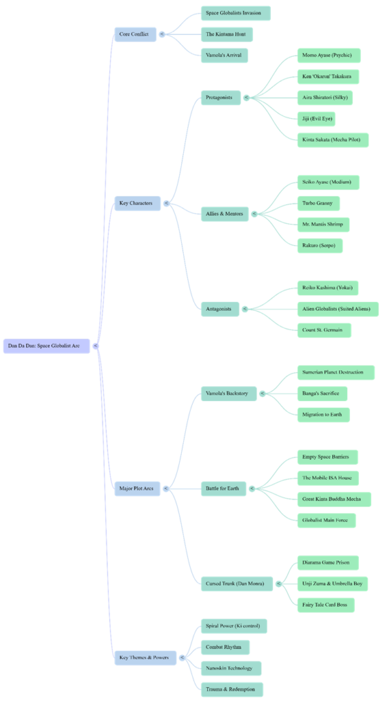
If I was listening to this topic for the first time, I feel like this podcast wouldn’t be a bad starter. Like I mentioned earlier, it gave a pretty decent summary of the whole plot. I think it definitely gets you started if you need a quick explanation of a subject area. I found the mindmap to be pretty decent too. It was a decent overview of the characters and the arcs. The infographic on the other hand… so bad. The design is super cringe and again, a lot of emphasis is on the romance and how it drives the action. Which I disagree with.
3. The Aesthetic of AI
Overall, the conversation was SO very cringe, and it was very difficult to get used to it in the beginning. I used the debate mode and they were talking so intensely about a topic that’s just nowhere as serious as the AI made it out to be. I had to just stop and remind myself it’s just a weird, fun anime they’re talking about. AI has this tendency to make everything sound intense, I guess.
4. Trust & Limitations
I would recommend AI to someone who wants a quick summary or overview of a topic. It’s what the AI is good at. What I wouldn’t recommend is to dwell on the details that the AI talks about. If anyone wants details or wants to form an opinion about a topic, they should look into it themselves.
Link to the podcast:
AI-Generated Visuals:

Sources:
https://youtu.be/8XdTF5tnMVU?list=TLGG7J2IoA7cY1QwNTAyMjAyNg